Shure 100th Anniversary | Visual identity & Premium Design

Branding Story:
Background
Since 1925, Shure has been a global leader in the field of audio excellence, redefining how the world experiences sound. Founded in Chicago, Shure specializes in designing and manufacturing high-performance microphones, earphones, headphones, and audio electronics trusted by professionals and enthusiasts worldwide. Whether on iconic stages, in recording studios, critical communication settings, or personal listening environments, Shure products are renowned for their unmatched quality, durability, and innovation. For a century, Shure has stayed true to its core mission: to create audio tools that capture and reproduce sound with absolute integrity, fostering connections and creativity across generations and cultures. As our centennial slogan declares: “100 years of extraordinary sound. The story of sound is the story of us.”
Design Concept
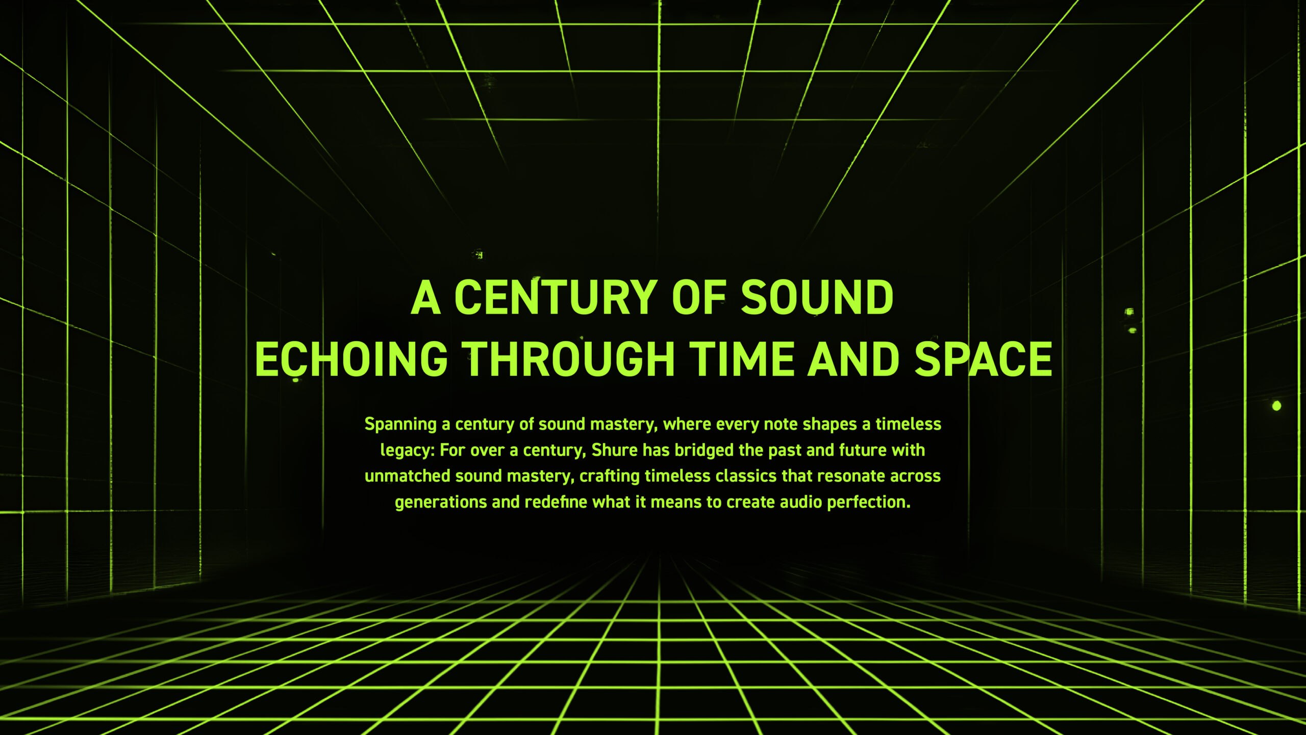
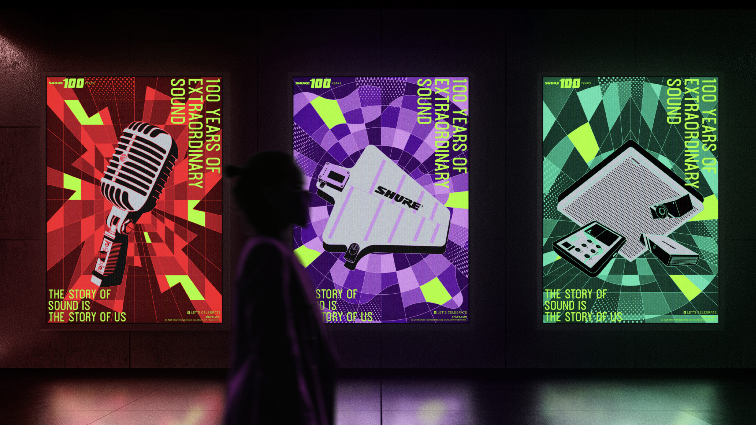
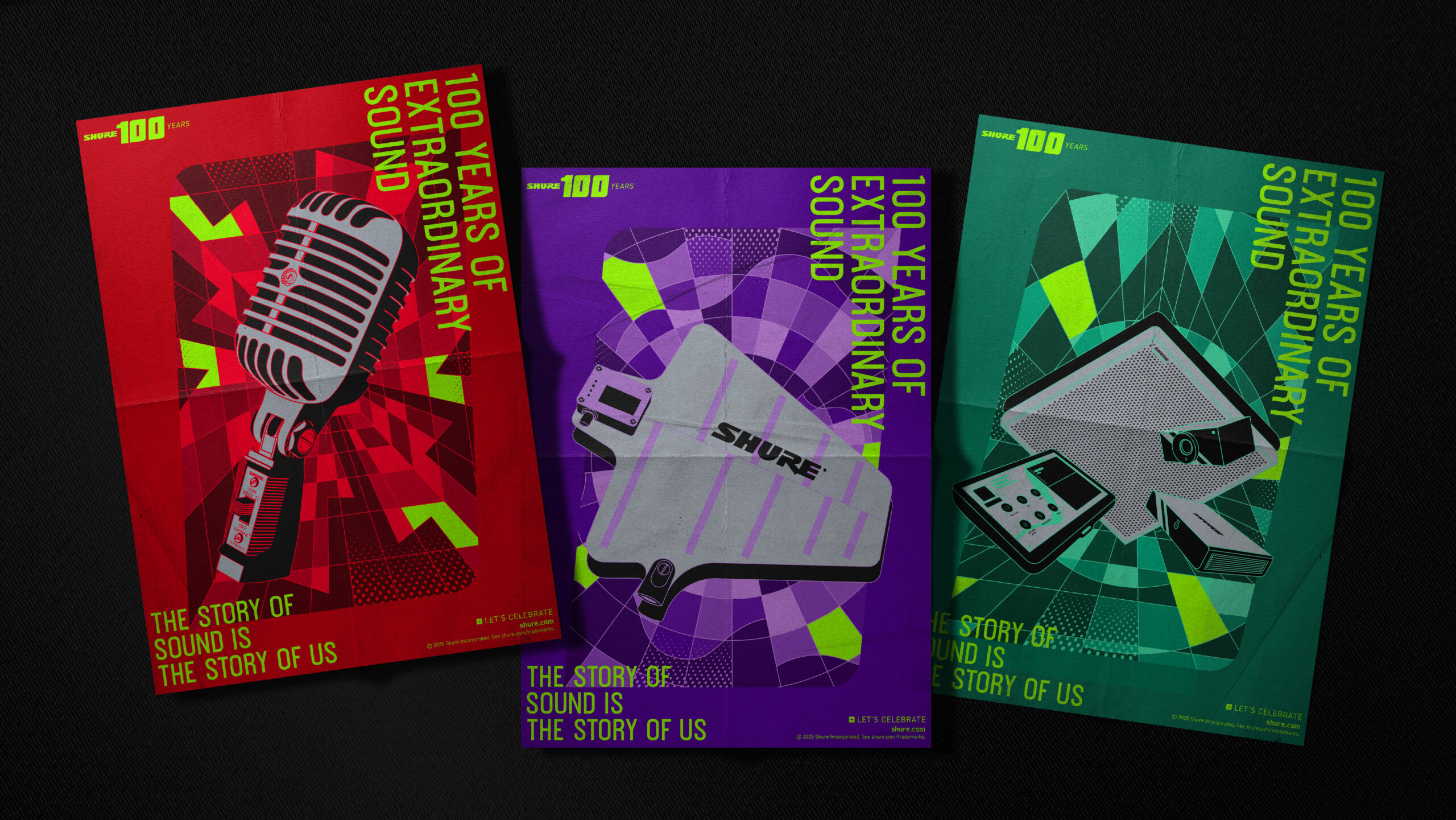
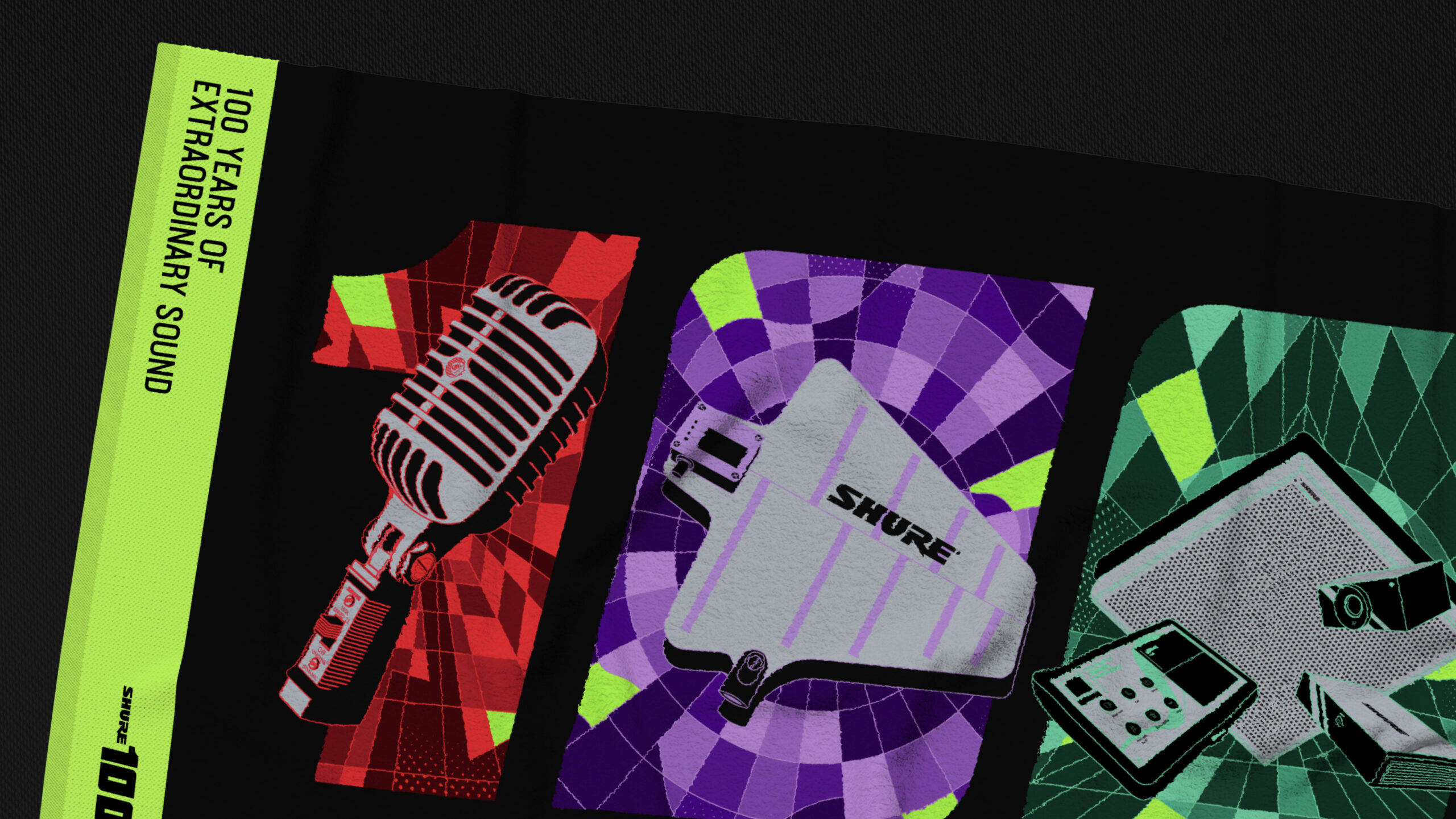
The visual branding narrative draws inspiration from the theme: “A CENTURY OF SOUND ECHOING THROUGH TIME AND SPACE.” Soundwaves explode in visual dimensions—bold squares emerge from pressure peaks, resembling a crimson lightning bolt slicing through the haze of a rock concert. The metal grid of the legendary 55SH microphone vibrates, compressing the roars of thousands into timeless acoustic fossils. Diffused circles ripple in violet hues, gradually expanding in the sealed silence of a recording studio. The diaphragm of headphones mirrors the creator’s breathing rhythm, abruptly swelling into a tsunami of soundwaves that engulf massive stages, eventually permeating into conference rooms within concrete jungles. Stable triangles, cast in green light, form an acoustic fortress symbolizing reliability and precision.
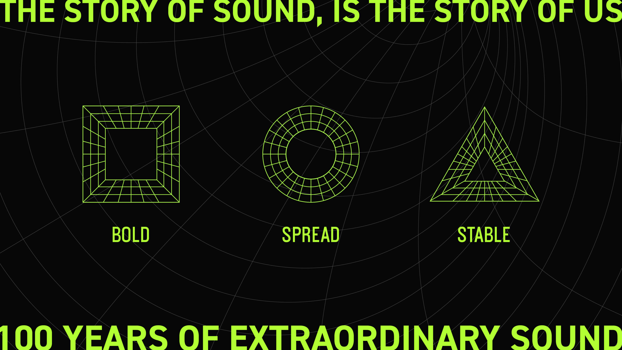
The visual design is anchored by three iconic geometric shapes, representing the three acoustic dimensions Shure excels in:
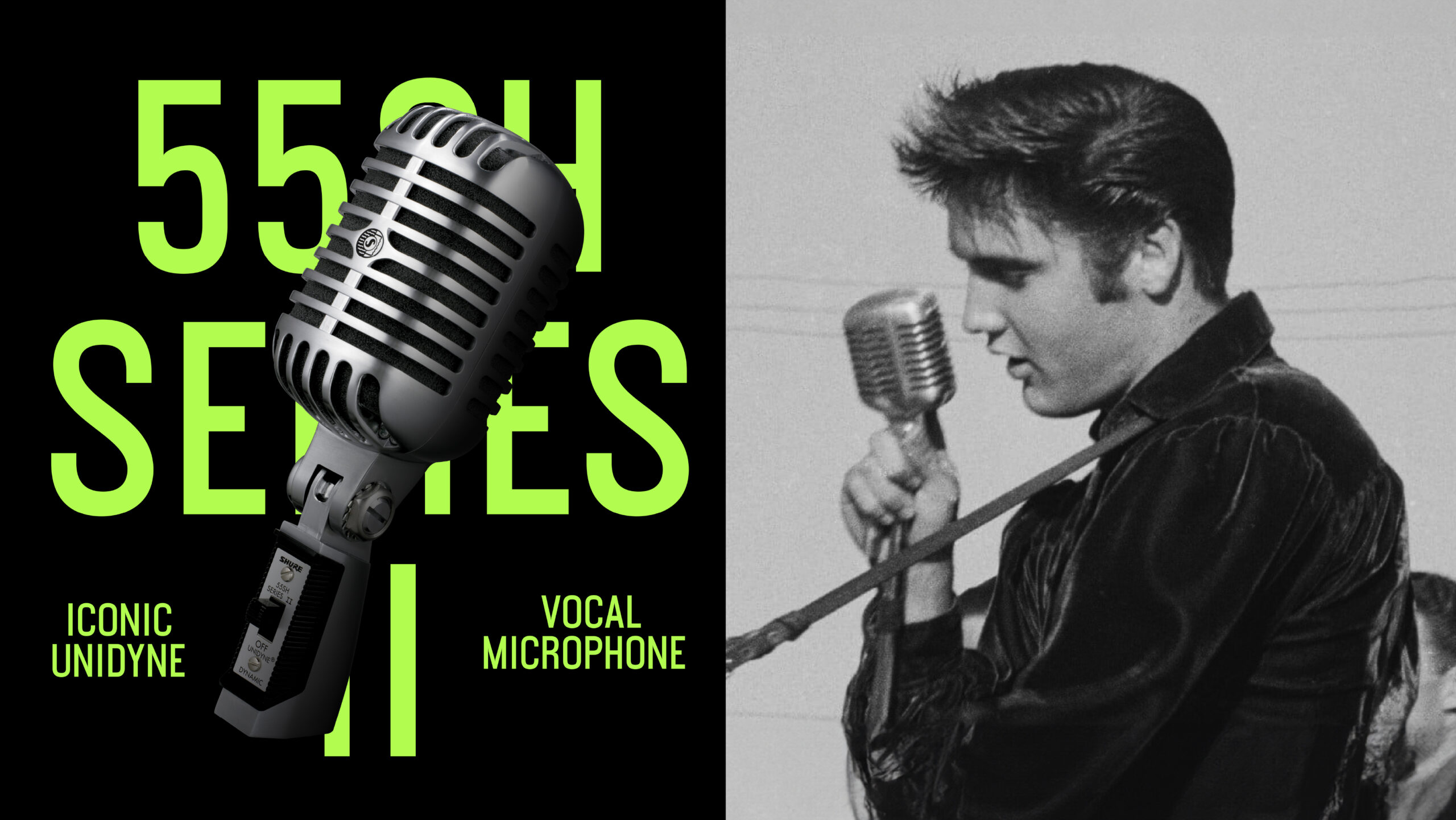
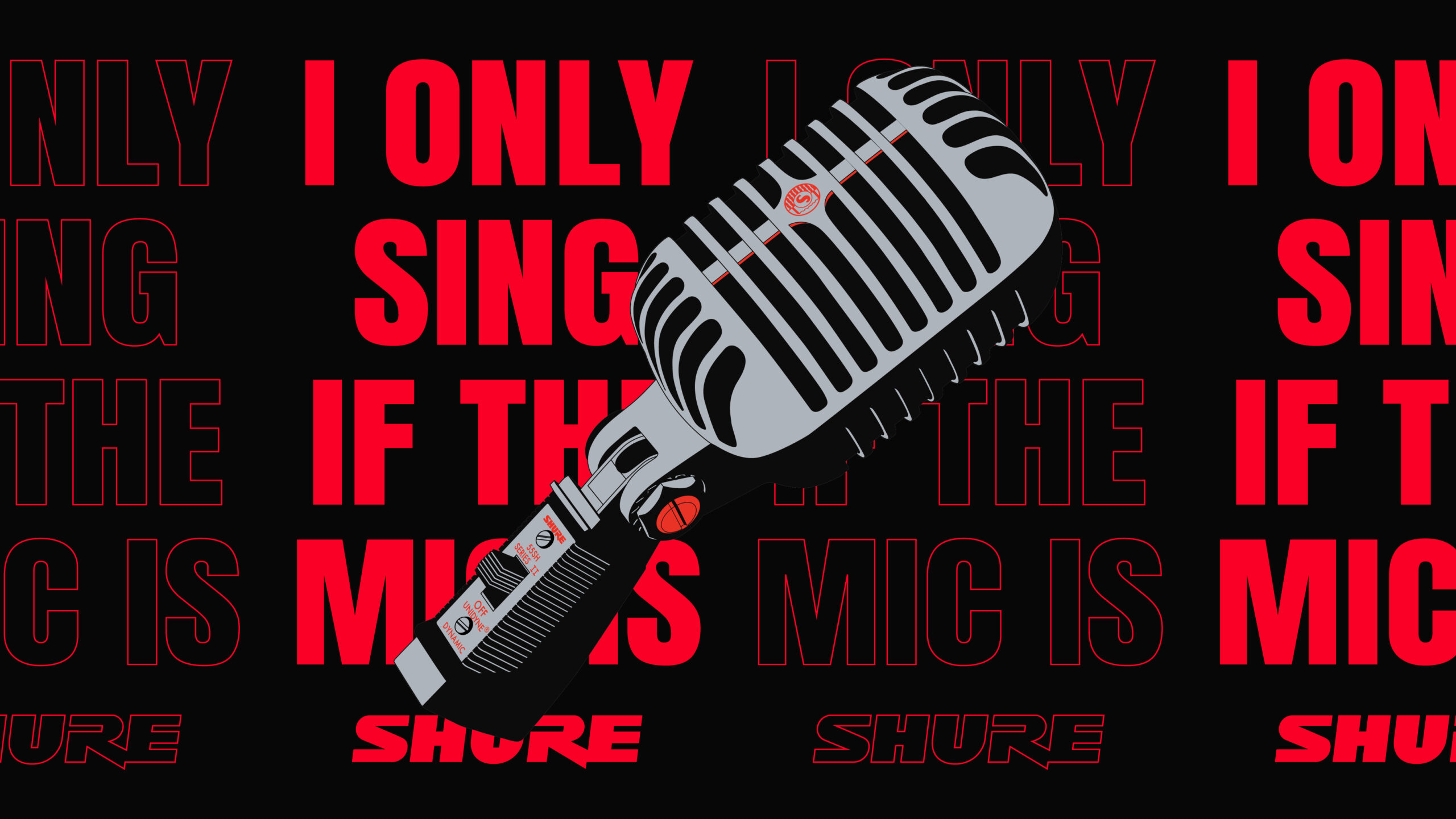
Bold ・ Square : Symbolizes strength and precision, paying tribute to pioneering products like the legendary 55SH “Elvis Mic,” highlighting Shure’s indelible mark on audio history.
Diffuse ・ Circle : Embodies the boundless resonance of soundwaves, reflecting Shure’s seamless integration across recording studios, stages, and office spaces, connecting people through sound.
Stable ・ Triangle : Represents the reliable foundation of engineering, showcasing Shure’s consistent clarity in critical scenarios, building absolute trust in audio quality.
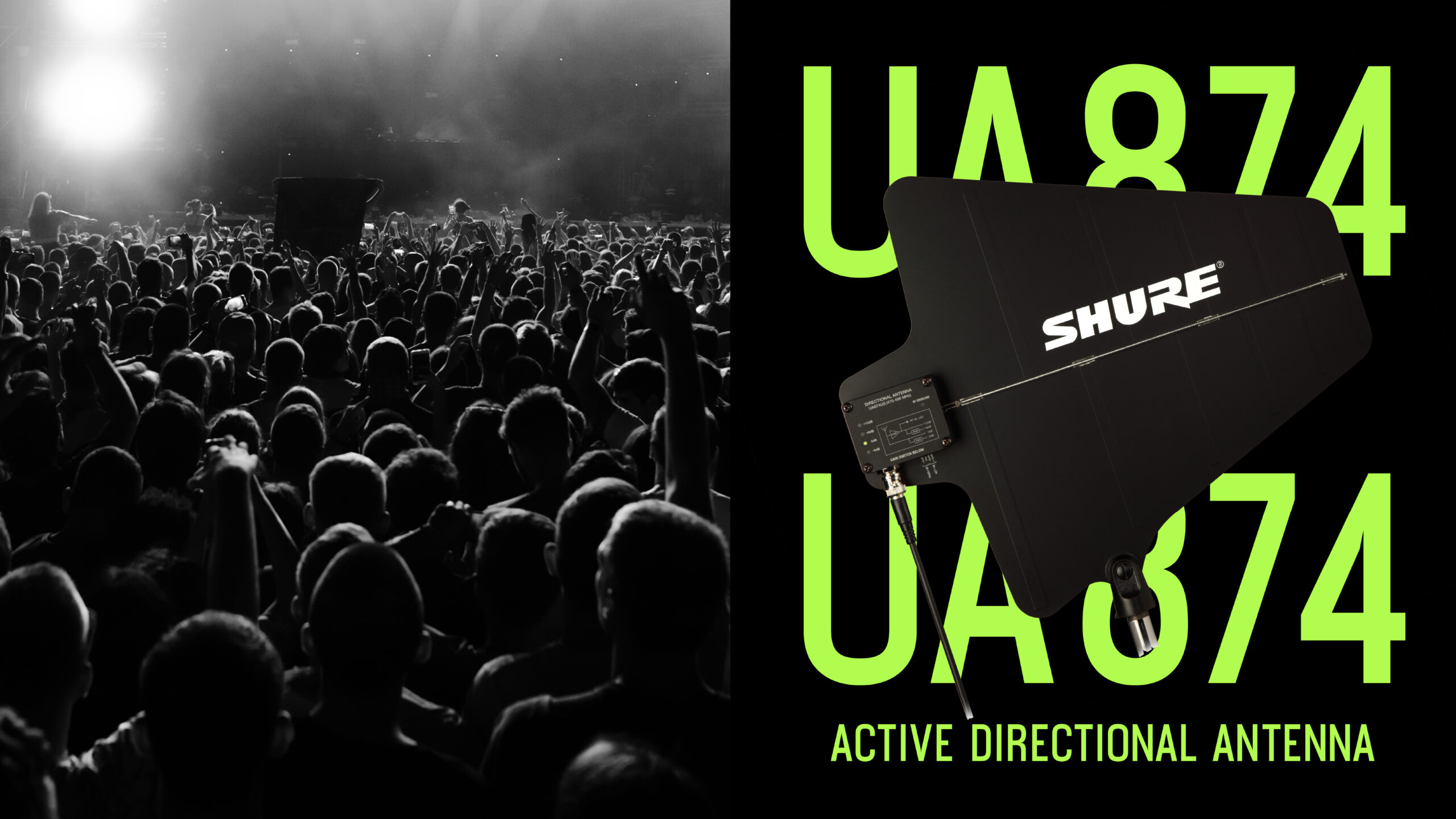
This dynamic graphical system intertwines with iconic product imagery—stage microphones, studio headphones, and conferencing systems—highlighting Shure’s multifaceted applications across performance, creativity, and communication. The vibrant triadic color palette injects modern energy, creating a rhythm that visually echoes the essence of sound’s dynamic tension.

The visual design is anchored by three iconic geometric shapes, representing the three acoustic dimensions Shure excels

Bold ・ Square: Symbolizes strength and precision, paying tribute to pioneering products like the legendary 55SH “Elvis Mic,” highlighting Shure’s indelible mark on audio history
The vibrant triadic color palette injects modern energy, creating a rhythm that visually echoes the essence of sound’s dynamic tension.

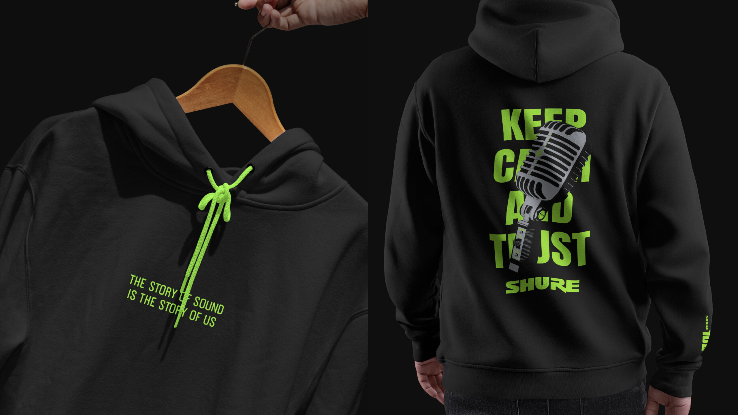
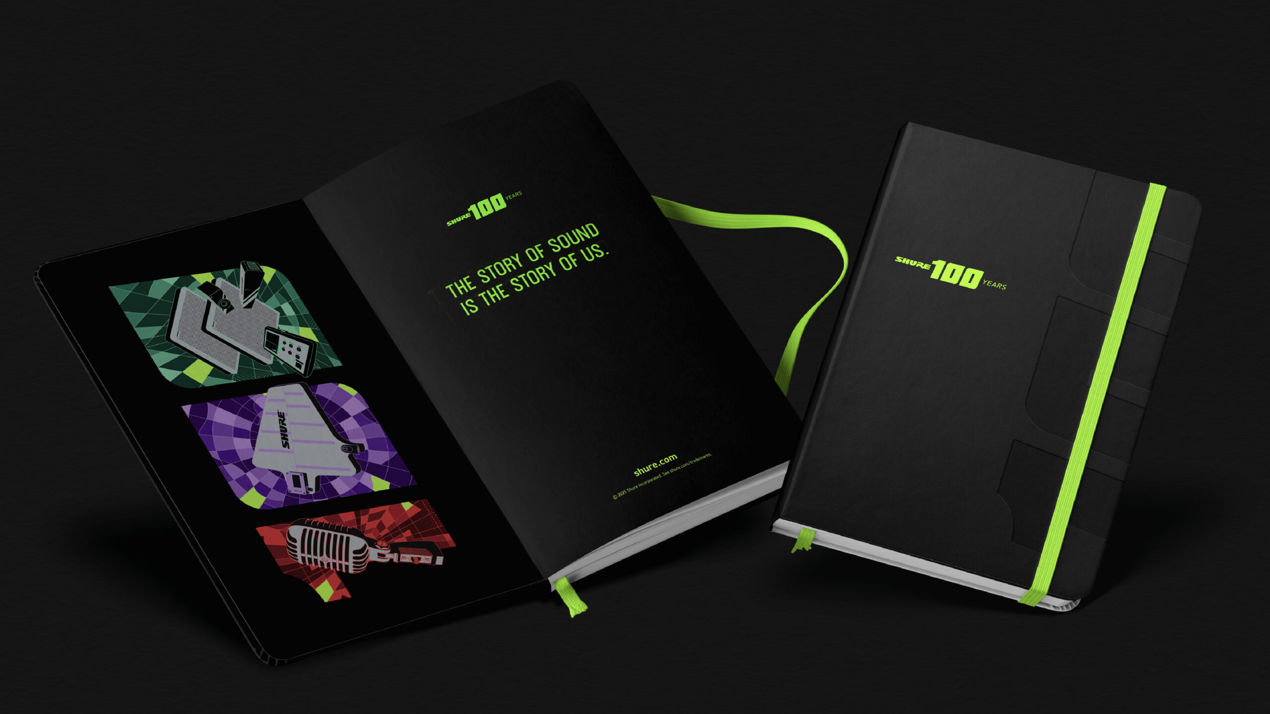
Shure’s global branches collectively weave a rich tapestry of cultural expression, celebrating a century of sound-driven resonance that transcends borders


What we did:
Brand Positioning, Brand Story, Visual Identity, Premium Design
Client/Project: Shure Inc.
Creative Director: Vince Cheung
Design and Illustration: PingTing Lee
Result:
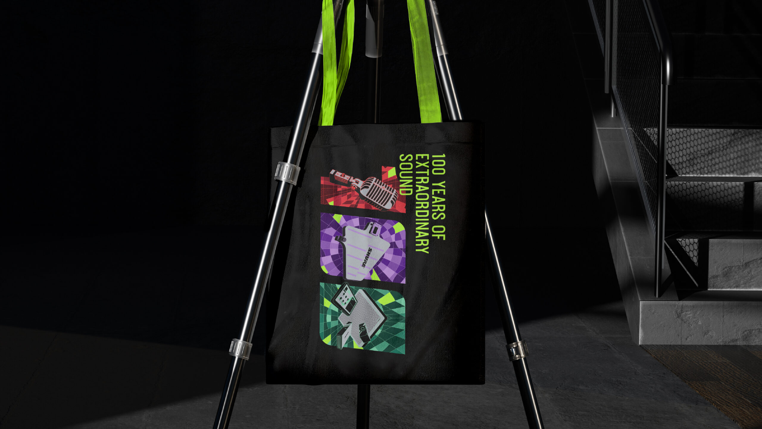
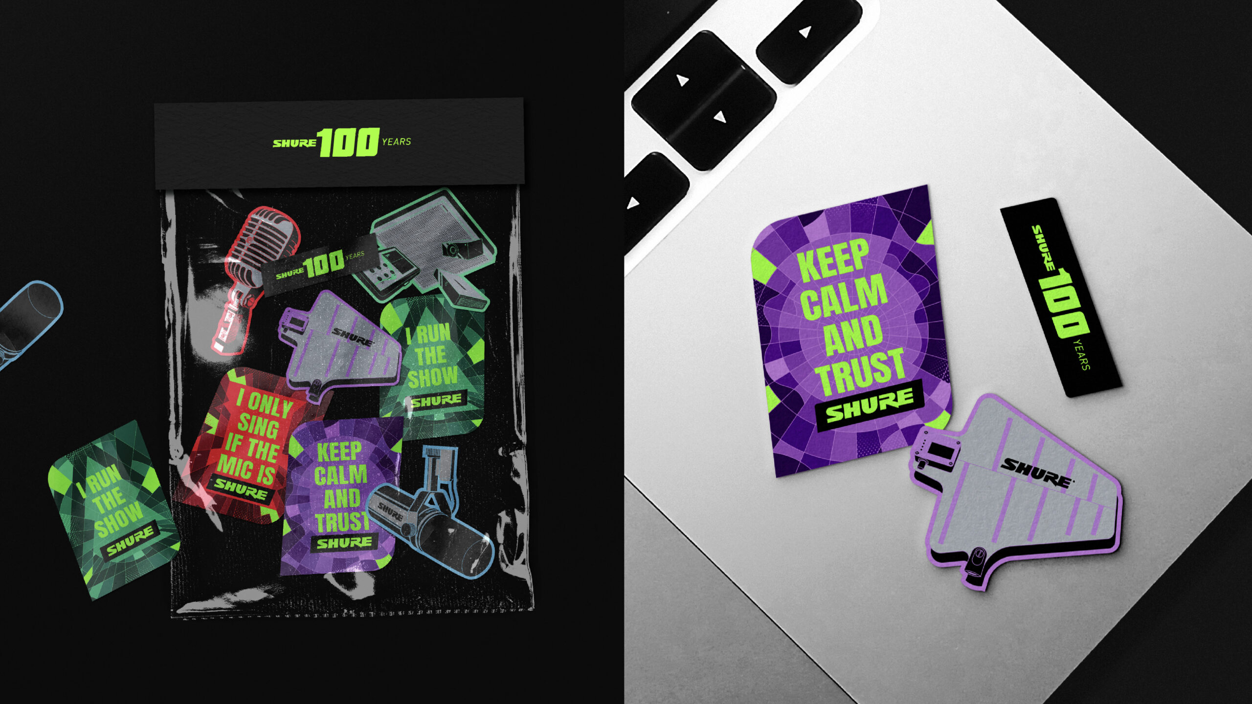
The visual design extends to themed merchandise, including hoodies, stickers, towels, and tote bags, inviting Hong Kong fans to partake in this centennial celebration. When juxtaposed with creative designs from the United States, Japan, Europe, and other regions, Shure’s global branches collectively weave a rich tapestry of cultural expression, celebrating a century of sound-driven resonance that transcends borders. This perfectly embodies the essence of our slogan: “100 years of extraordinary sound. The story of sound is the story of us.”