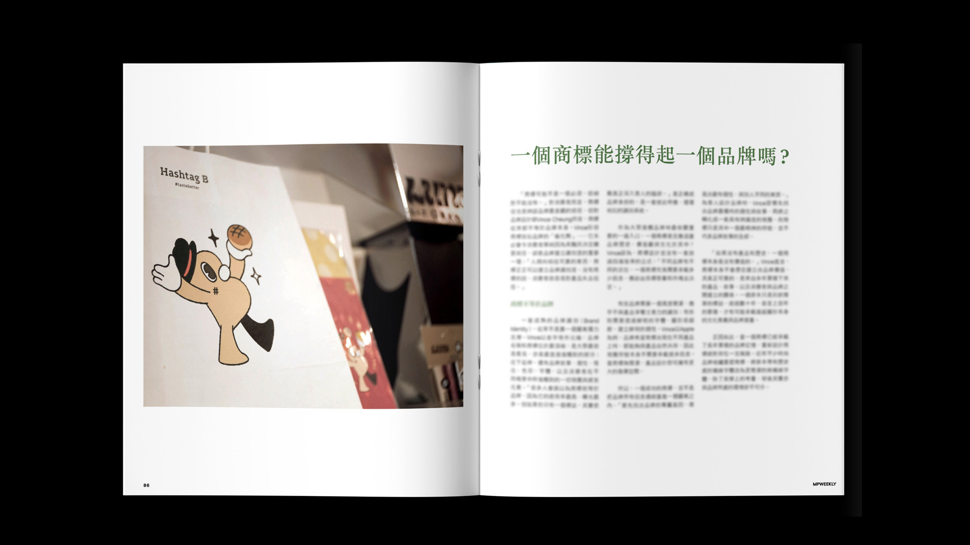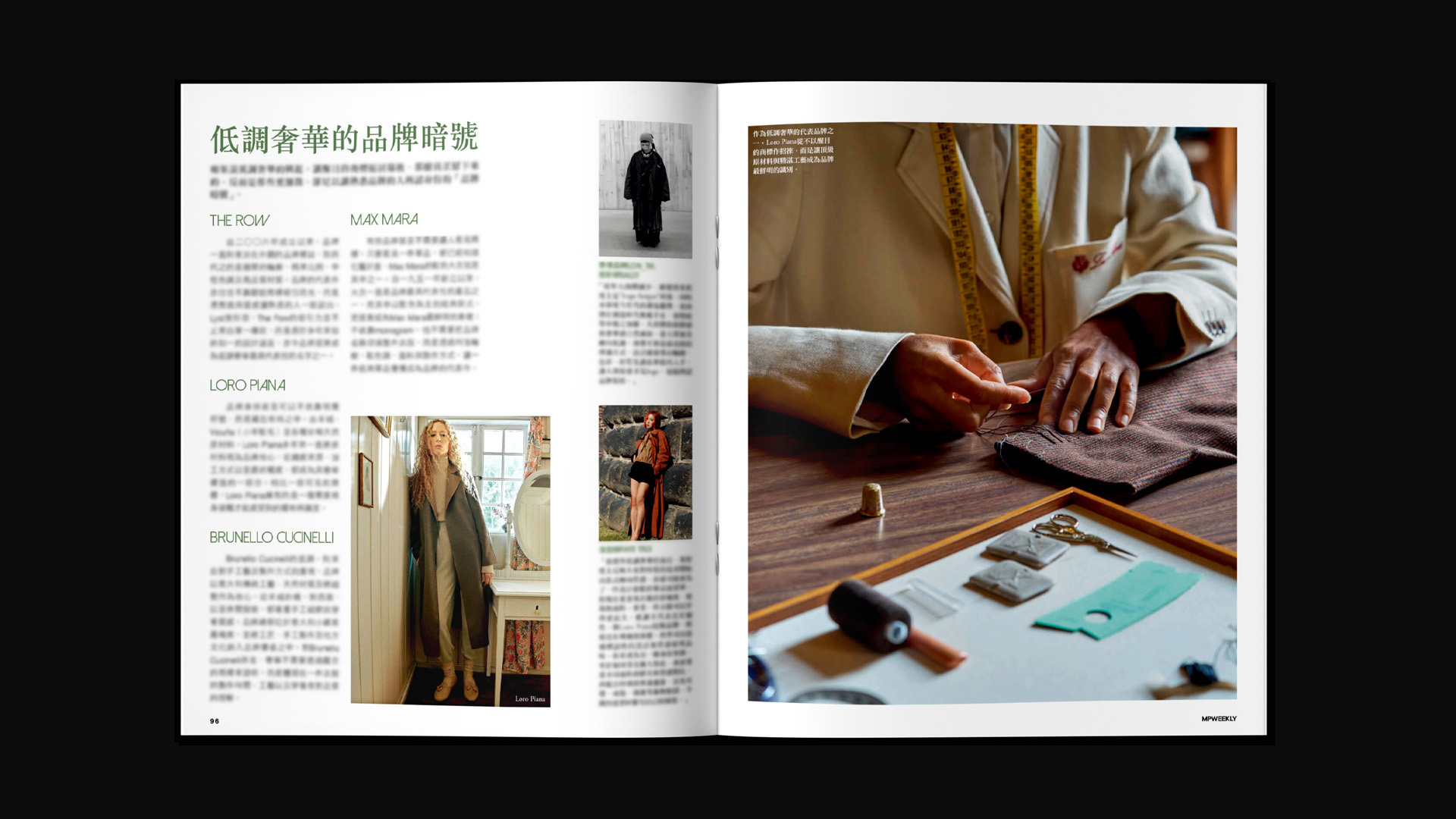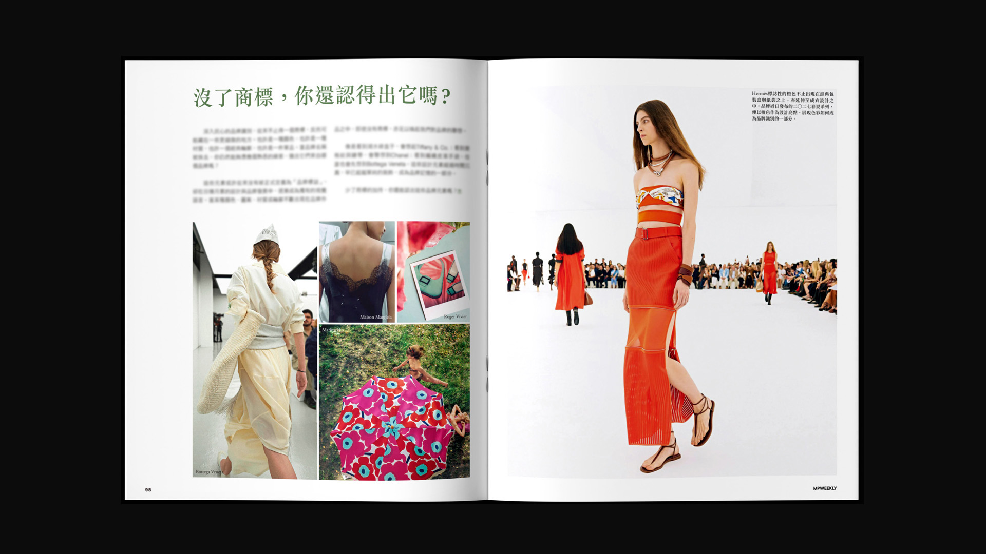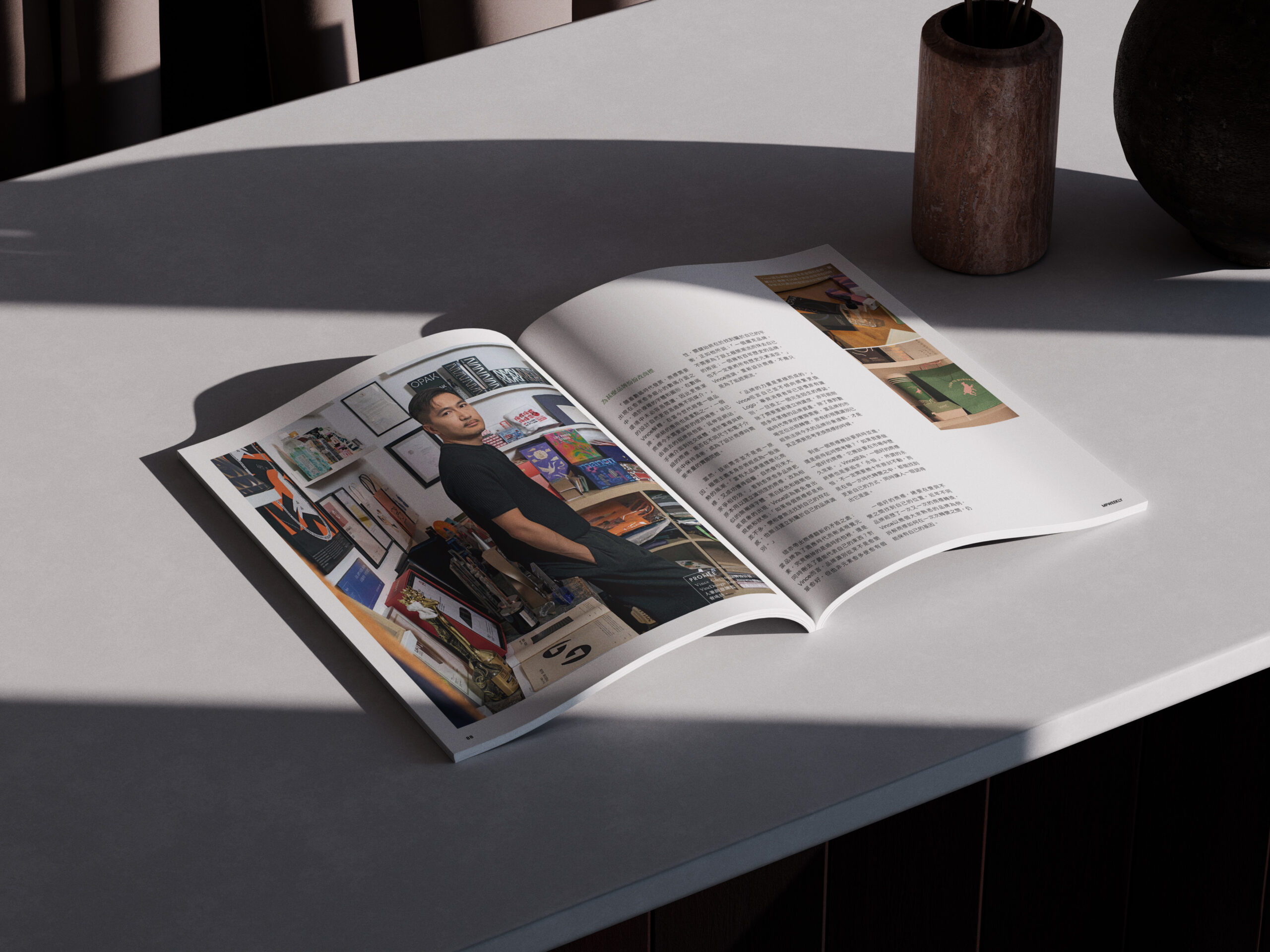
In recent years, major global fashion and technology brands have been redesigning their logos—from Celine removing its accented letter, and Burberry reverting to its classic Equestrian Knight Design, to subtle interface tweaks by Instagram and YouTube for digital screens. Why do brands push the reset button on their visual identities? And can a single logo truly carry the weight of an entire brand?
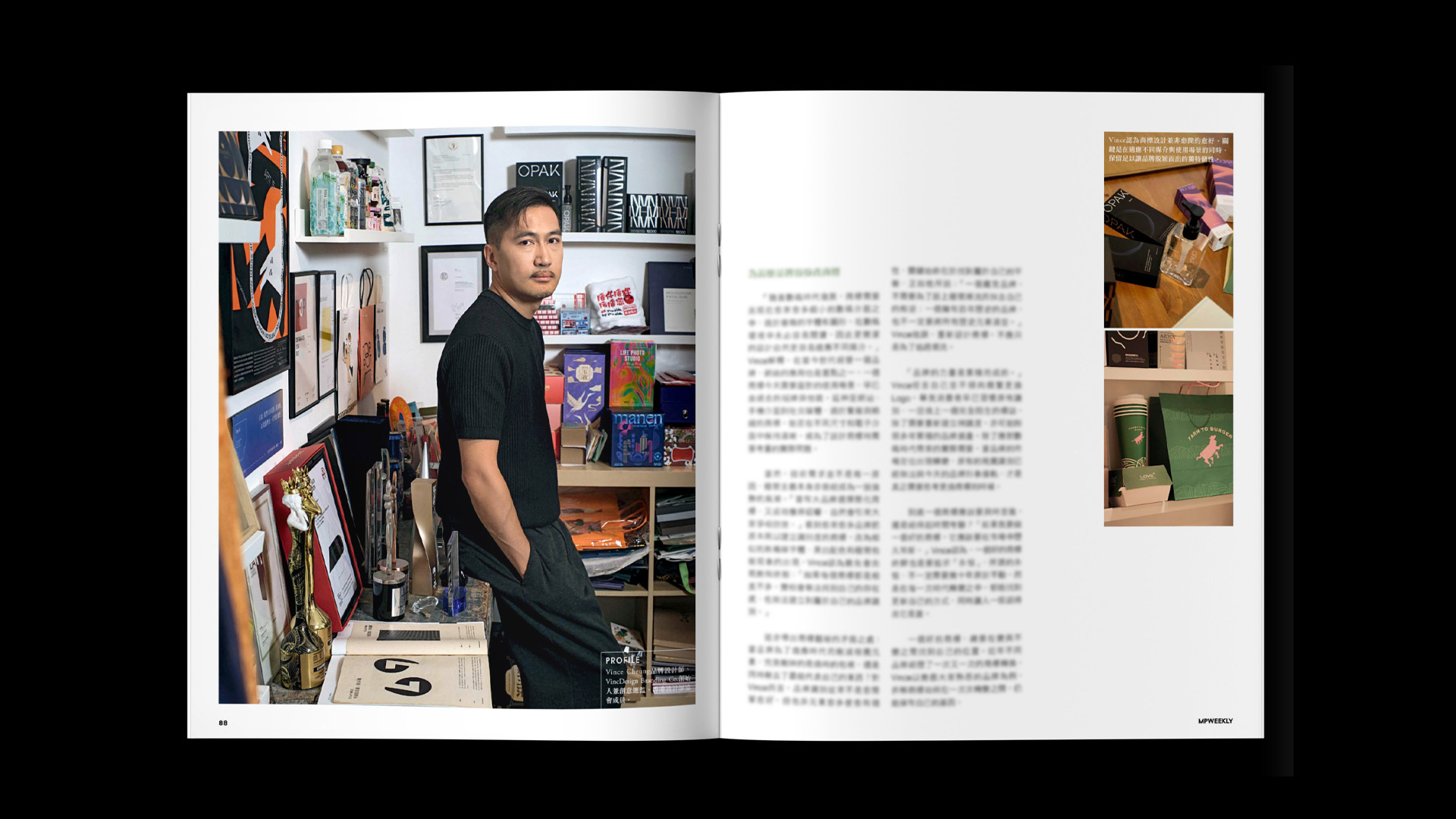
In an exclusive interview with MP Weekly, Vince Cheung, Founder and Principal Brand Designer of VincDesign Branding Co., shares his expert perspective on branding design, rebranding and brand identity system design.
1. A Logo Is Not the Brand: It Is a Catalyst for Recognition
A common misconception is that “the logo equals the brand”. Vince emphasizes that a logo serves as a catalyst and the most concentrated symbol of brand recognition, but it cannot exist in isolation from a brand’s products, history, and values:
“Without solid products and history, a logo itself holds no intrinsic value. A logo alone may not build a brand, but for designers, it acts as a catalyst—it may not immediately drive a purchase based on aesthetics alone, but it is a critical touchpoint for building brand recognition and trust.”
— Vince Cheung
Vince illustrates a mature Brand Identity System using a pyramid model:
-
The Apex: The brand name and logo—the most visible and direct touchpoints for consumers.
-
The Foundation: The brand story, core values, personality, color palette, typography, and every sensory experience across various consumer touchpoints.
A genuine brand identity is a cohesive system where every element aligns and reinforces the rest. There is no universal formula for logo design; how much narrative a logo needs to carry depends on market positioning and audience expectations.
2. The Digital Era: Why Are Brands Redesigning Their Logos?
As consumer touchpoints shift from physical storefronts and print catalogs to mobile screens, social media platforms, and app interfaces, logo design faces new technical and aesthetic demands. Vince breaks down the two main drivers behind contemporary rebranding:
① Adapting to Screen Interfaces and Minimalism
On small smartphone screens and app icons, intricate typography, crests, and decorative details often lose clarity. Simplifying designs and switching to clean, sans-serif typefaces has become a widespread strategy to improve legibility and digital adaptability.
② The Dilemma of Homogenization Under Minimalist Trends
However, as brands embrace minimalism and adopt similar sans-serif fonts, the minimalist approach itself turns into a trend. Vince warns:
“If every logo looks virtually identical, a brand risks losing its distinct presence and failing to establish a memorable identity.”
— Vince Cheung
An effective rebranding effort should not blindly follow trends at the cost of brand individuality. Designers must strike a delicate balance between modern relevance and preserving core brand heritage.
3. Case Studies: The Evolution of Global Brands
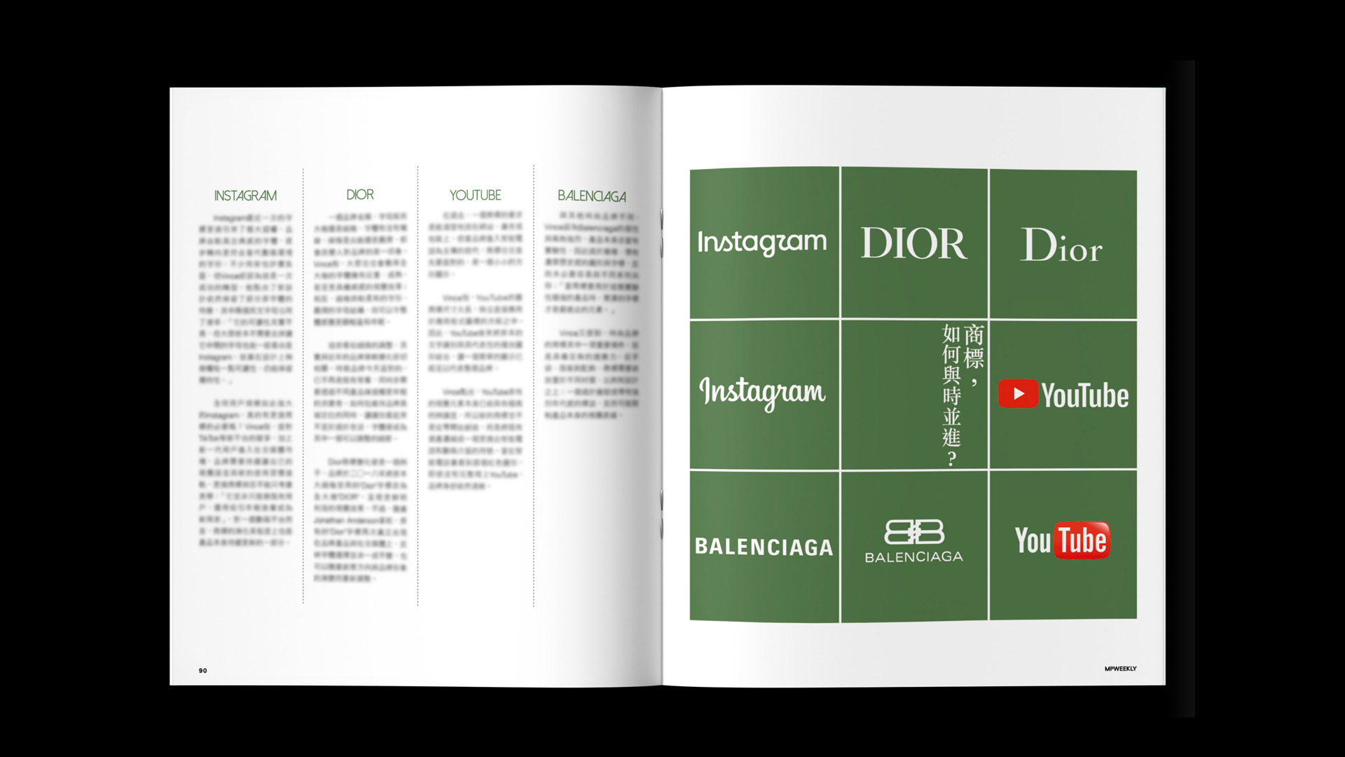
During the interview, Vince analyzed several iconic brand redesigns, demonstrating the interplay between design aesthetics, market positioning, and digital environments:
| Brand | Key Redesign Action | Insights |
| Celine |
Removed the accent mark from “CÉLINE” and adjusted letter spacing (2018). |
A subtle tweak that paid homage to its 1960s roots while signaling a distinct transition from the Phoebe Philo era to a new direction. |
| Burberry |
Reverted to its 1901 Equestrian Knight Emblem and classic blue palette under Daniel Lee (2023). |
Moved against the minimalist trend to embrace over a century of brand heritage, proving rebranding isn’t strictly about simplification. |
|
Introduced Instagram Sans with enhanced readability. |
For a platform serving billions, continuous subtle typography updates ensure the brand identity evolves alongside product iterations. |
|
| YouTube |
Combined its custom font with the iconic play button icon. |
Isolated its key asset—the play button icon—making the brand instantly recognizable even in tiny app icon spaces. |
| Balenciaga |
Adopted a clean, bold sans-serif logotype. |
Because Balenciaga’s products feature strong, avant-garde styles, a understated logotype serves as a neutral canvas to support the product design. |
4. Designer’s Perspective: What Makes a Great Logo?
Should a logo strive for timelessness or adapt to changing times?
Vince believes a great logo doesn’t necessarily need to remain unchanged for decades. Instead, it should find ways to refresh itself across changing eras while ensuring audiences immediately recognize who it represents.
“Brand power is built over time. A great logo always finds its place between evolution and consistency.”
— Vince Cheung
At VincDesign, the team focuses on uncovering each brand’s unique narrative before translating it into a comprehensive visual identity system. A logo is merely the cover of a book; the full story and experience inside are what truly resonate with consumers.
About VincDesign Branding Co.
VincDesign Branding Co. specializes in full-service Branding Design, Rebranding, Visual Identity (VI) System Design, Logo Design, and Packaging Design. We believe thoughtful design elevates visual aesthetics while driving sustainable commercial value and market impact.
👉 Looking to transform your brand identity or explore rebranding options?
Contact VincDesign Branding Co. today to craft a distinct visual strategy for your business!