Bino N’ Booze Guangdong Hot Pot | Branding Design
Brand Story:
Background
Bino & Booze offers a new way to experience traditional Hong Kong-style hot pot by putting a modern twist to traditional Hong Kong flavours. The signature soup bases are expertly paired with a selection of fine alcoholic beverages, creating a unique dining adventure where the flavours and aromas evolve as the pot simmers.
Bino N’ Booze branding brings Hong Kong hot pot into the spotlight for a younger crowd by offering an alternative to traditional food stalls (大牌檔) and Cantonese restaurants (酒樓). The venue captures the vibrant energy of local hot pot culture, featuring high-quality, fresh ingredients to enjoy with friends and family as you gather together to eat and drink the night away.
Design Concept
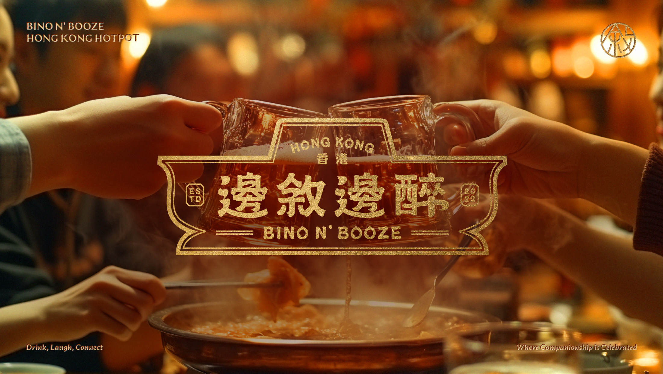
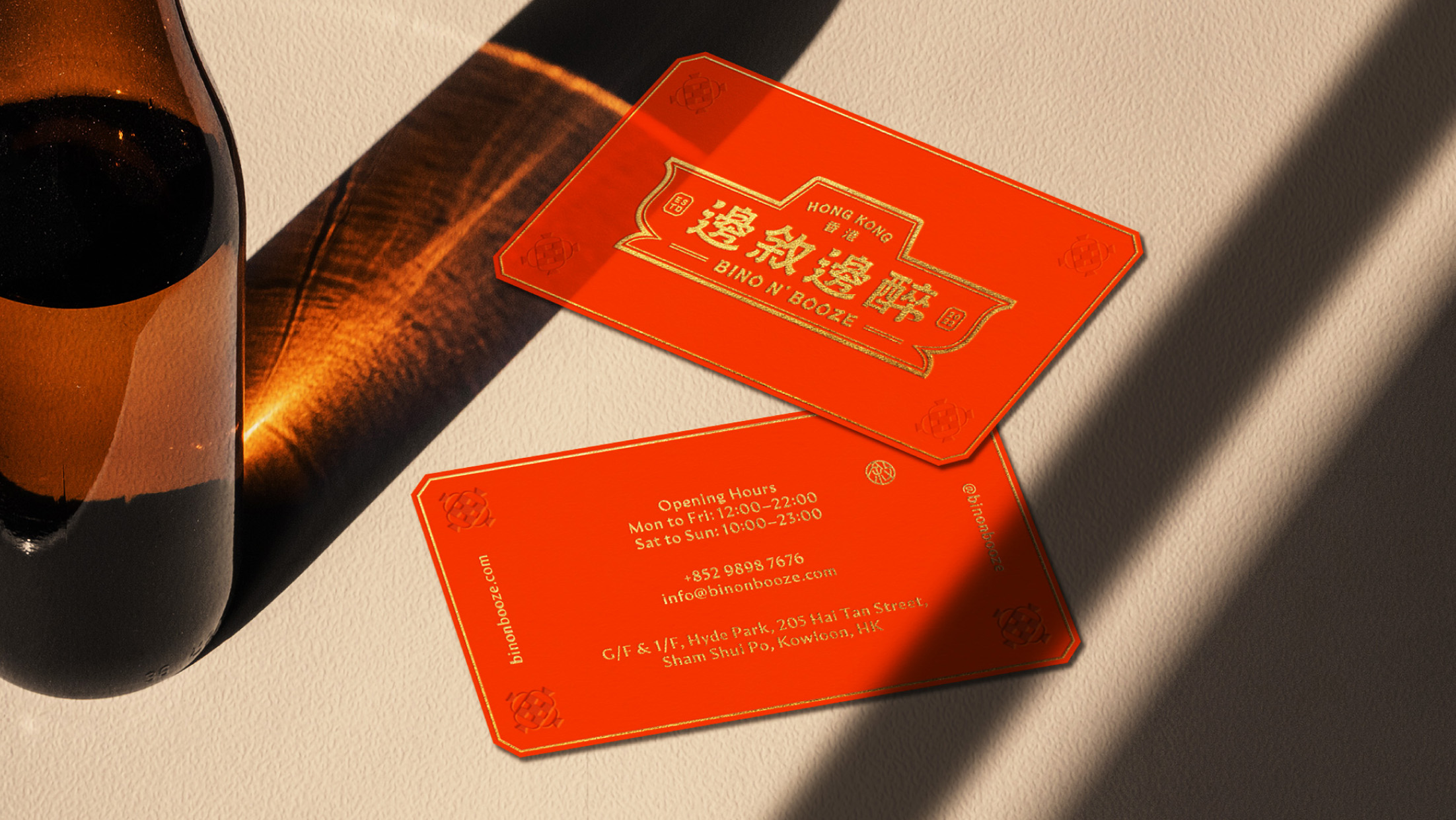
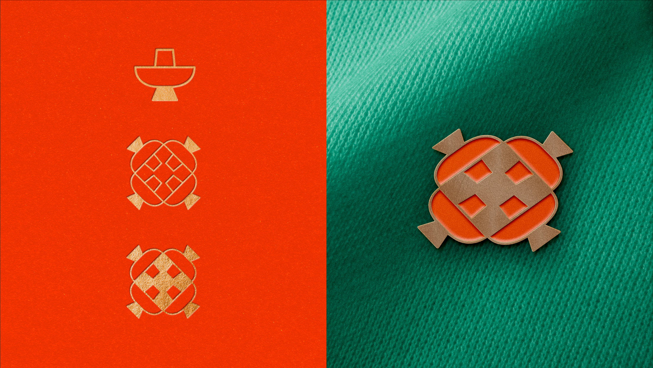
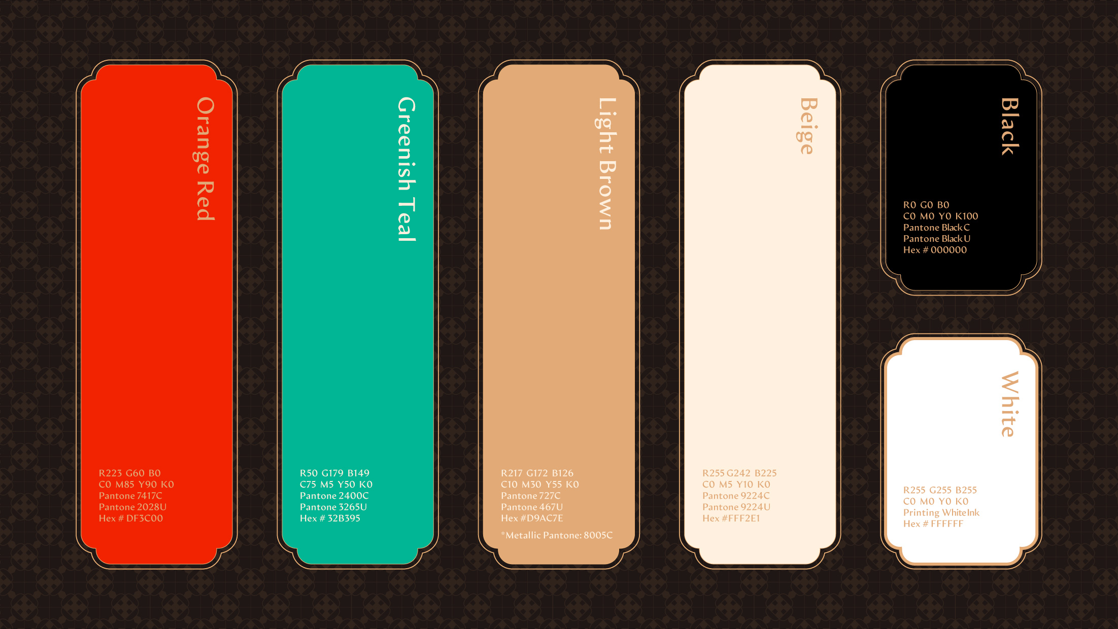
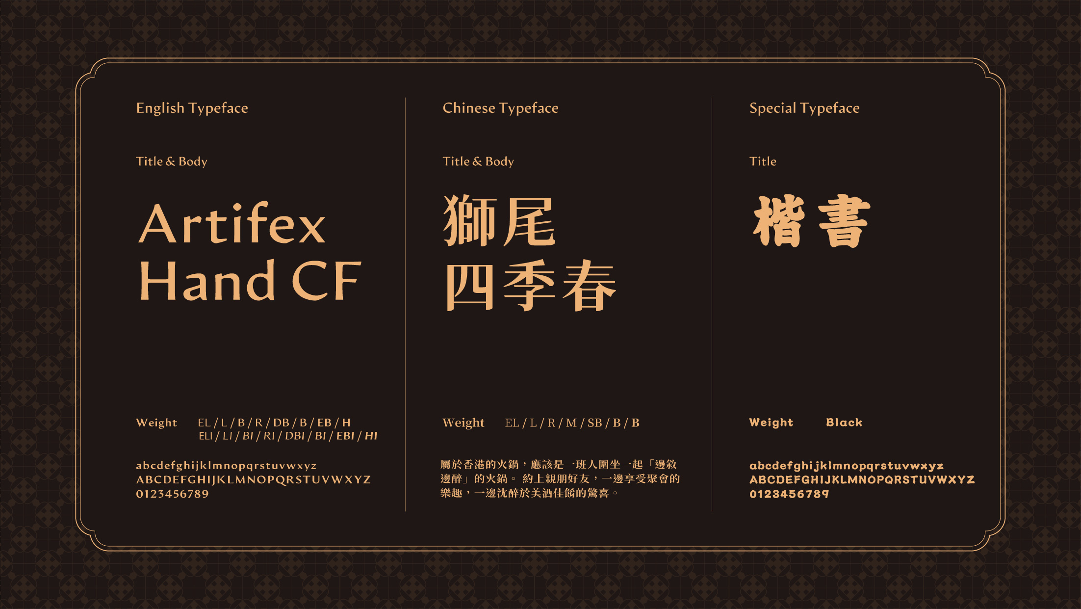
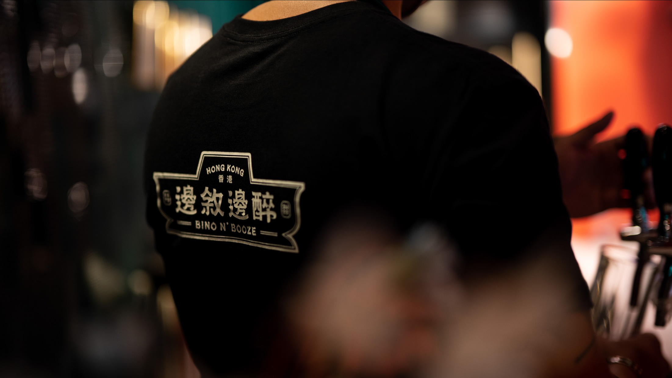
To showcase the fusion of traditional Hong Kong culture with the vibrant spirit of modern Hong Kong, the branding for Bino N’ Booze was thoughtfully crafted to showcase the city’s unique style and aesthetics while capturing the lively energy of youth and gatherings. The colour palette nods to traditional Chinese colours with red as the main colour, embodying the dynamic energy of socializing and the heat of the hot pot, while also representing Hong Kong. The logo is shaped like a classic Hong Kong-style hot pot, while the typography features playful, flowing strokes that playfully mirror the carefree movement of a tipsy person.
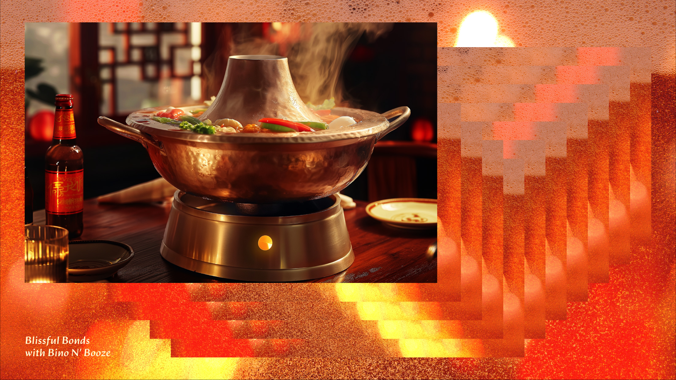
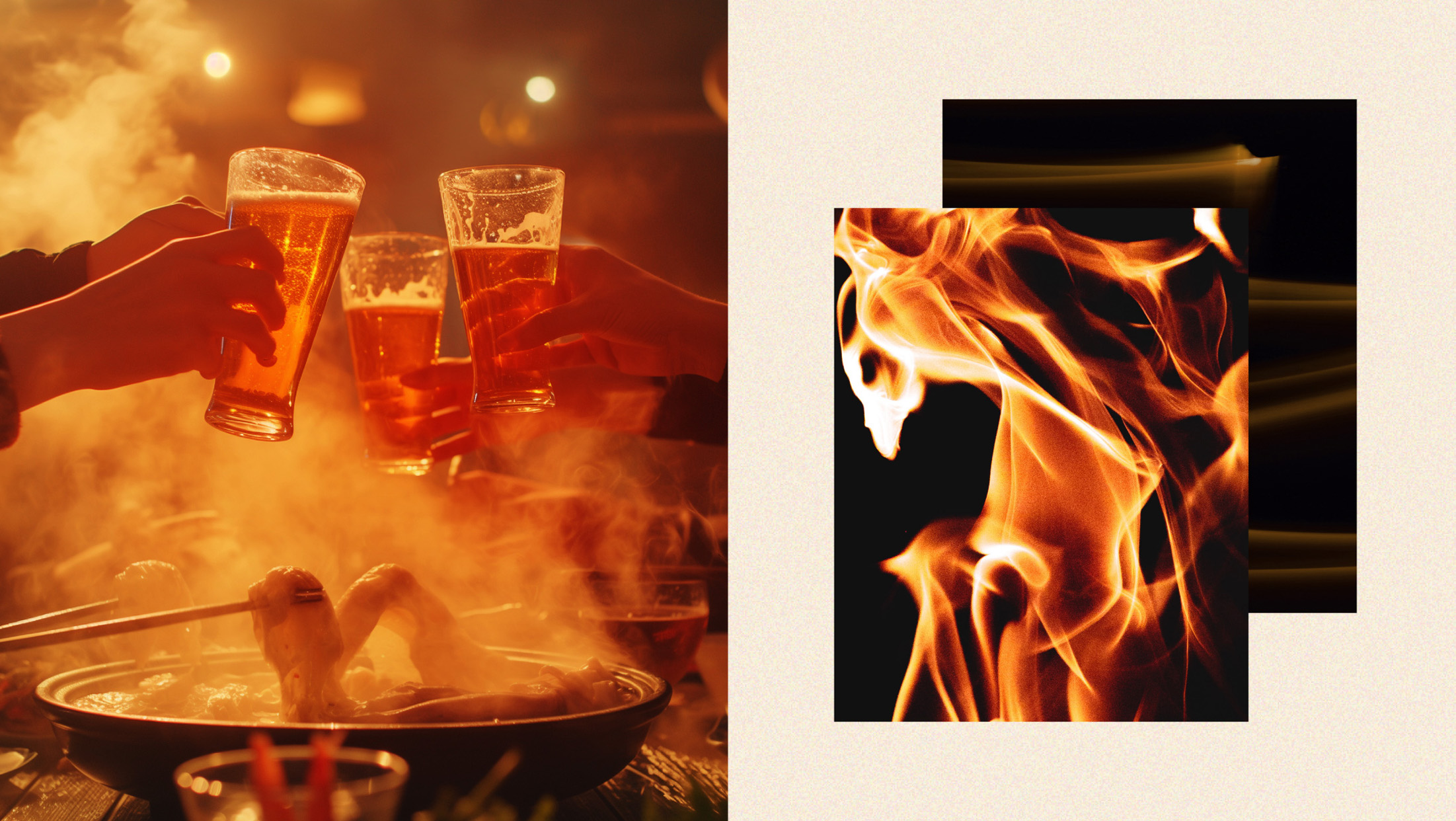
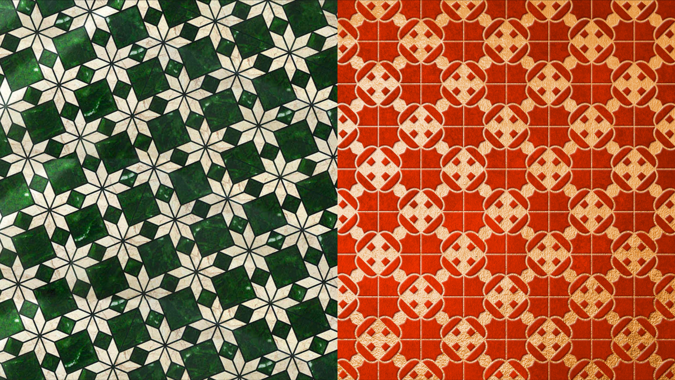
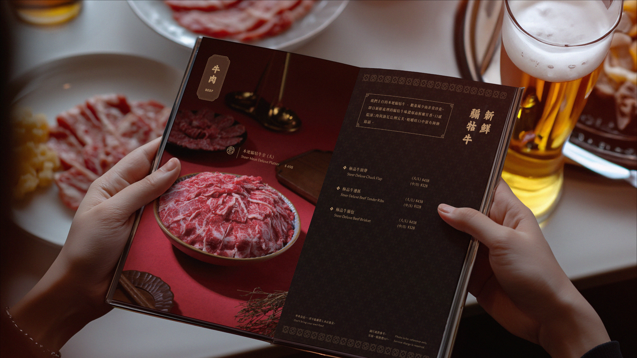
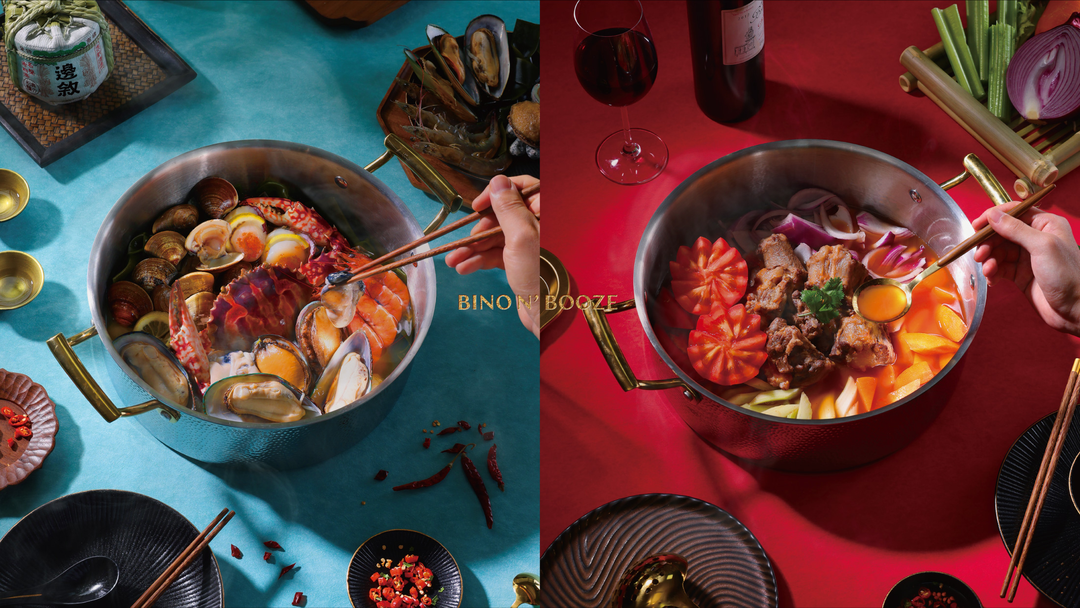
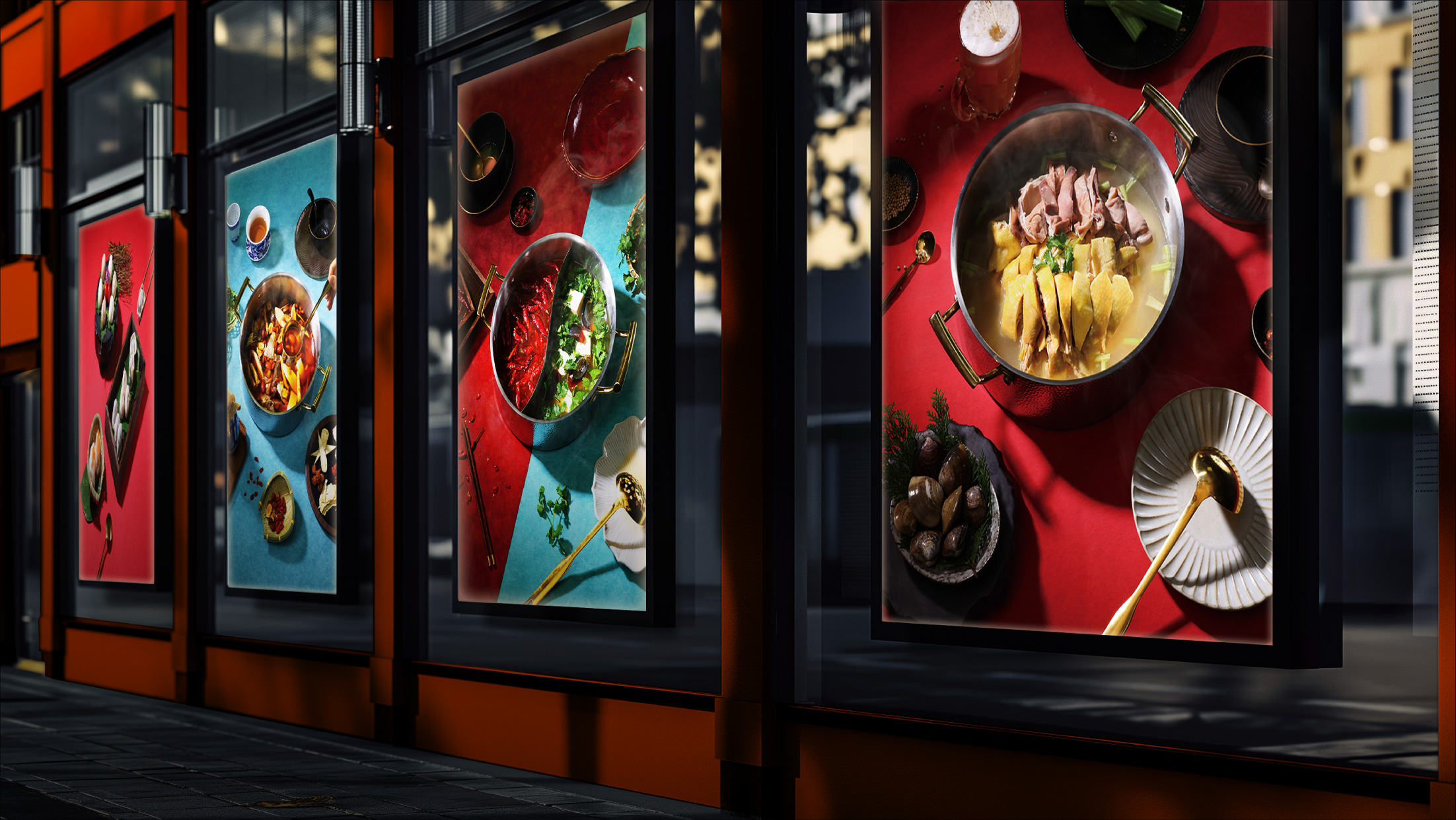
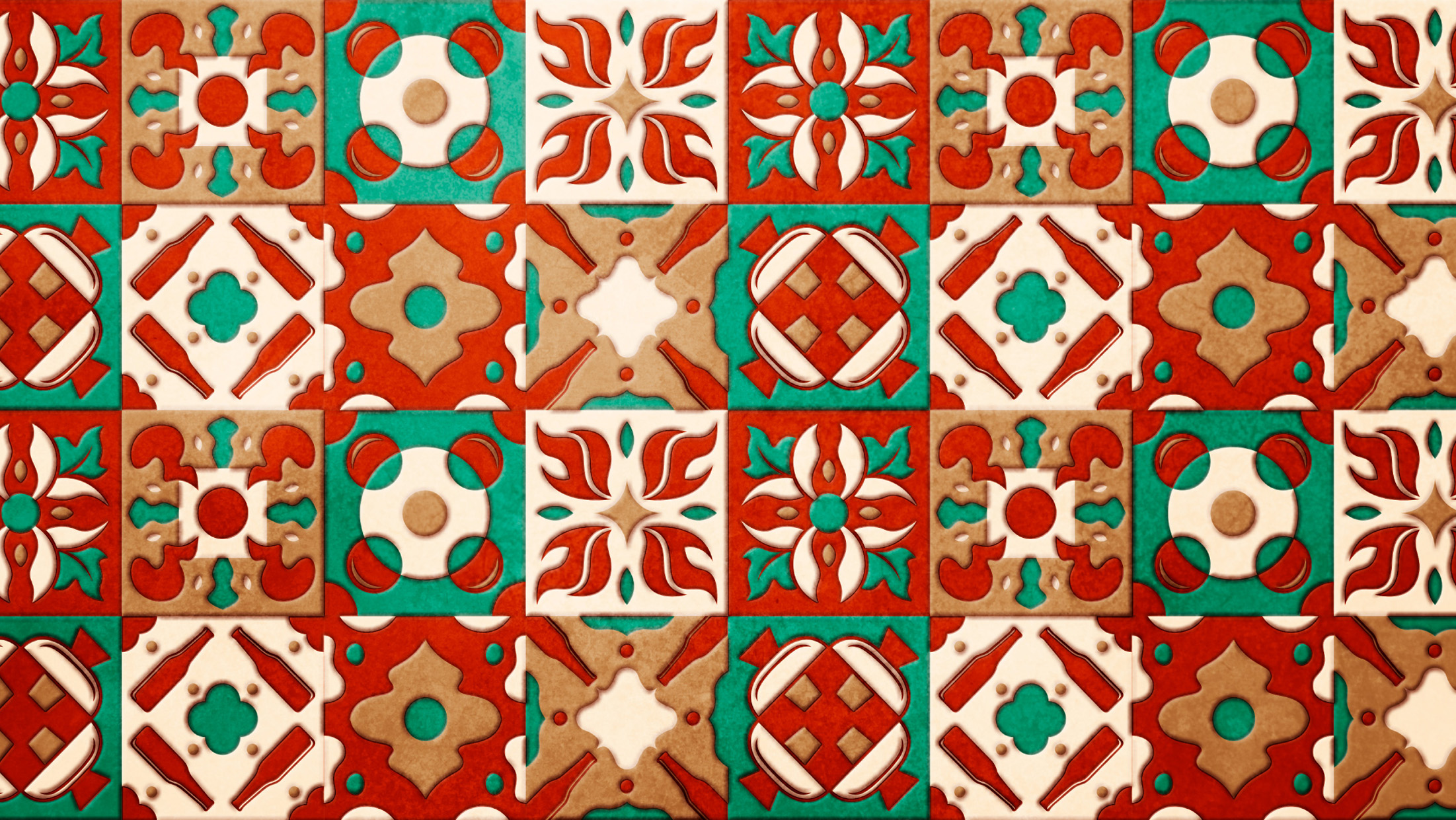
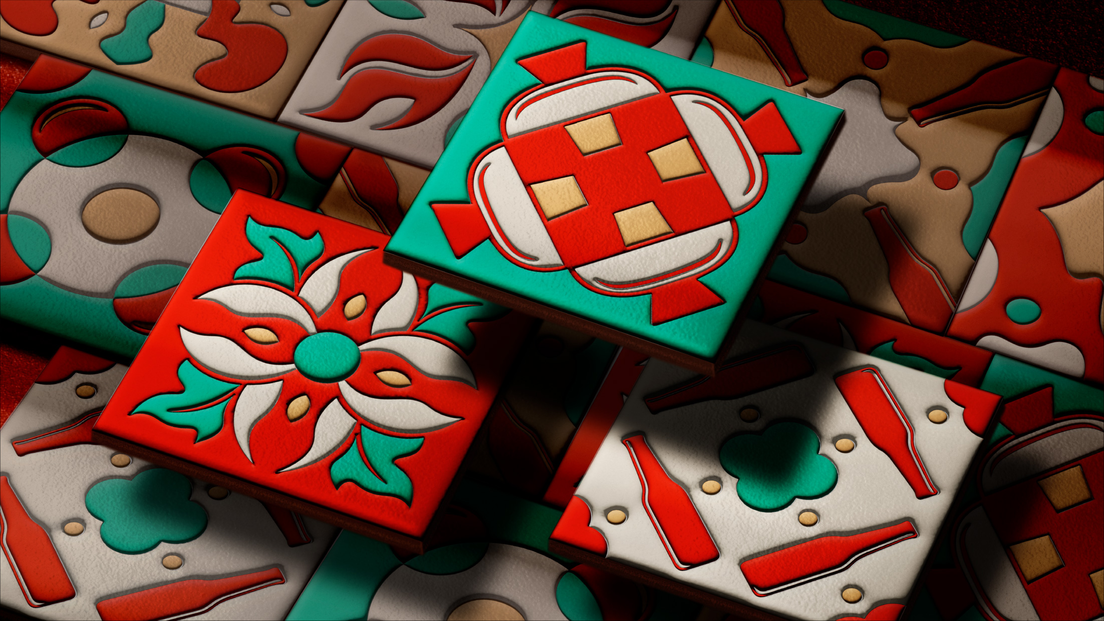
A collection of eight Hong Kong-style graphics was created to highlight key elements of a Bino N’ Booze experience: the fiery heat and billowing steam from the hot pot, the joys of gathering together to eat and drink, and the freshness of premium ingredients. These graphics are integrated into the store’s design, featured in Hong Kong-style patterns on tiles and wall panels, and throughout various elements such as menus and business cards. To highlight Bino N’ Booze’s specialty of alcohol paired with food, the décor also includes a feature wall of beer bottles with these graphics printed on, as well as photographs of various dishes paired with specific alcohols such as beer, wine, sake, and more.
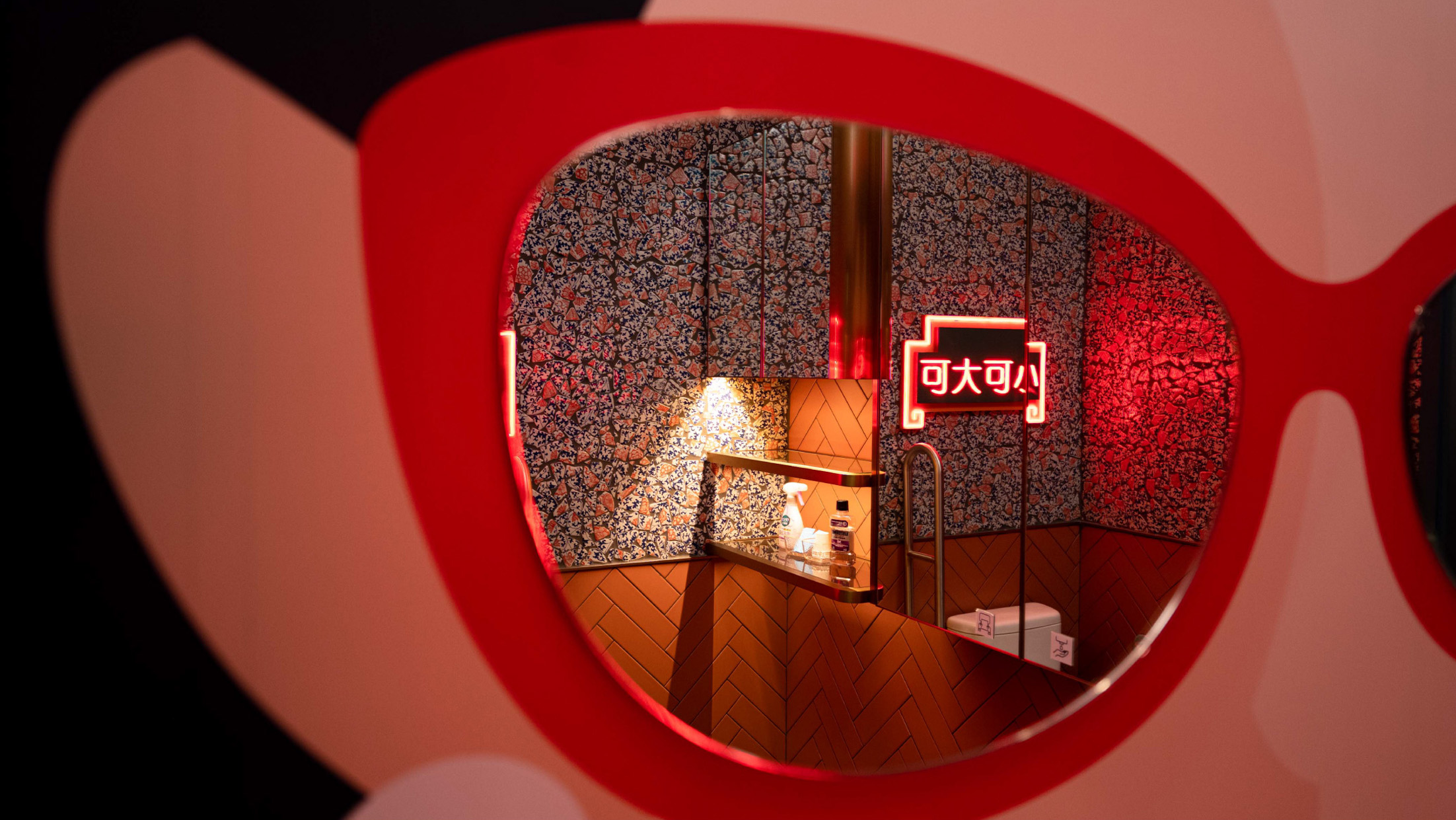
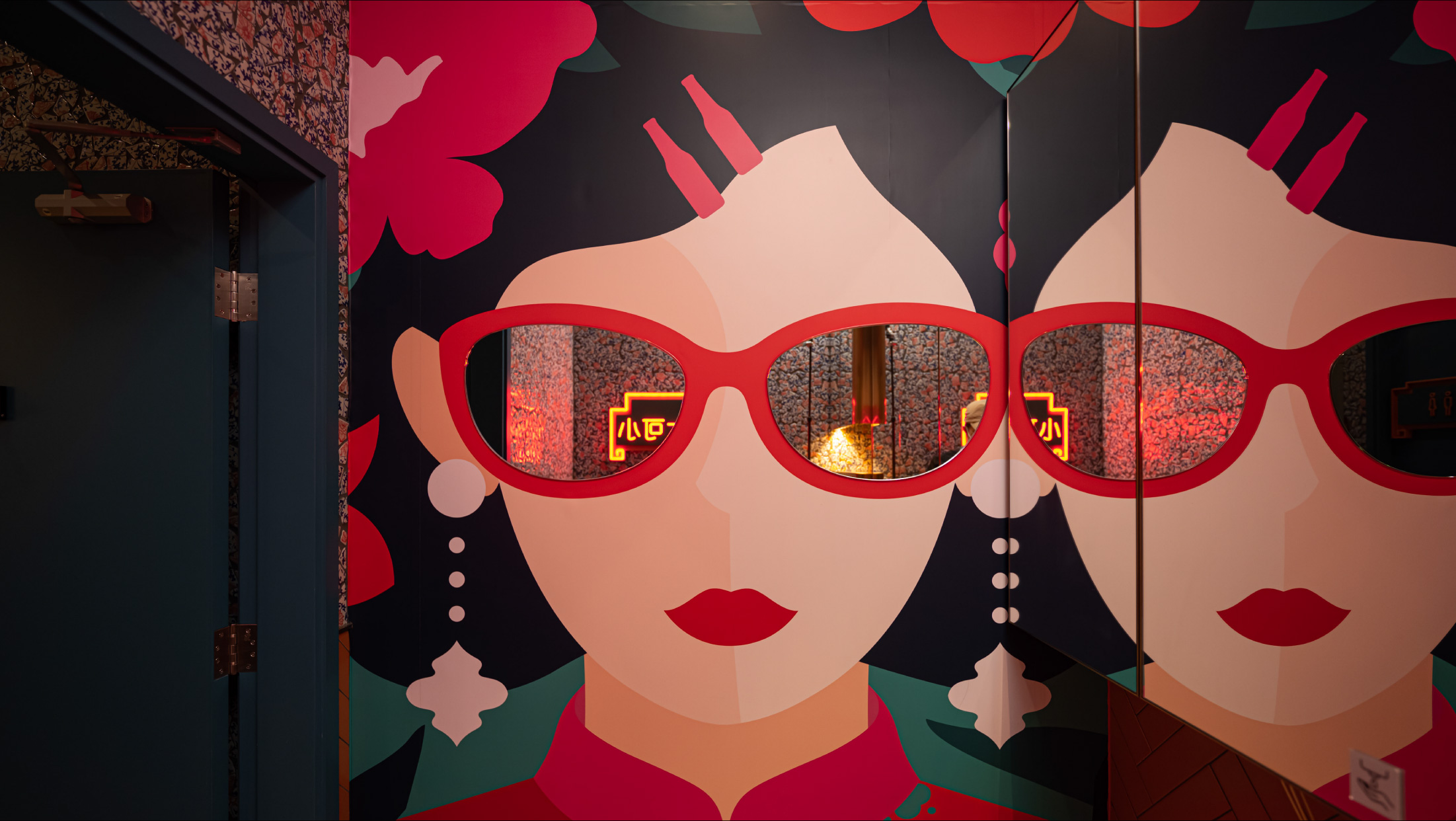
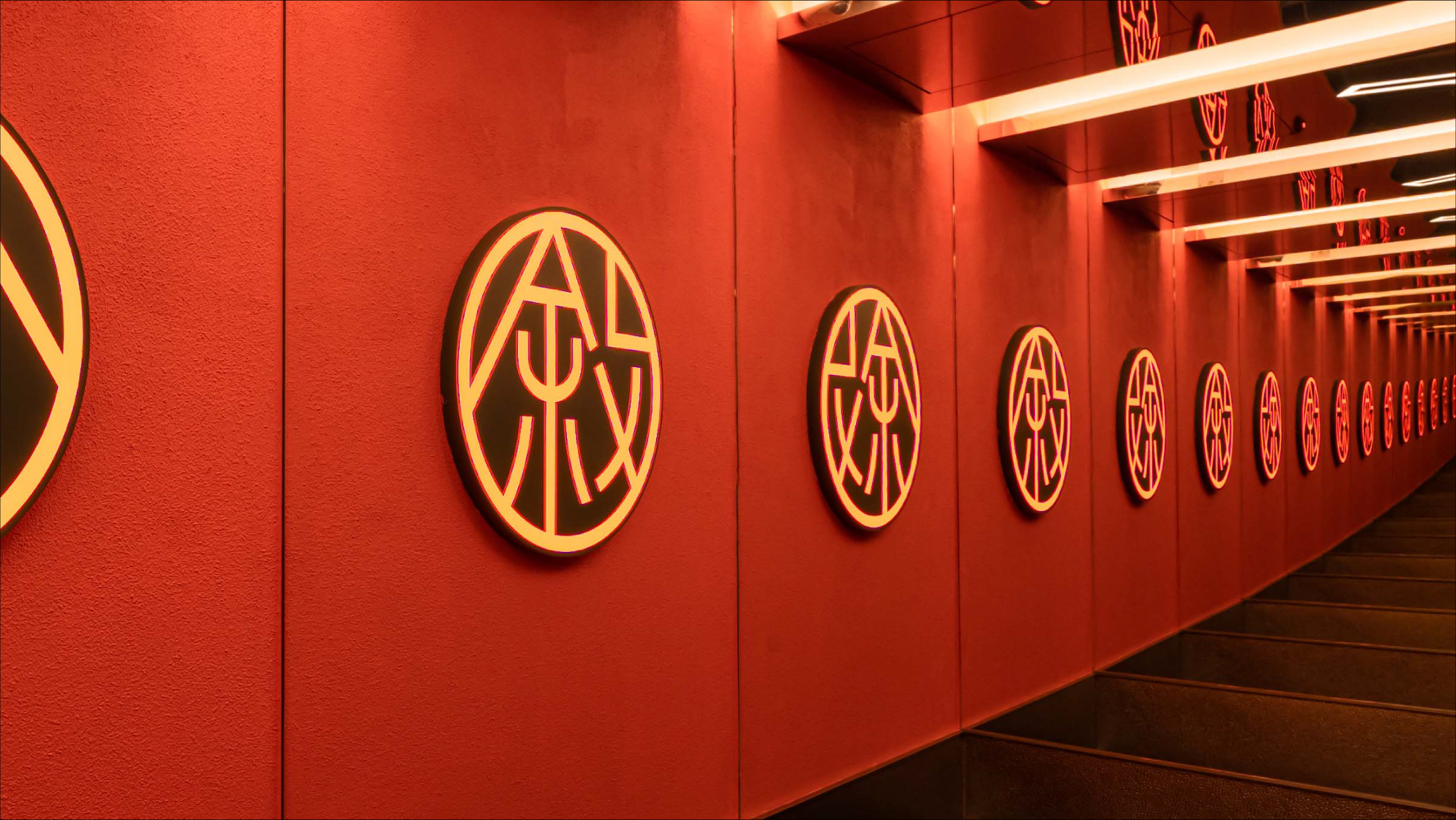
For a dynamic experience that appeals to younger patrons, statement décor pieces are designed to be fun, cheeky, and witty. For example, in the bathroom, the lenses of a woman’s glasses are replaced by mirrors, while in the dining area, a beer bottle-shaped mirror featuring the phrase “I’m not drunk” in wavy typography and Hong Kong’s traditional neon lights creates an infinity mirror effect, humorously capturing the blur of drunkenness. This infinity effect continues in the elevators, where the word “gathering” (which phonetically resembles “drunk” in Chinese) repeats endlessly on the walls, adding a playful touch. Other décor pieces feature cheeky slogans designed to add humour and offer a playful nod to Bino N’ Booze’s Chinese name.
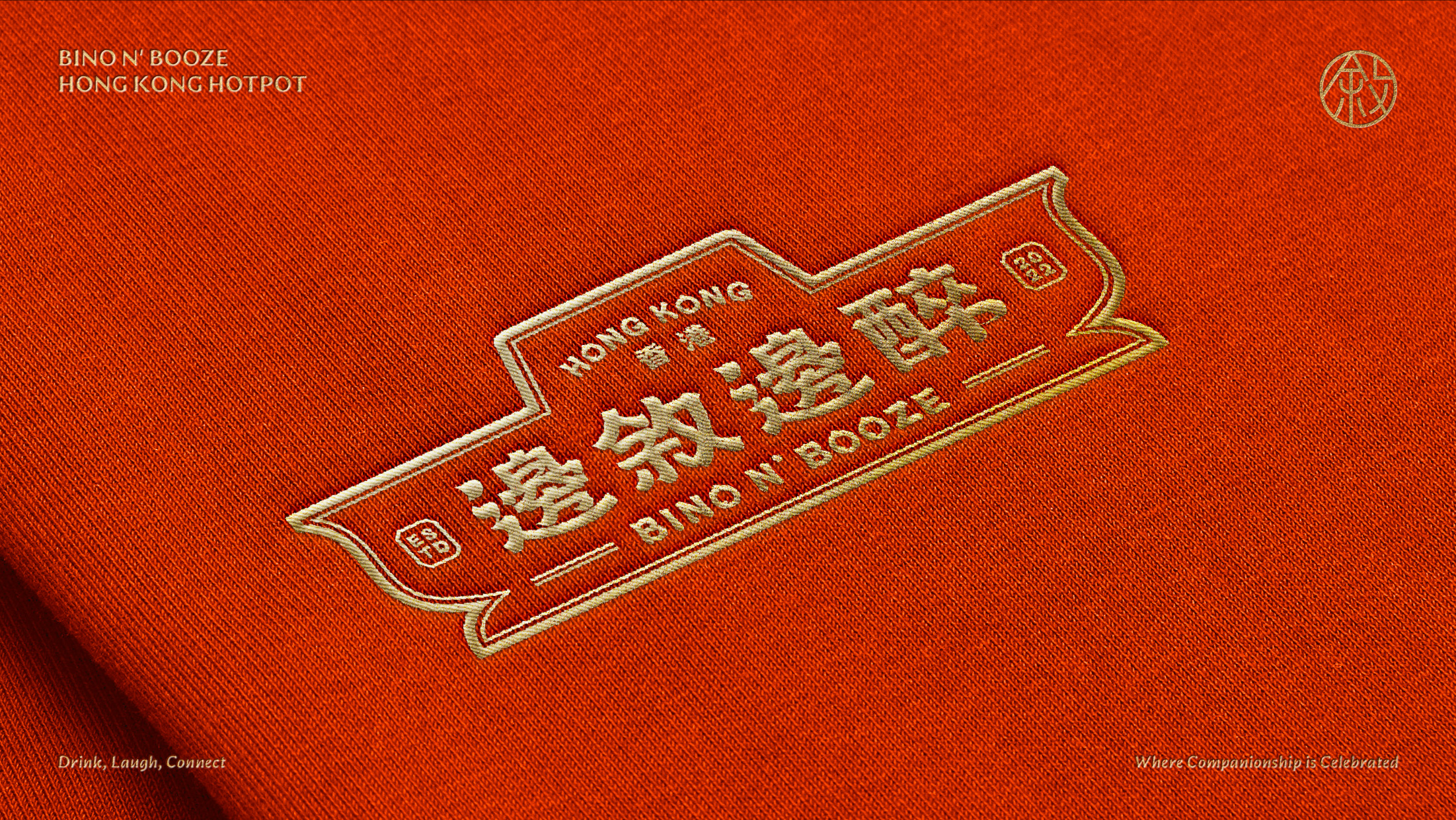
The logo is shaped like a classic Hong Kong-style hot pot, while the typography features playful, flowing strokes that playfully mirror the carefree movement of a tipsy person.
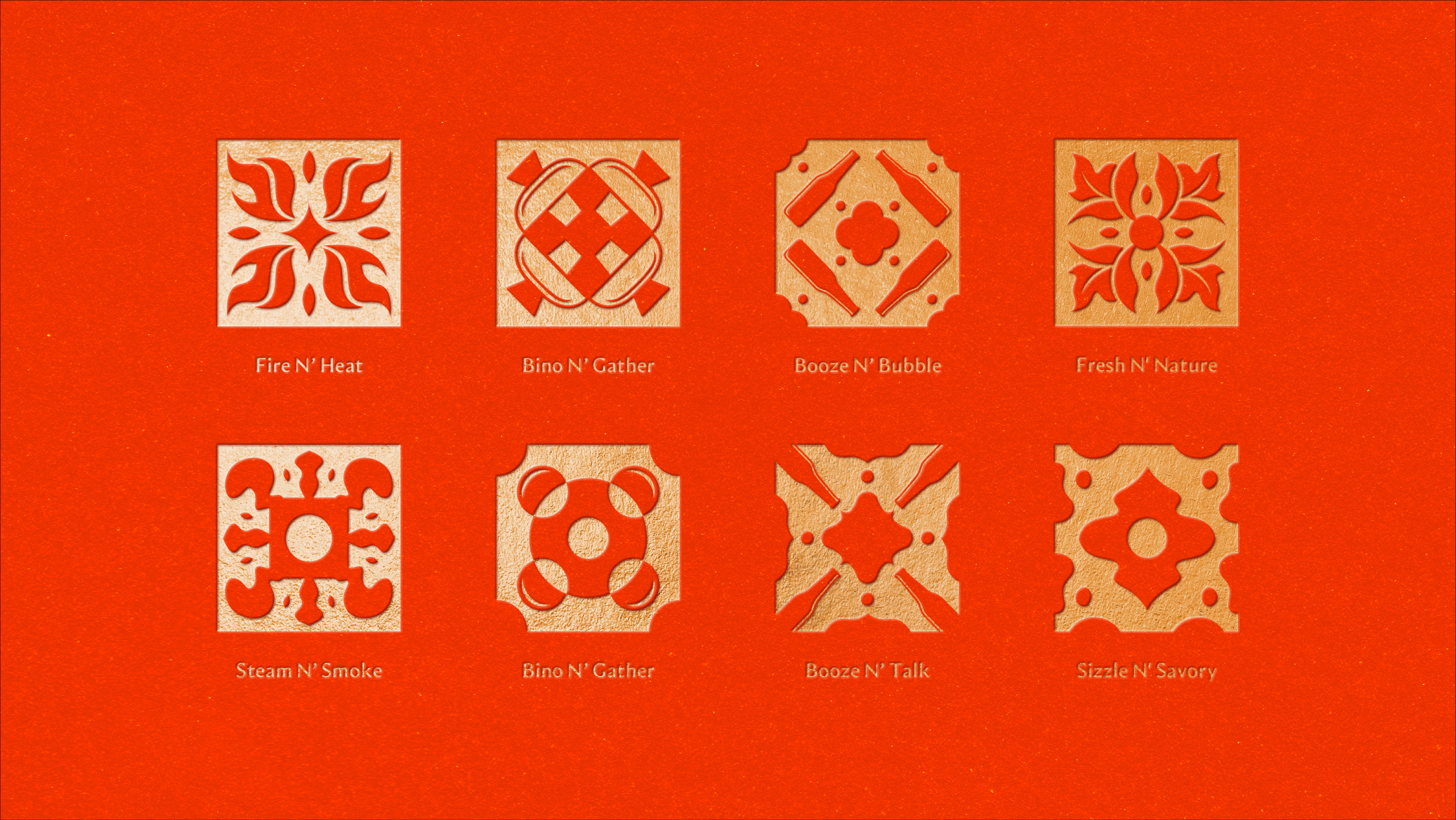
A collection of eight Hong Kong-style graphics was created to highlight key elements of a Bino N’ Booze experience.
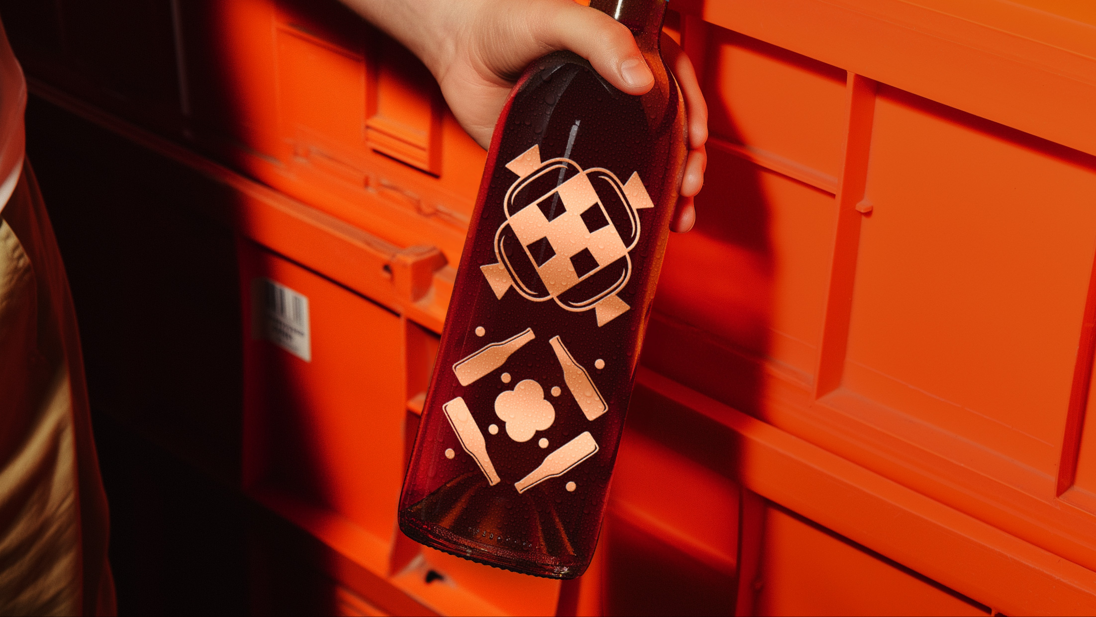
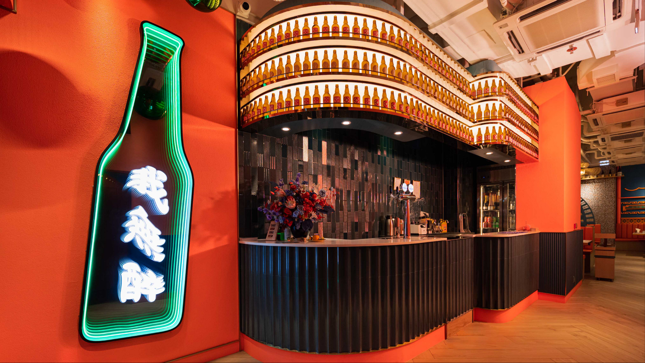
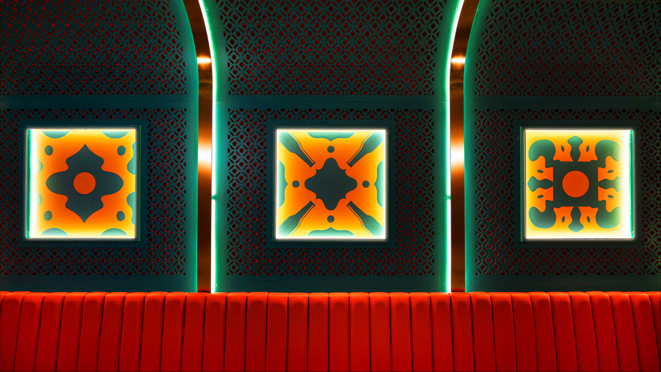
To highlight Bino N’ Booze’s specialty of alcohol paired with food, the décor also includes a feature wall of beer bottles with these graphics printed on, as well as photographs of various dishes paired with specific alcohols such as beer, wine, sake, and more.
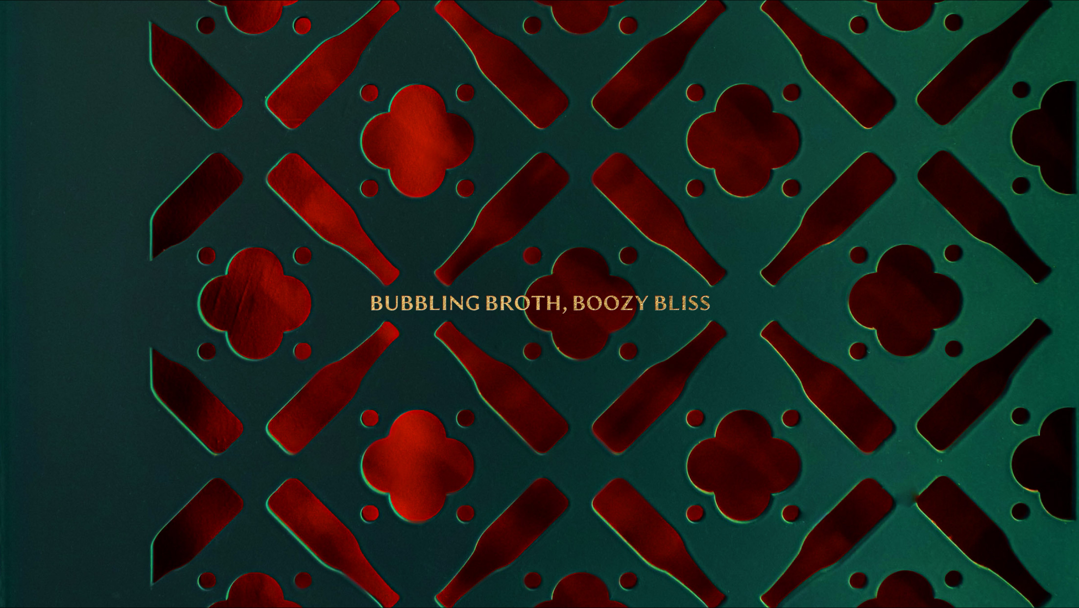
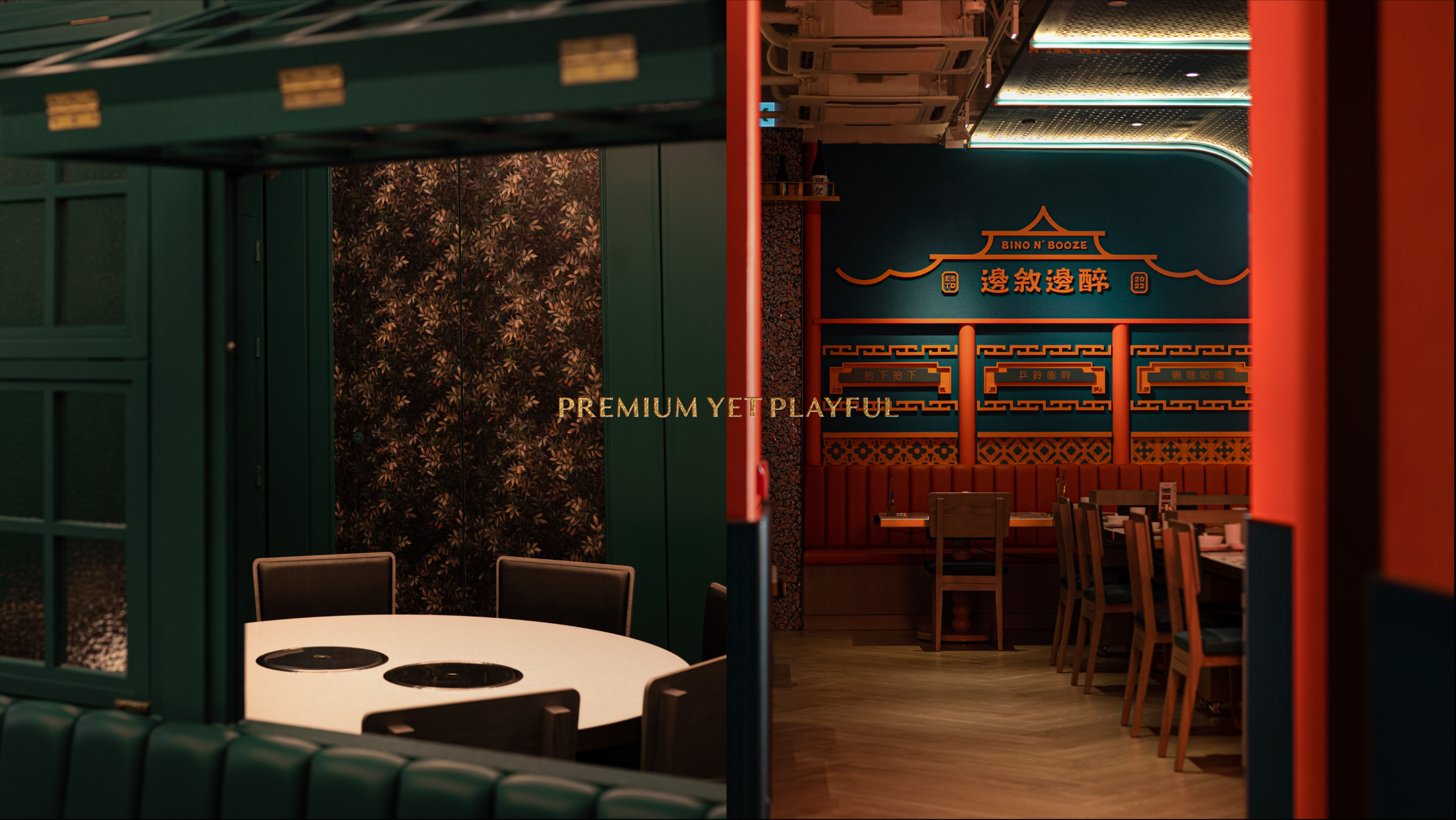
For a dynamic experience that appeals to younger patrons, statement décor pieces are designed to be fun, cheeky, and witty.

What we did:
Brand Positioning, Brand Story, Logo Design, Illustration, Visual Identity, Namecard Design, Package Design
Branding & package design for Bino N’ Booze
Client/Project: Bino N’ Booze
Creative director: Vince Cheung
Design and illustration: PingTing Lee
Food photography: Chris Chan @thingstudio
Interior design: Winnie Cheng
Interior photography: Eddie & Yin Ip @Tiny so Tiny
Results:
Featured by Time Out Hong Kong on their list of best hot pot restaurants in Hong Kong.
https://www.timeout.com/hong-kong/restaurants/hong-kongs-best-hotpot-restaurants
Bino N’ Booze boasts a successful branding strategy that is trendy and youthful, crafting a unique dining experience that revitalizes traditional Hong Kong-style hot pot for a younger audience while still preserving the nostalgic appeal that resonates across generations.
Branding has been applied across all of Bino N’ Booze’s operations. This can be seen in the restaurant through their décor, uniforms, and more, and through their social media and website.