Hashtag B #B Bakery | Branding Design
Brand Story:
Background
Hashtag B is a local bakery brand that redefines Hong Kong-style baking.
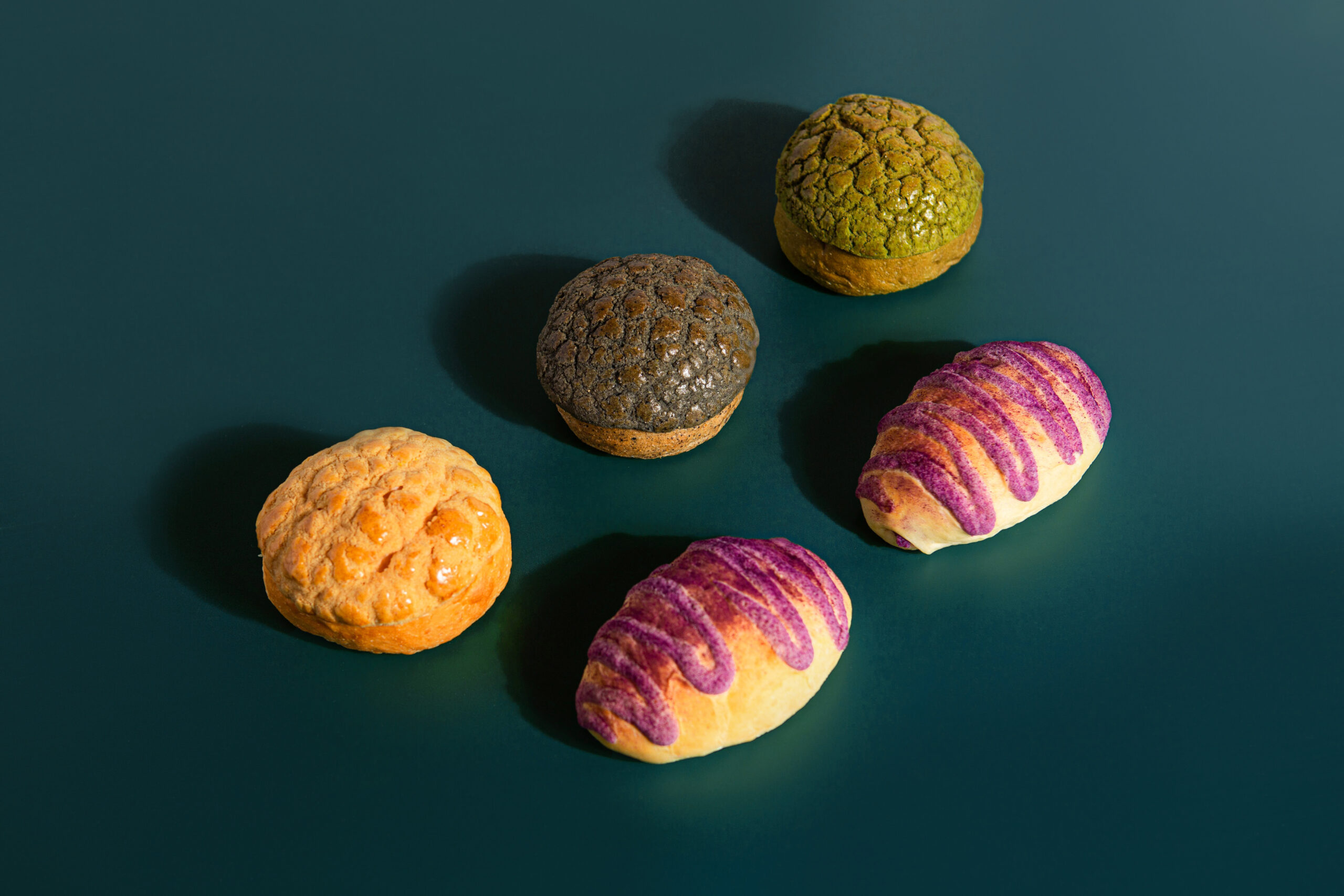
Hashtag B reinterprets Hong Kong-style baking from a fresh perspective, focusing on innovation and developing a diverse range of bread flavors for the public to choose from. The brand prioritizes health by carefully selecting natural ingredients, ensuring that the bread is low in sugar and salt, and free from artificial colors and preservatives. With a commitment to handmade quality, customers can enjoy freshly baked bread every day.
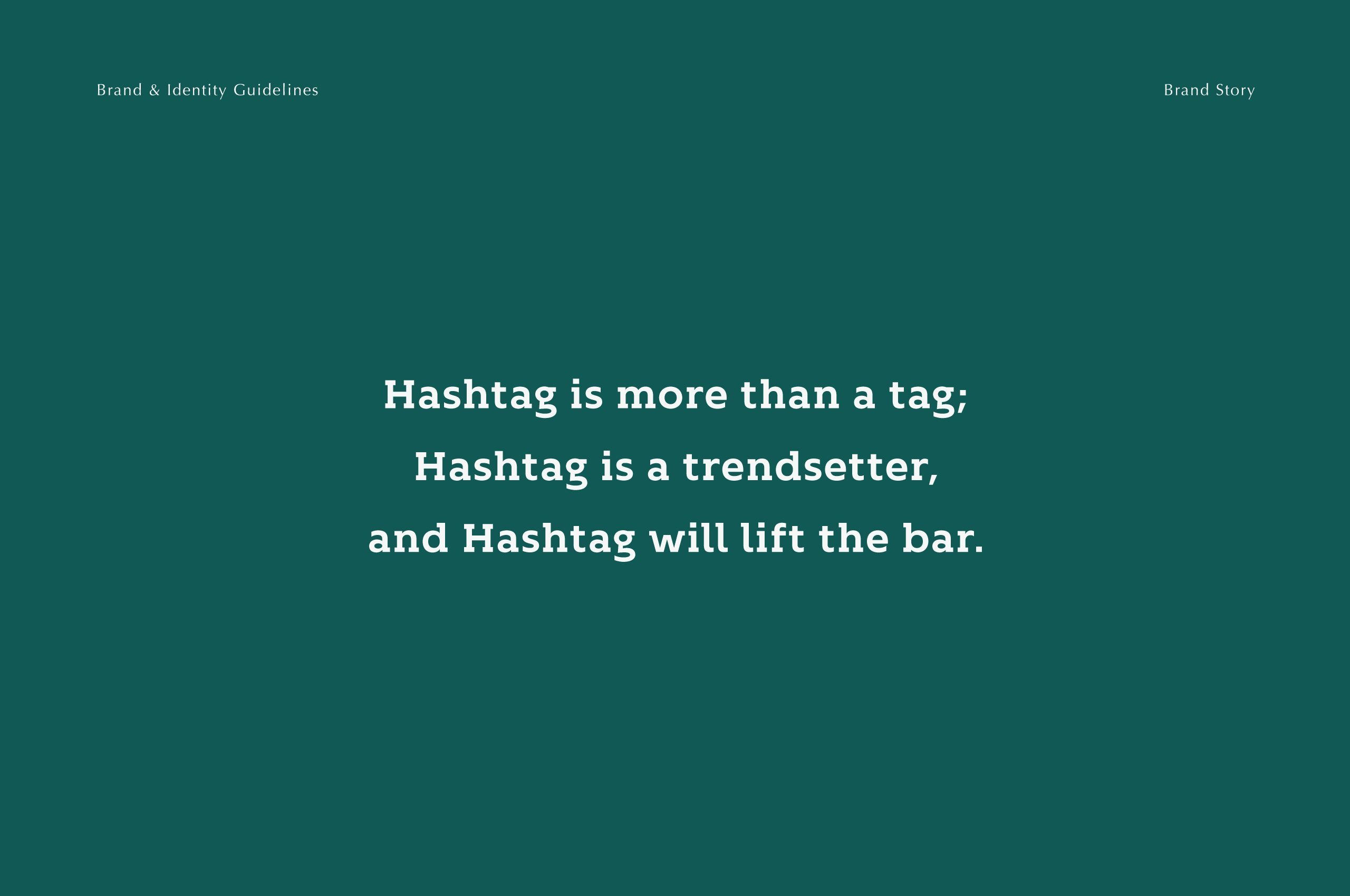
The name Hashtag B carries multiple meanings, with B standing for Bakery, Better, Bread, and Believe, among others. We believe that B represents endless possibilities, aligning with our brand concept. Through continuous innovation, we redefine Hong Kong-style baking, offering a rich variety of bread choices to ensure that every day is filled with freshness and delight.
Design Solution
B for Bakery; B for Bread; B for Better!
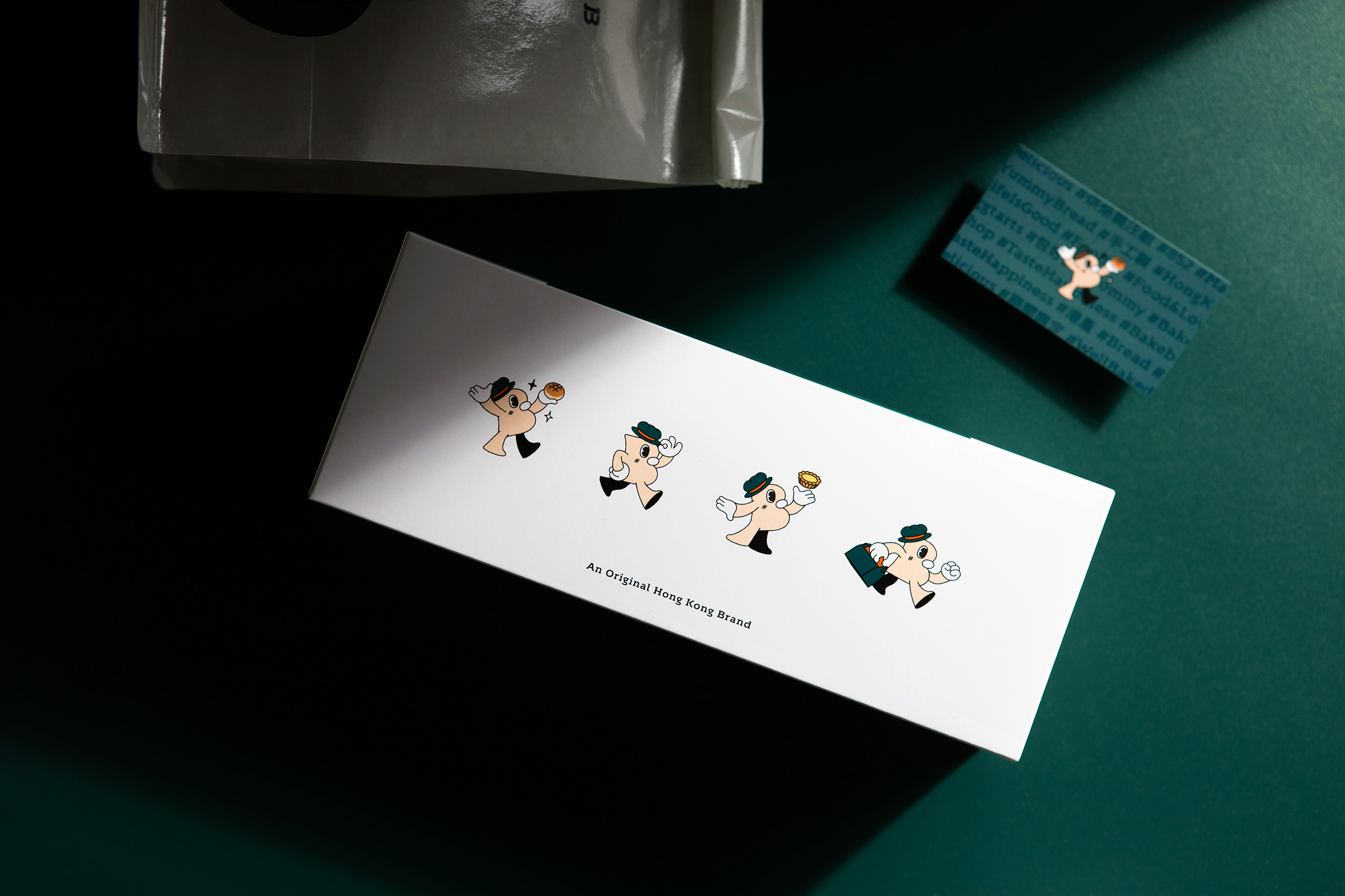
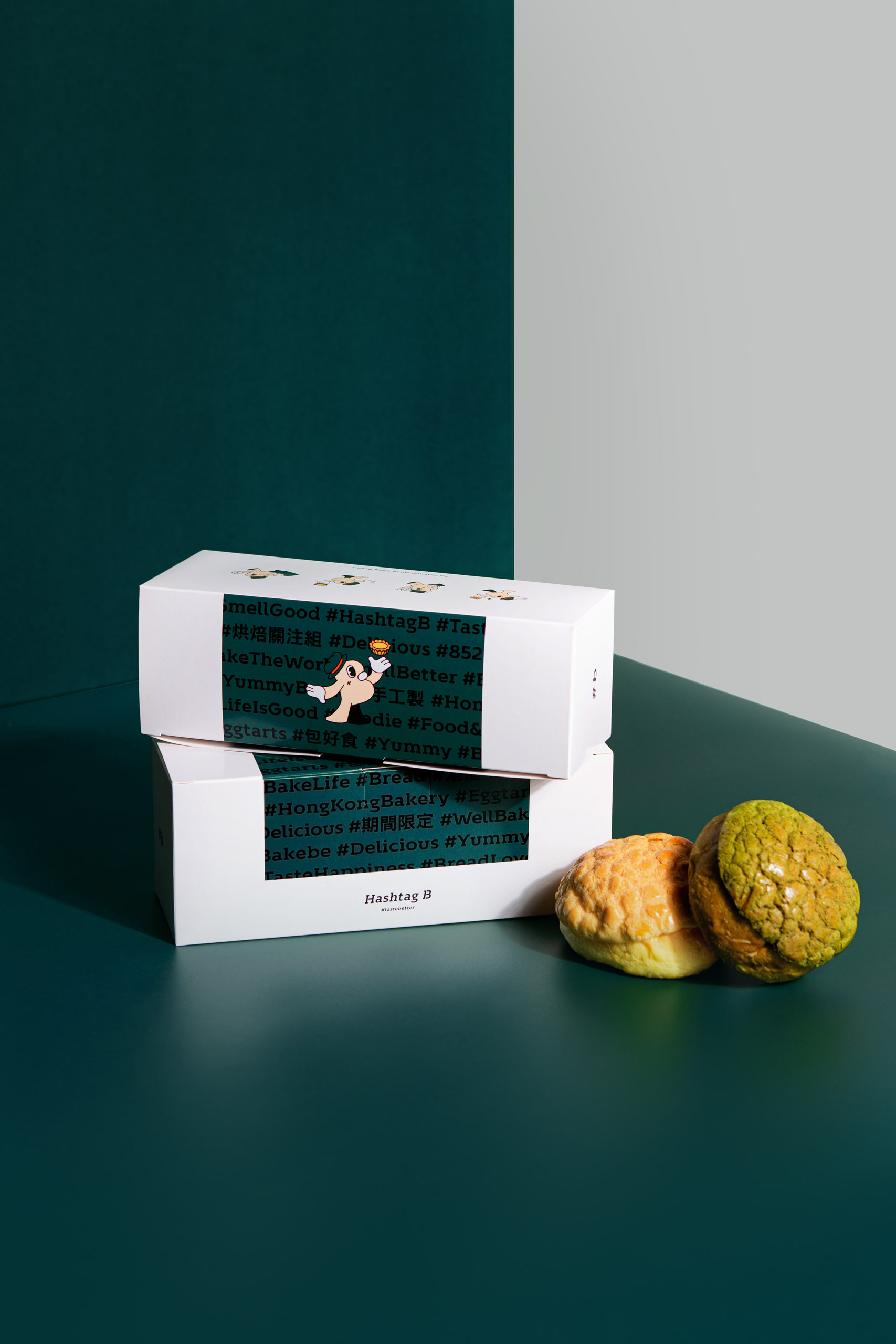
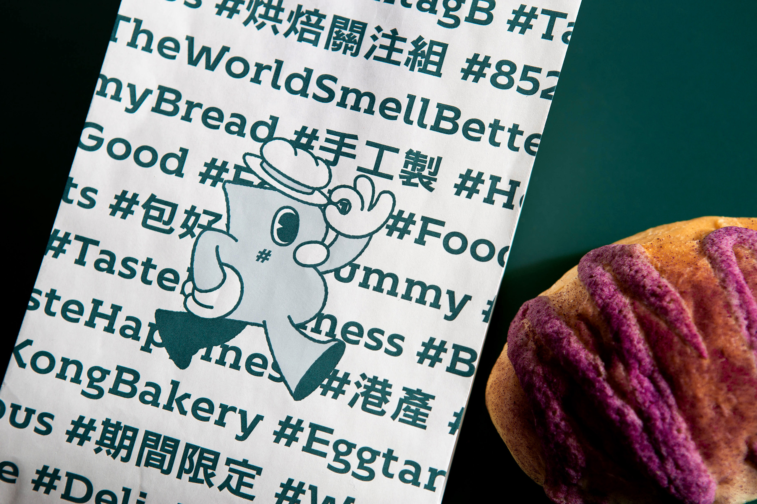
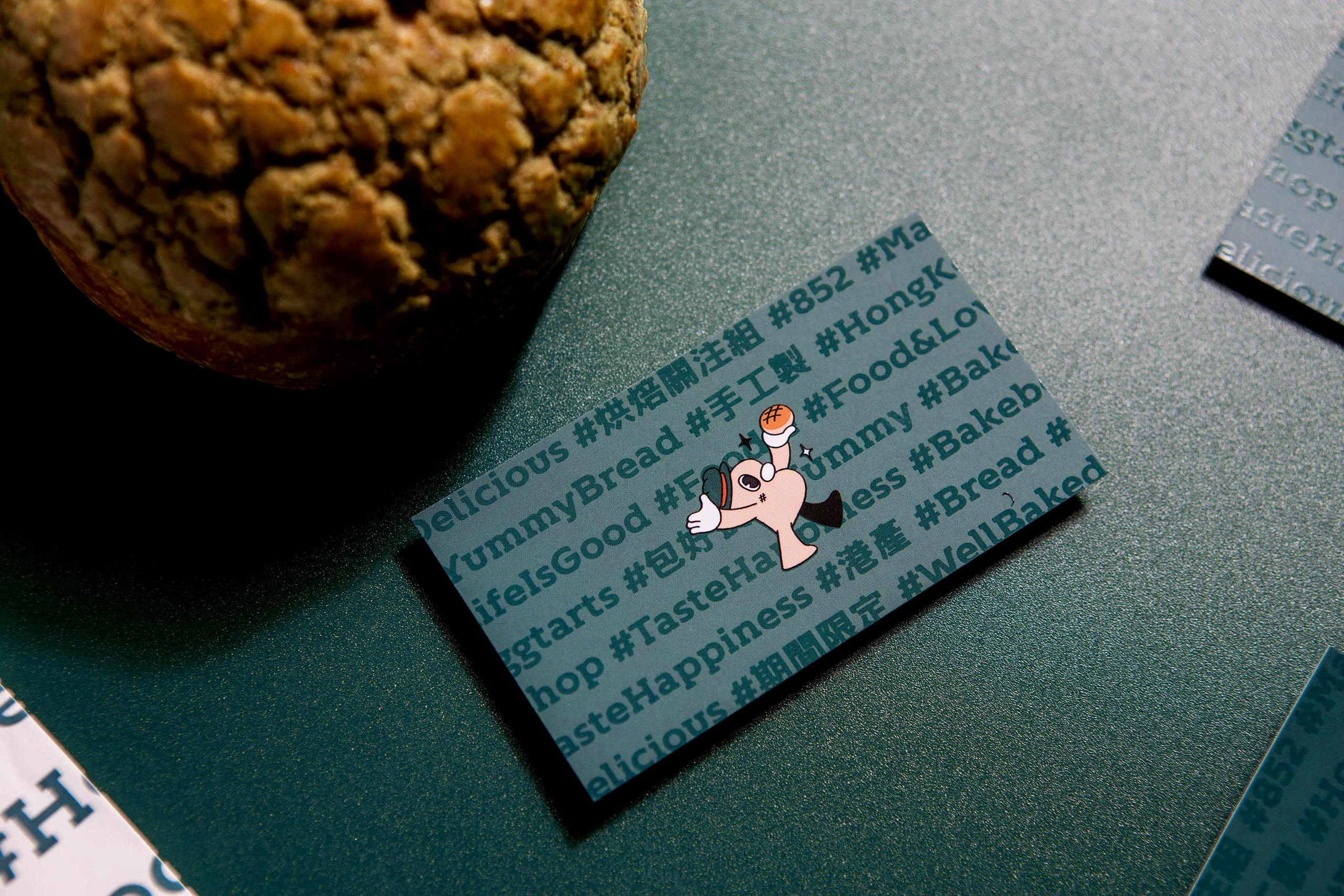
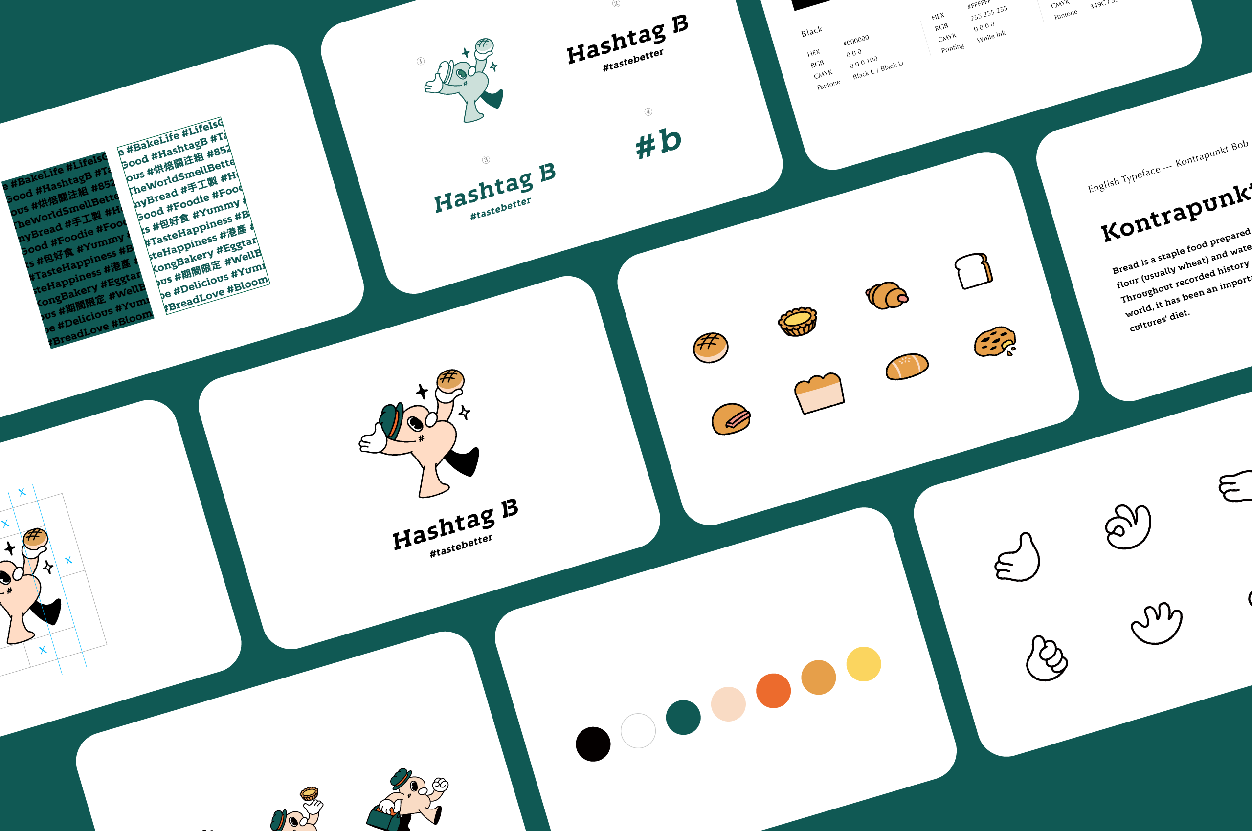
Hashtag B is more than a brand name, it also carries the brand’s high hopes for Hong Kong-Style baking. The brand’s Super Graphics feature a quirky gentleman named Mr. B, who embodies the brand’s promise of using high-quality natural ingredients and handcrafting their baked goods daily. Mr. B is brought to life with his signature top hat, while the sparkles in his eyes symbolize Hashtag B’s creativity and dedication to fusing local flavors and delights.
The Super Graphics also feature a Hashtag Wall, which highlights the Hong Kong trend of using hashtags. This design element adds an aesthetic touch to the brand and reinforces its theme of innovation and modernity. These design elements combine to create an energetic and reliable profile for Hashtag B.
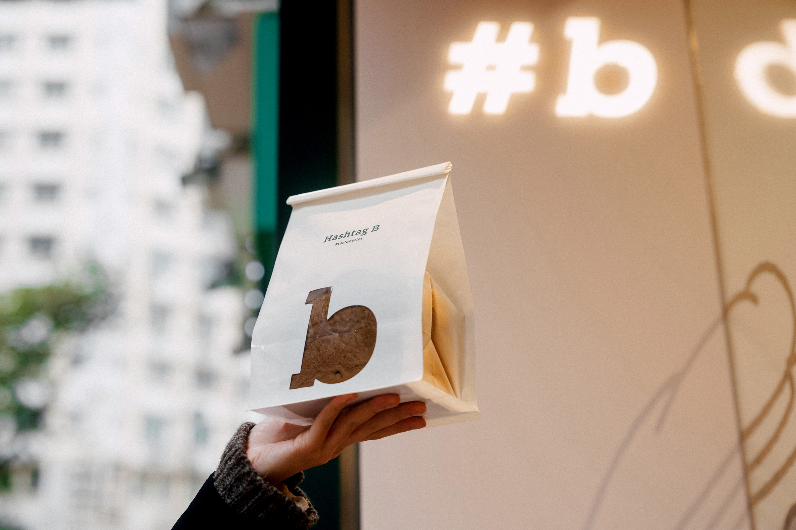
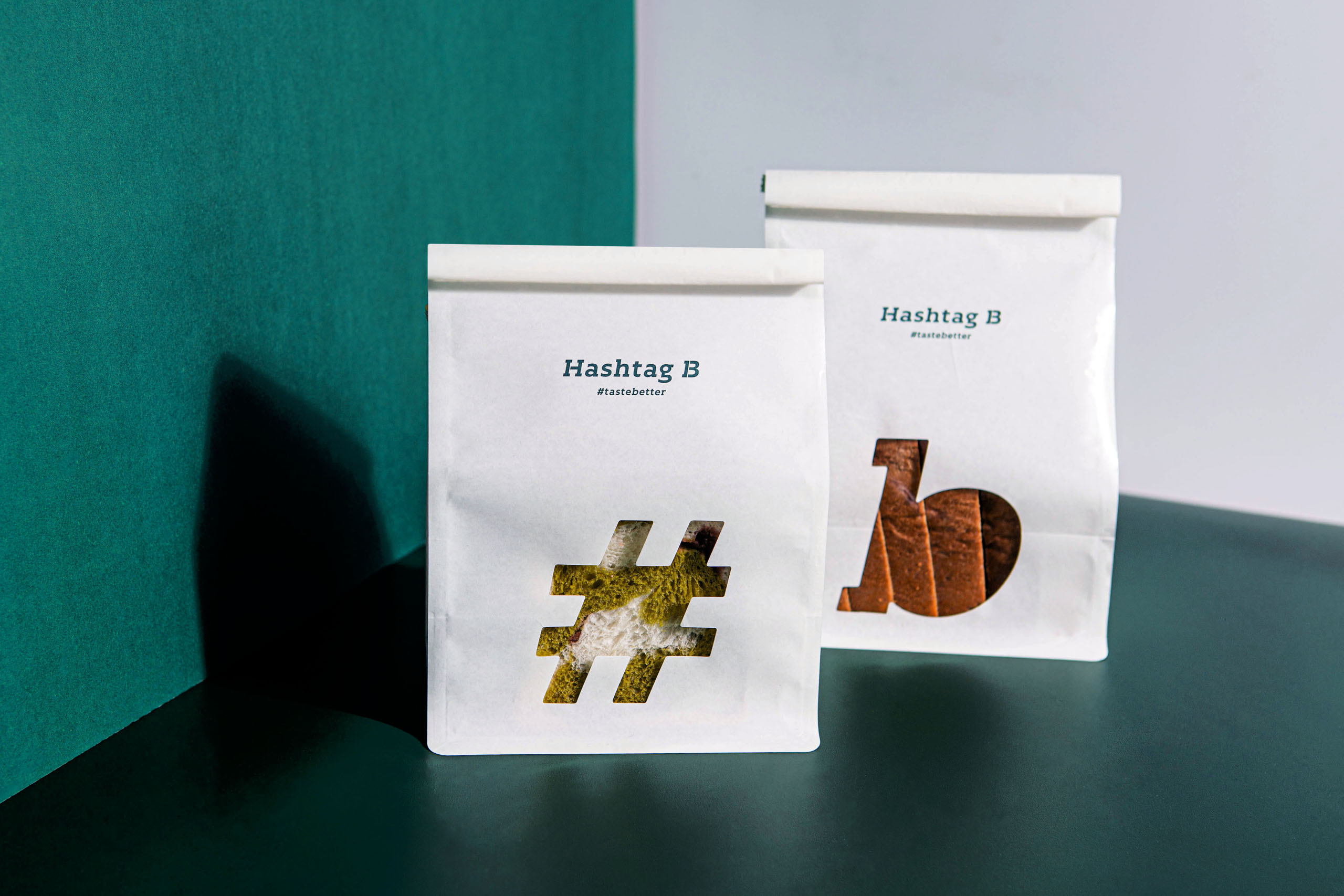
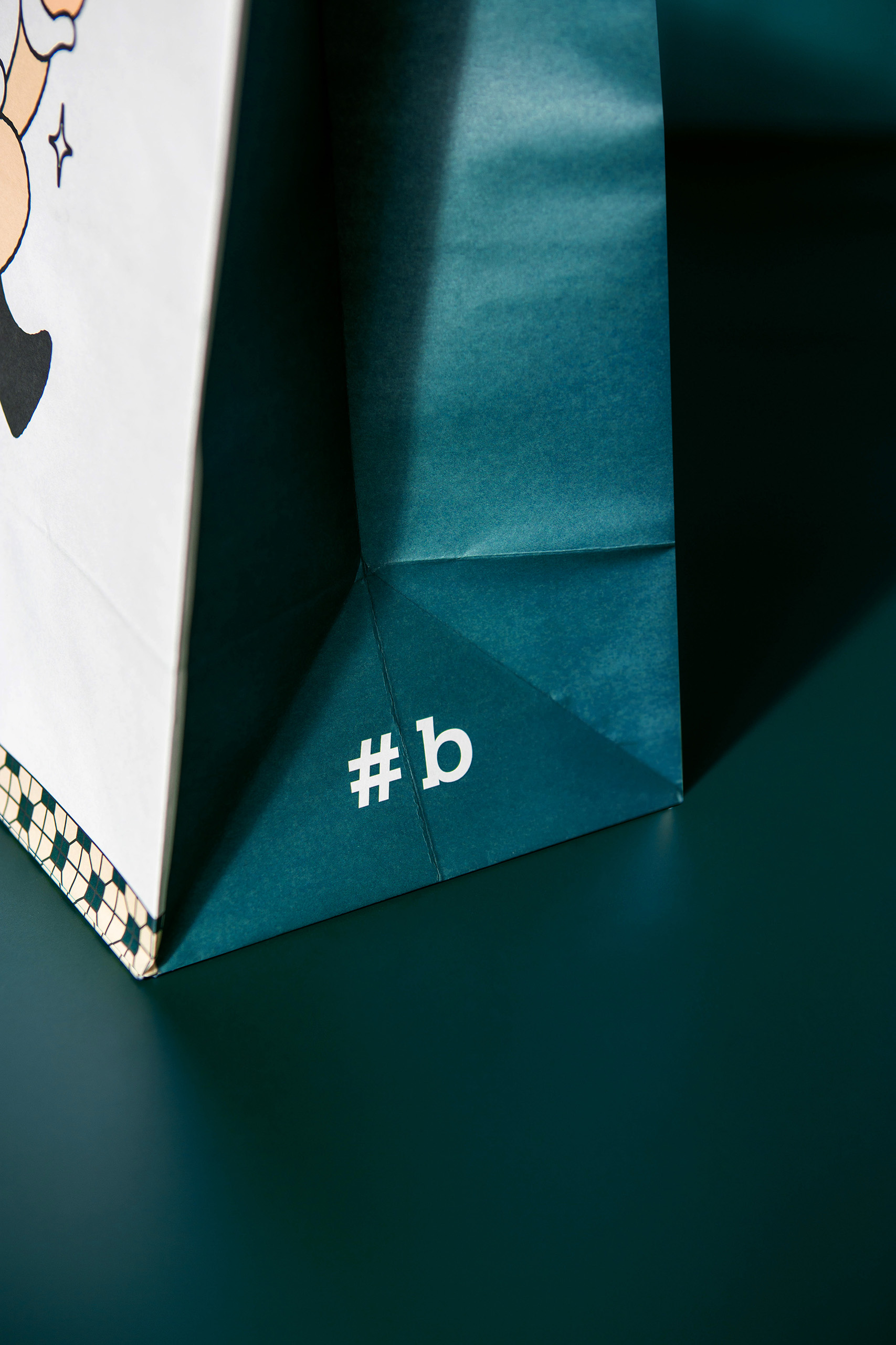
The brand’s logo features a clean and simple design with the letter “B” as the main focus. The tagline “#TasteBetter” is written underneath in bold sans-serif font that is easily recognizable. The use of color in the logo symbolizes warmth and excitement, which are essential elements for a Hashtag B bakery brand.
One unique aspect of Hashtag B’s branding design is its use of social media to connect with customers. The brand has a strong online presence and regularly updates its social media pages with new products, events, and promotions. This approach allows the brand to engage with customers in real-time and build a loyal following. Hashtag B also uses hashtags on its social media posts to encourage customers to share their experiences and engage with the brand.
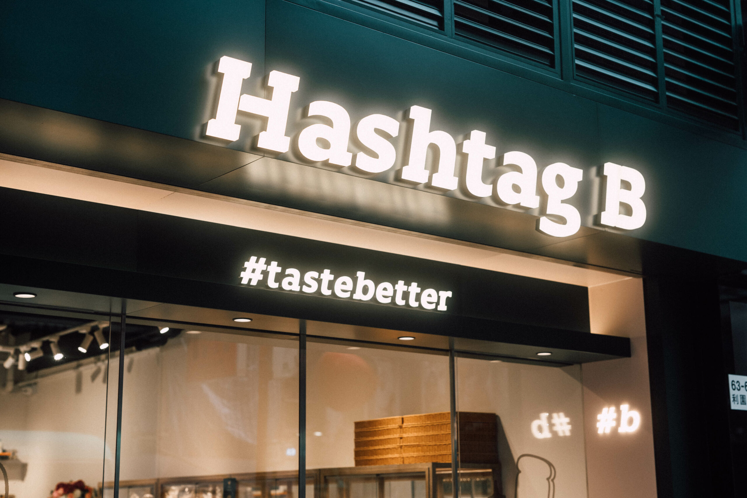
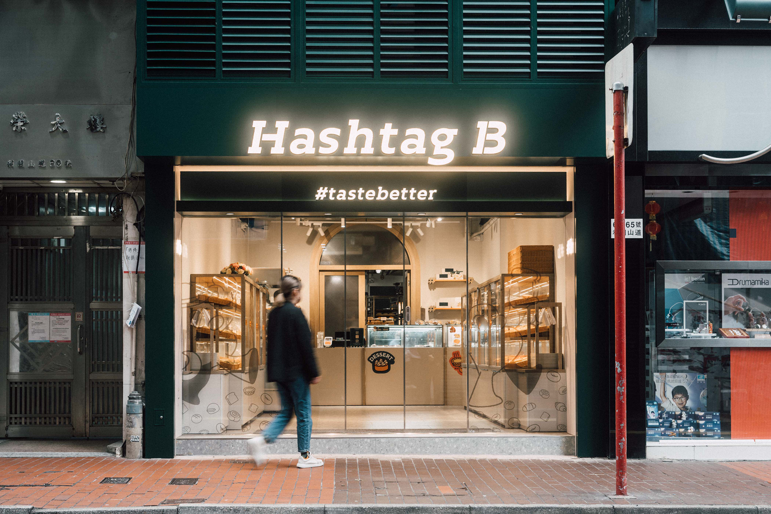
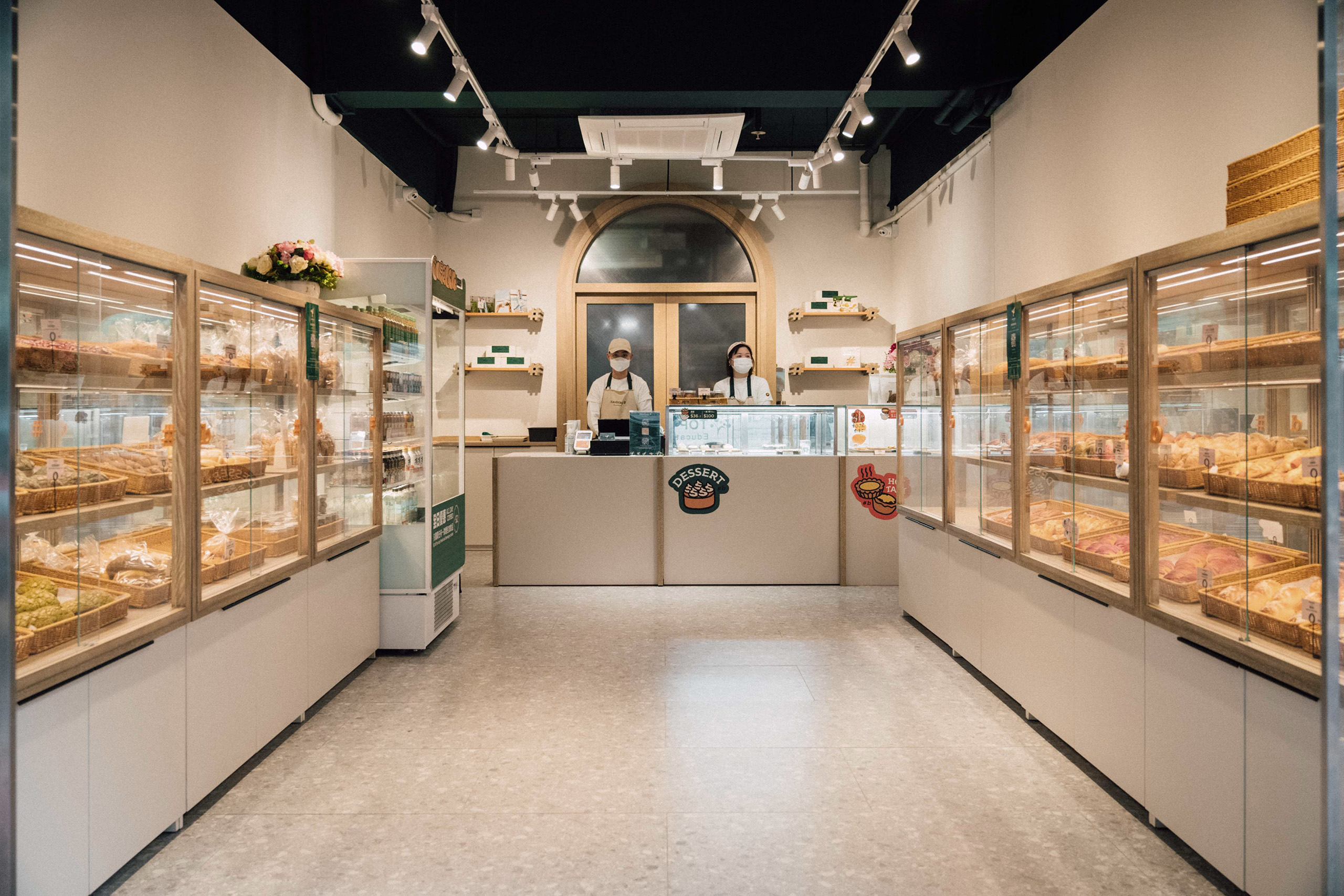
Hashtag B’s branding design extends beyond its digital presence to its physical storefronts. Each location across Hong Kong features the brand’s Super Graphics and unique design elements. The storefronts are designed to be warm and inviting, with a modern and minimalist aesthetic that reflects the brand’s commitment to innovation.
The success of Hashtag B’s branding design is evident in its popularity among Hong Kong locals and tourists. The brand has managed to stand out in a competitive market by staying true to its philosophy of using organic ingredients and handcrafting its baked goods daily. Hashtag B’s commitment to innovation and modernity is reflected in its branding design, which has helped the brand build a loyal following and establish itself as a leader in Hong Kong’s baking scene. Altogether, VINCDESIGN’s inspirations complete an energetic and reliable profile for Hashtag B.
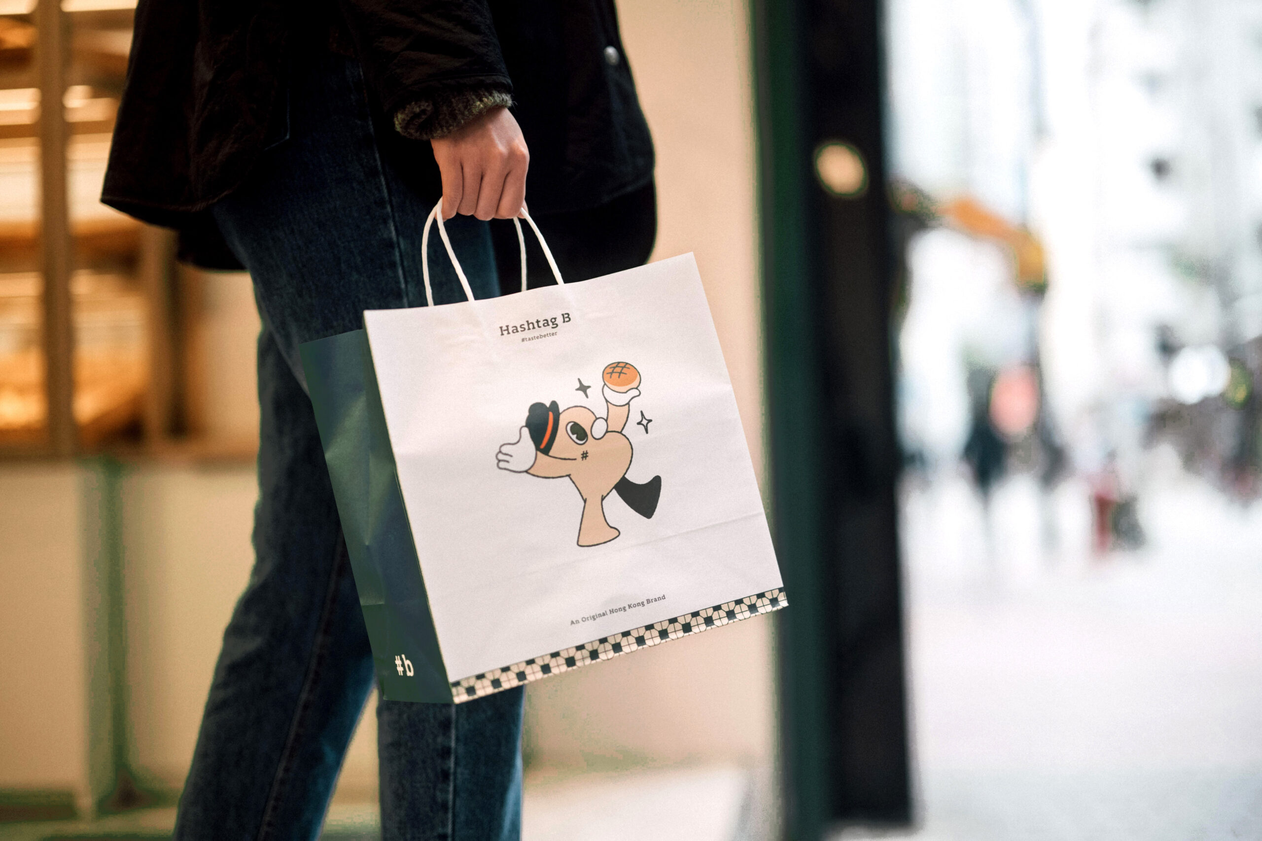
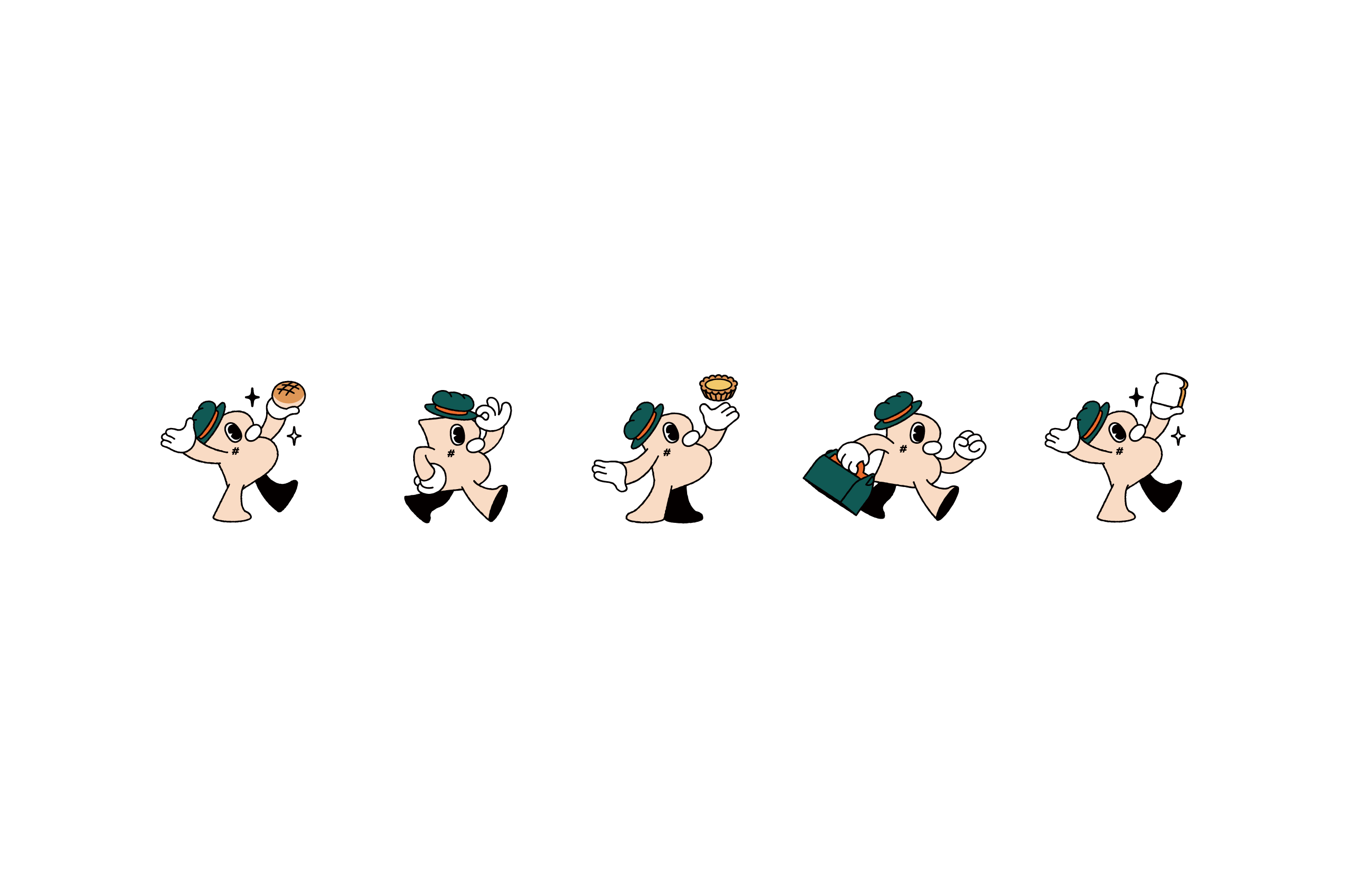

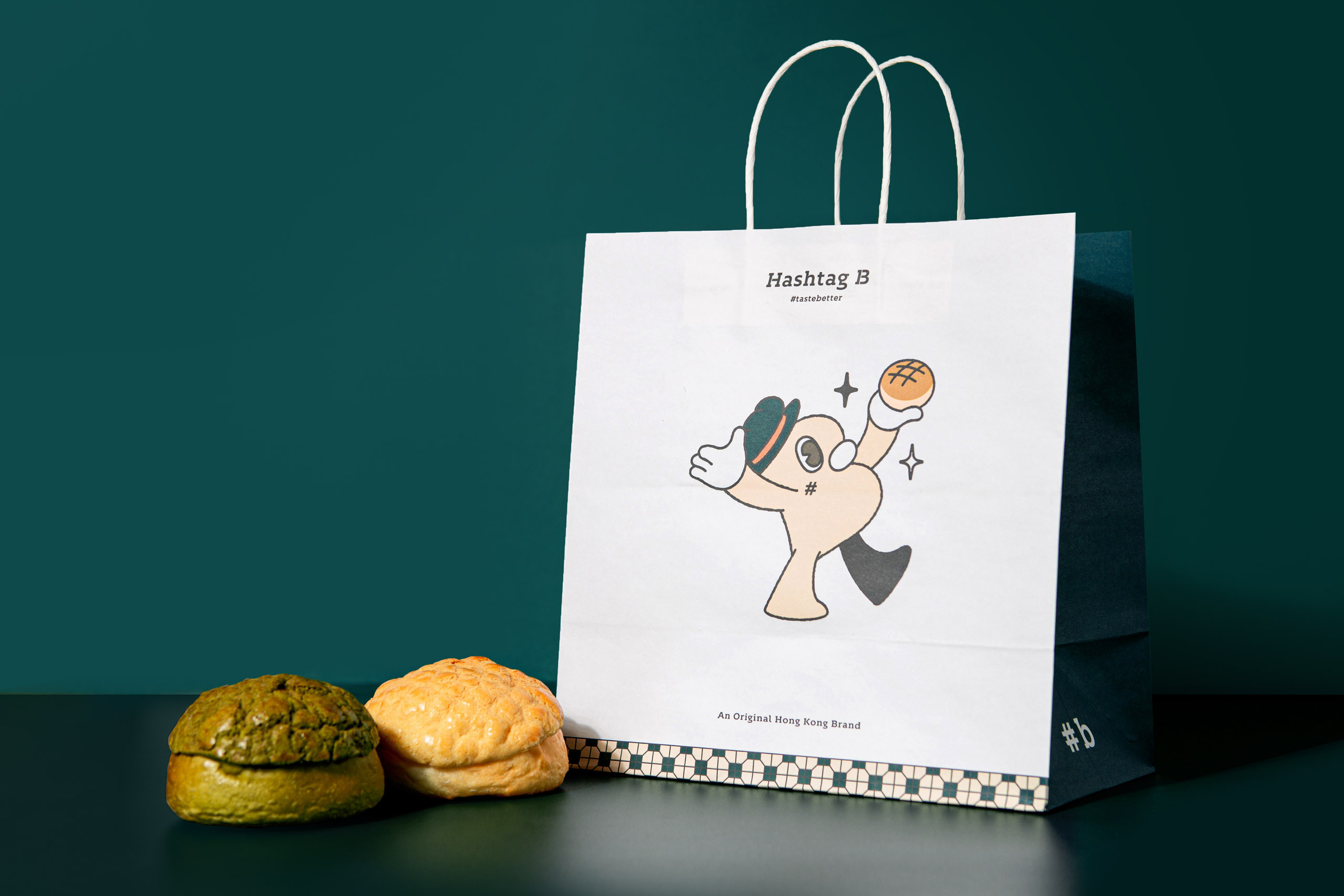
“Mr. B is brought to life with his signature top hat,while the sparkles in his eyes symbolize Hashtag B’s creativity and dedication to fusing local flavors and delights.”


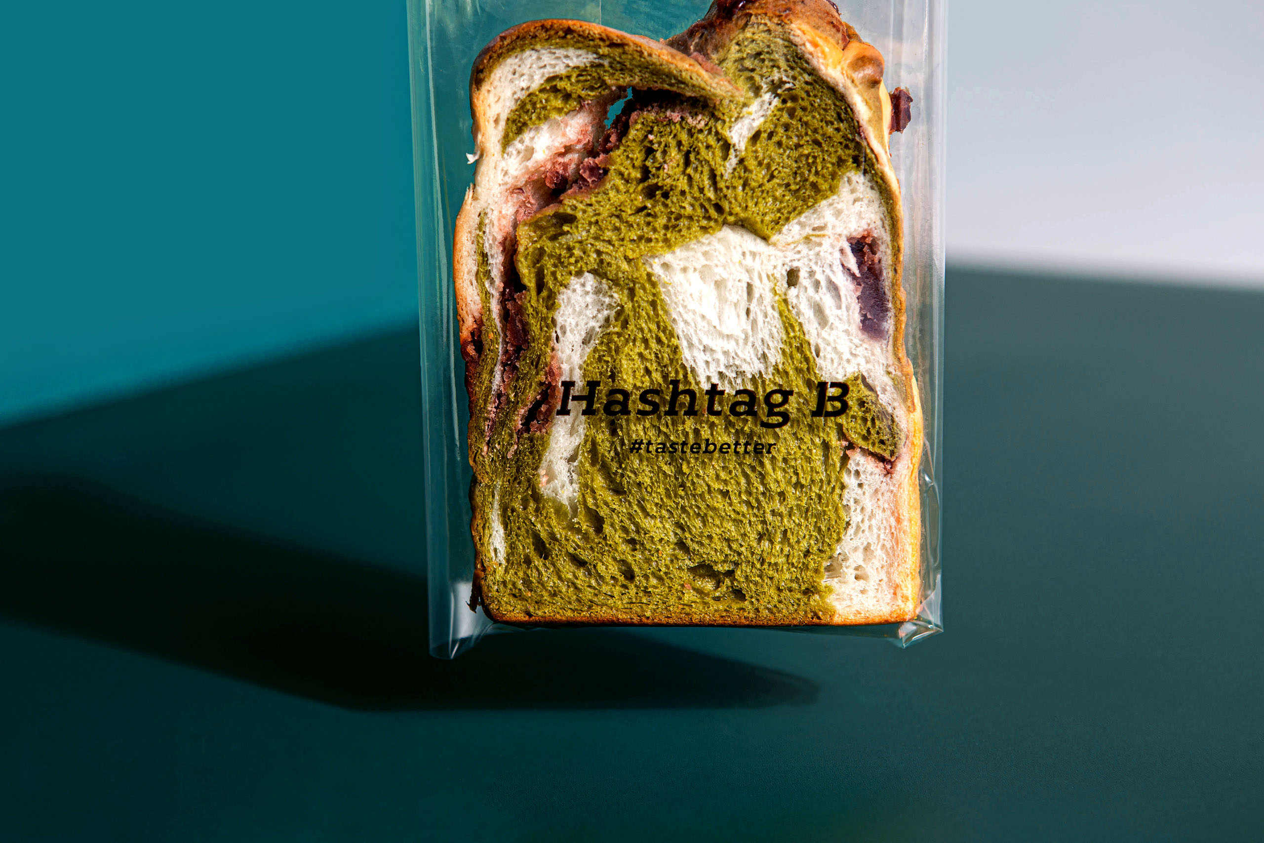
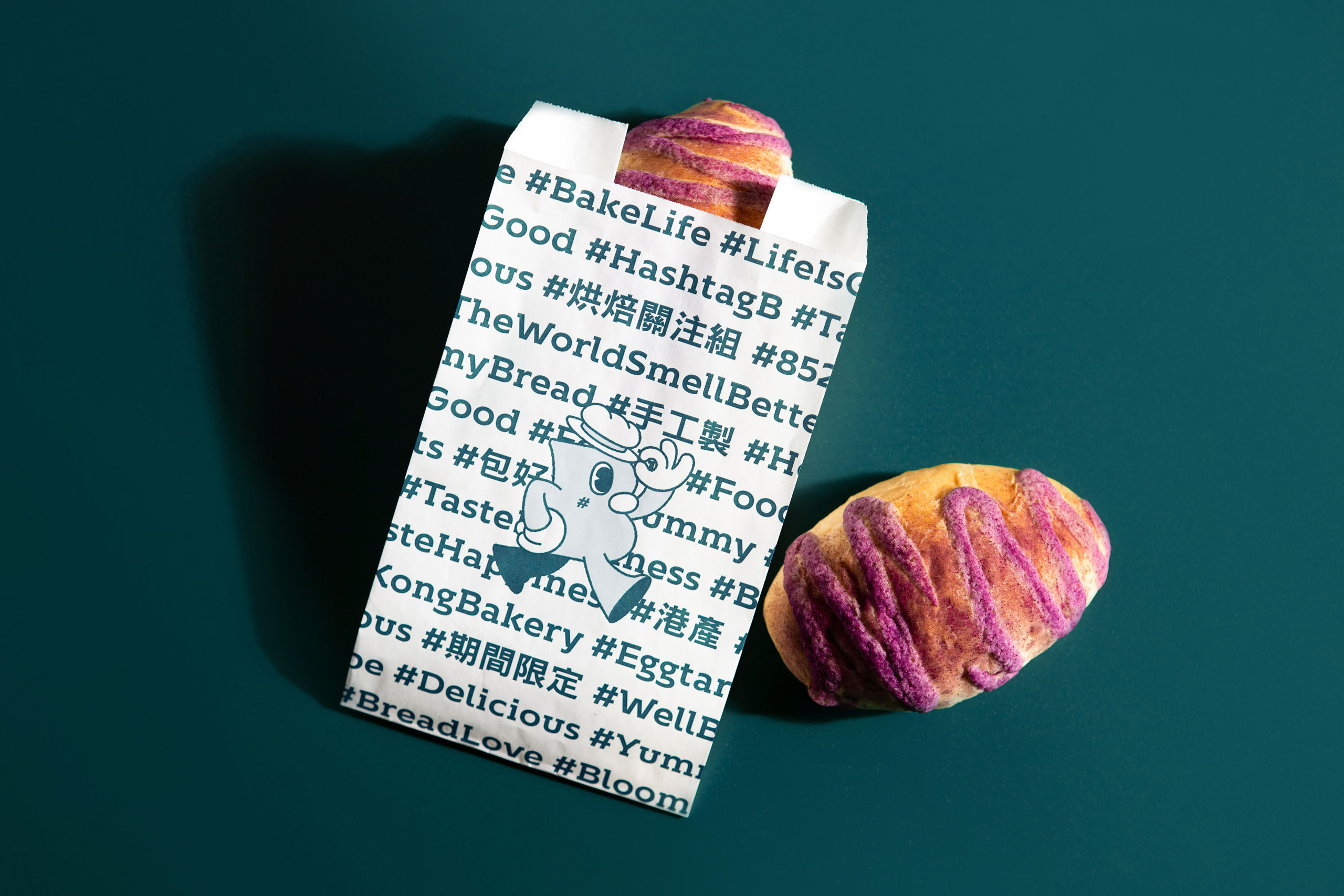
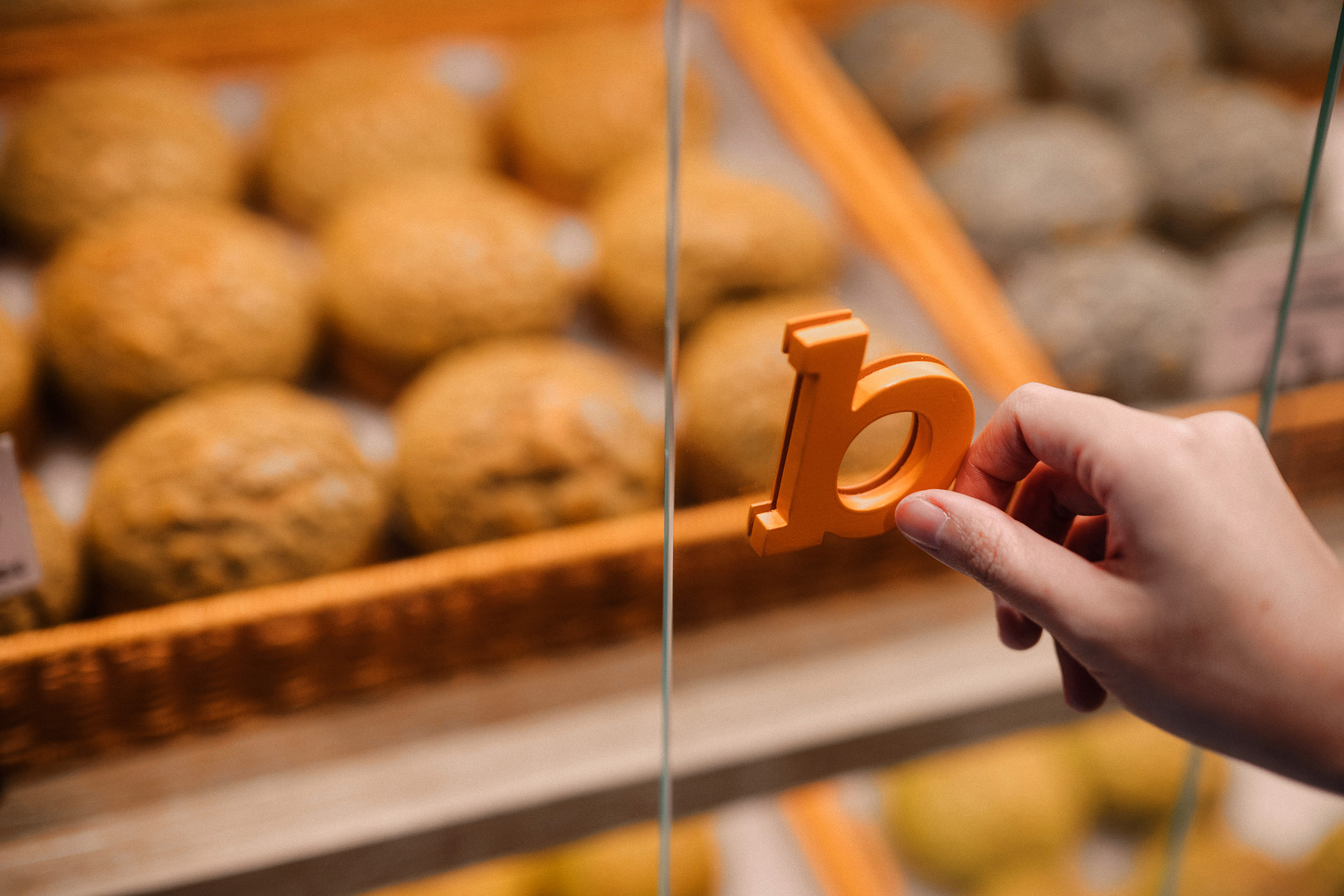
“The storefronts are designed to be warm and inviting, with a modern and minimalist aesthetic that reflects the brand’s commitment to innovation.”
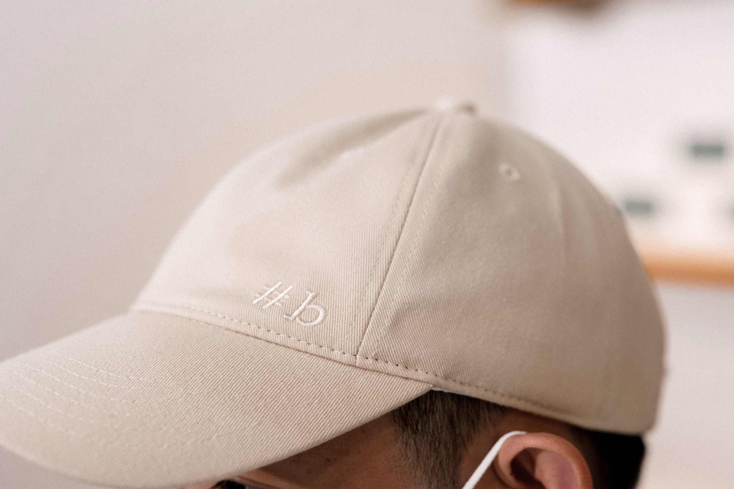
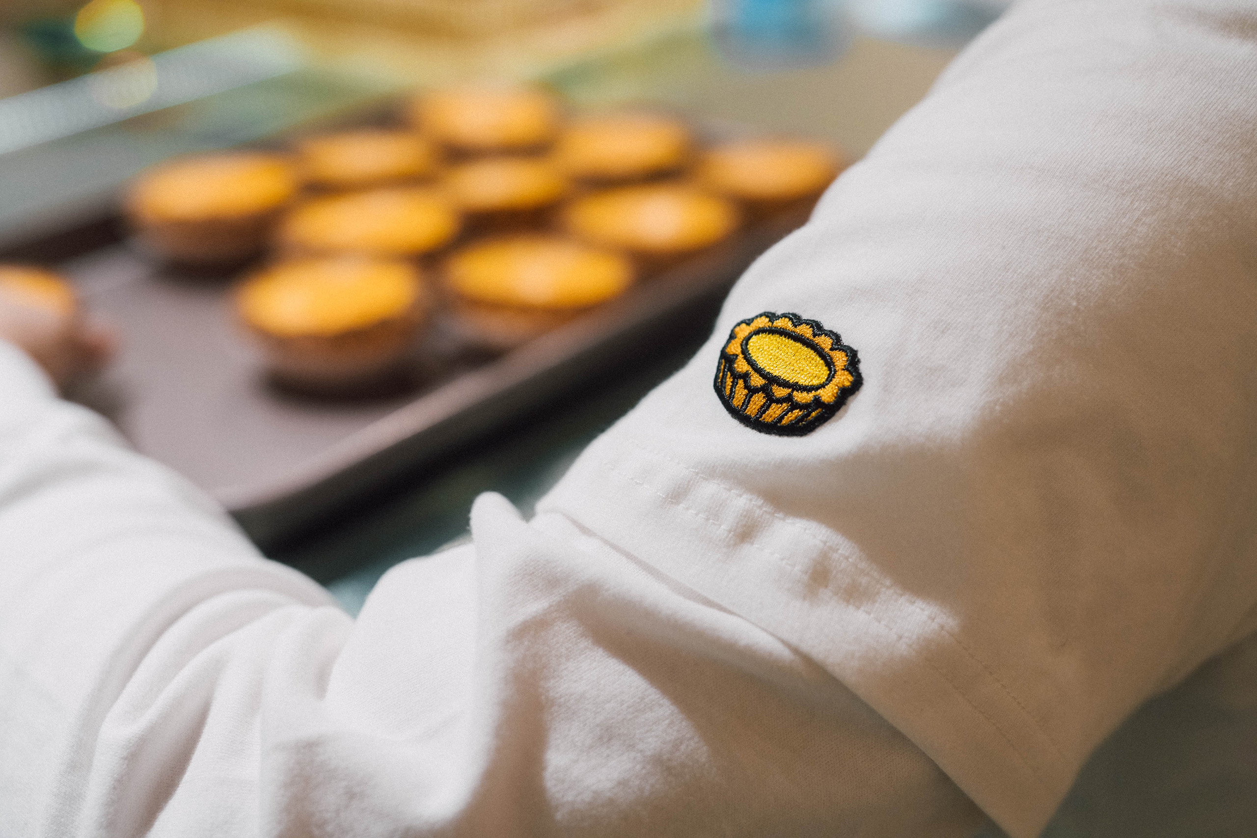

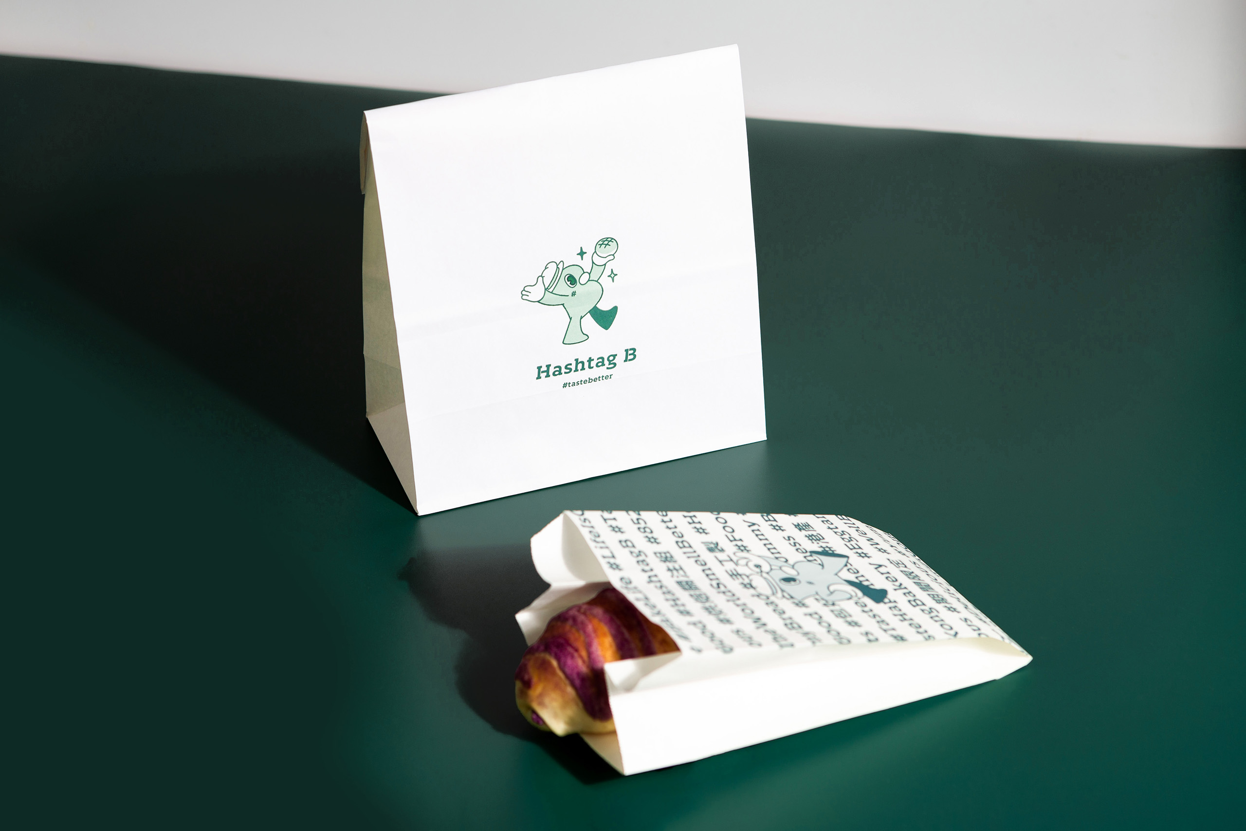
Brand Positioning, Brand Story, Logo Design, Illustration, Visual Identity, Namecard Design, Package DesignBranding & package design for Hashtag B #B
Client/Project: Hashtag B
Creative Director: Vince Cheung
Design and illustration: Kaman Kan
Hashtag B Photography: Yin Ip@tinysotiny.co & Eddie Li @tinysotiny.co
Result
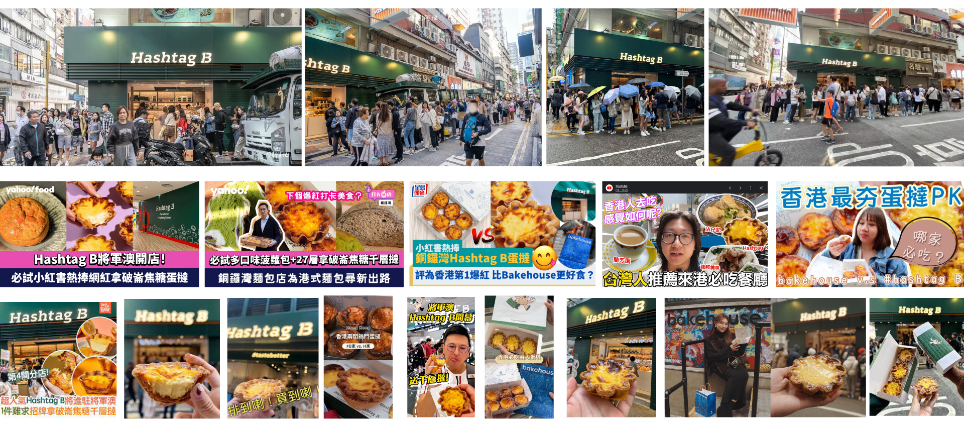
Hashtag B, launched in 2022, has seen immense popularity, attracting long queues of eager customers each day for their unique baked goods.
In just two years, the bakery has expanded to four locations across Hong Kong—Causeway Bay, Tsim Sha Tsui, Quarry Bay, and Tseung Kwan O.
Hashtag B successfully established a unique brand image that resonates deeply with Hong Kong’s local community through a friendly mascot, trendy and unique design elements, and a clean aesthetic design that highlights their commitment to innovation and quality baked goods.
In addition to their local popularity, Hashtag B has also successfully expanded their brand image across Asia, capturing the attention and receiving love from tourists visiting from Mainland China, Japan, Taiwan, Korea, and Thailand.
商標 | 品牌設計 | 香港 | 香港設計 | 視覺形象 | 包裝 | 包裝設計
logo | branding | design | hong kong | hong kong designer | VI | visual identity | vincdesign | package | package design
The success of VINCDESIGN’s approach to the #B Hong Kong bakery brand design is evident in its ability to create a distinctive and memorable identity. The careful consideration of every aspect, from the brand story to the visual elements, has cemented Hashtag B’s position in the competitive Hong Kong bakery scene. The unique character of Mr. B, coupled with the innovative Hashtag Wall, forms a compelling narrative that resonates with consumers. This thoughtful bakery brand design strategy has been instrumental in Hashtag B’s rapid expansion and popularity.
Further elaborating on the brand’s identity, the strategic use of the name Hashtag B Hong Kong is a key element of its marketing success. The name itself is designed to be highly searchable and shareable, leveraging the prevalent use of hashtags in modern communication. This focus on digital engagement is also reflected in the distinctive Hashtag B logo, which features a clean “B” with the impactful tagline “#TasteBetter.” This simple yet effective design is easily recognisable and reinforces the brand’s commitment to quality and innovation. For those wondering about a specific Hashtag B location, the brand has strategically expanded across key areas in Hong Kong, including Causeway Bay, Tsim Sha Tsui, Quarry Bay, and Tseung Kwan O, making their unique baked goods accessible to a wide audience.