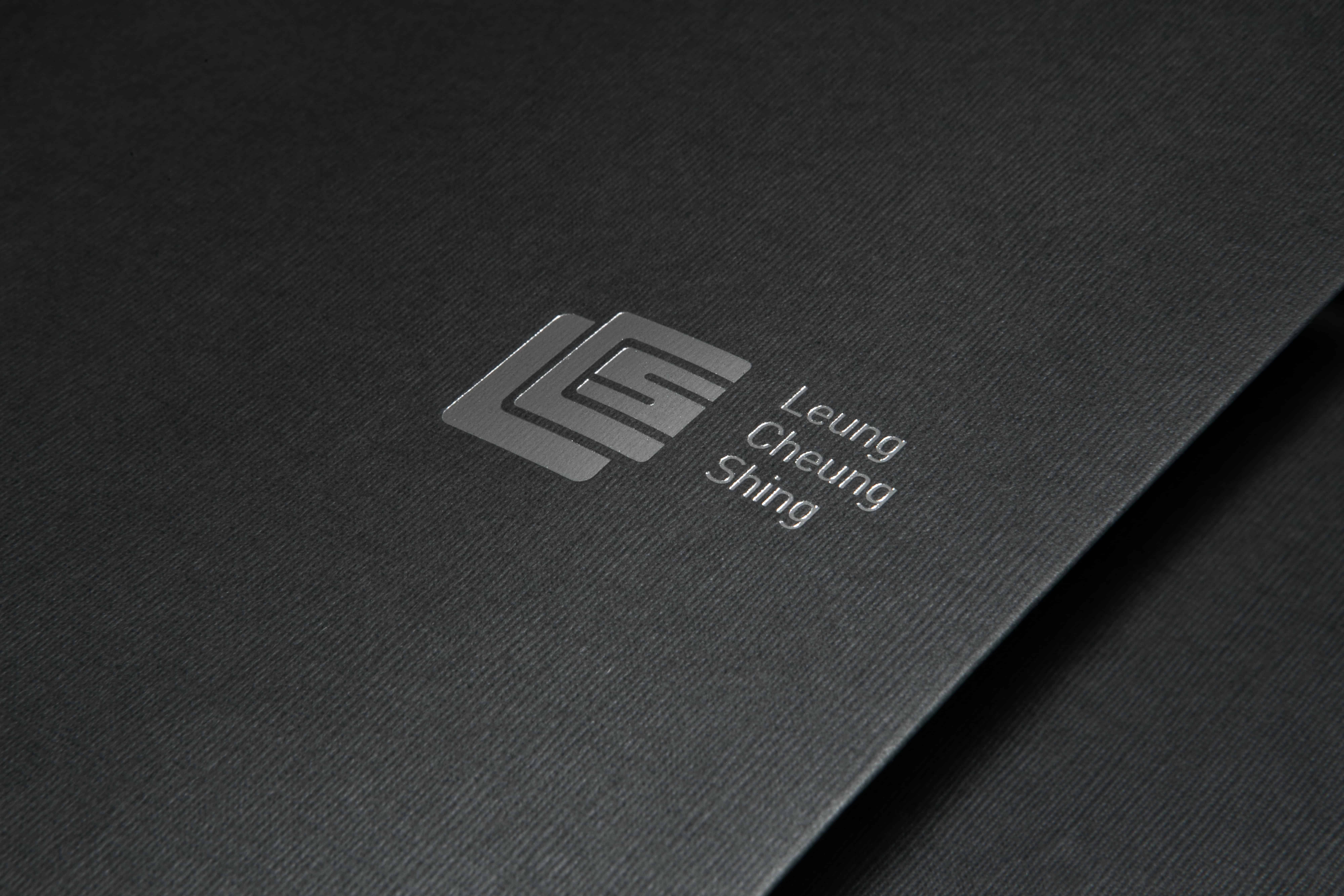
LCS
Background
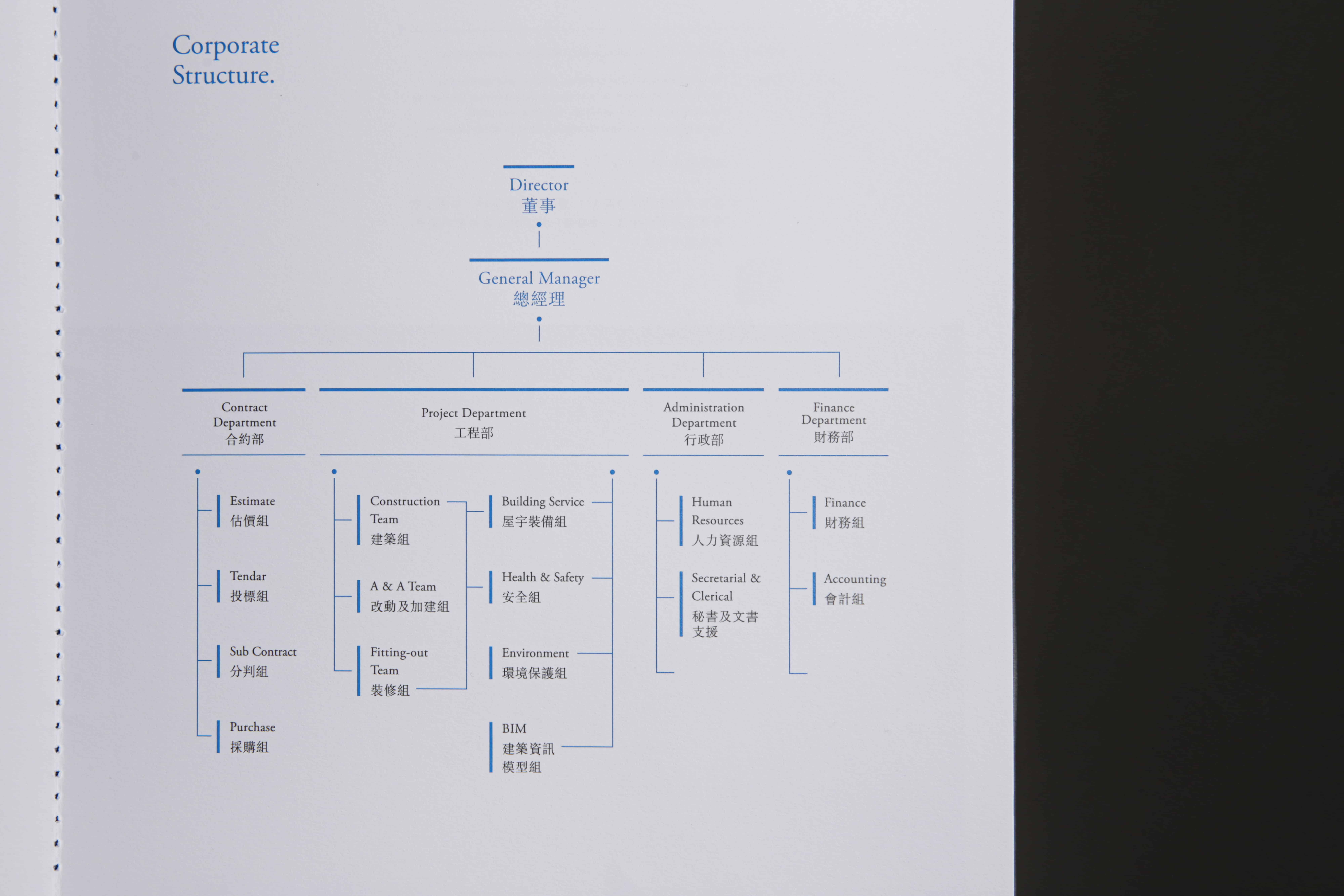
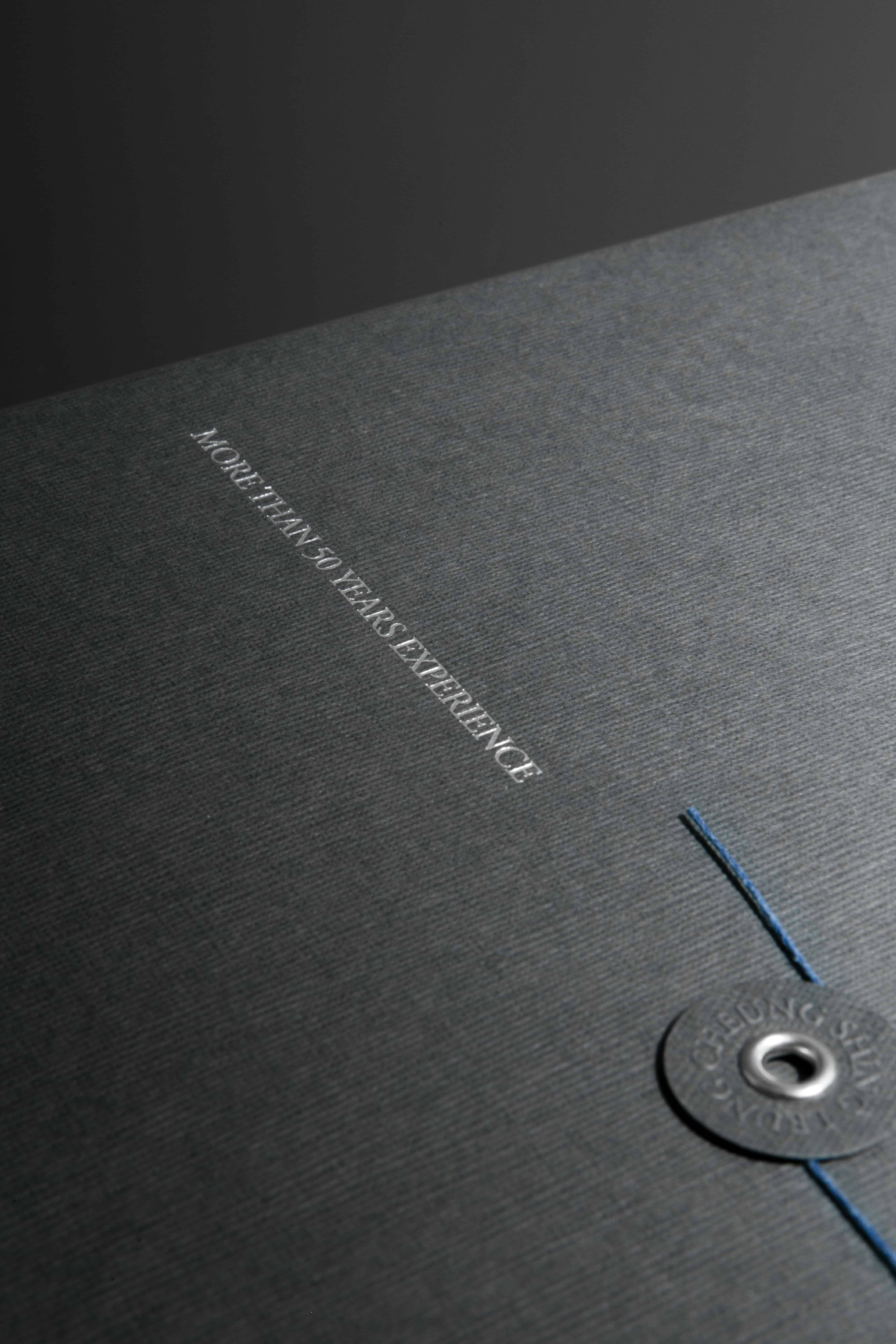
Established in 1968, Leung Cheung Shing Construction & Eng Co Ltd. (LCS) invited Vincdesign to compose a company brochure that represented their professional and trustworthy brand image and introduced the corporate’s profile, structure, and missions through the recollection of the company’s origin and birth.
Beginning with plastering, Leung Cheung Shing Construction has broadened its field of expertise to superstructures and fitting-out works over the past five decades. The company has served and preserved an extensive number of partners, from warehouses and factories to houses and hotels for their excellent proactive service attitude, commitment in practicality, and dedication in pursuing divine quality. Their five spirits, sincerity, trust, profession, virtue, and righteousness, thus explain their well-earned reputation and affection in the industry.
Design Solution
Vincdesign understood how dear Leung Cheung Shing Construction valued their roots, and created a brochure with details accenting the sense of nostalgia and appreciation to the past, conveying to the readers the trustworthiness of the long-established company.
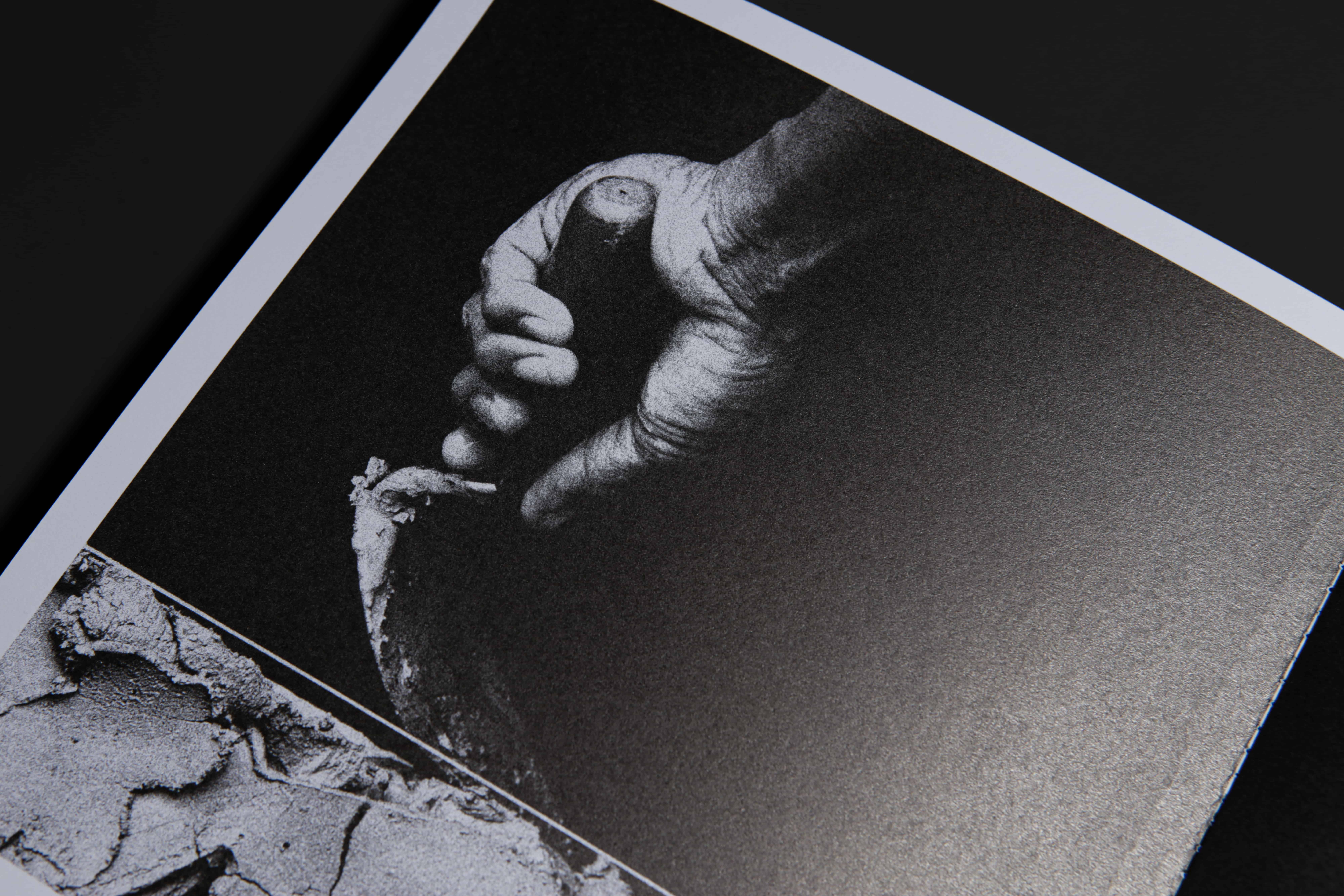
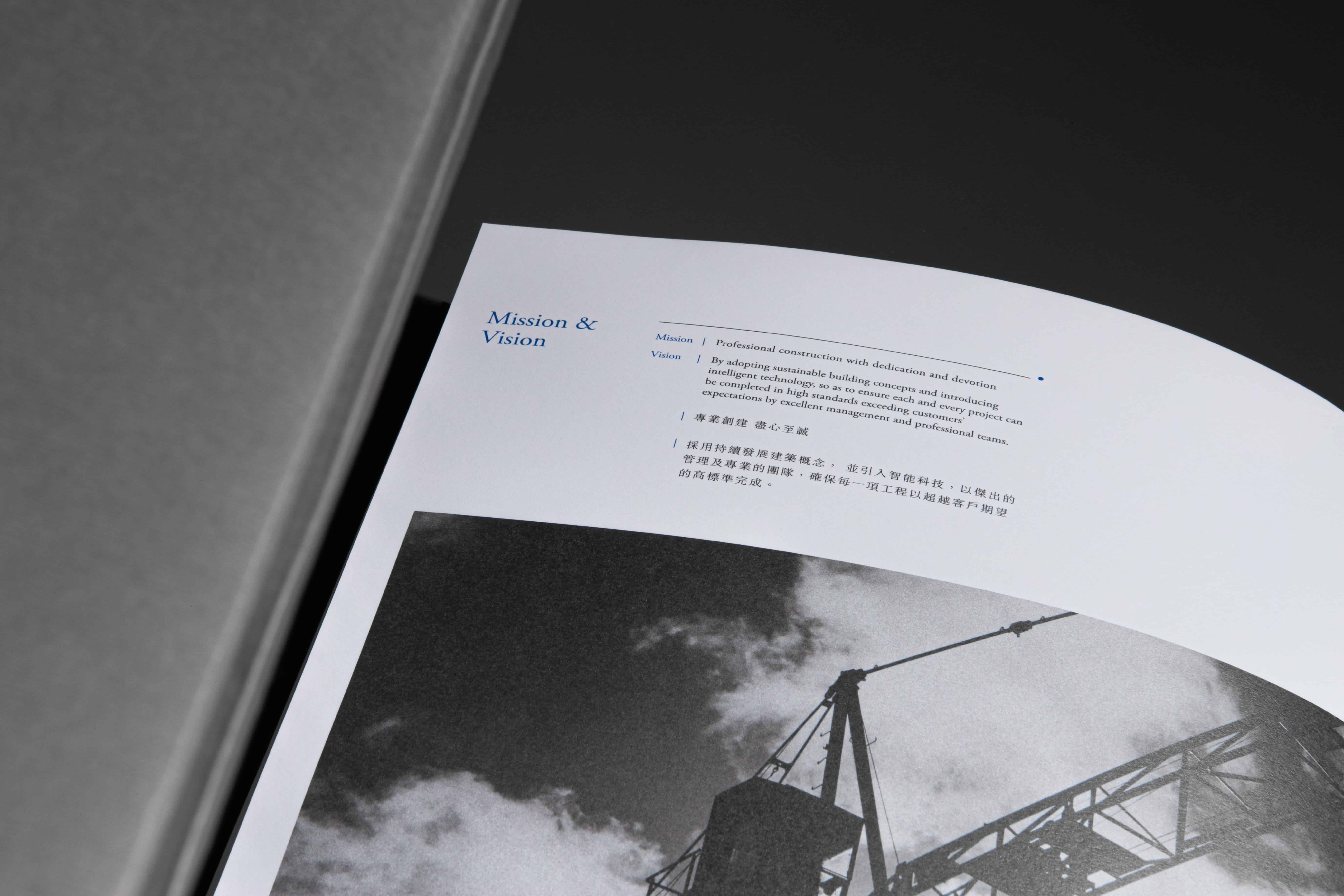
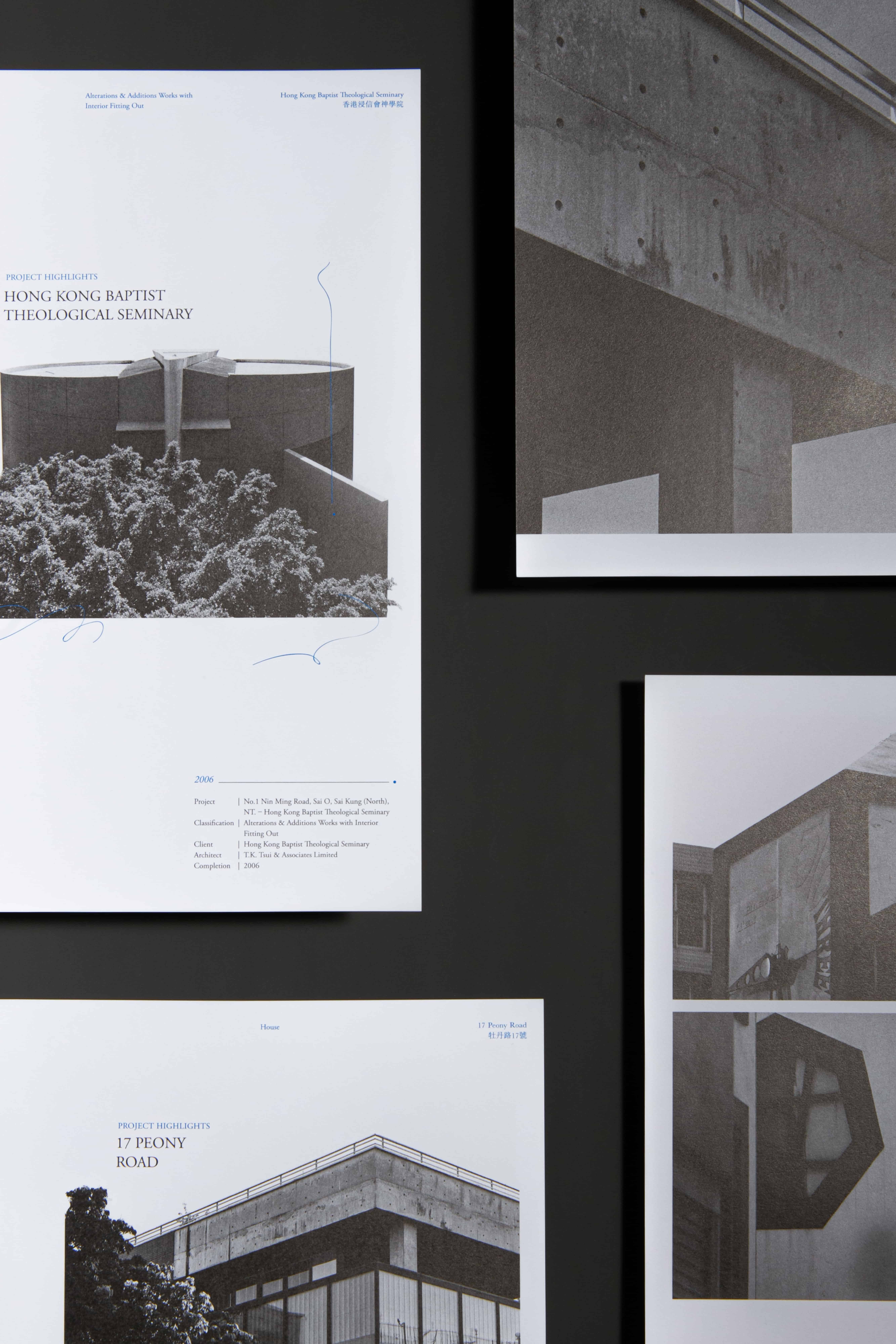
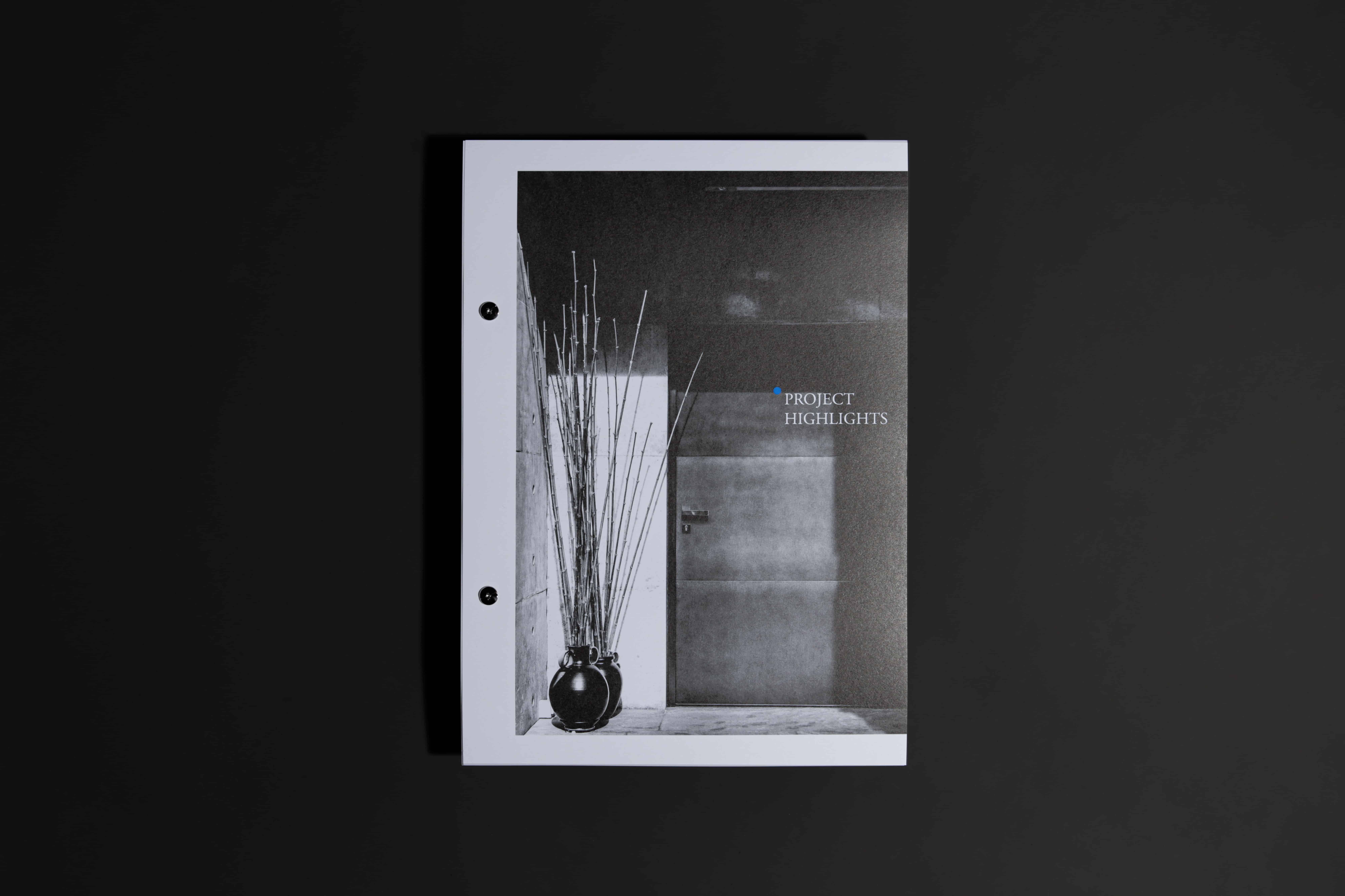
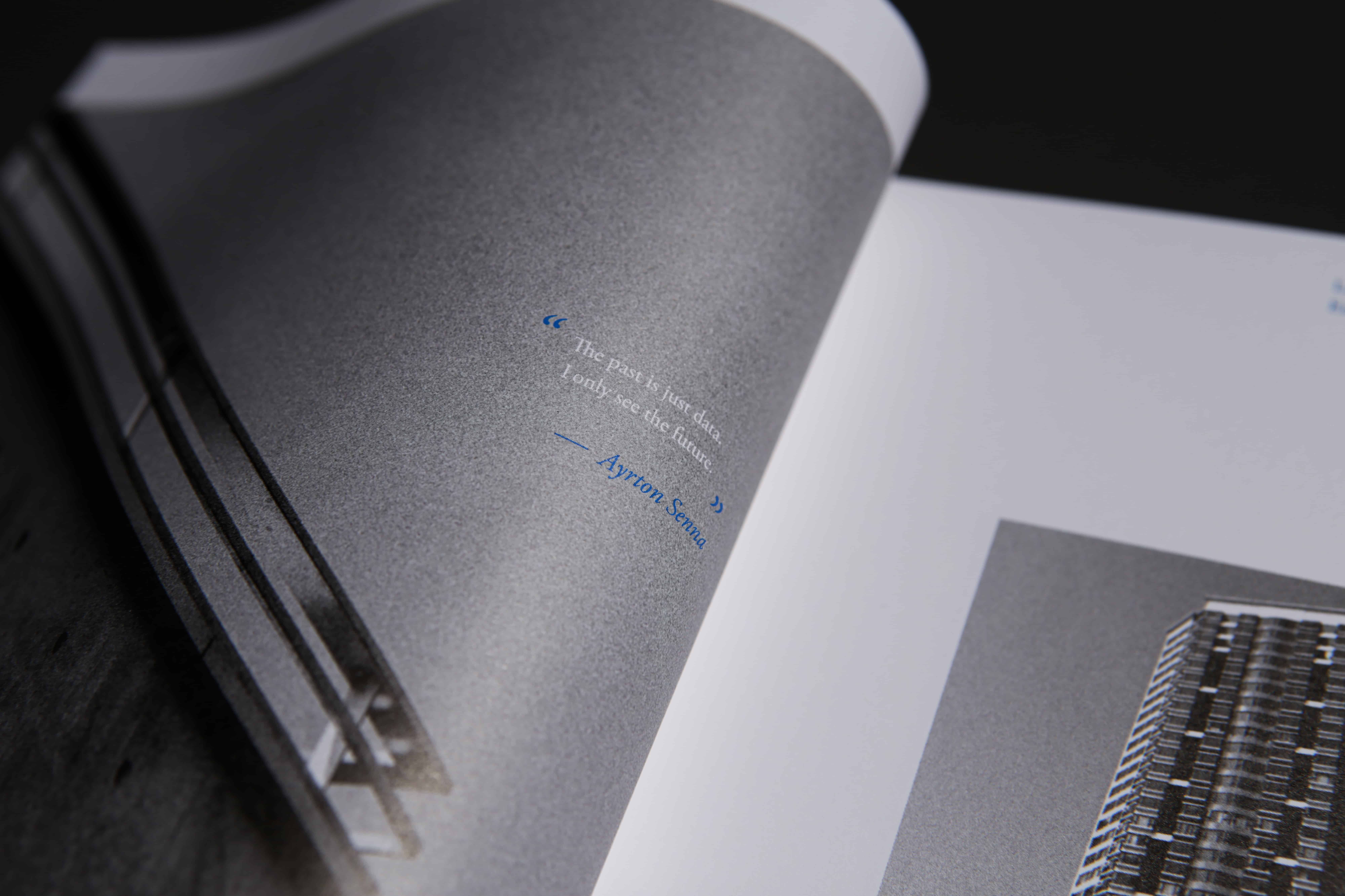
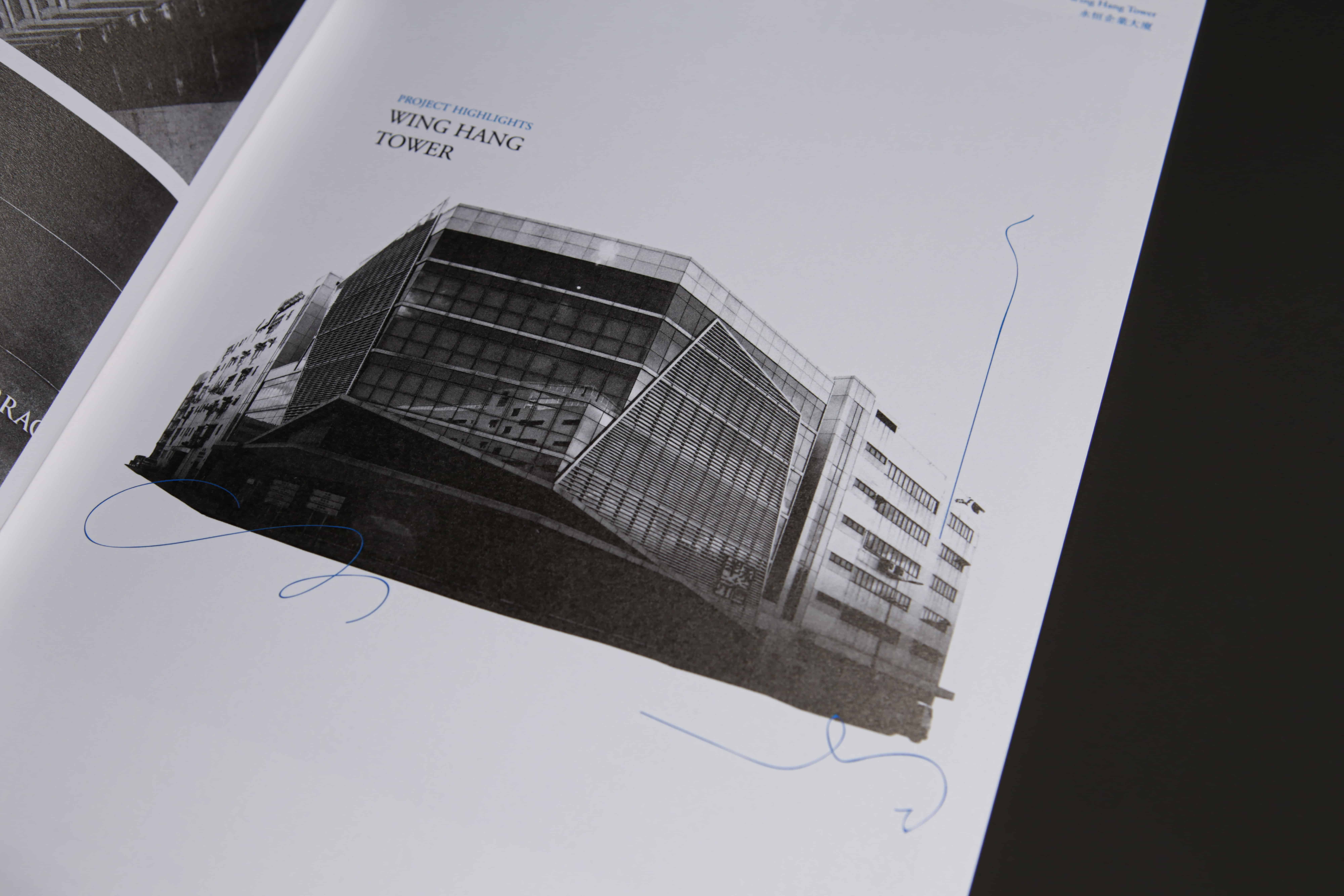
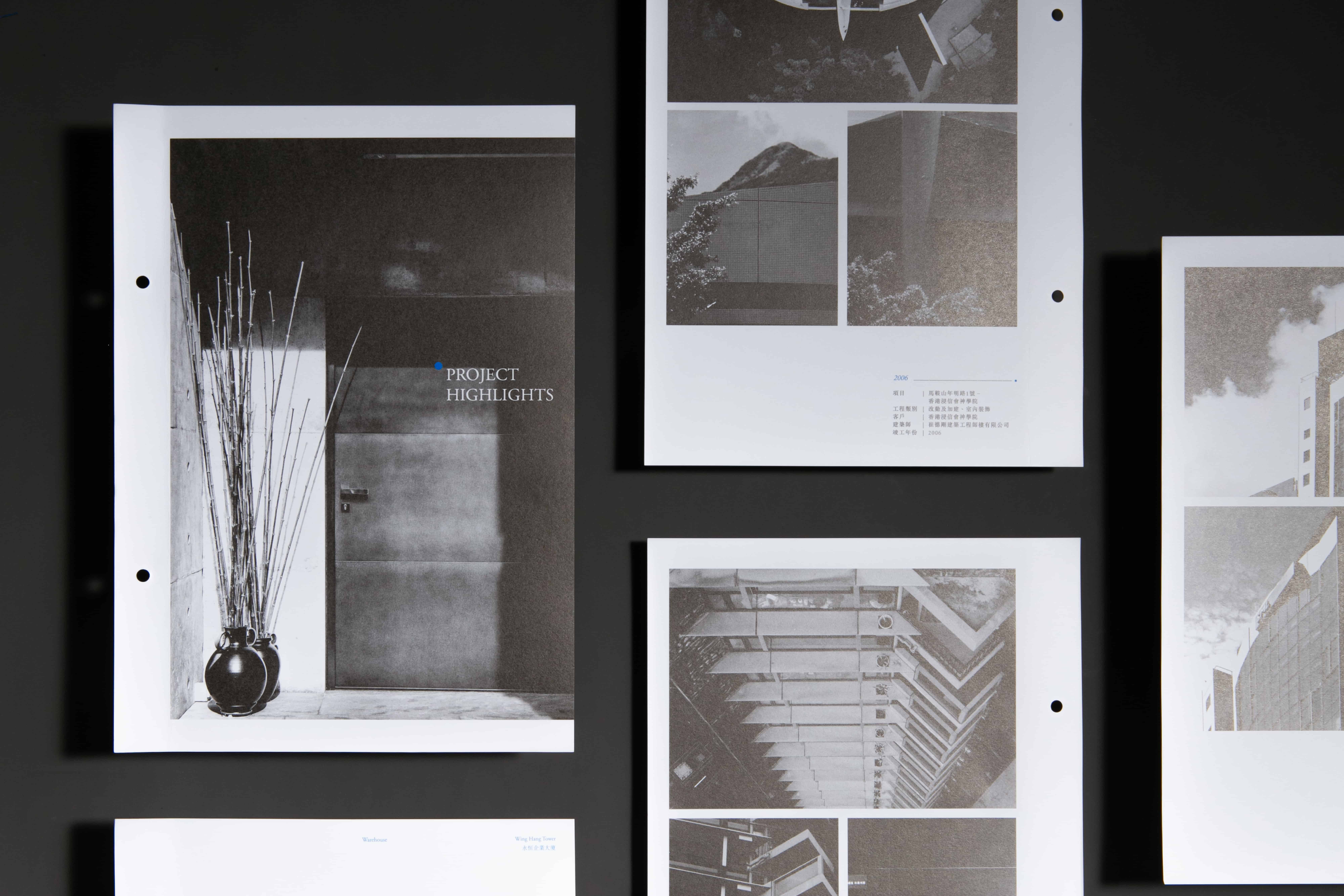
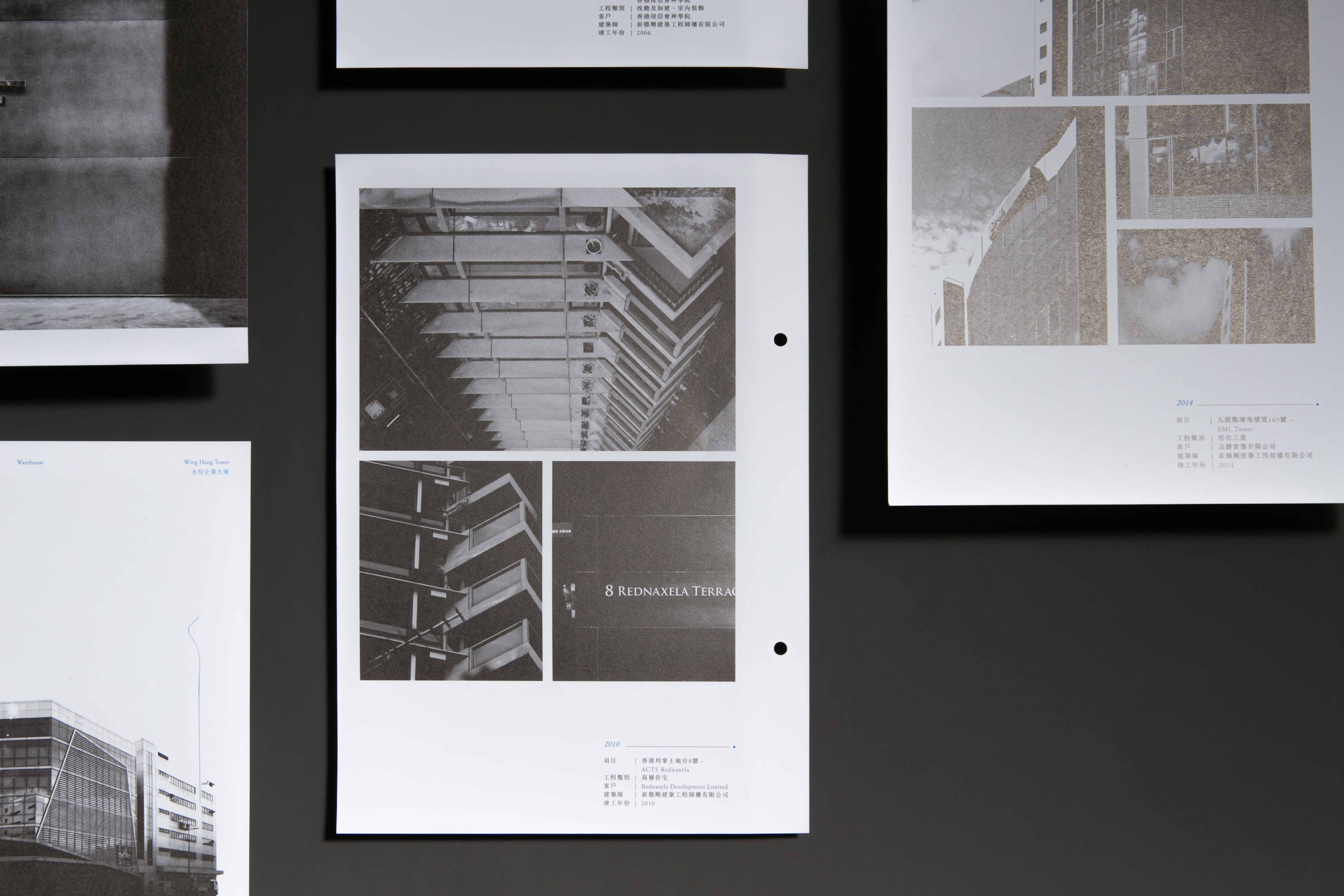
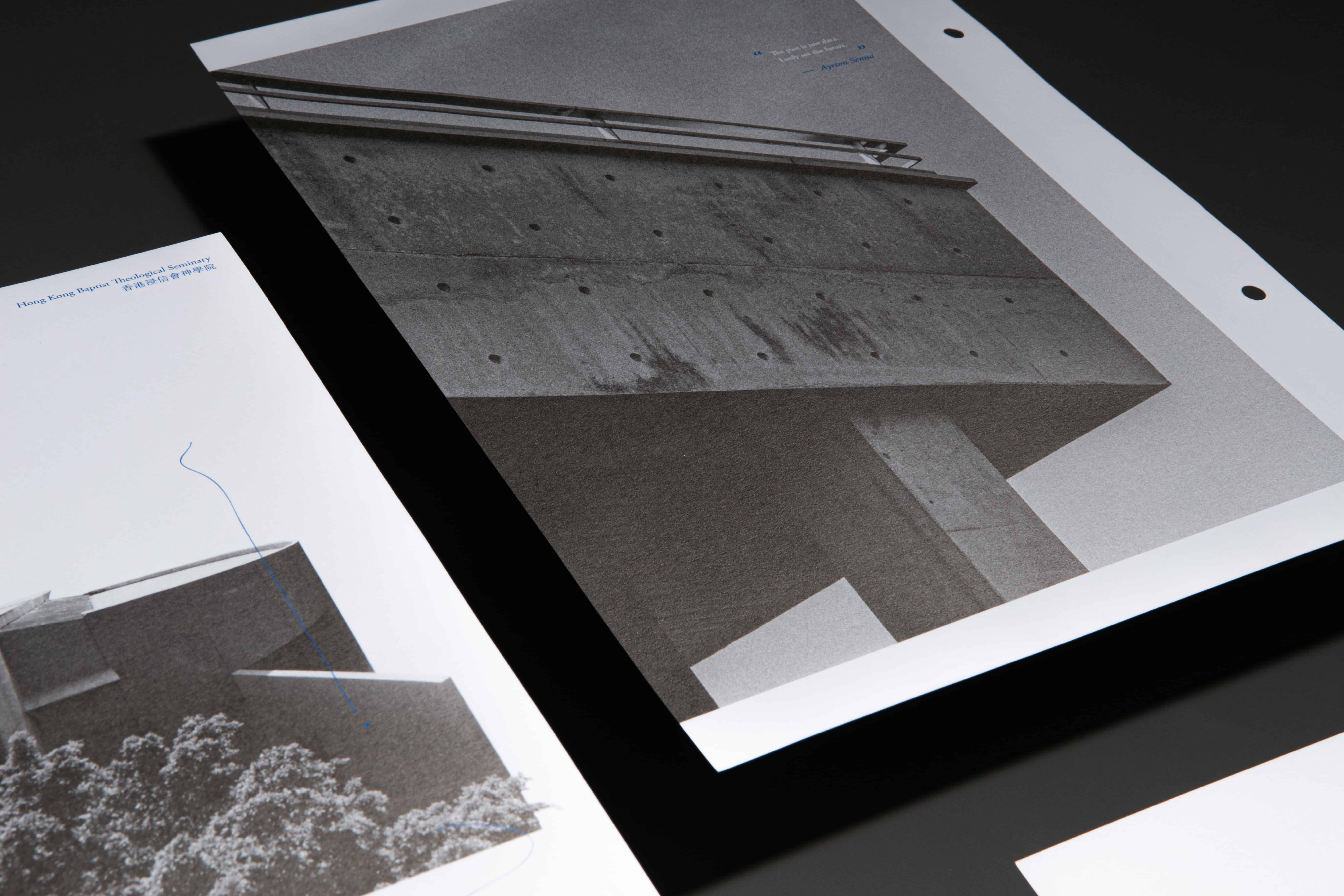
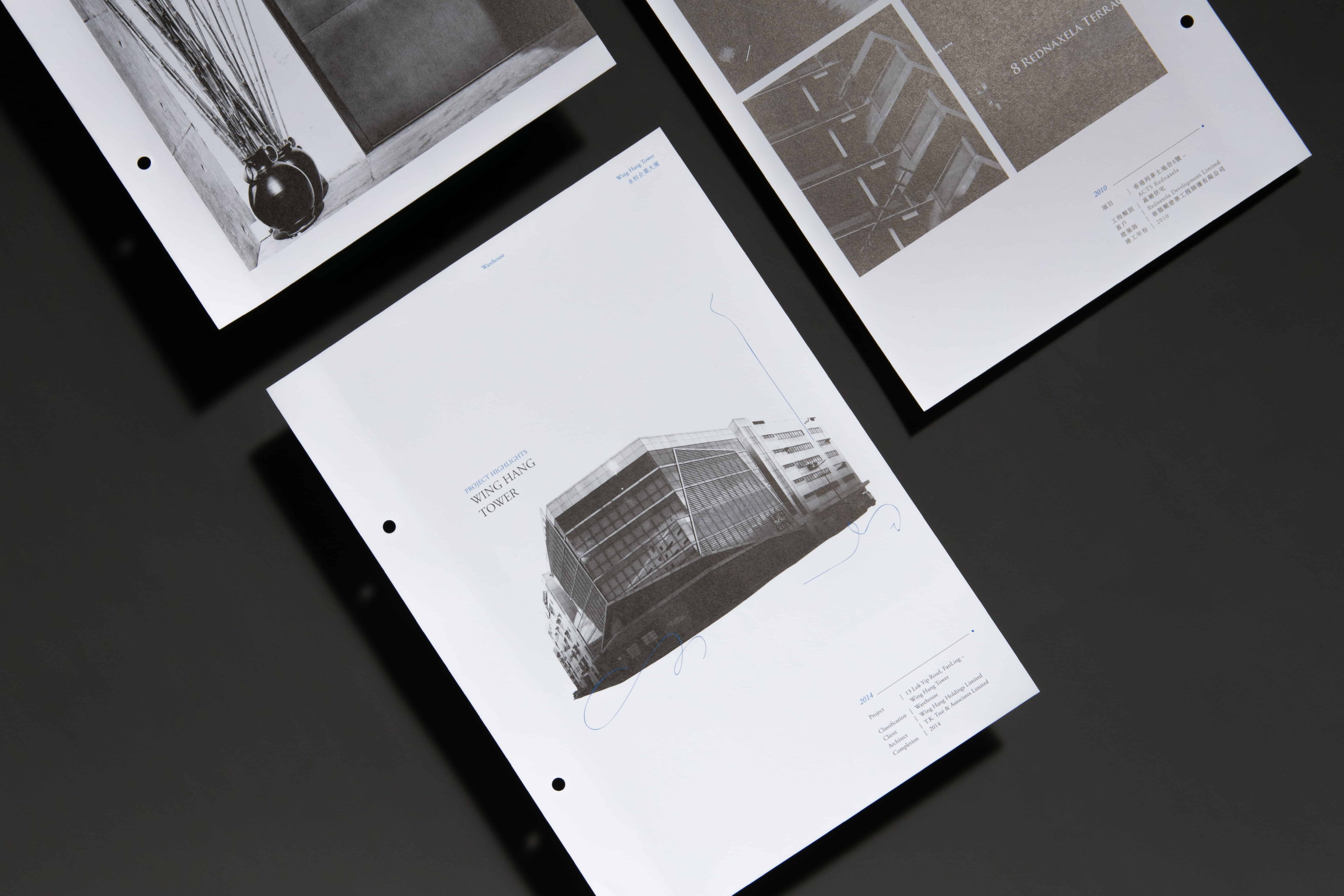
Sectioning the excerpts with photographs, the pagination design of the brochure immerses readers into the company’s story comfortably and enjoyably without feeling overwhelmed by cramming passages. While the passages unfold a concept, a story, a purpose, the monochrome photographs complement and supplement the narration, passing on the story.
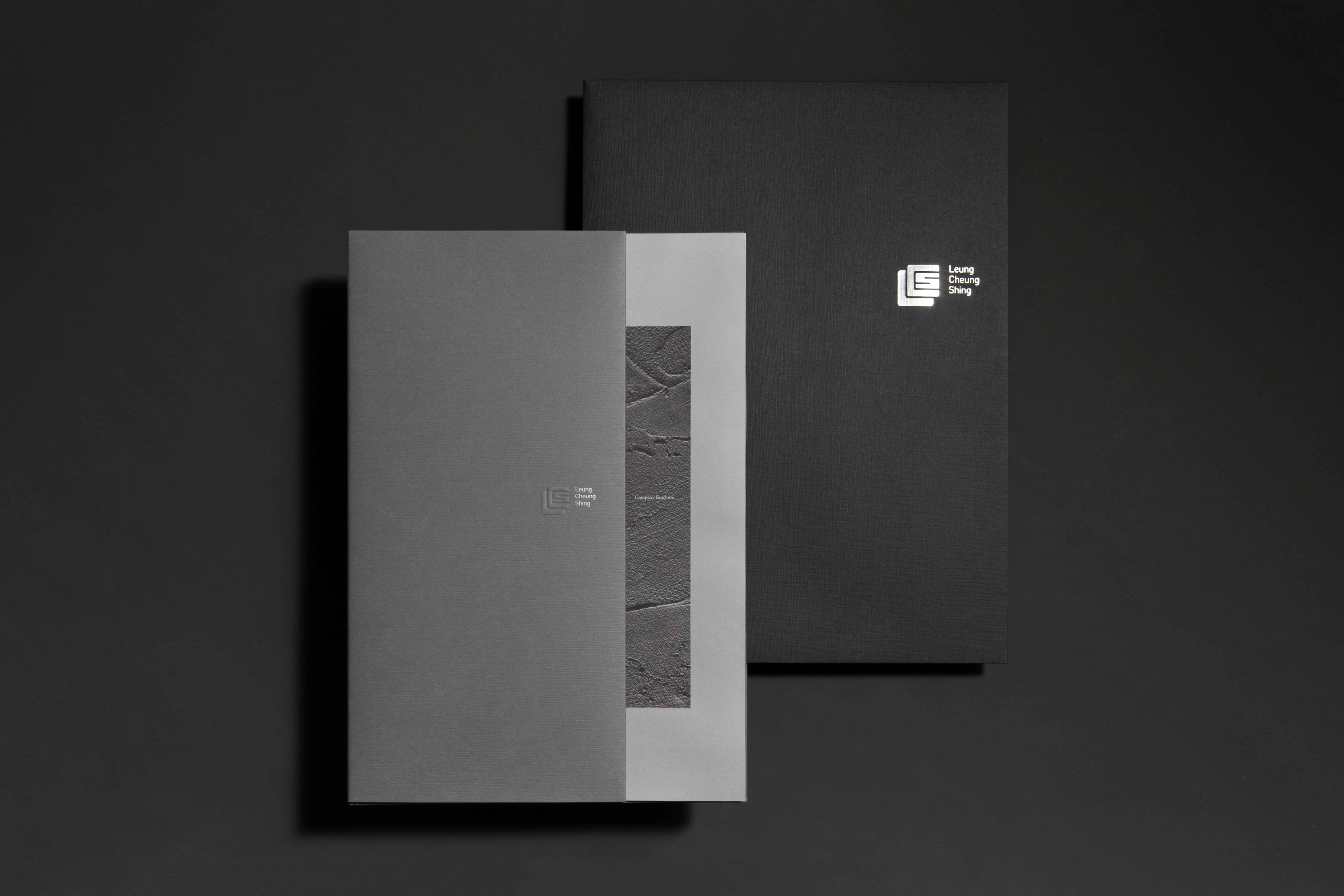
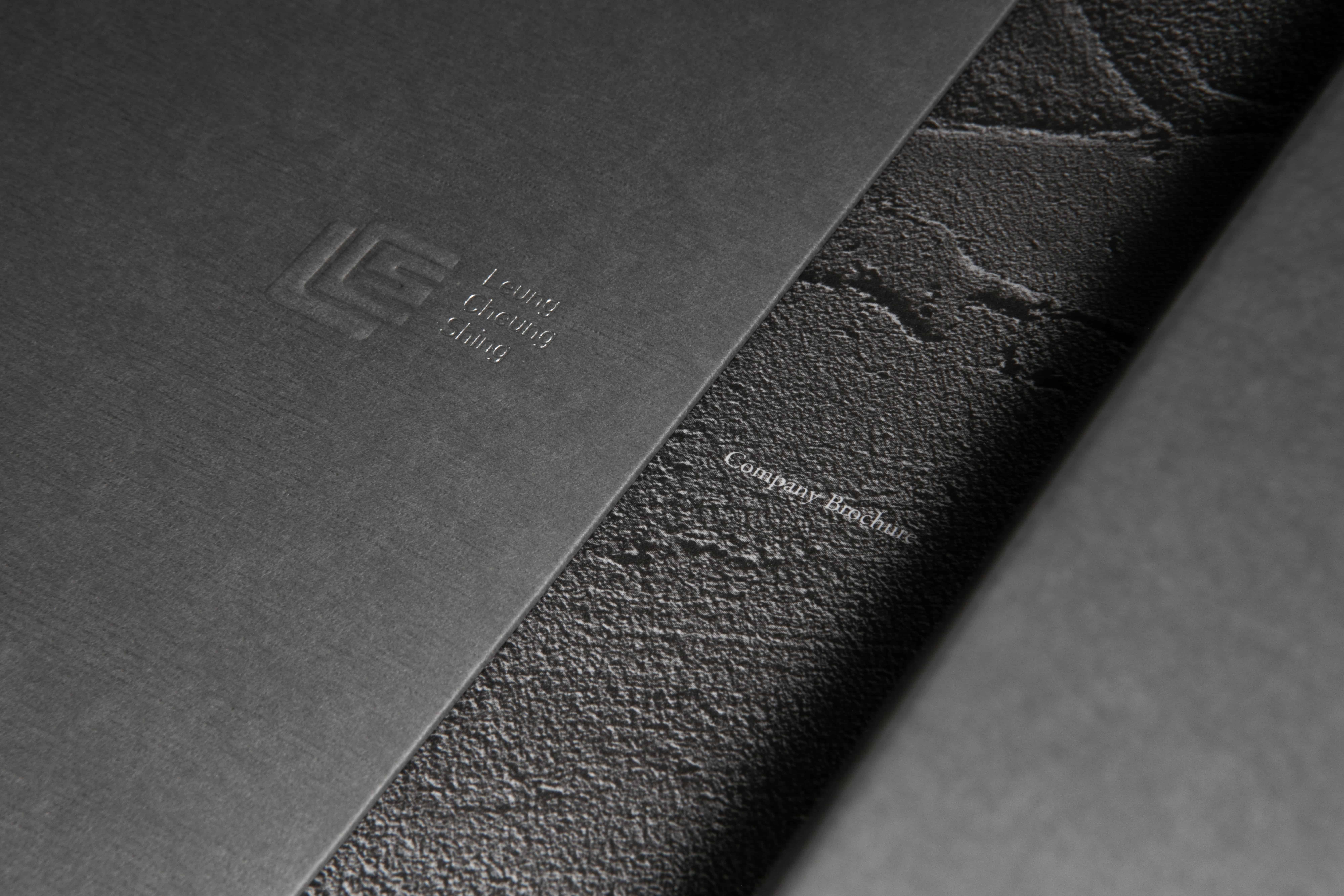
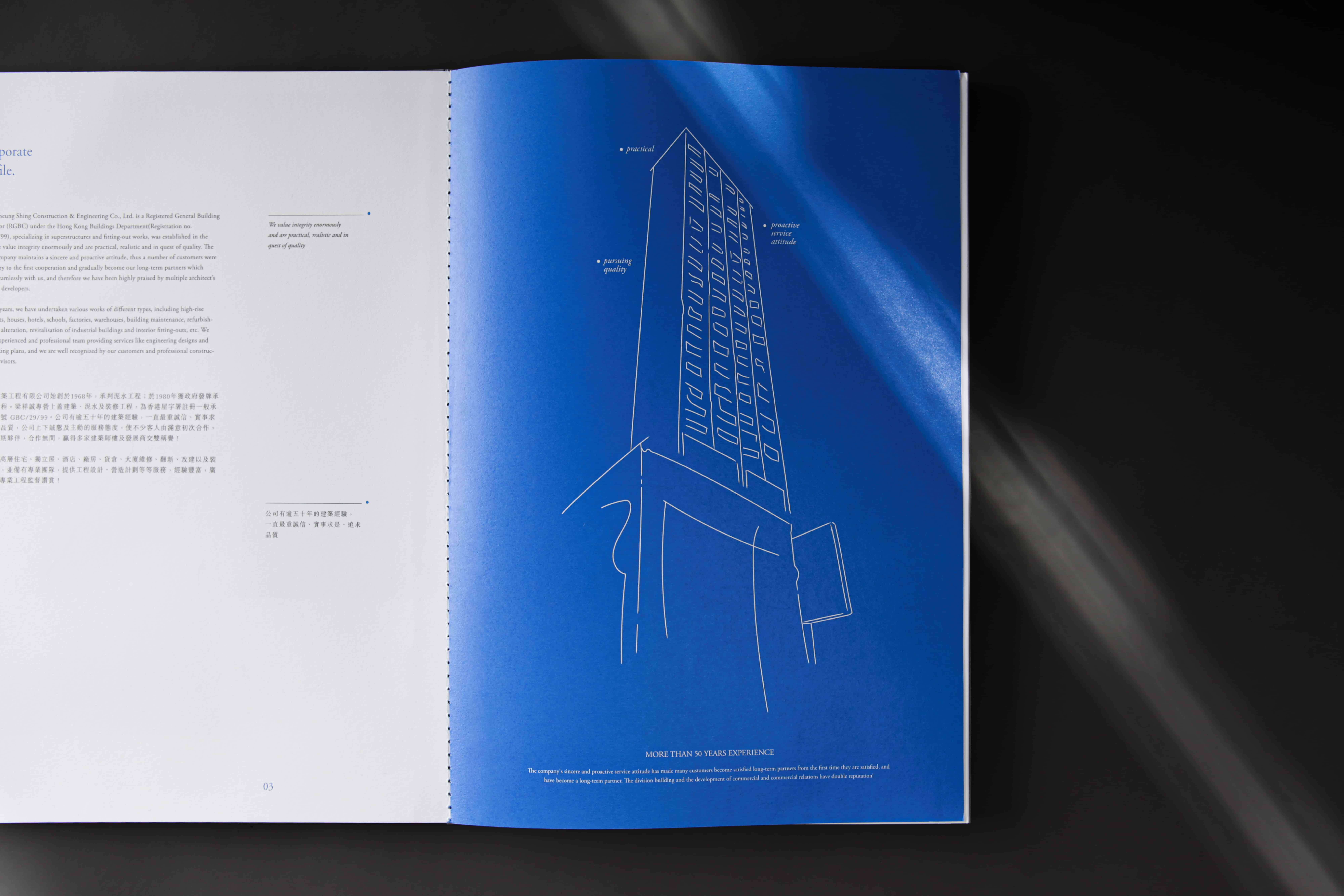
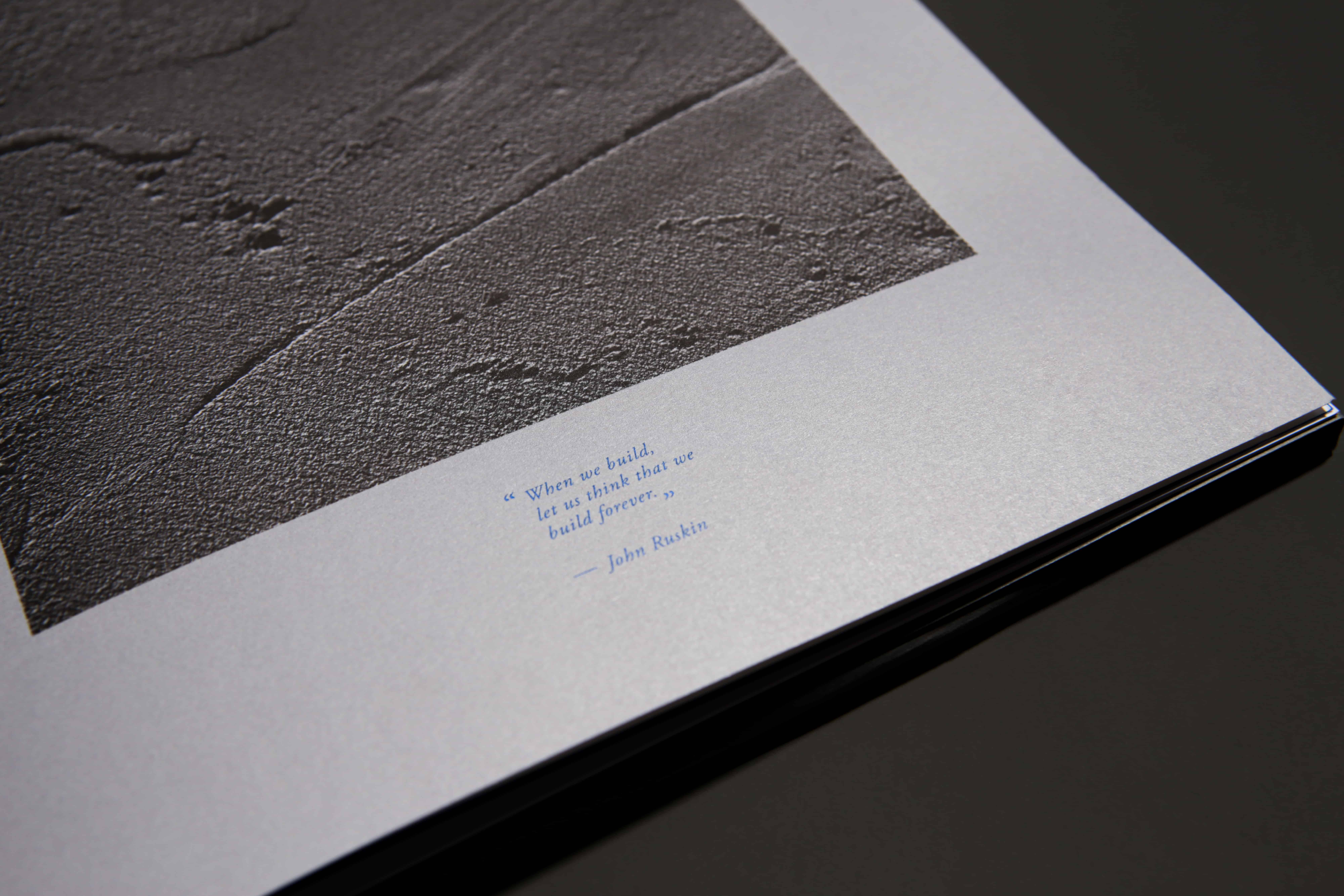
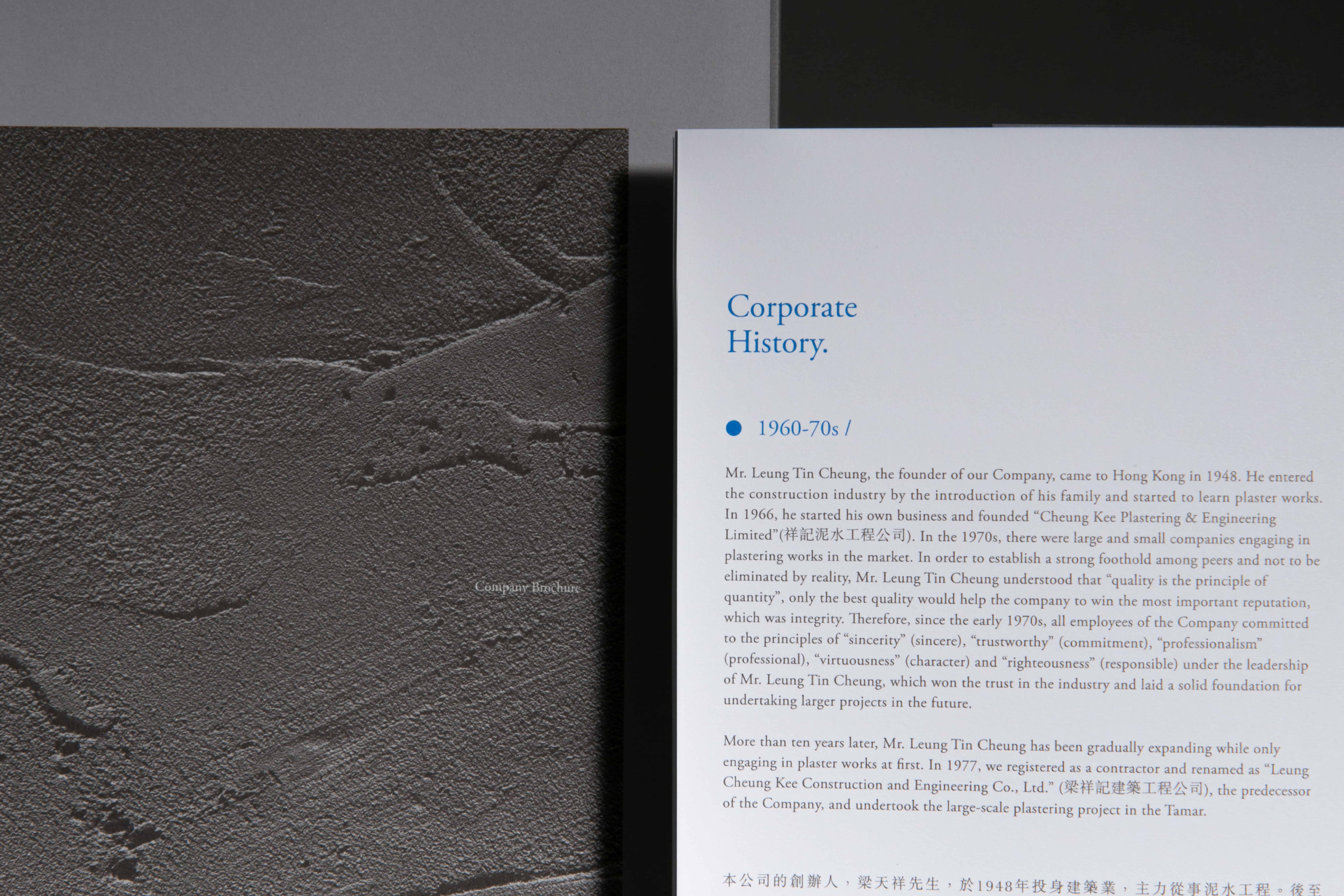
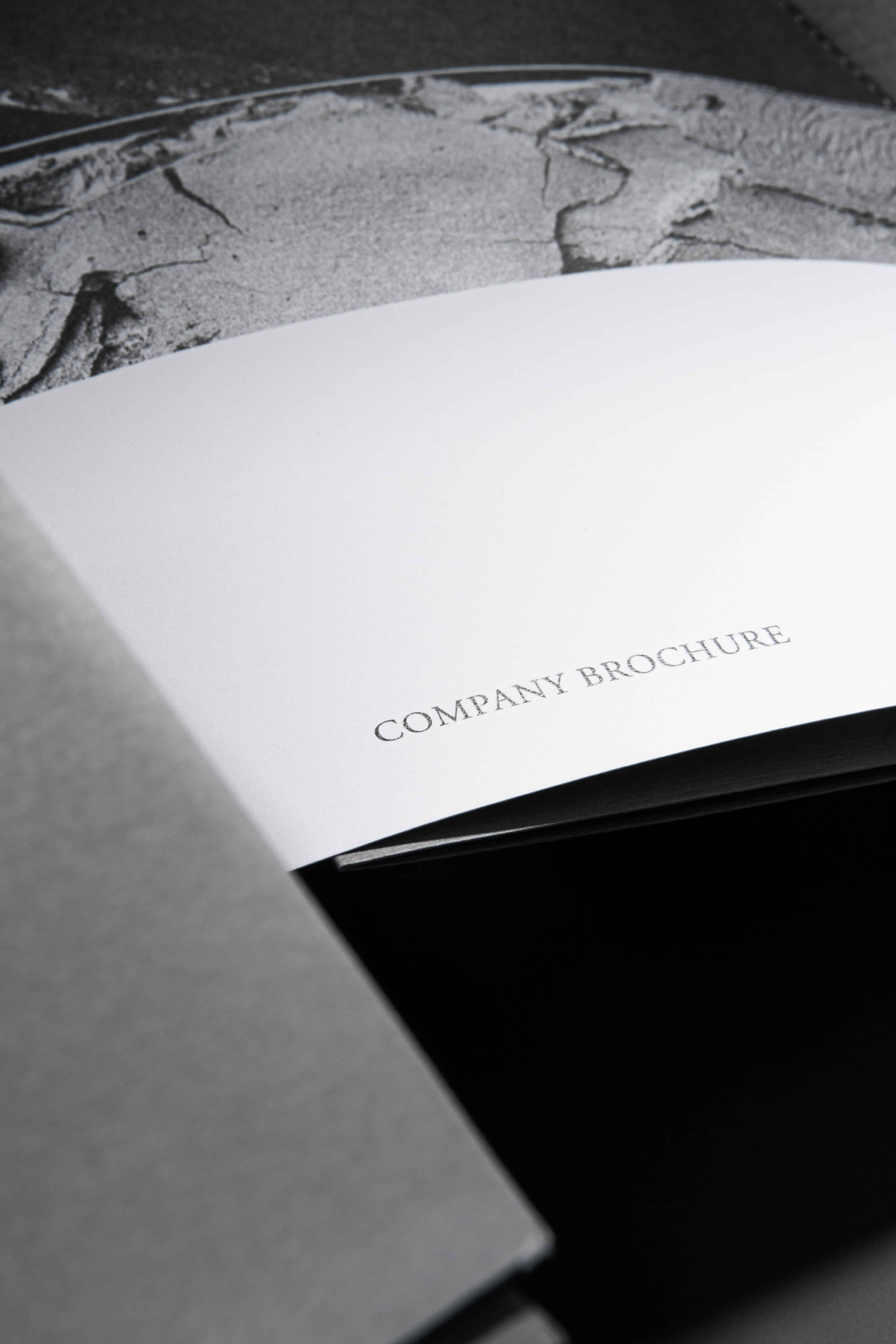
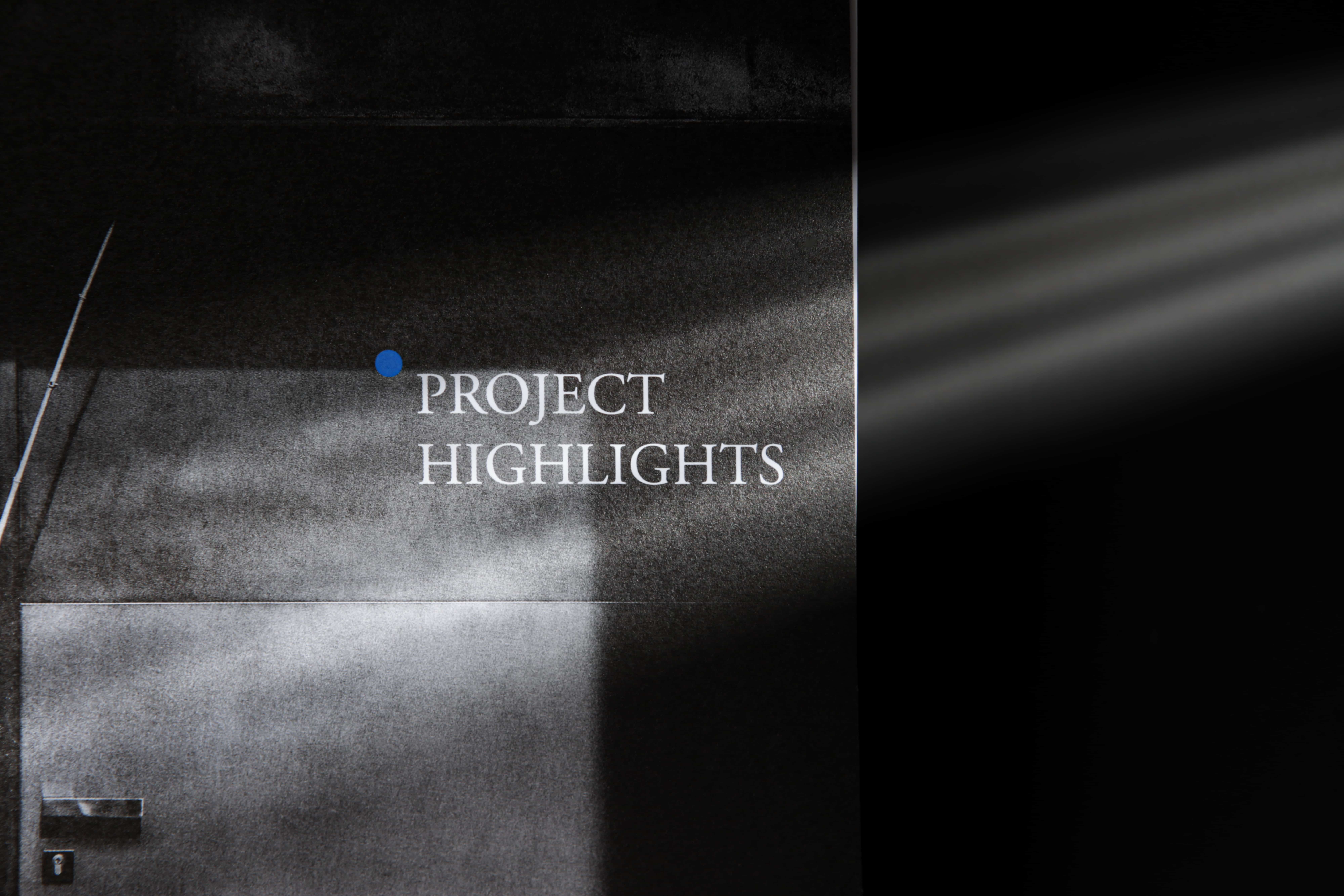
This explains why a textured cement wall took on the role to welcome readers in the beginning, as it represented the plastering work the company undertook when the business first developed, symbolising the memory lane readers about to walk down when reading through the birth of the company. Another noteworthy illustration in the brochure is the hand-rendered sketch of a skyscraper. It recalled to the reader’s mind that the business has grown from the basics and strived its way to achieve the reputation and height they possess today. To readers, these depictions envisaged and authenticated the company’s talented craftsmanship, strengthening the reliable brand image of the company.
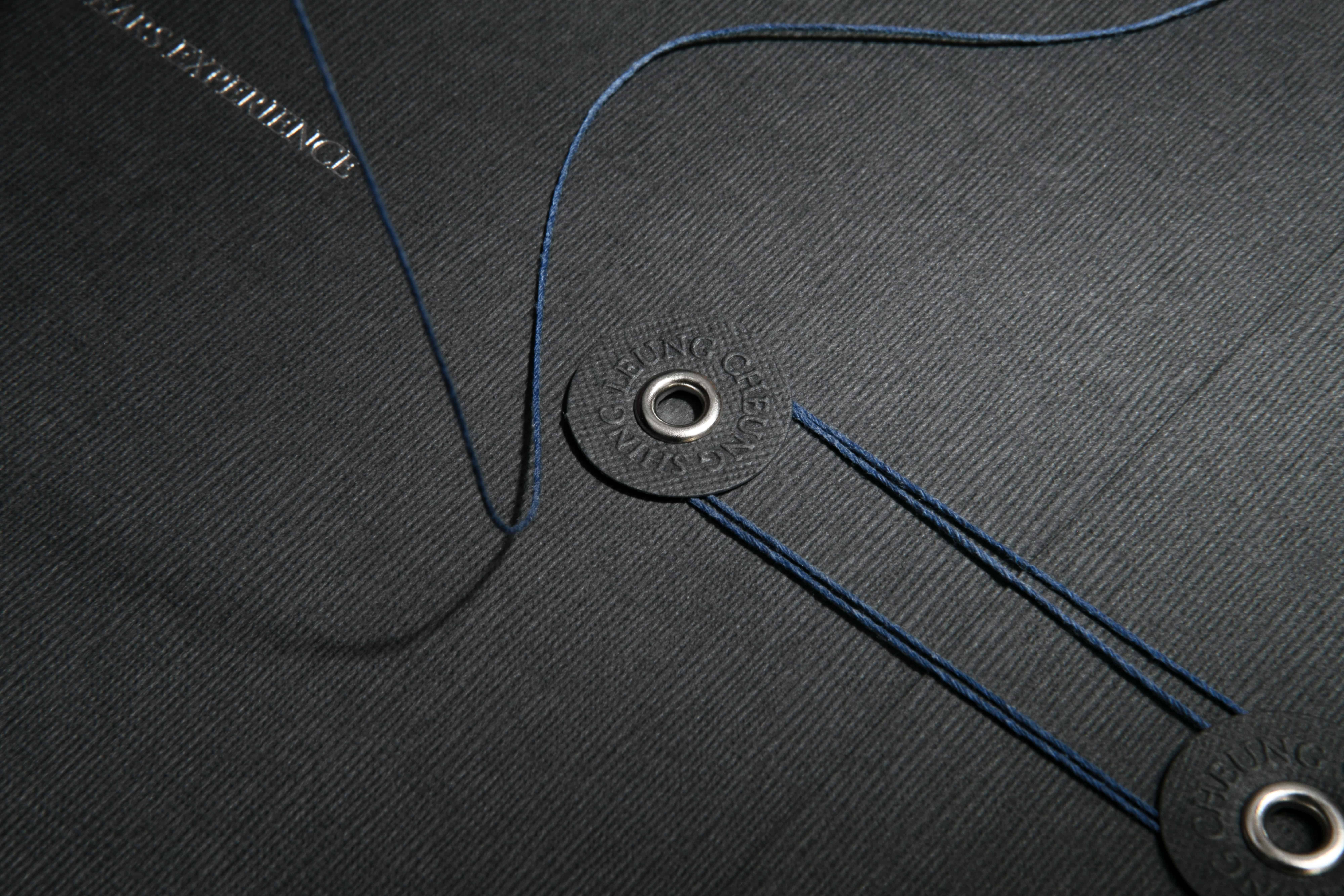
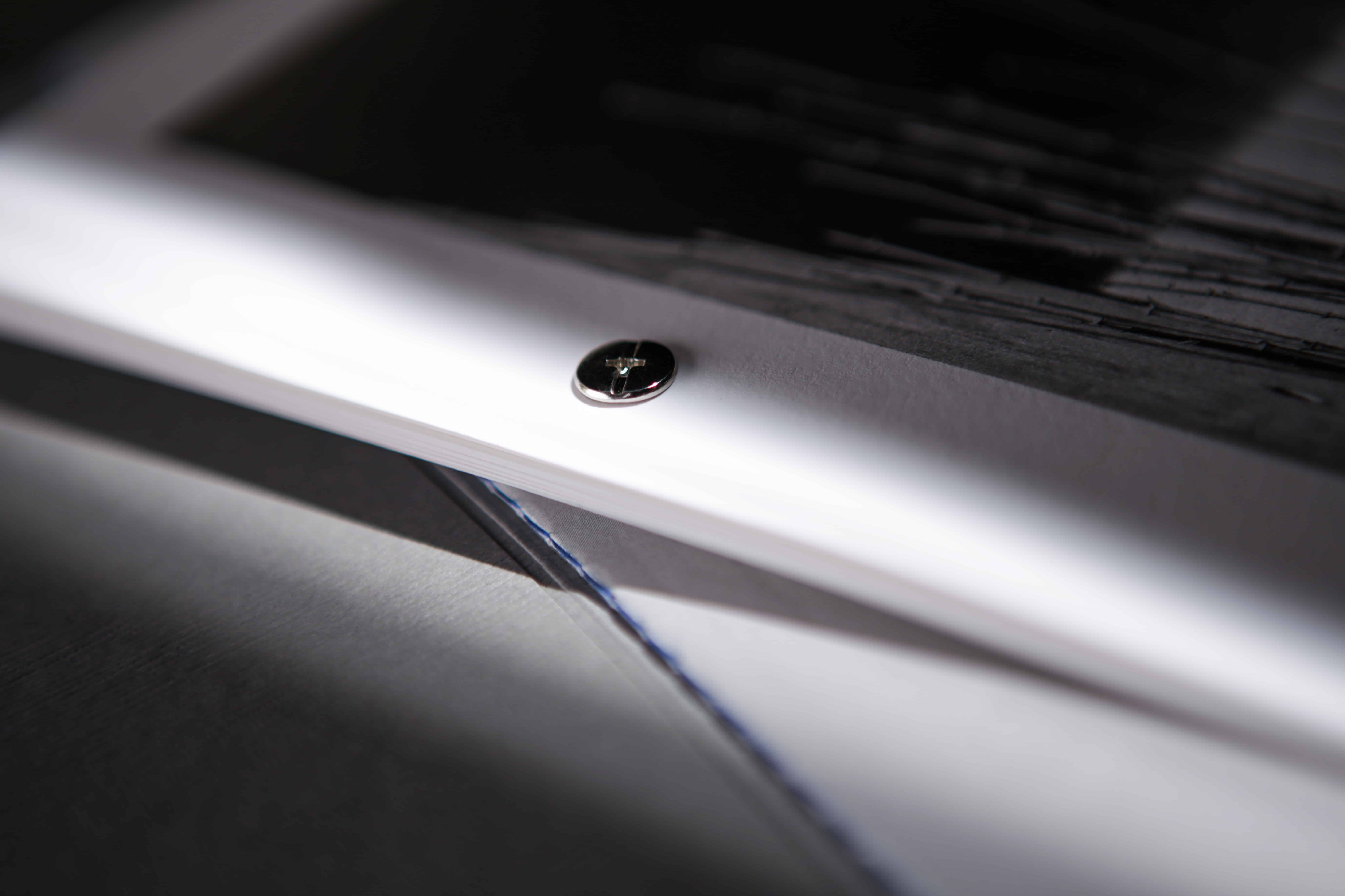
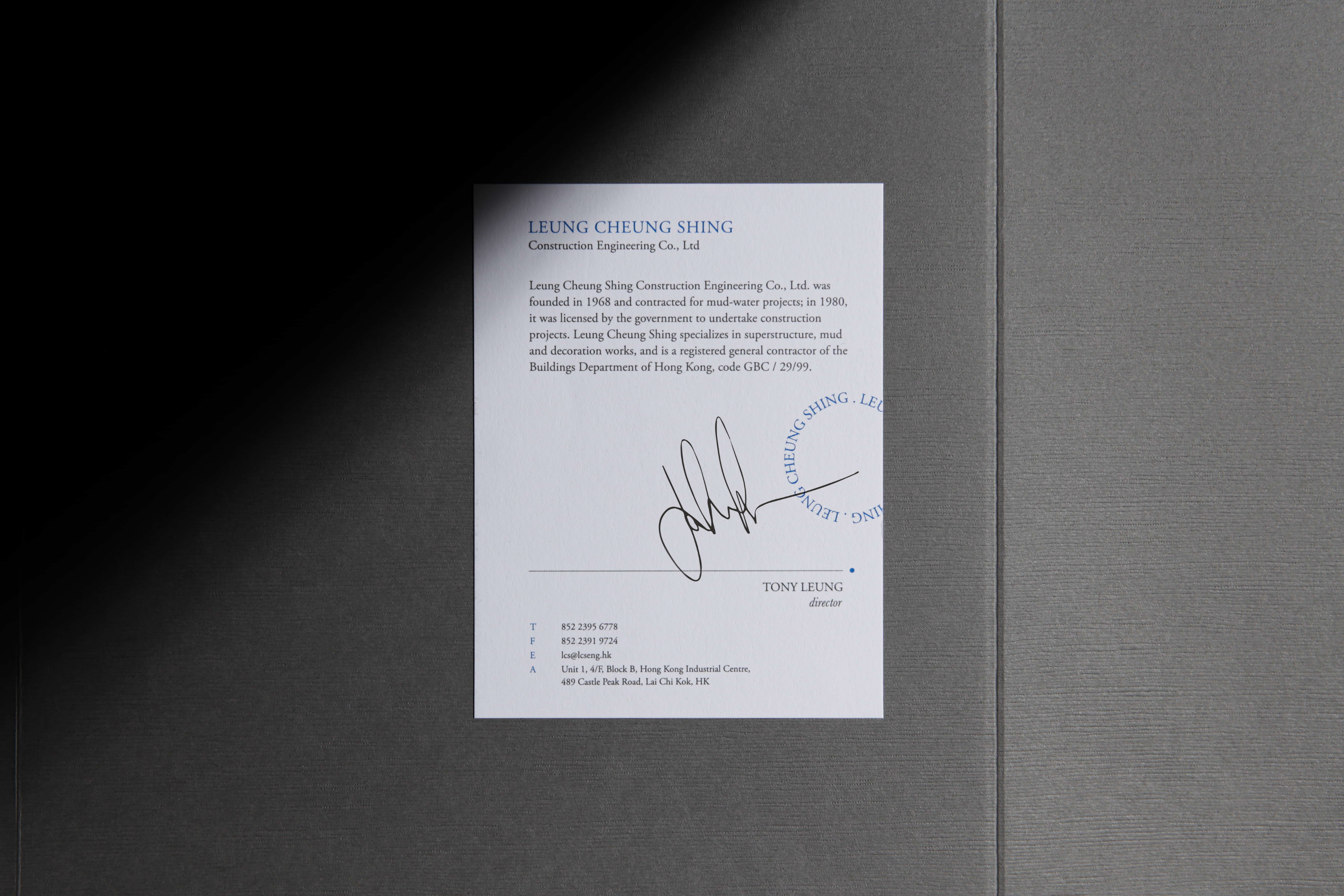
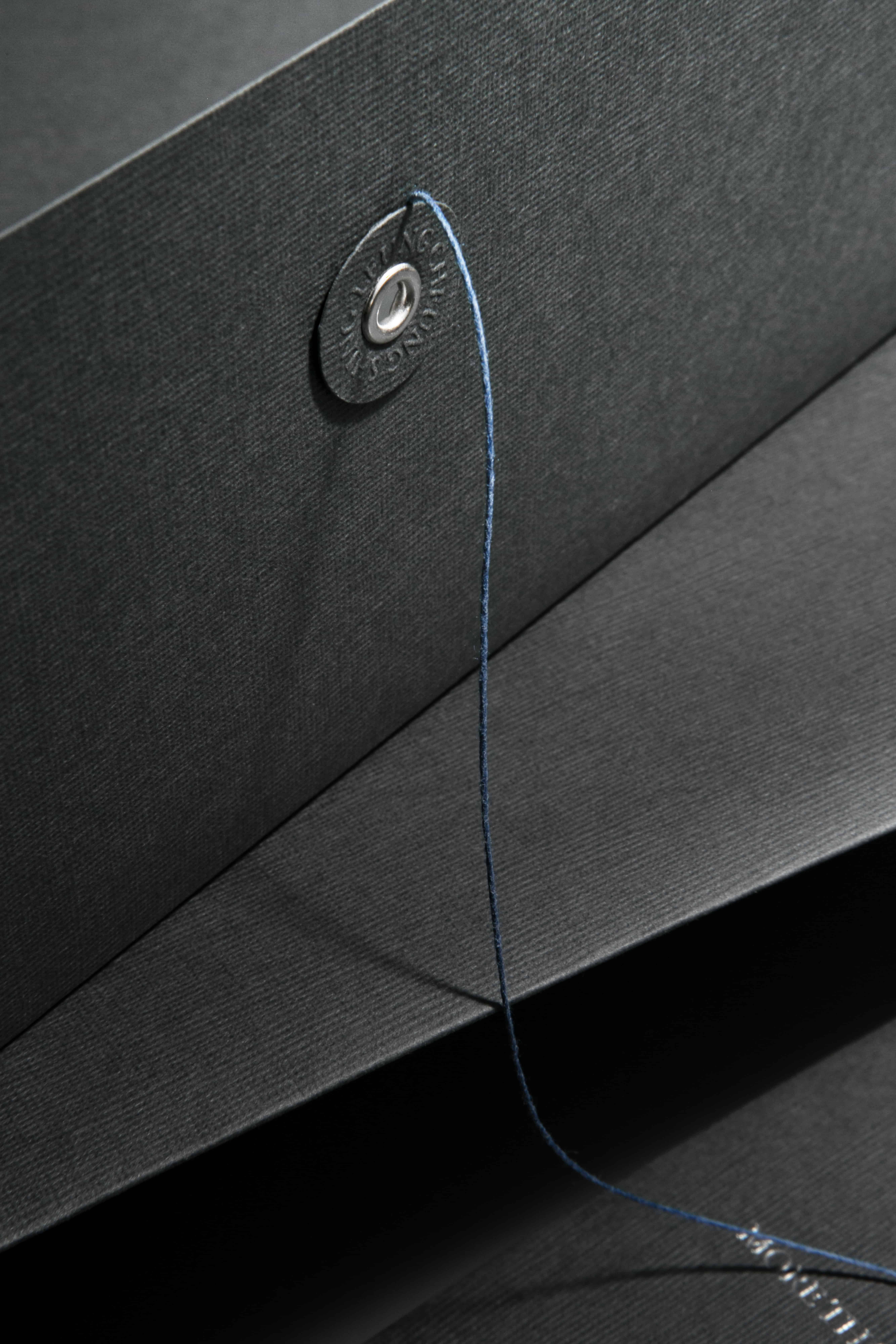
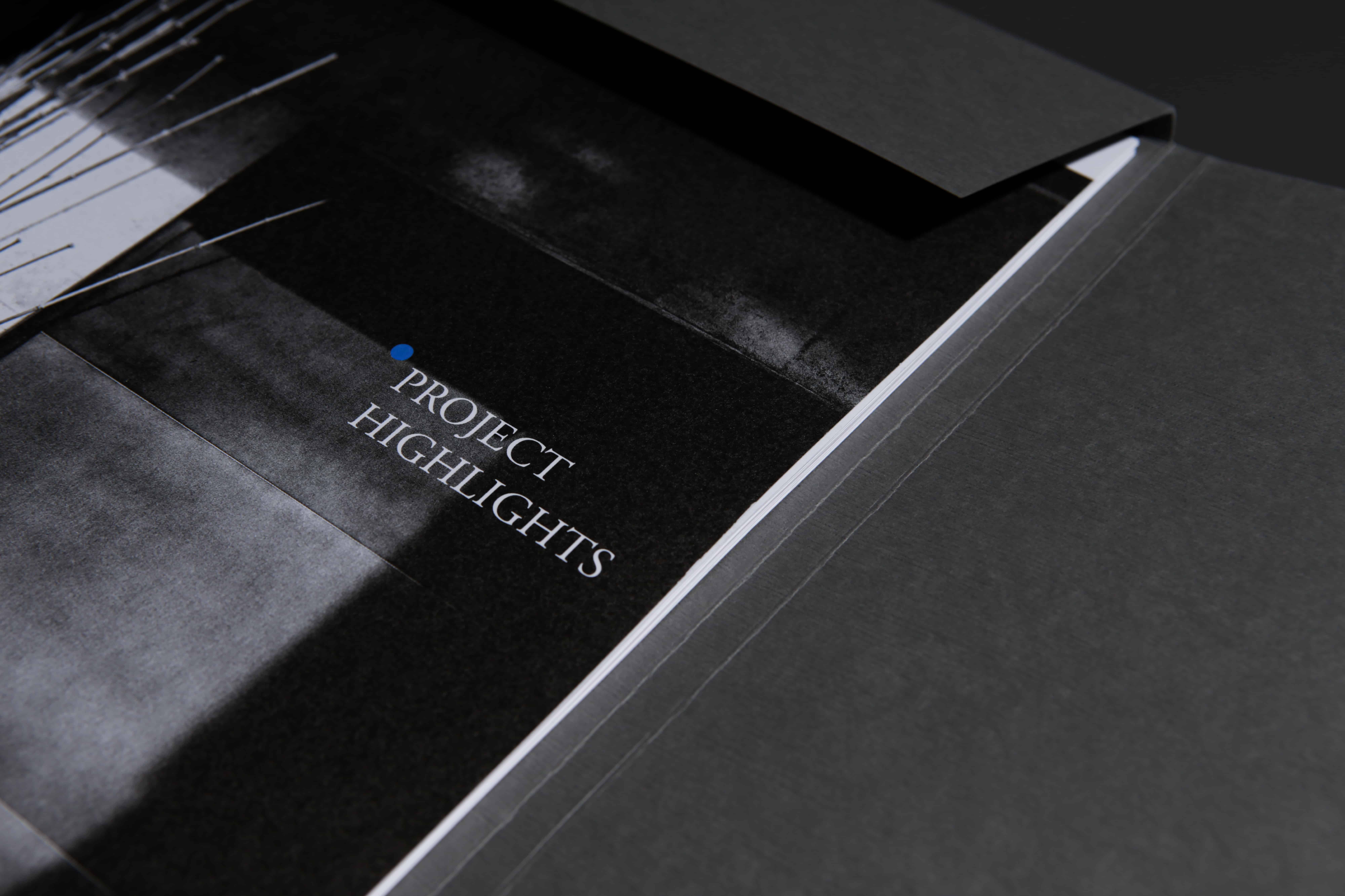
In the design of the brochure, the ink, paper, and method of binding were all finely chosen to reflect the company’s diligent image and their pursuit of divine quality. The white-grained matt paper contrasted with the black and blue letters that were varnished with gloss to emphasise and highlight the messages while also accentuating the elegance and competence of the company. Along with the ancient singer sewn binding, it resonates with the theme of remembrance and nostalgia, delivering to readers the authenticity and tenderness of the company.
WHAT WE DID
Brochure Design, Folder Design, Printing
Brochure design for Leung Cheung Shing
Client/Project: LCS
Creative Director: Vince Cheung
Design and illustration: Koan Tse
Interior & Aerial Photography: Eddie Li @tinysotiny.co
Photography: Yin Ip @tinysotiny.co
商標 | 品牌設計 | 香港 | 香港設計 | 視覺形象 | 包裝 | 包裝設計 | 企業刊物設計
logo | branding | design | hong kong | hong kong designer | VI | visual identity | vincdesign | package | package design | brochure design
#brochure design hong kong #design house hong kong