OPAK – The Ultimate Hair Growth Solution | Branding and Packaging
THE ULTIMATE HAIR GROWTH SOLUTION
Background
Led by a team of specialists and researchers in Cambridge, OPAK is an innovative brand that integrates science with medicine in devising research-proven formulas to promote hair growth, providing users with more accessible, convenient, and trustworthy solutions.
To accentuate the brand’s robust knowledge and professionalism, VINCDESIGN coined ‘OPAK’ from the iconic British Oak that symbolises divine wisdom and from one of the major active ingredients used in products, Oligopeptide-41 (OP-41).
Design Solution
In addition to naming, VINCDESIGN took part in the logo design, branding, positioning, and product packaging for OPAK.
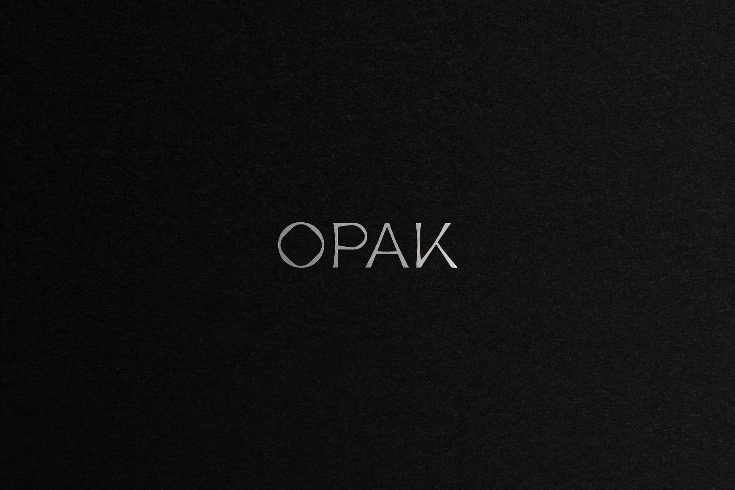
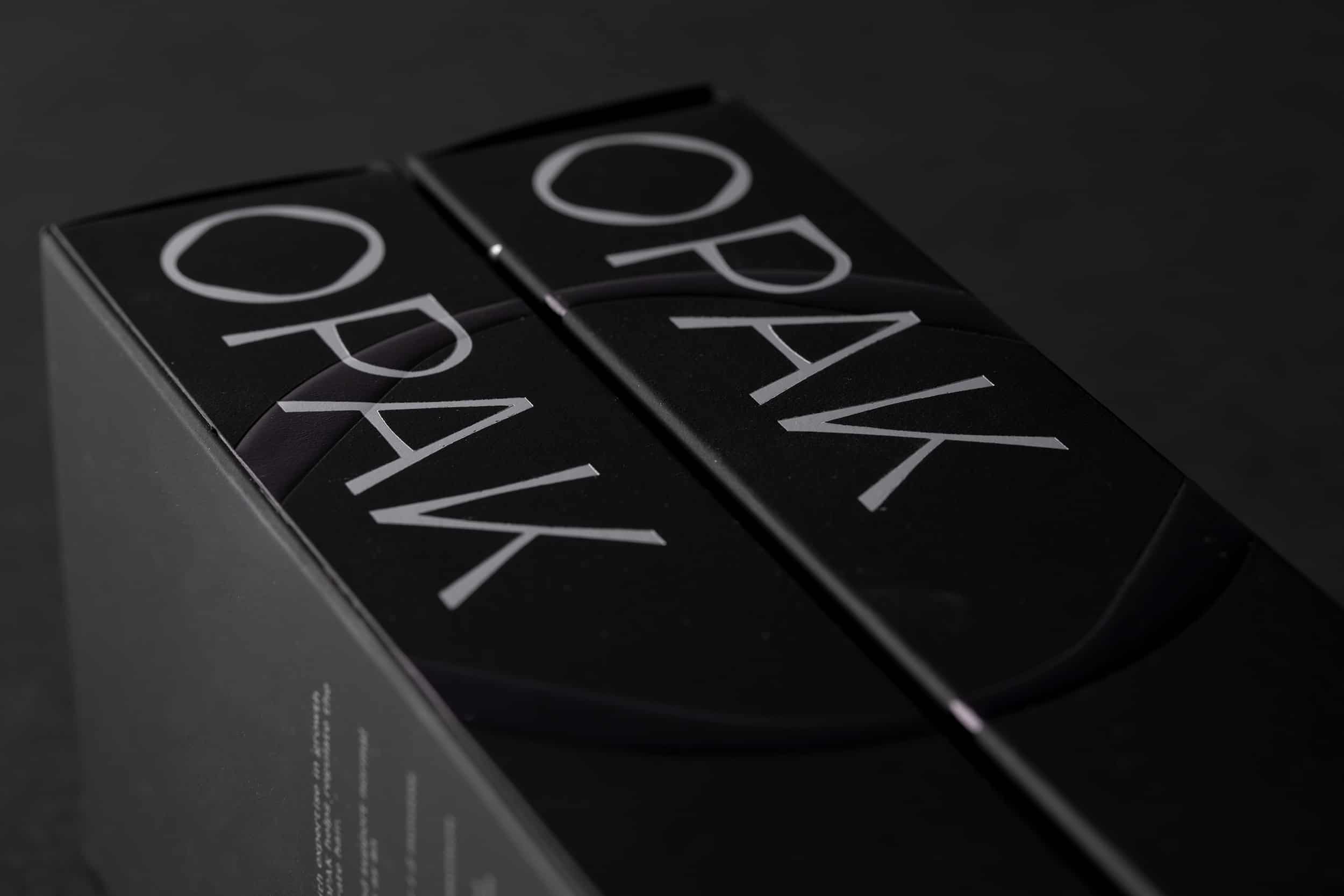
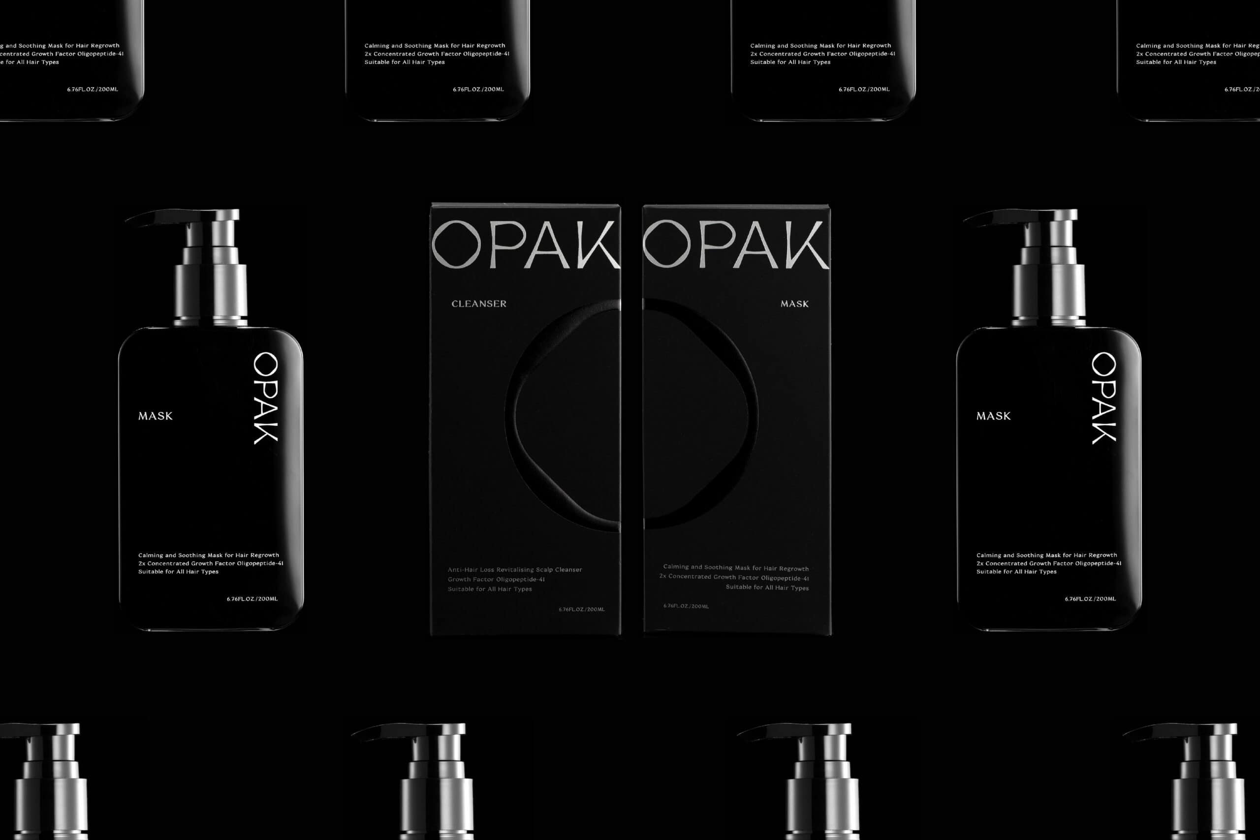
Concerning the typography of the logo, each twist and turn in the letters was designed with a unique stroke weight, honouring the logo with a more elegant and fashionable appearance. More so, this subtle design detail symbolised OPAK’s attention to details in their research and innovation.
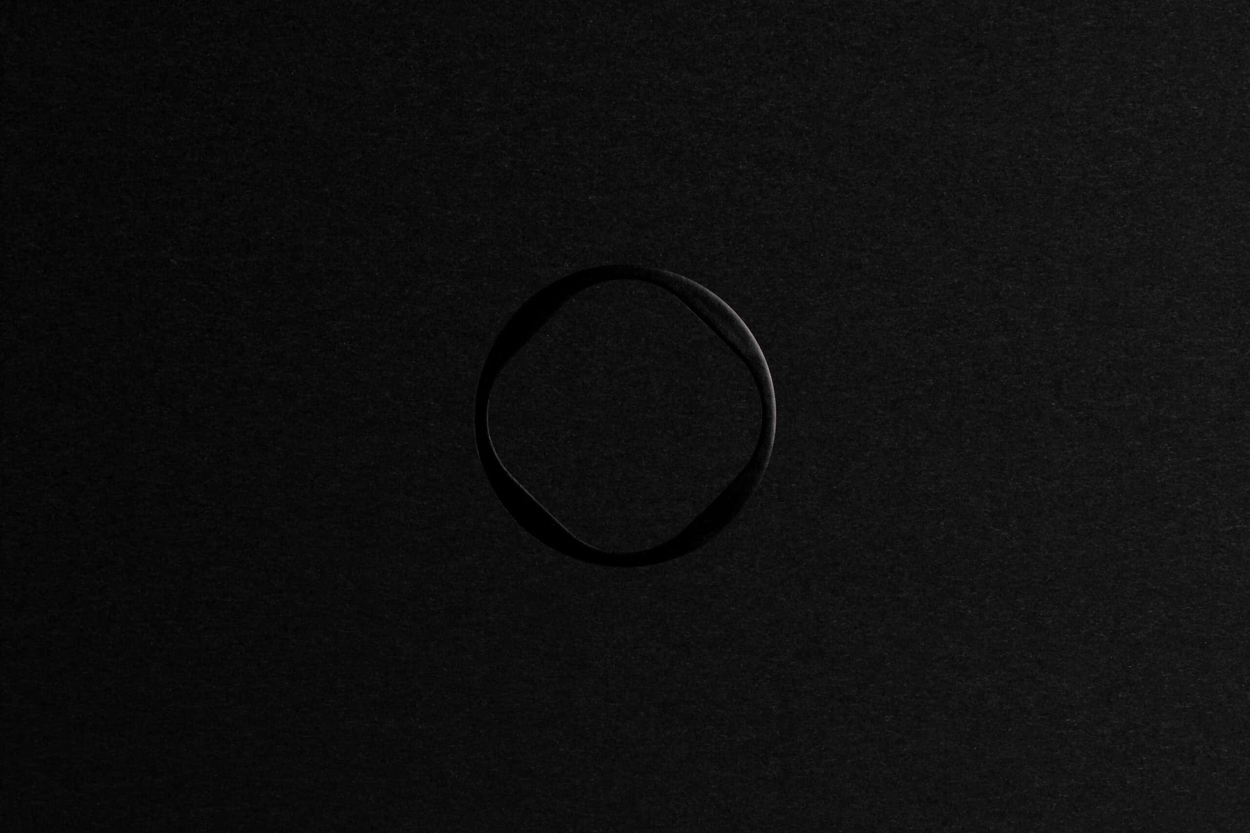
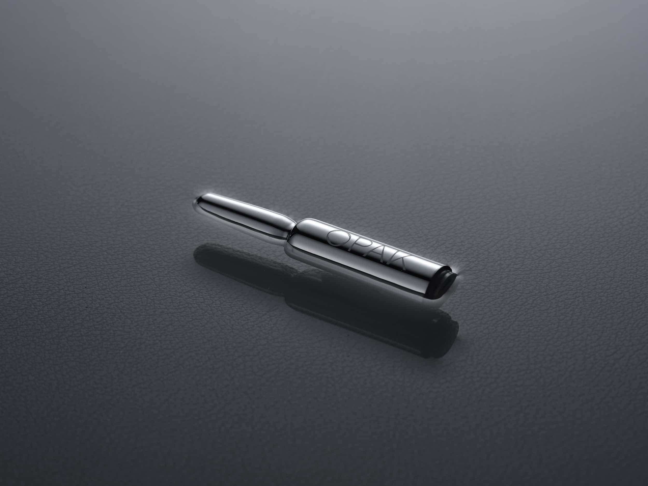
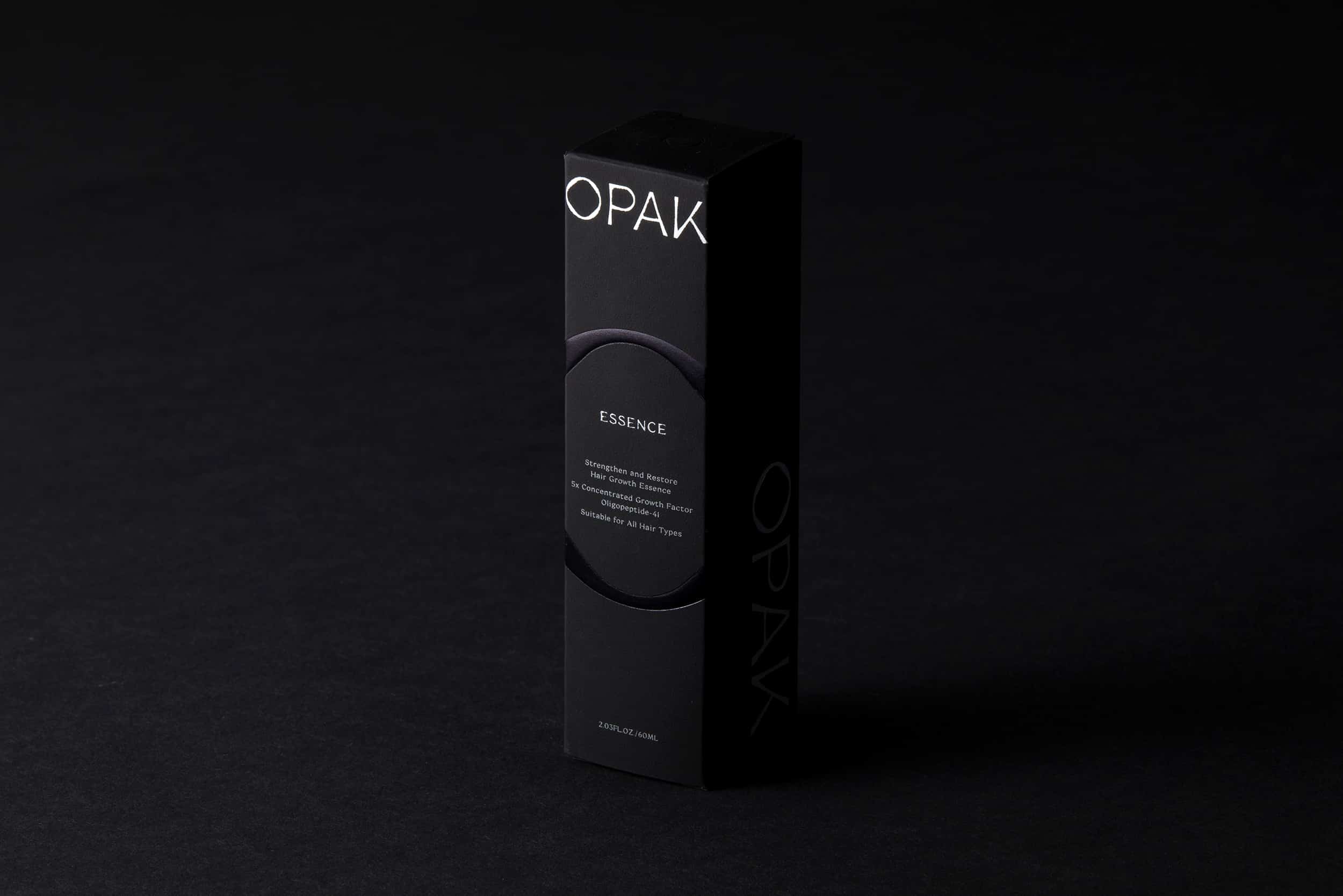
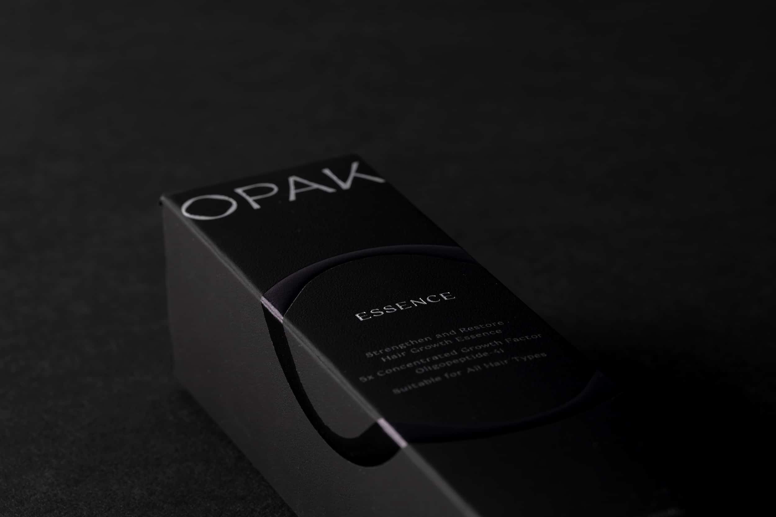
Specifically, the O in OPAK served multiple functions. O was chosen to be emphasised since it resembled the shape of oaknut, submitting to the idea that OPAK is also the fruit of the collective effort from the professional team. Also, the circularity of O not only provided a perception of concentration and unification, but also portrayed a tensed yet captivating aperture into the future unknown.
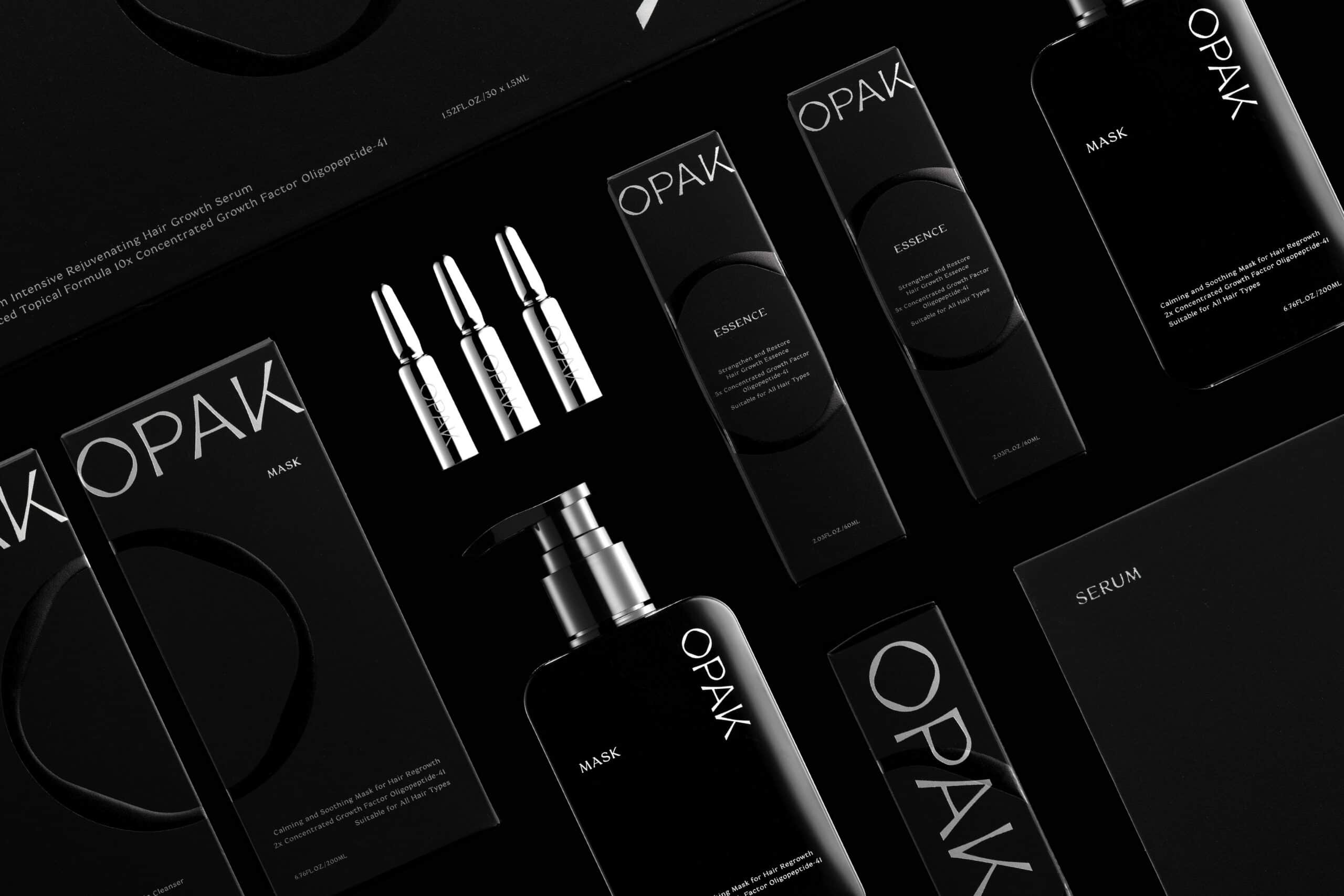
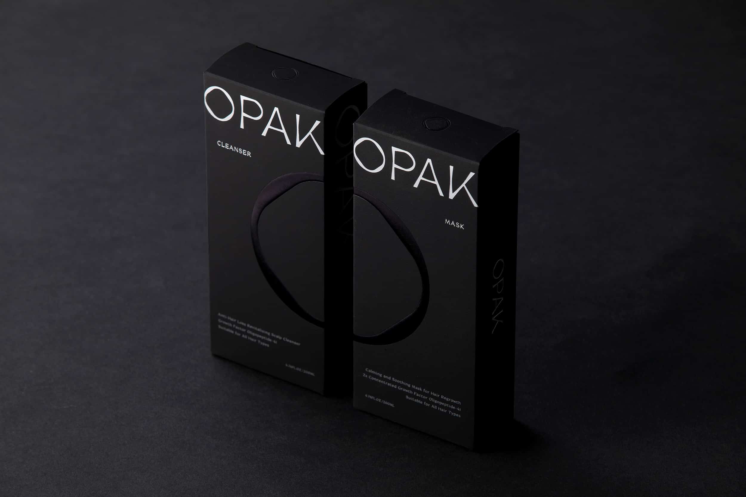
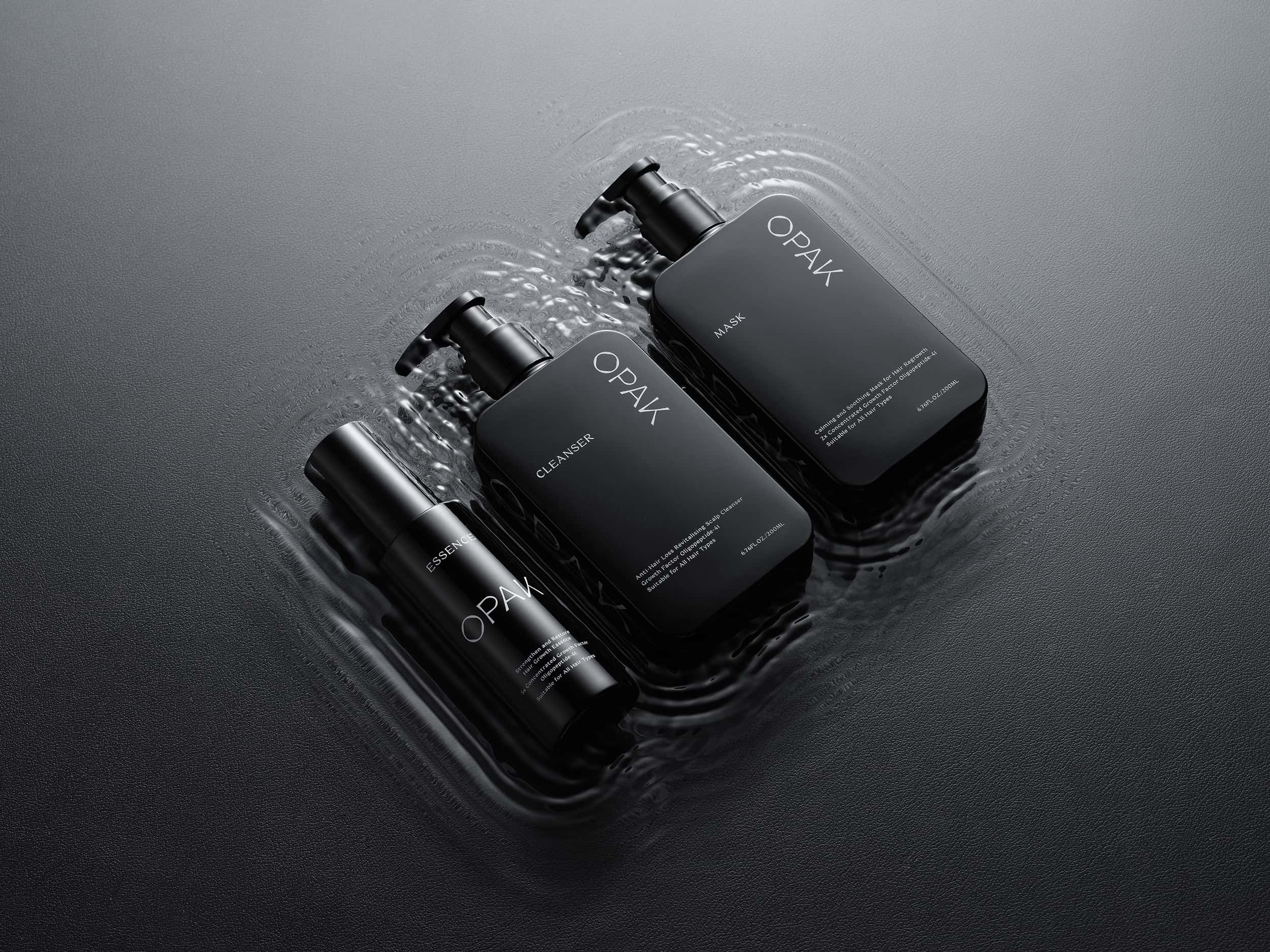
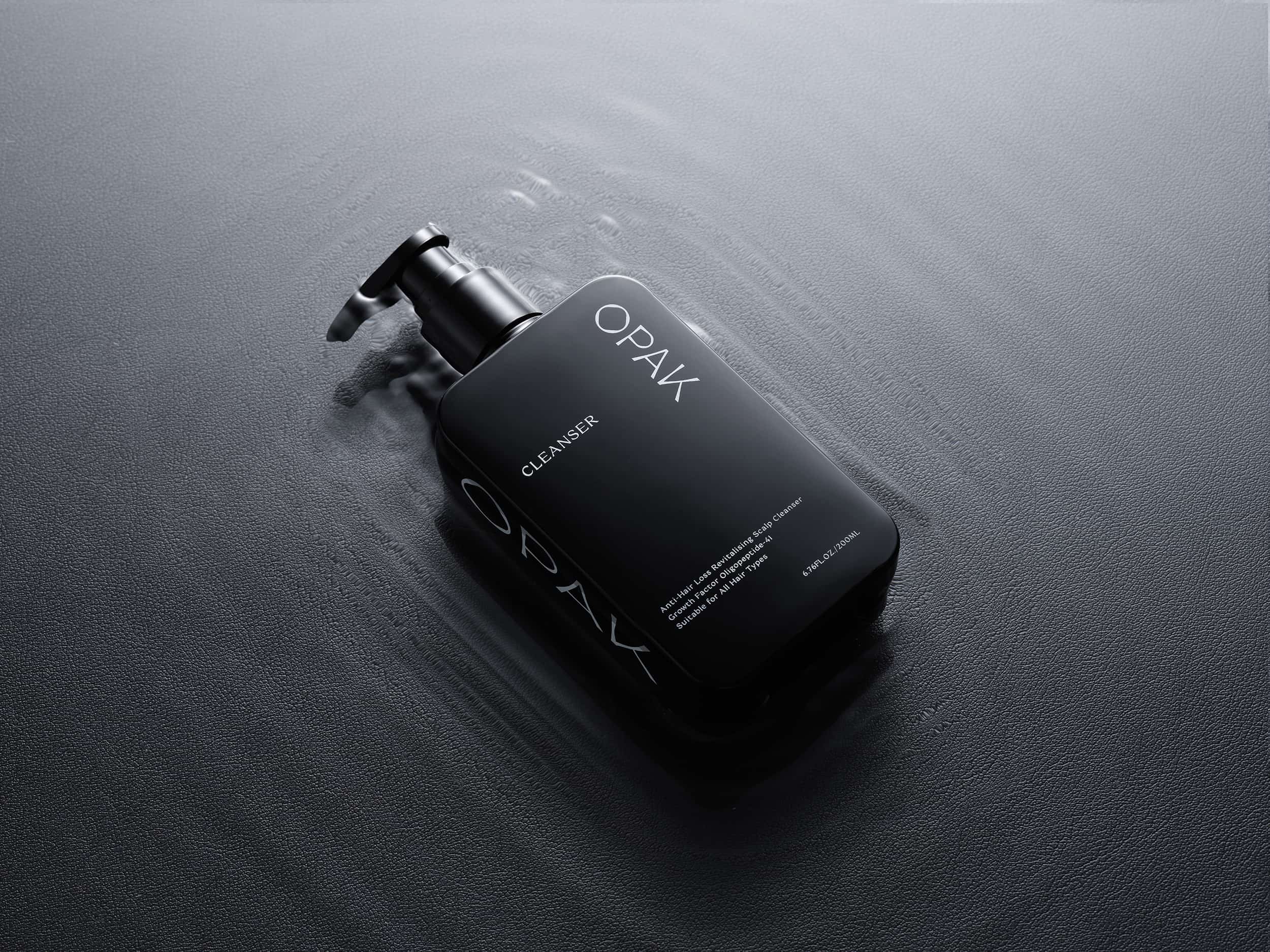
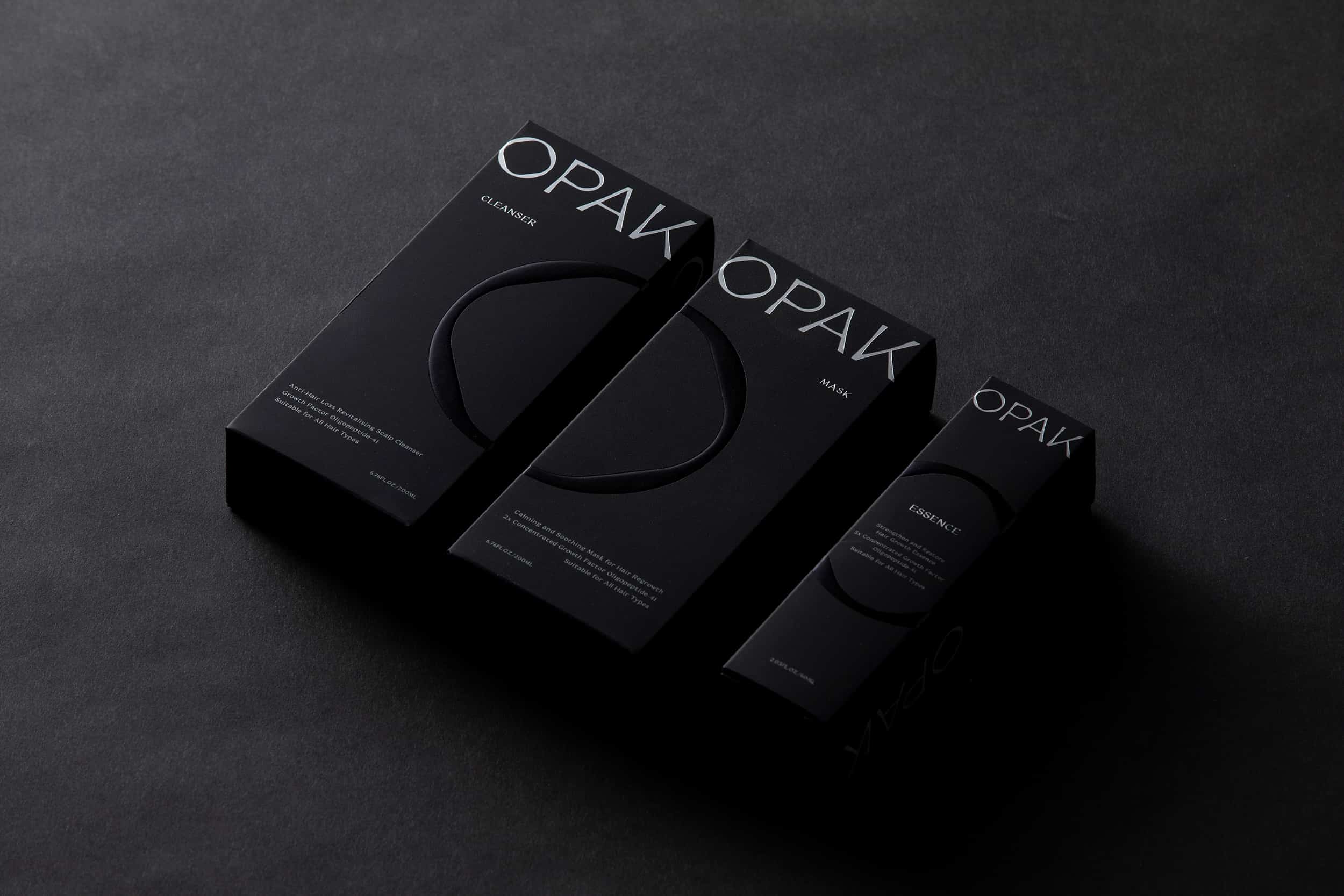
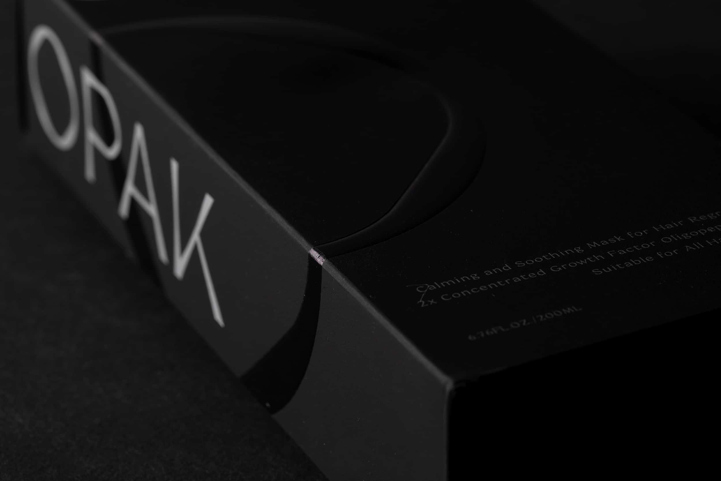
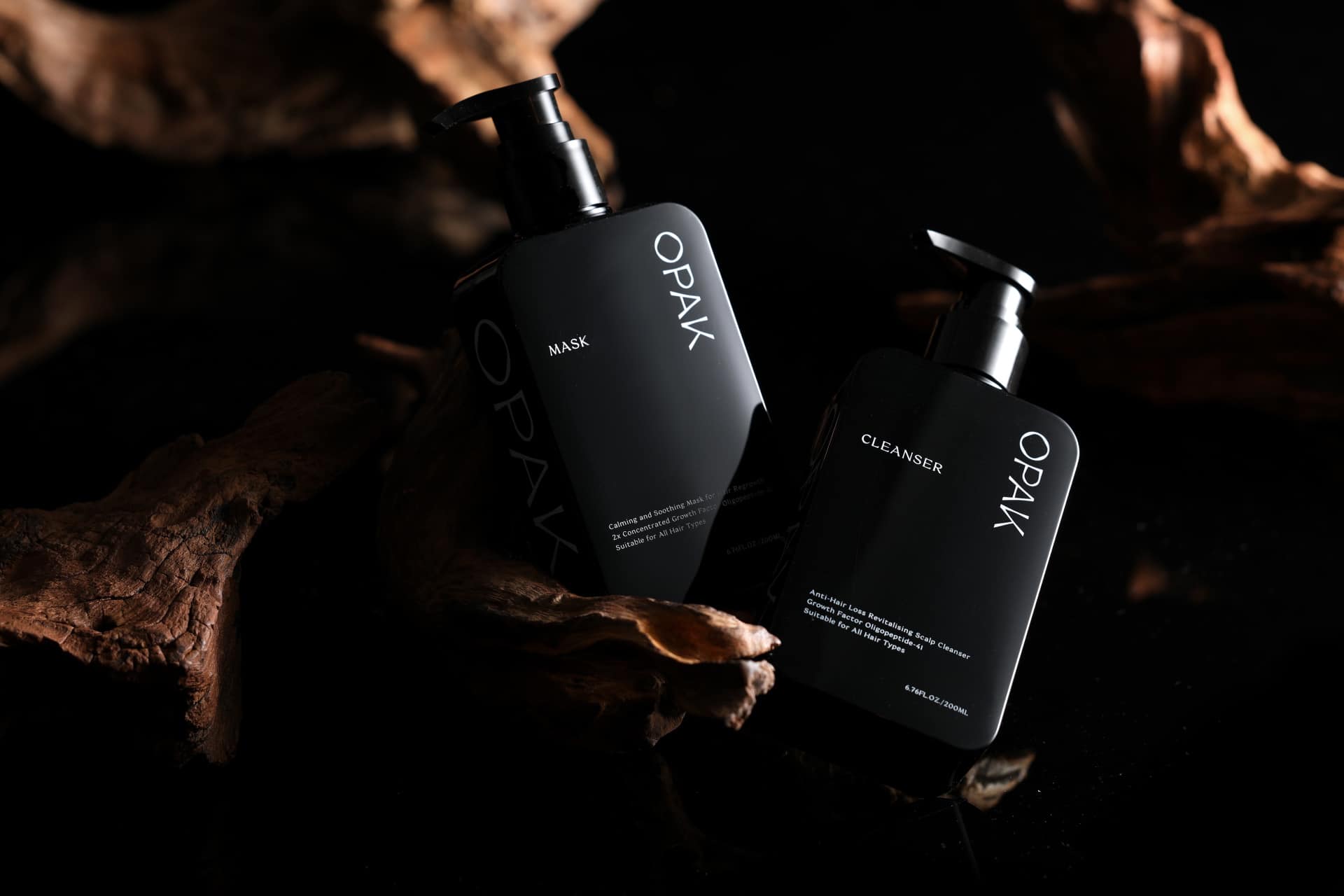
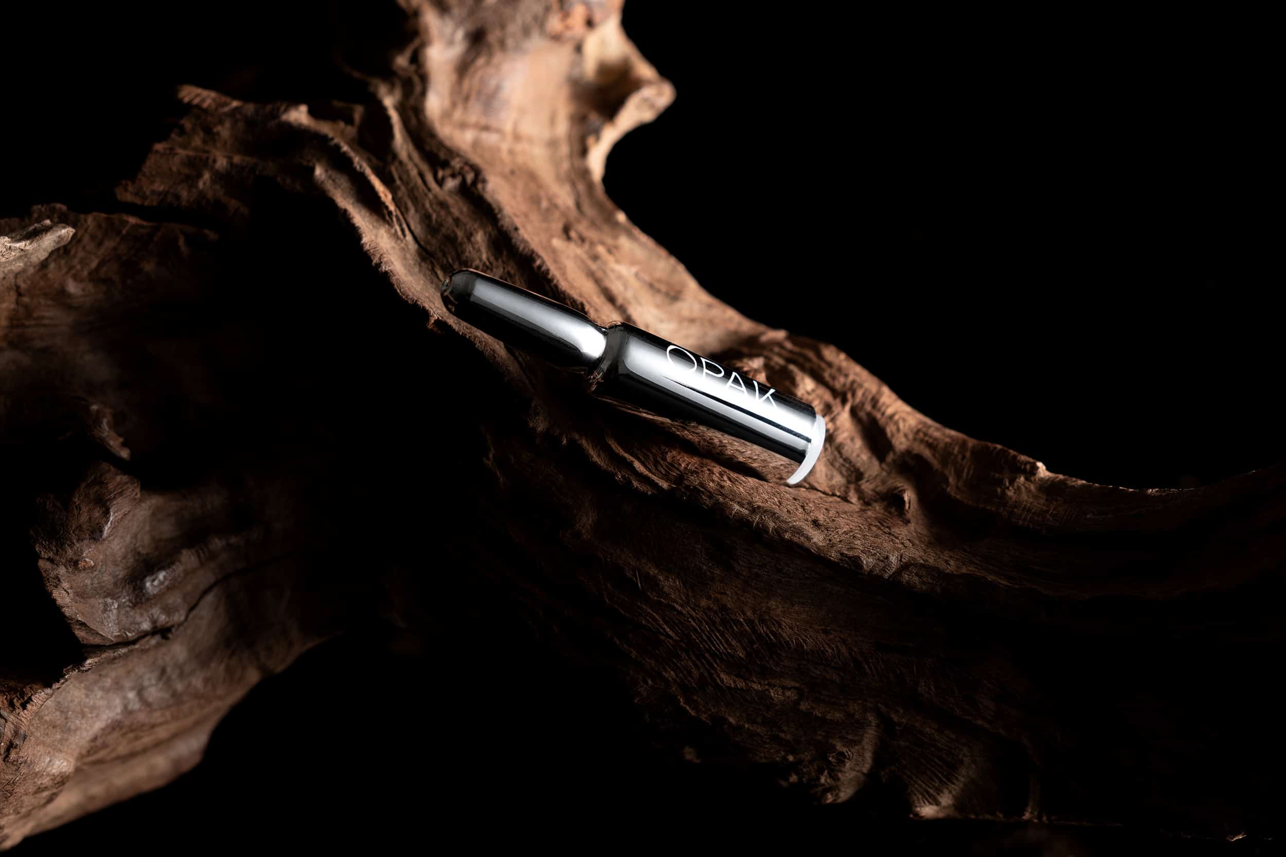
The repetitive emphasis of O in all product packaging effectively captured customer’s focus, enhancing the brand’s distinctiveness. To balance the innovative technological perception, the choice of heavily textured material with natural creases made a connection back to the raw nature.
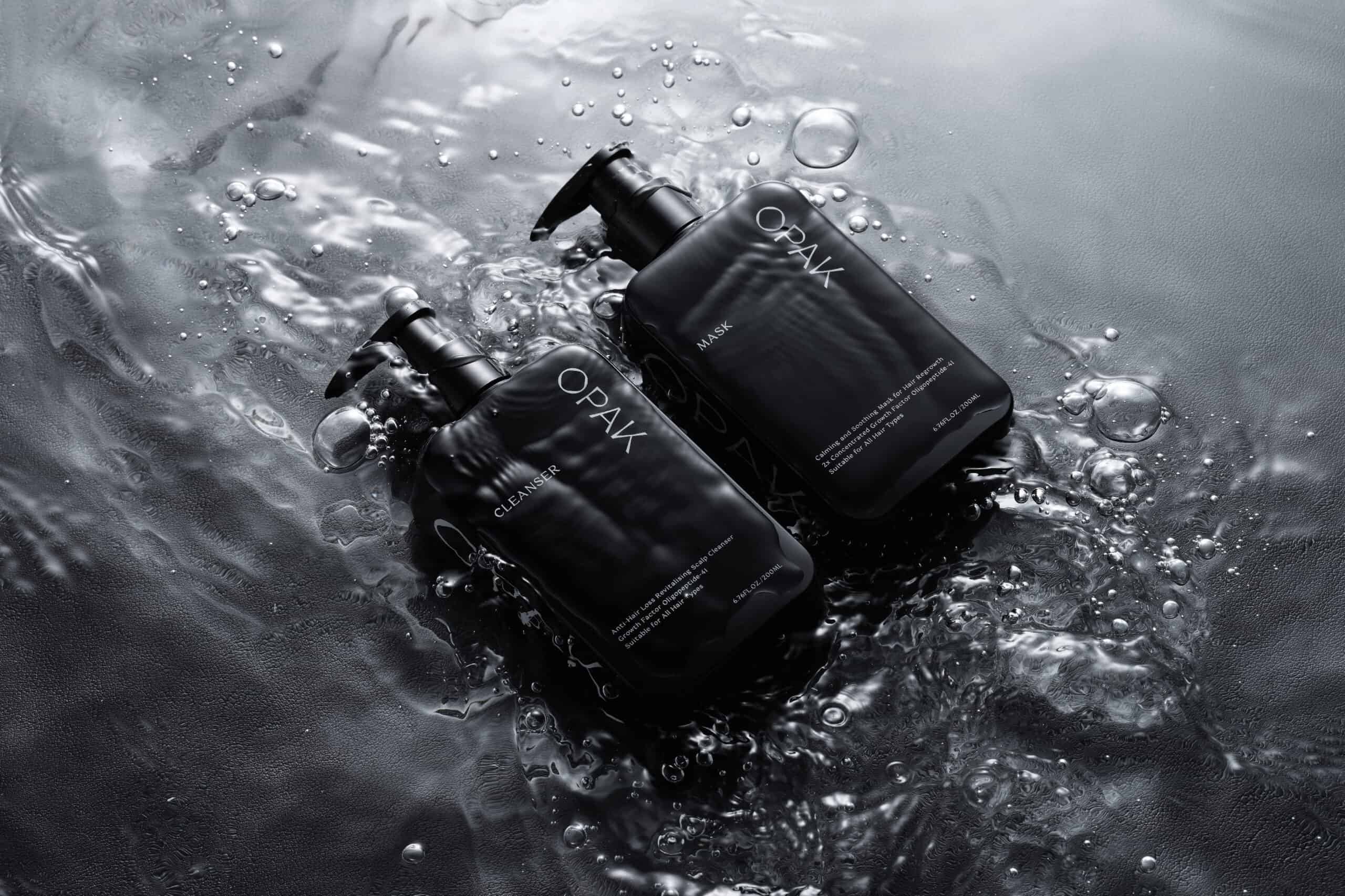
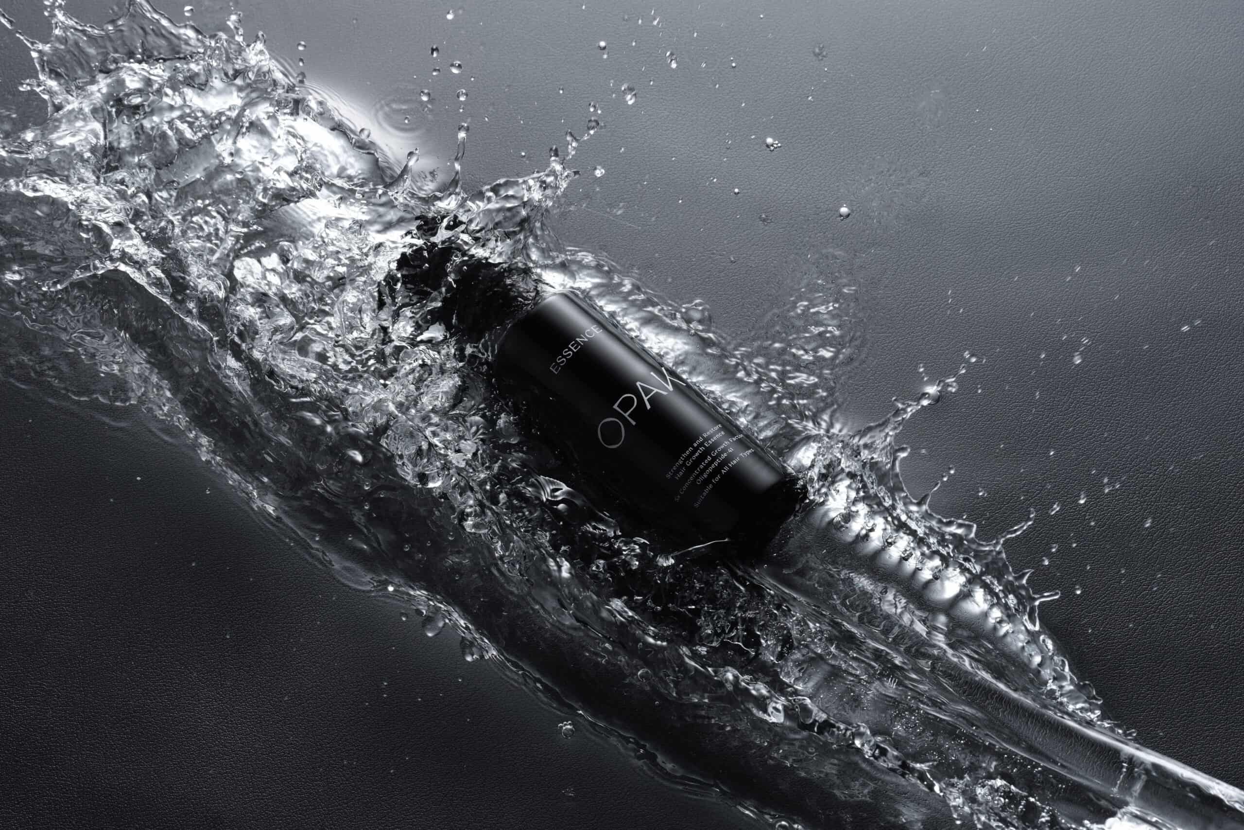
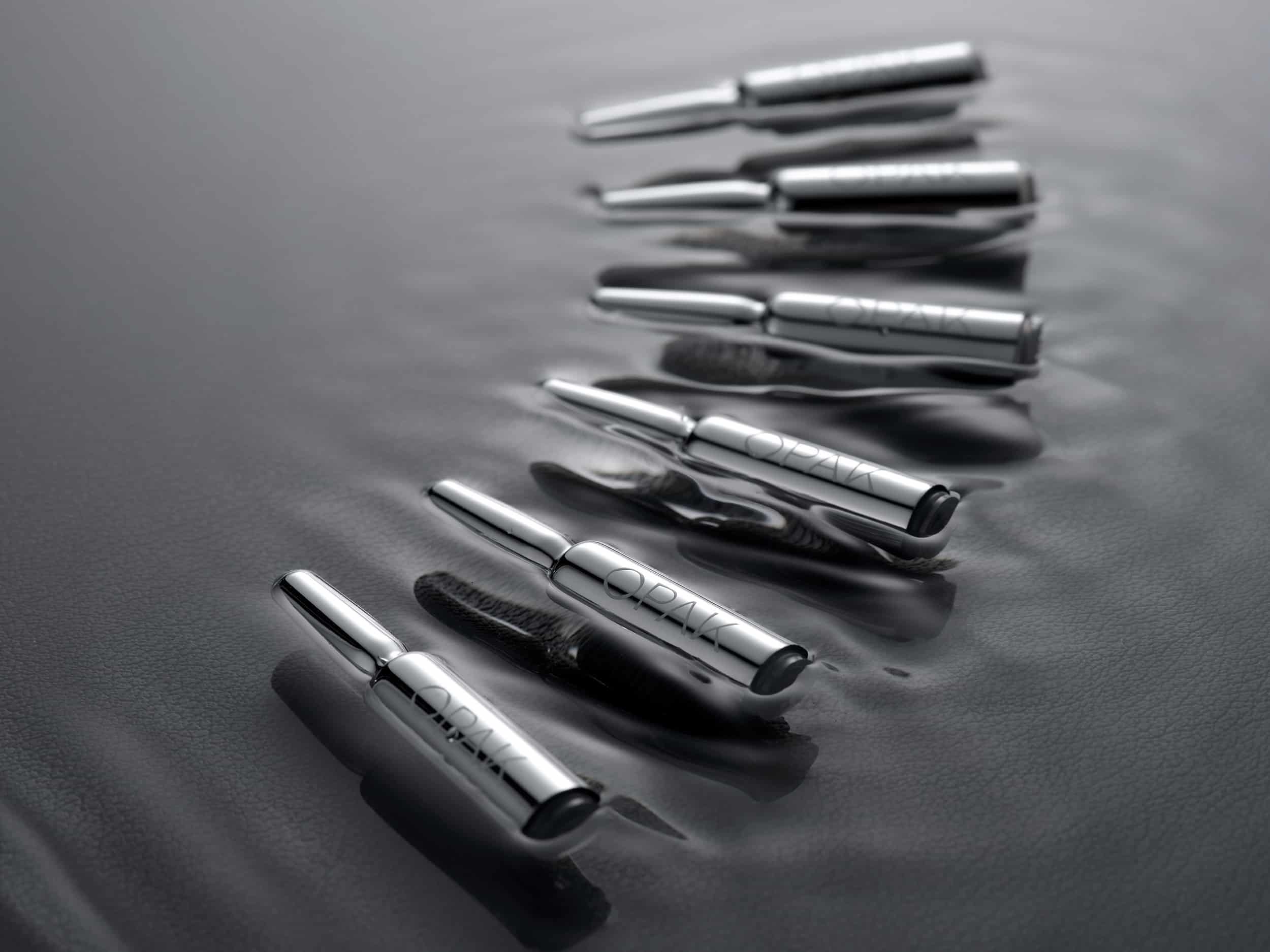
Black dominated the colour palette of the brand to deliver an enigmatic and modern impression while the touch of silver sublimated the design with elegance and a future-tune.

Background
Design Solution
Specifically, the O in OPAK served multiple functions. O was chosen to be emphasised since it resembled the shape of oaknut, submitting to the idea that OPAK is also the fruit of the collective effort from the professional team. Also, the circularity of O not only provided a perception of concentration and unification, but also portrayed a tensed yet captivating aperture into the future unknown.
The repetitive emphasis of O in all product packaging effectively captured customer’s focus, enhancing the brand’s distinctiveness. To balance the innovative technological perception, the choice of heavily textured material with natural creases made a connection back to the raw nature.
Black dominated the colour palette of the brand to deliver an enigmatic and modern impression while the touch of silver sublimated the design with elegance and a future-tune.
WHAT WE DID
Branding Design, Logo Design, Brand Strategy, Brand Positioning, Naming, Creative Concept, Brand Identity, Brand Communication, Package Design, Photography
Branding & package design for OPAK – The Ultimate Hair Growth Solution
Client/Project: OPAK
Creative Director: Vince Cheung
Design and illustration: Kaman Kan
Photography: Chris Chan @thingstudio
商標 | 品牌設計 | 香港 | 香港設計 | 視覺形象 | 包裝 | 包裝設計
logo | branding | design | hong kong | hong kong designer | VI | visual identity | vincdesign | package | package design
#opak packaging #opqk