Op·smooth | Branding Design

Op·smooth
OP-Smooth is a Hong Kong based experienced IT service provider which was established in 2004. In order to catch up with the ever-changing IT industry, VINCDESIGN started a rebranding project with OP-Smooth in 2020.
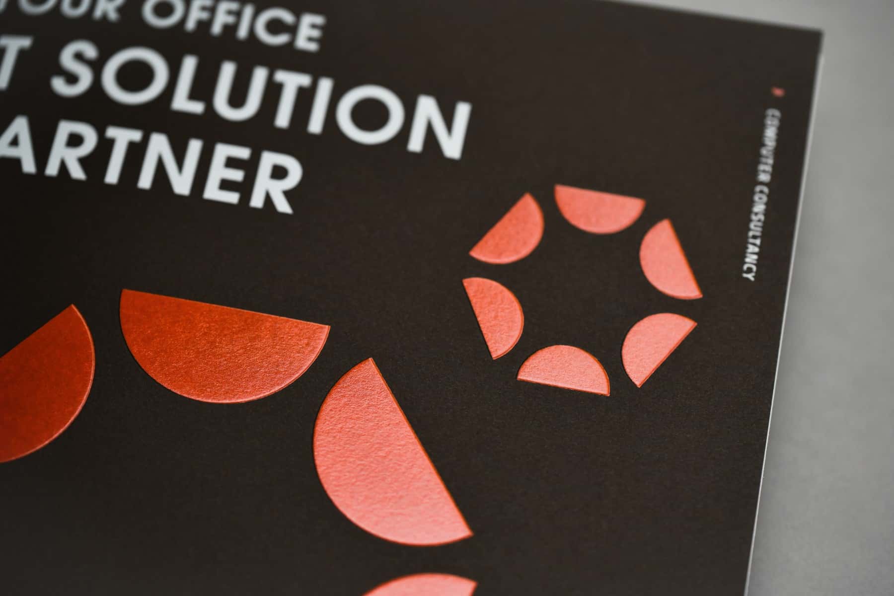
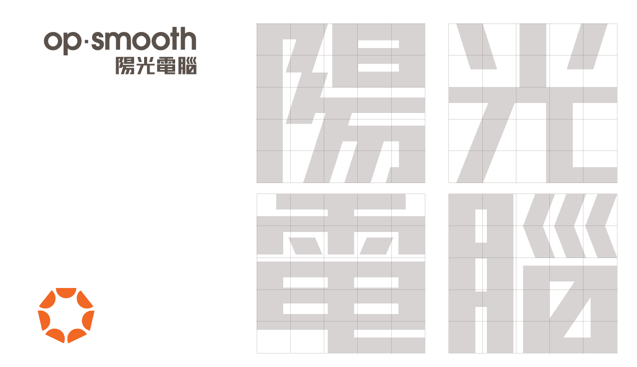
After conducting a brand survey, the brand’s Chinese name “陽光電腦” is more well-remembered. We therefore used “陽光” (i.e. sunshine) as the theme for the brand and applied the element in logo and brand colour, etc.
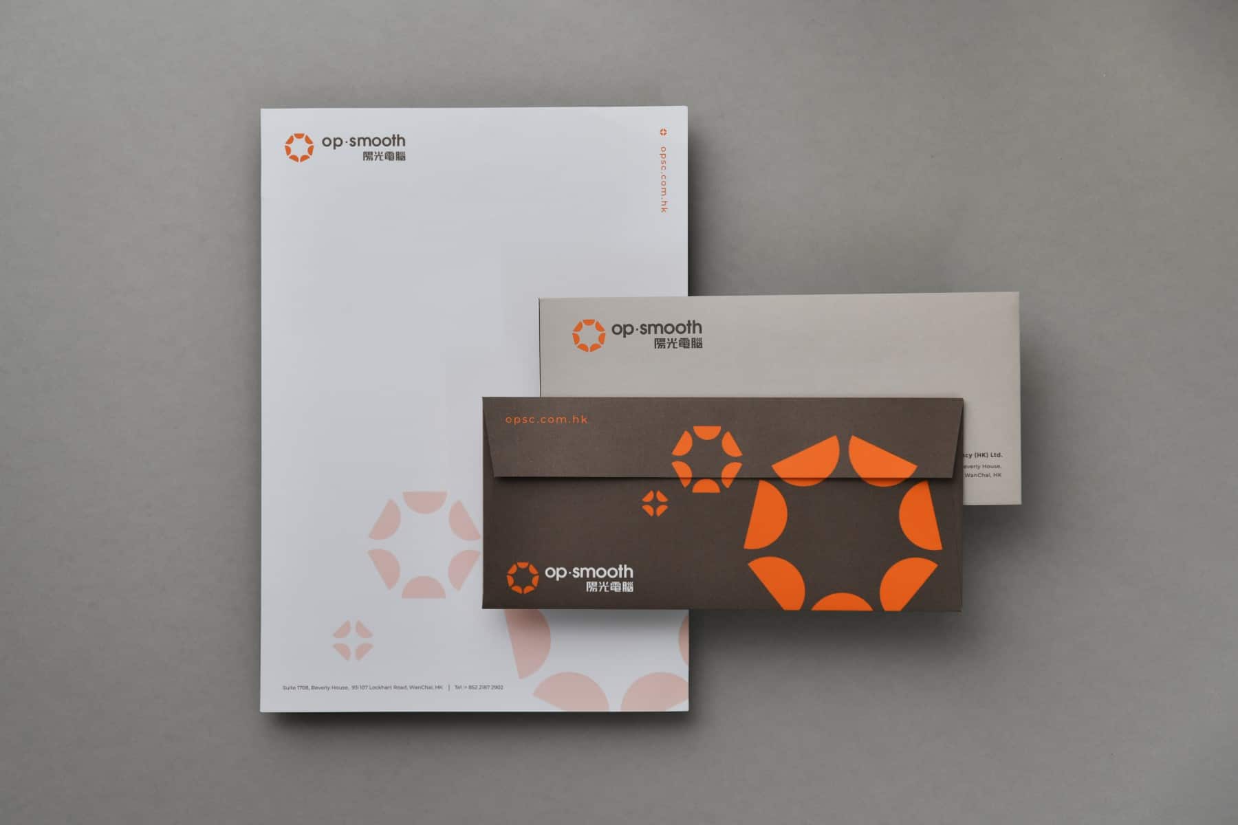
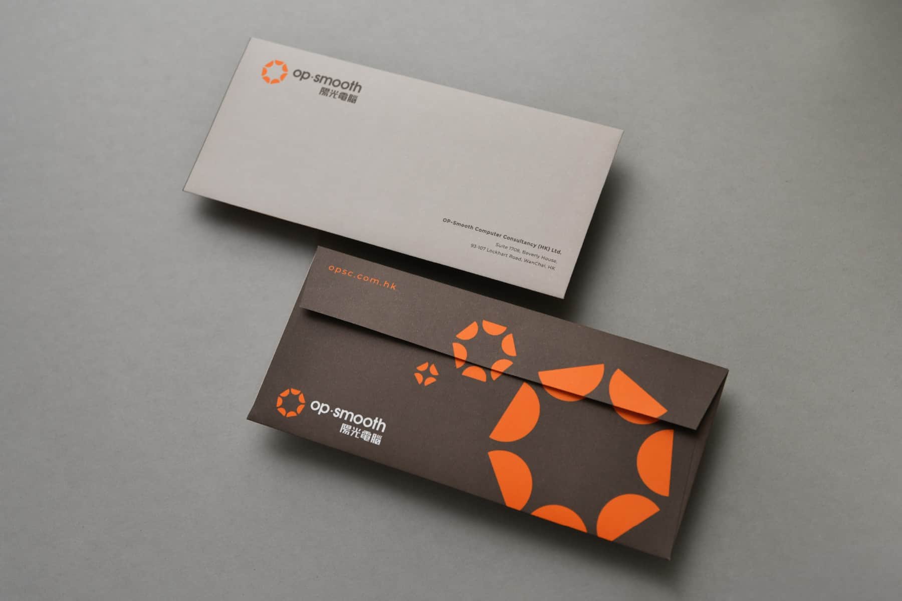
Besides logo, VINCDESIGN also helped with the design of corporate stationery, staff card and brochure, to extend and consolidate its brand identity to different customer touch points.

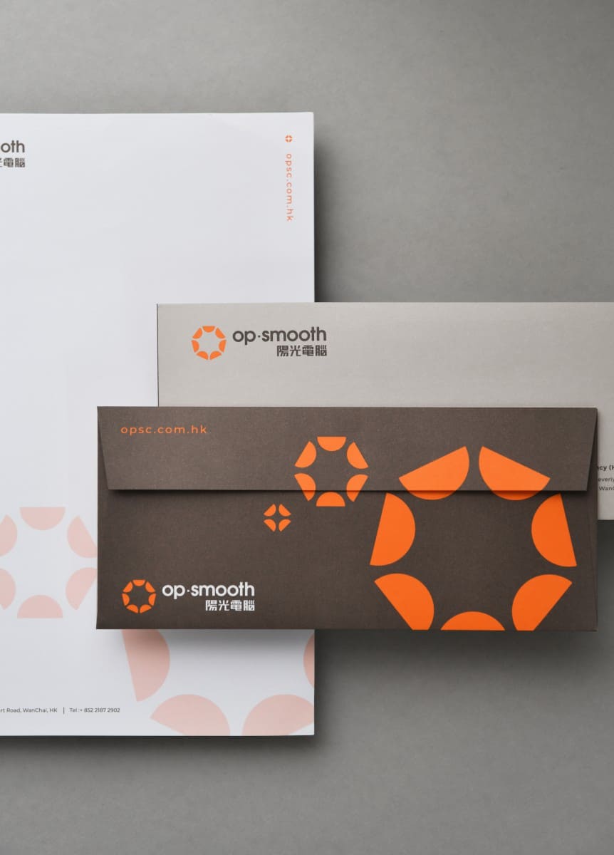
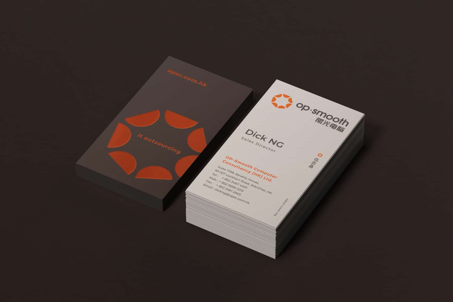
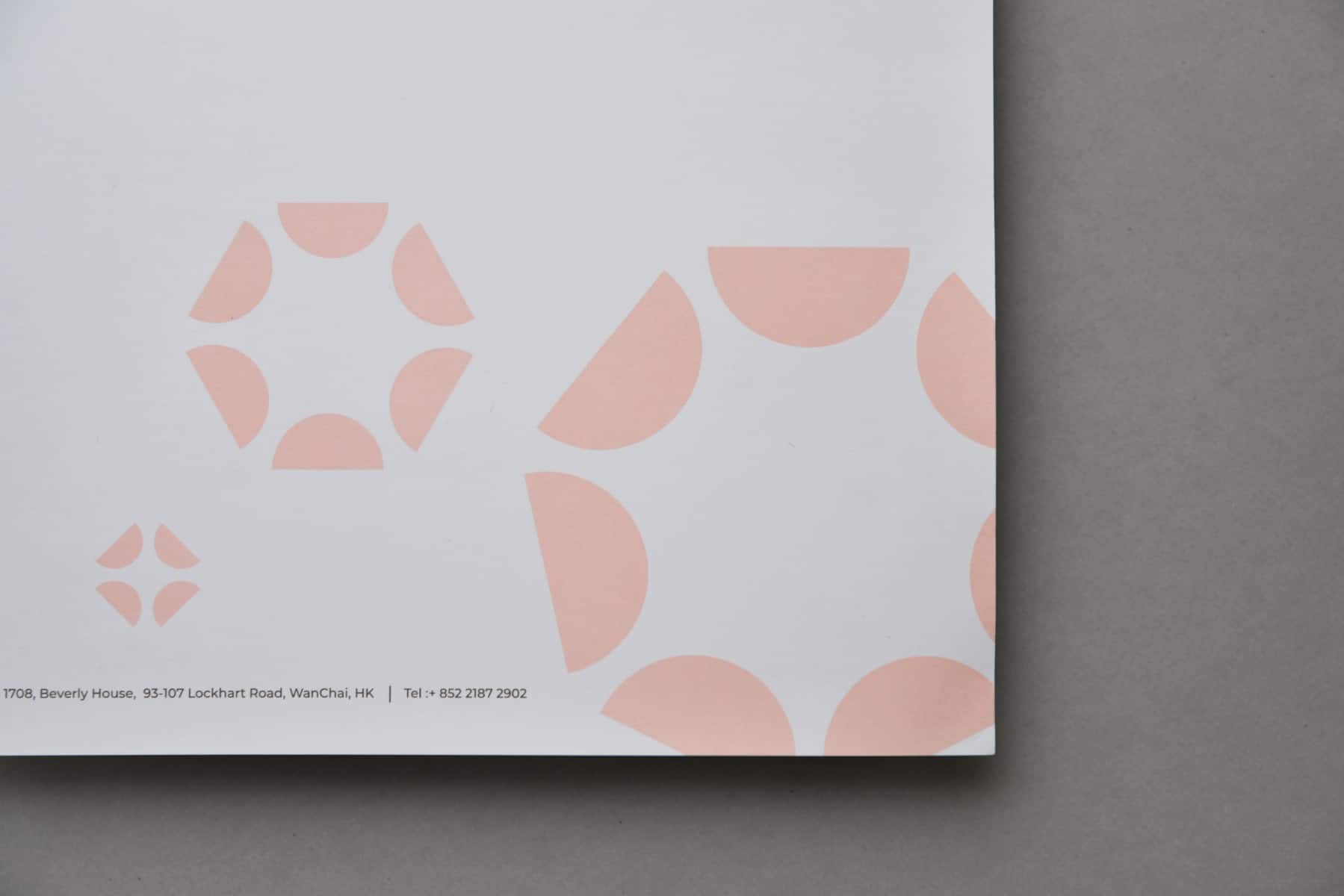
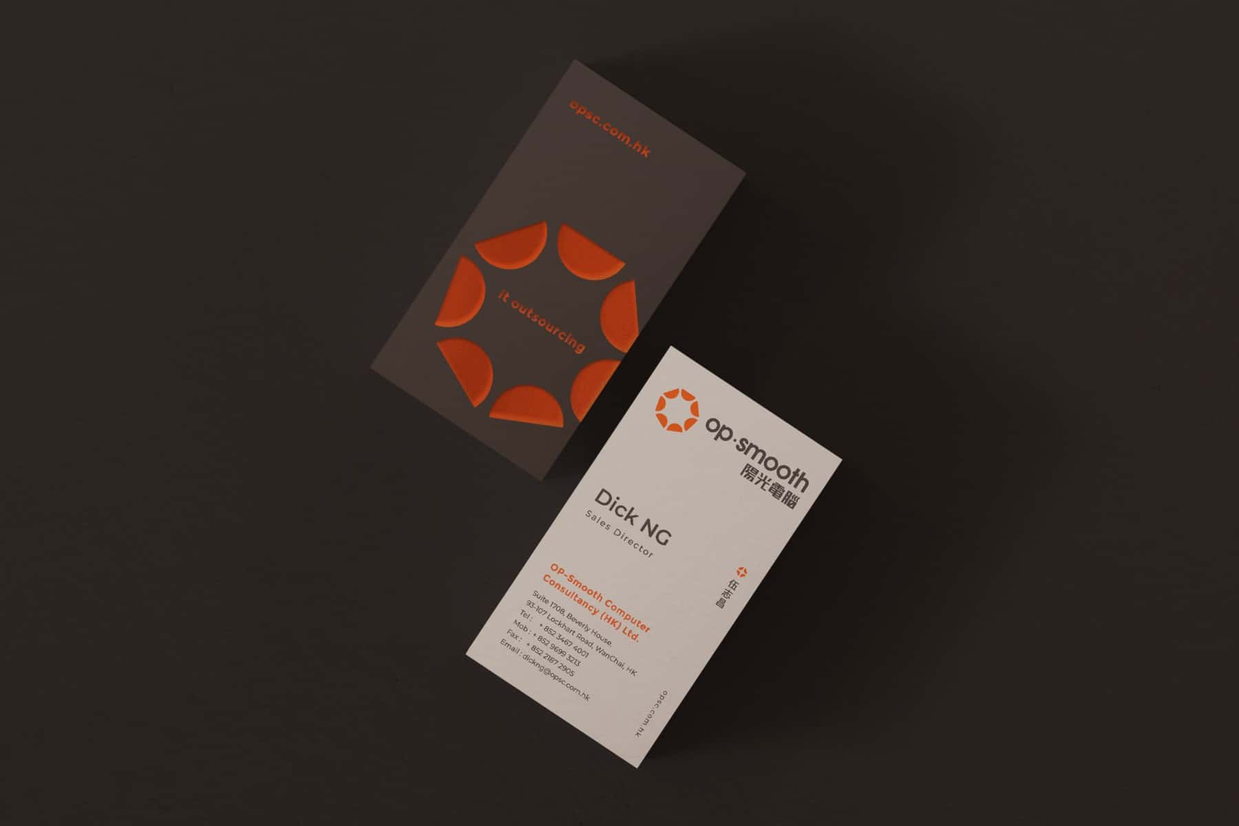
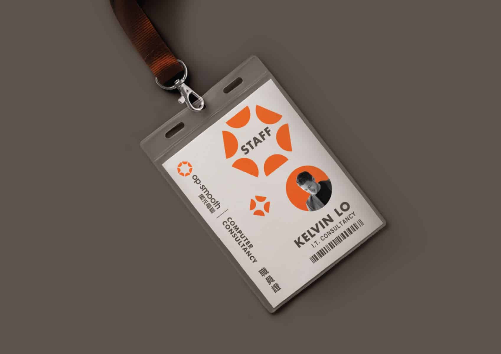
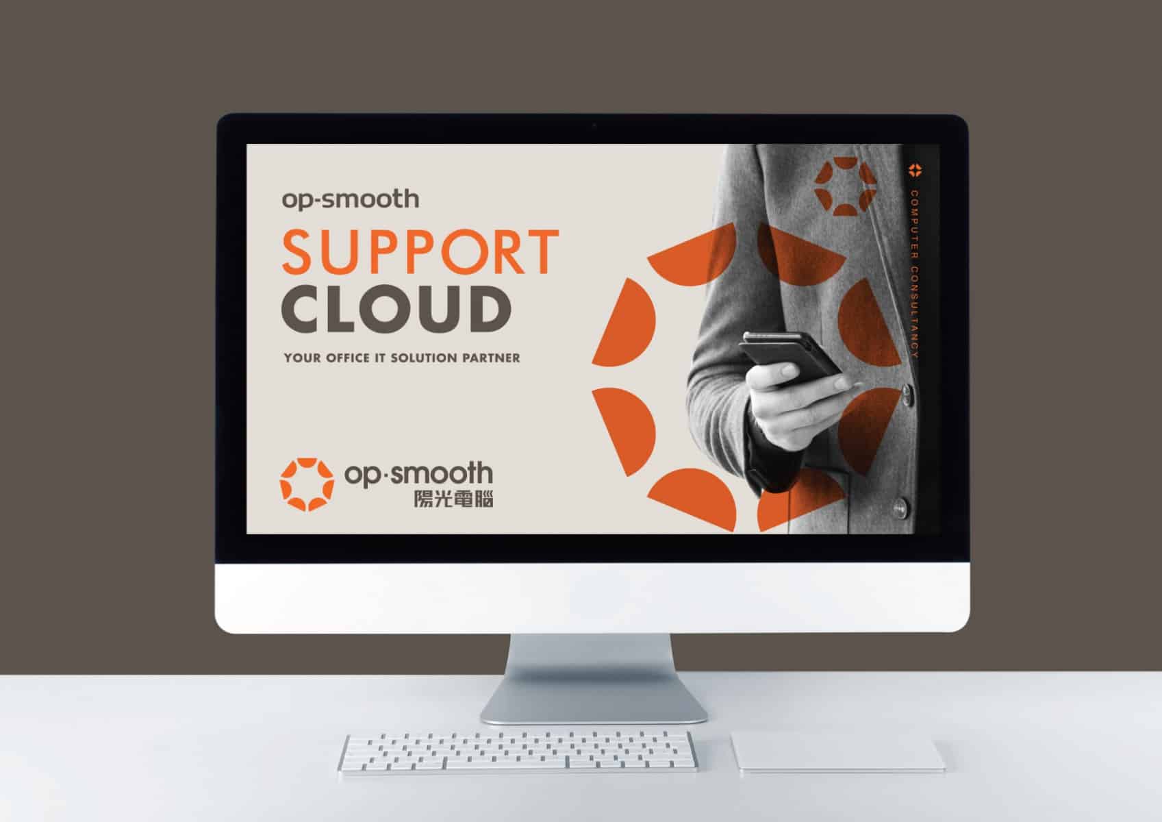

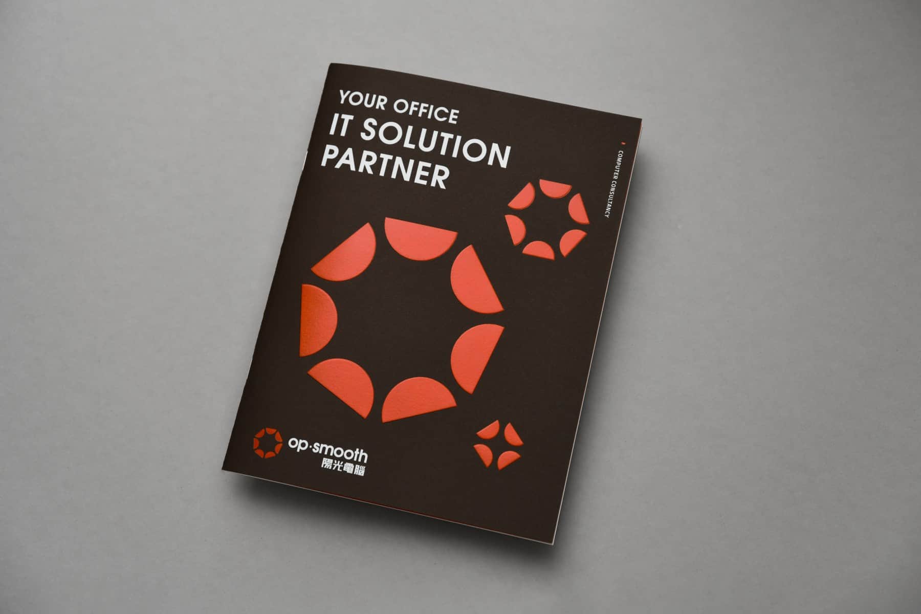
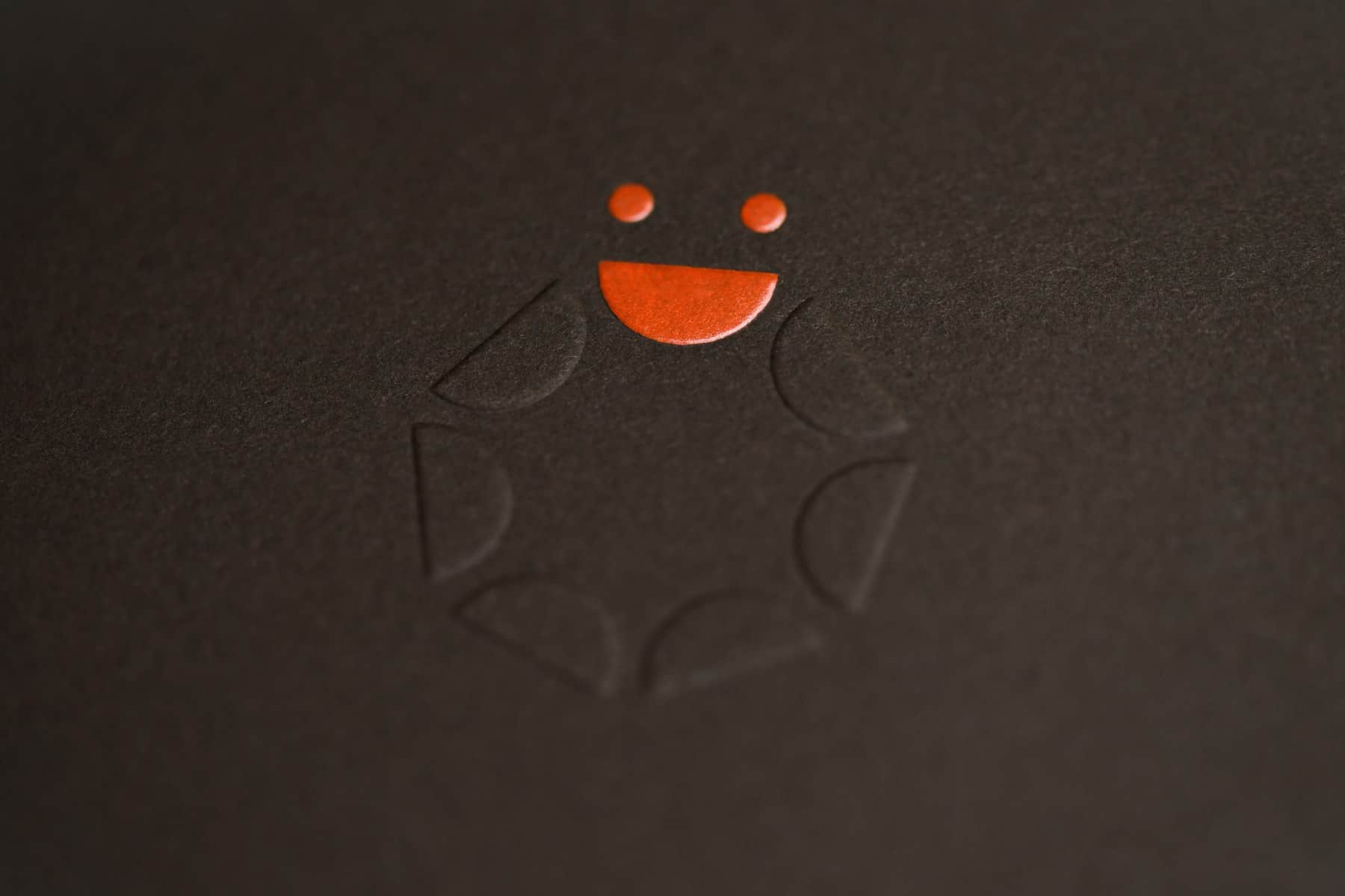
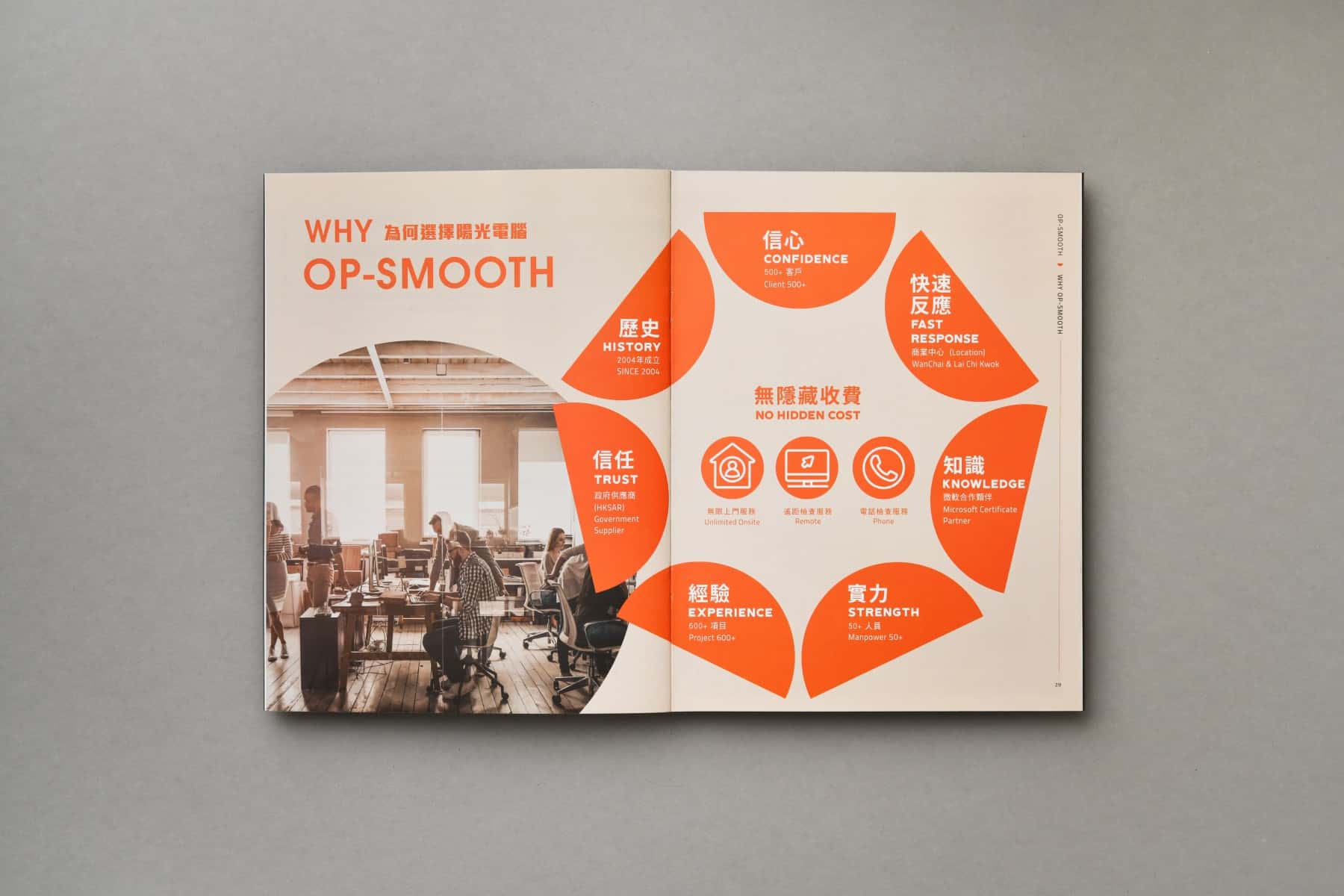
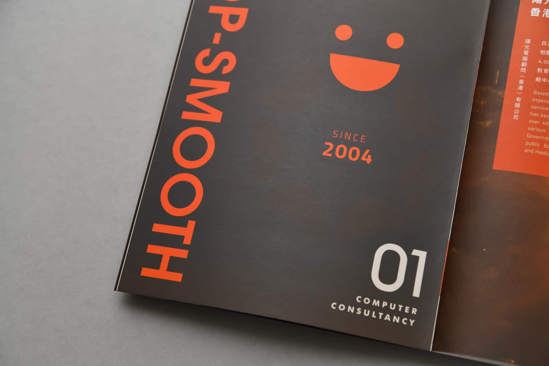
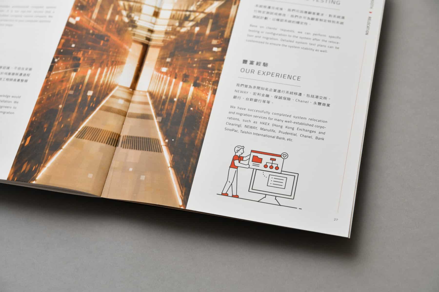
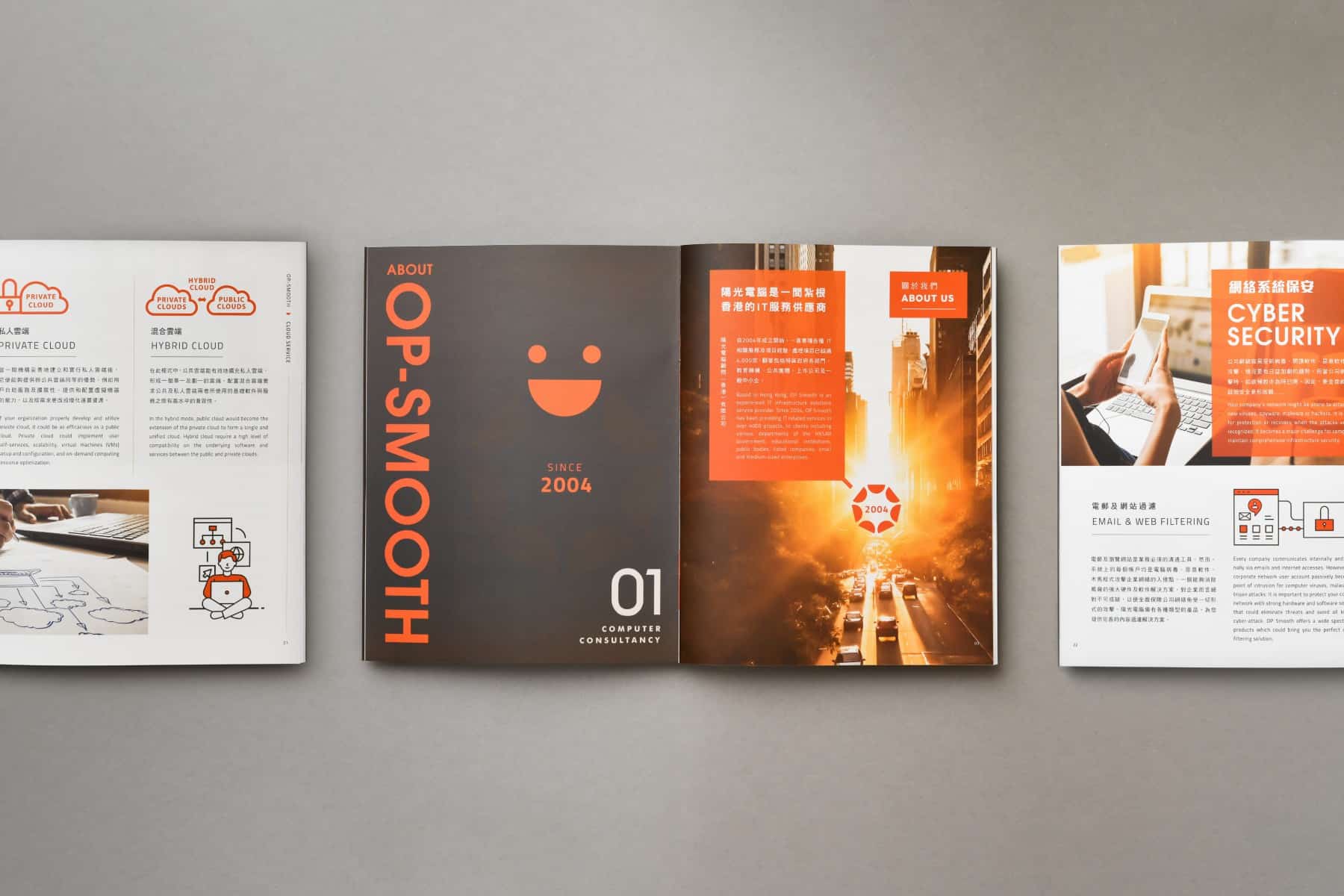
Branding design for Op-smooth 陽光電腦 品牌形象
Client/Project: Op-smooth 陽光電腦
Creative Director: Vince Cheung
Design and illustration: Ken Li
Photography & Animation: Yin Ip @tinysotiny.co
商標 | 品牌設計 | 香港 | 香港設計 | 視覺形象 | 包裝 | 包裝設計 |
logo | branding | design | hong kong | hong kong designer | VI | visual identity | vincdesign | package | package design |