PADIE – Biodegradable Pads | Branding and Packaging Design
PADIE –
Background
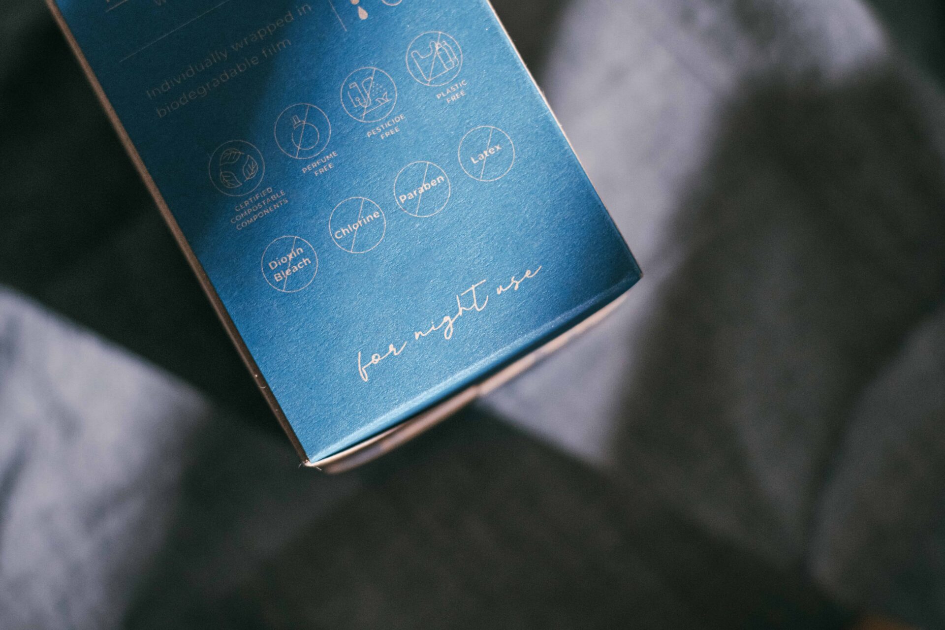
Committed to the brand mission ‘For Her, For Earth,’ Padie created a natural yet powerful resolution, caring for women and protecting the earth with their 100% Biodegradable Natural Pads made from the highly absorbent corn fibre. Impressively, when processed professionally, the decomposition of Padie’s biodegradable pads can even be shortened from 500 years to 180 days, significantly alleviating the pressure of the Earth, achieving their goals of being ‘Sustainable, Biodegradable, and Compostable.’
Design Solution
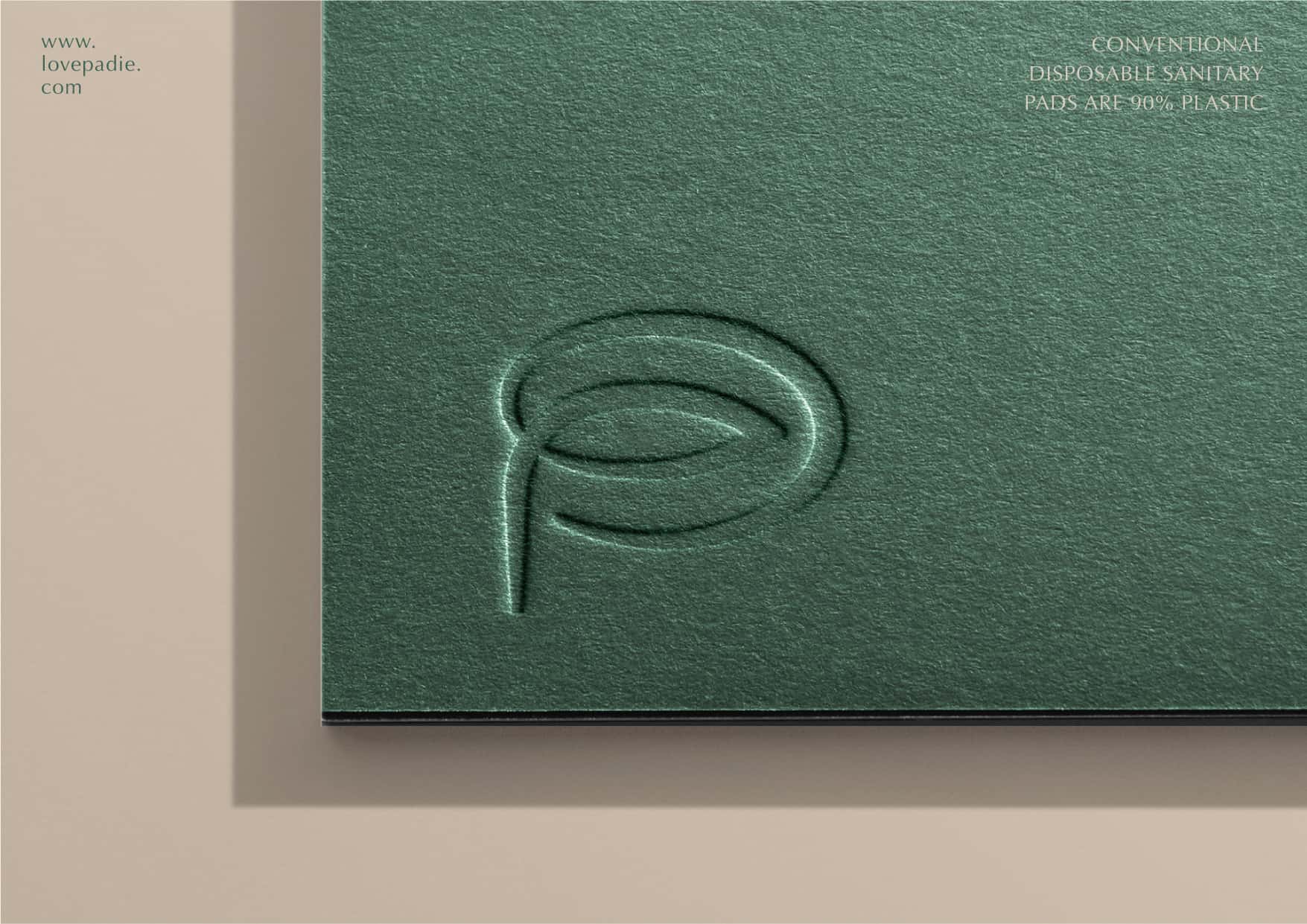
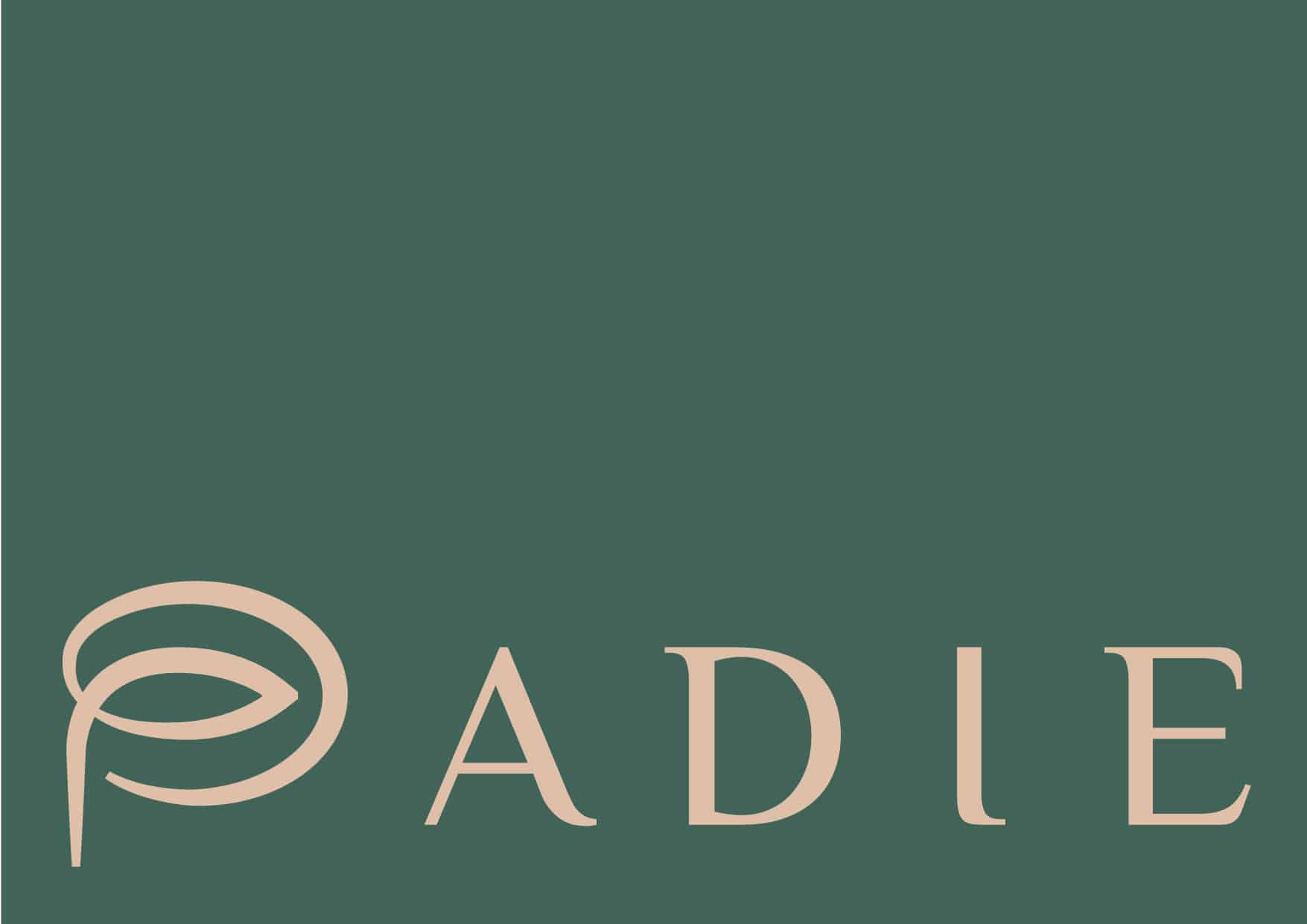
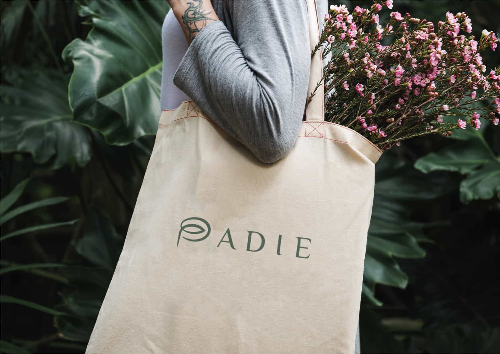
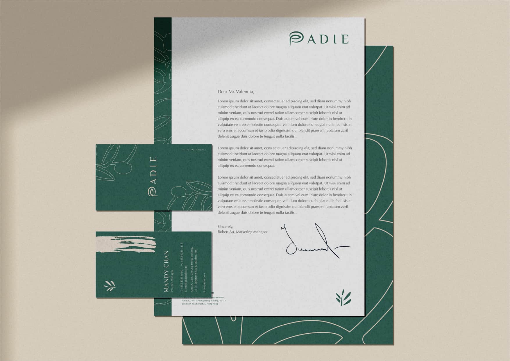
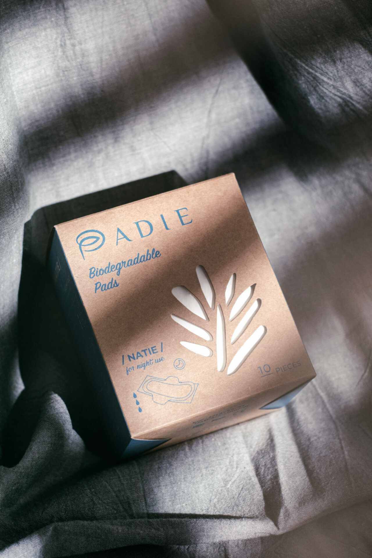
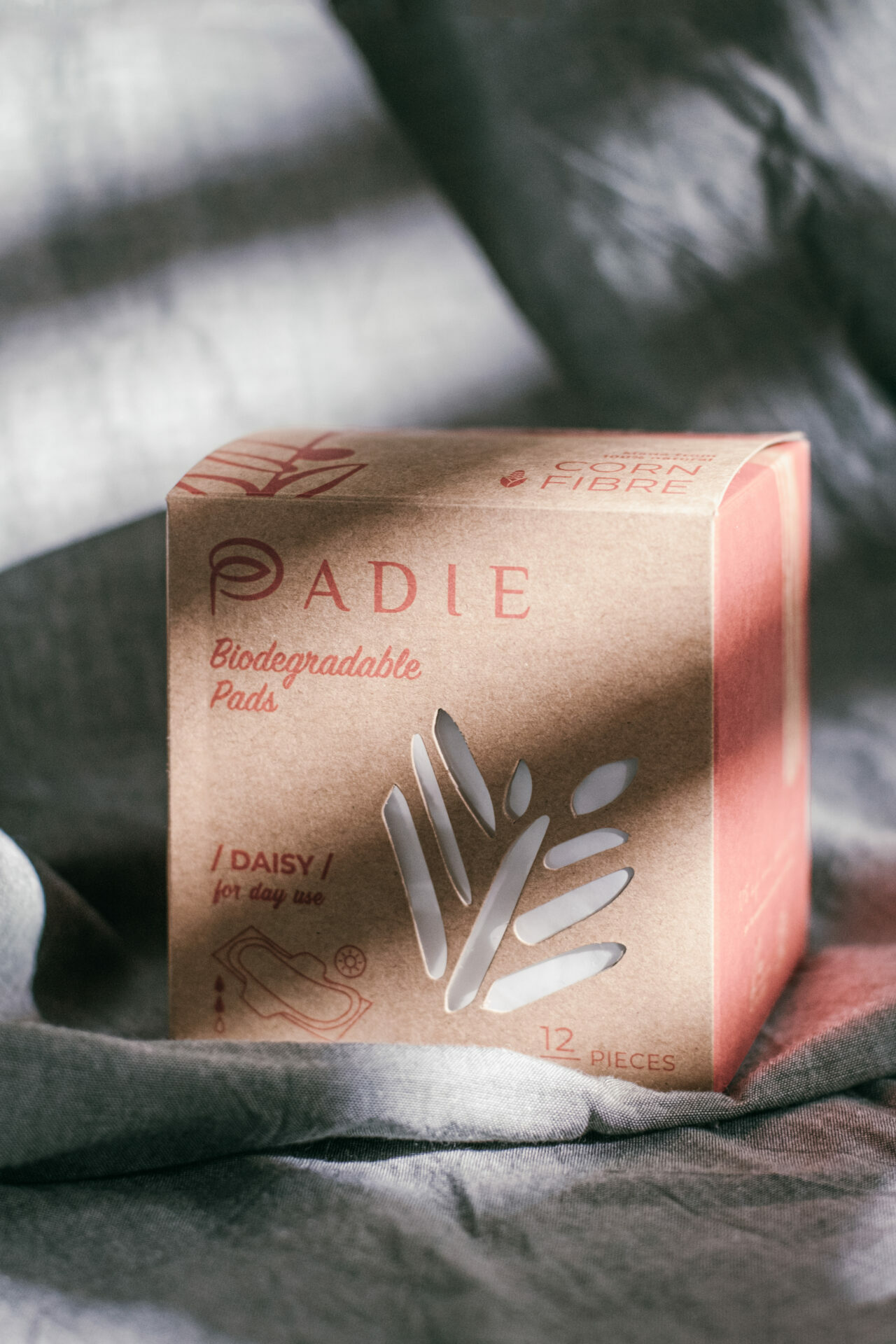
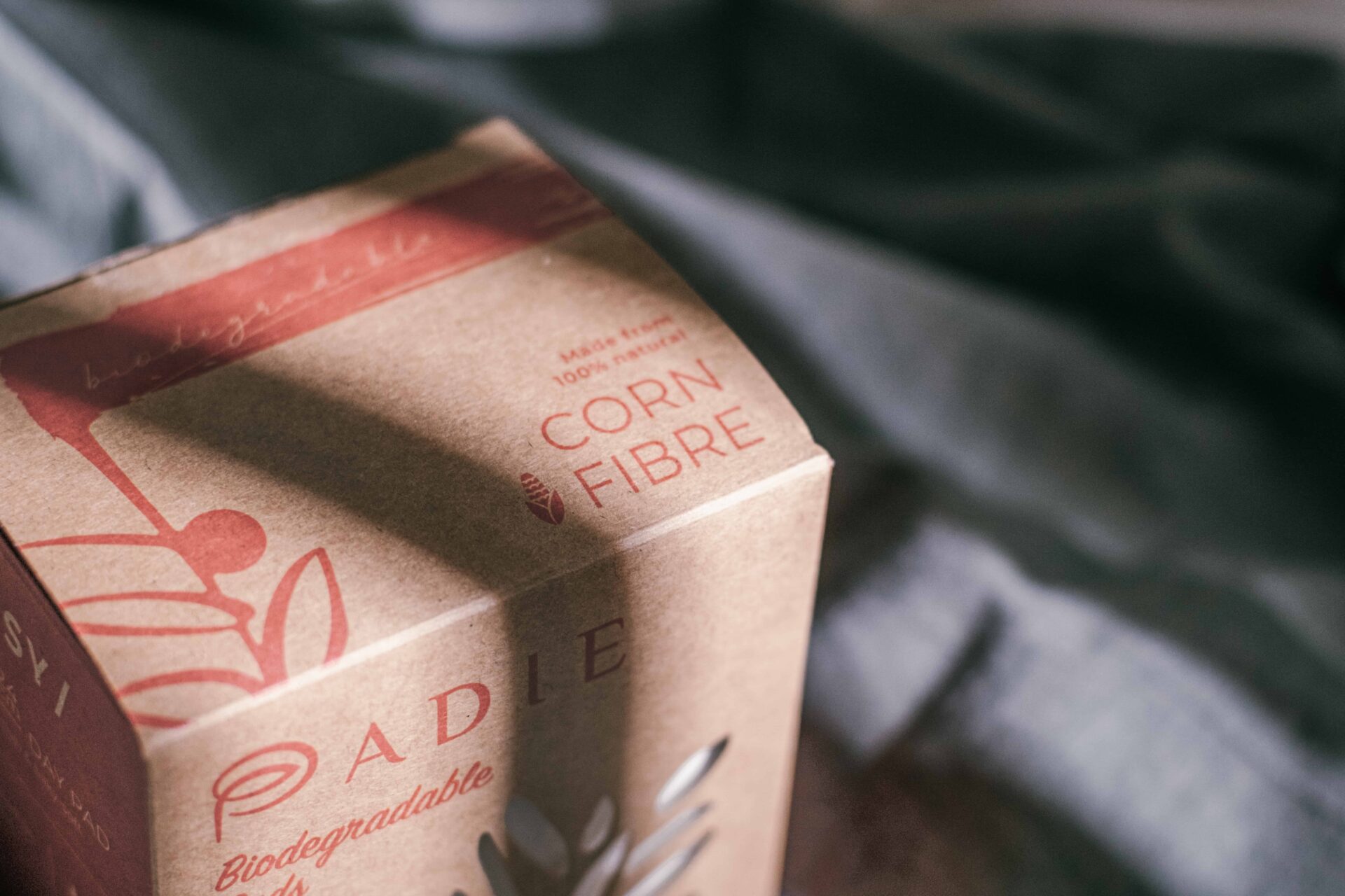
For the logo and packaging design of Padie’s Biodegradable Natural Pads, VincDesign explored creativity within the scopes of functionality. The letter P logo embodies two elements, which can be seen as the silhouette of the female’s intimate body part encircling a leaf, symbolising their commitment of prioritising customers and the earth in the creation of quality and sustainable feminine care products, emphasising the brand’s mission ‘For Her, For Earth.’
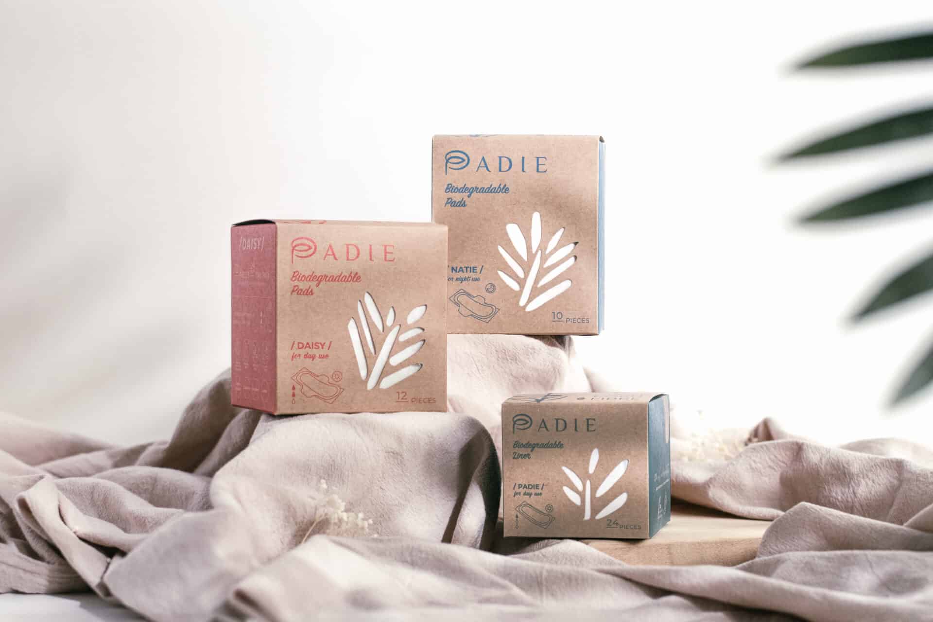
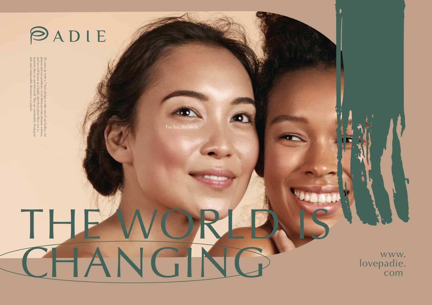
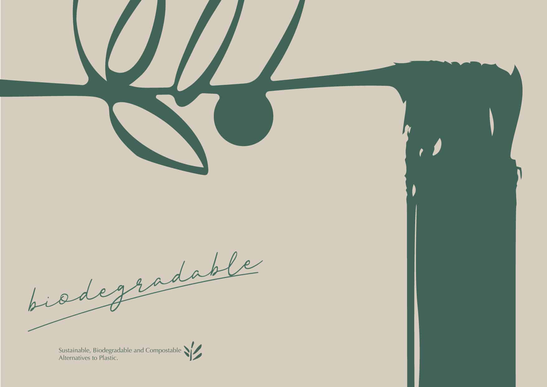
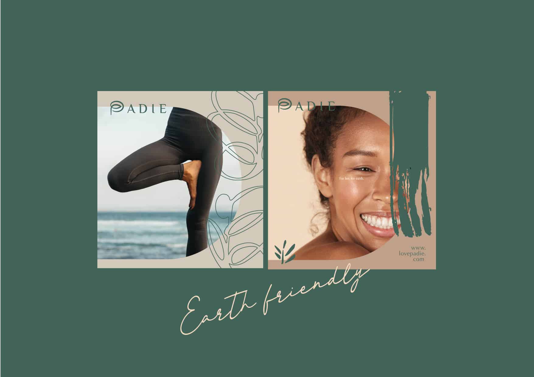
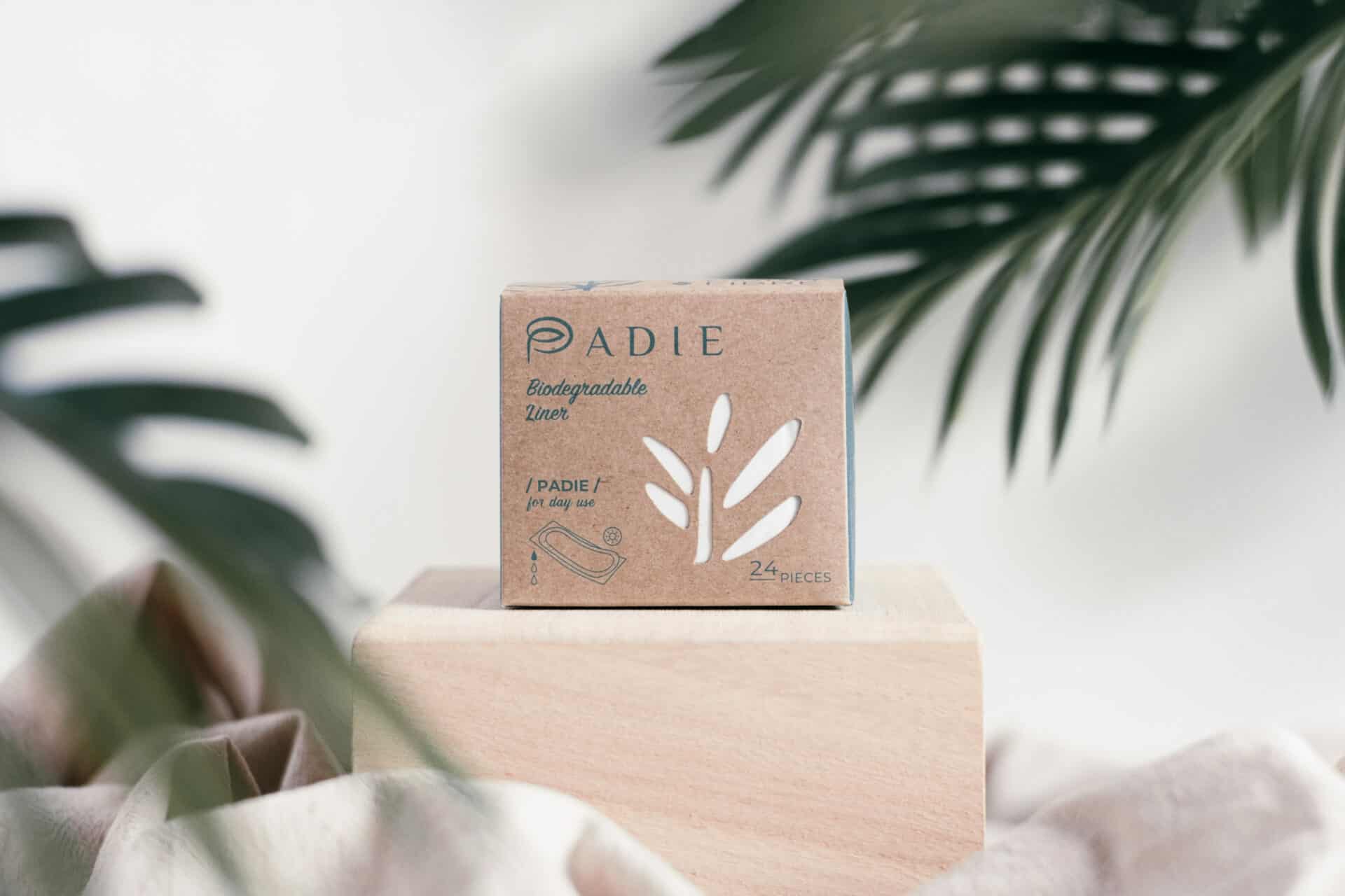
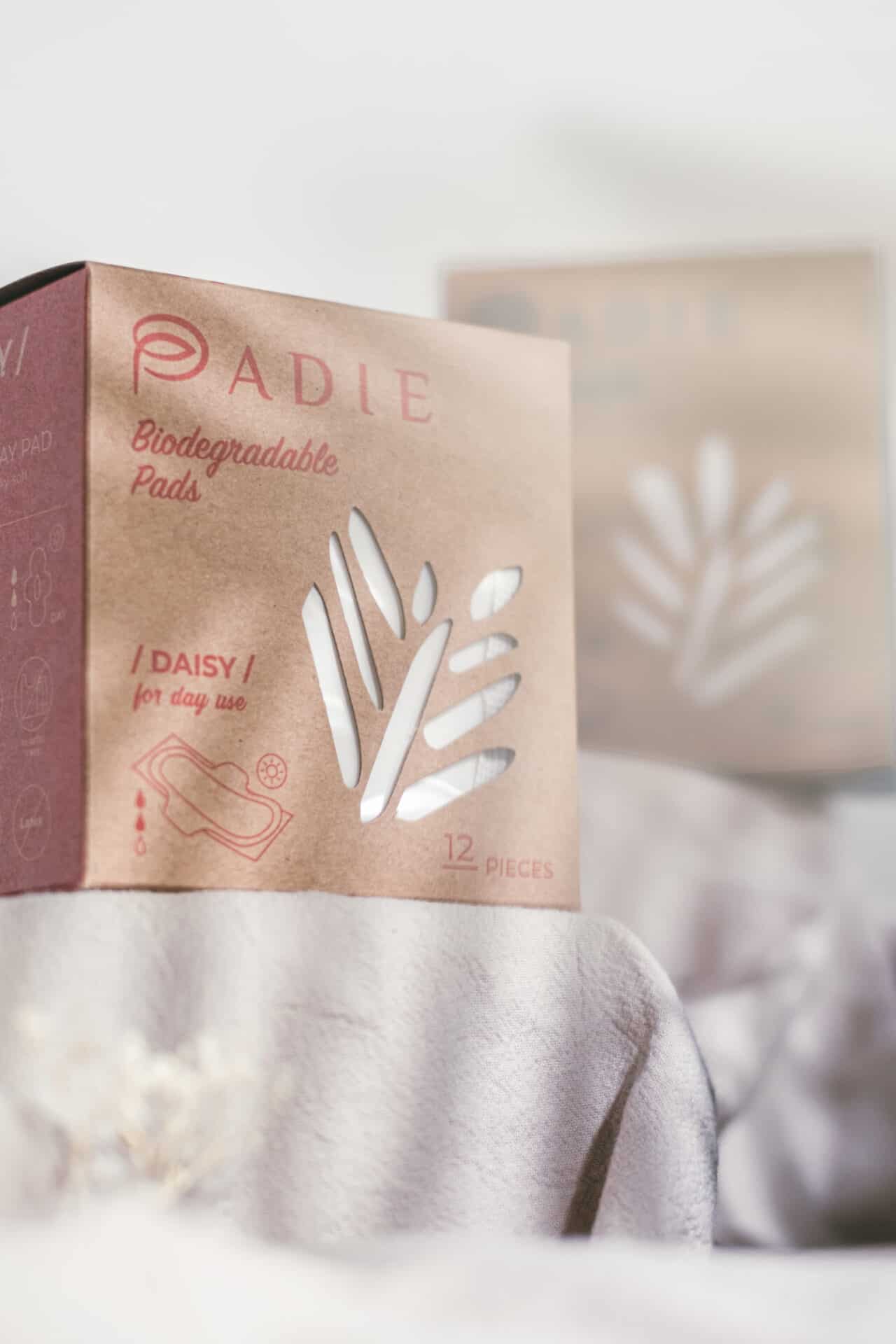
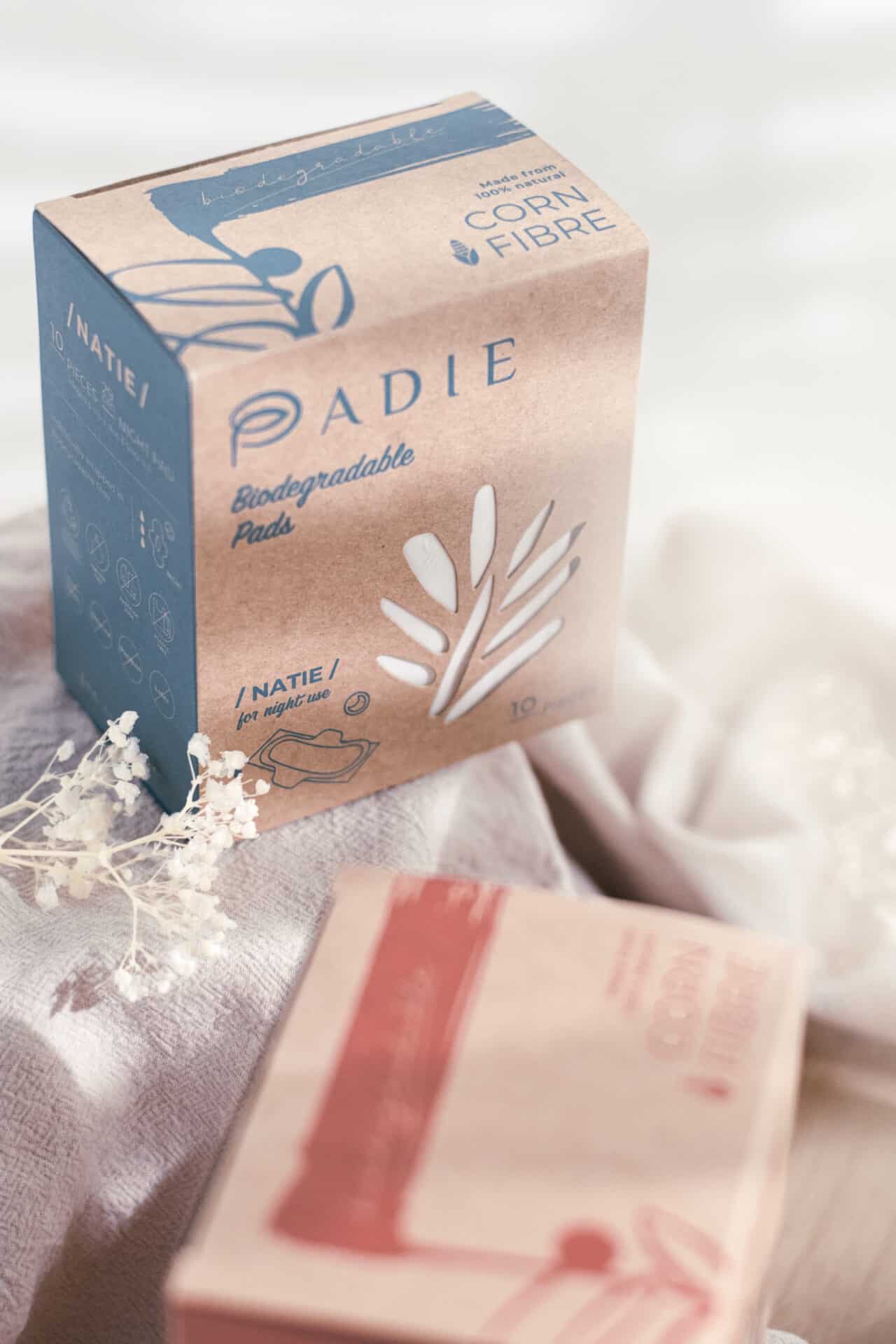
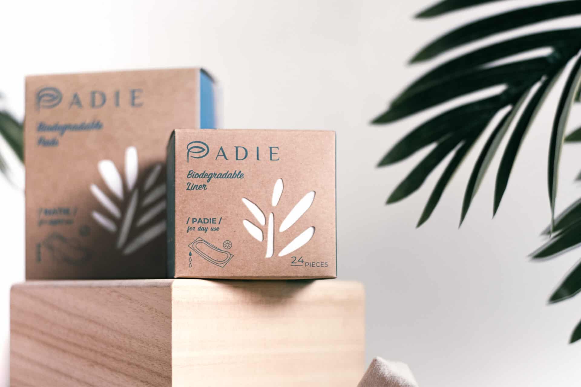
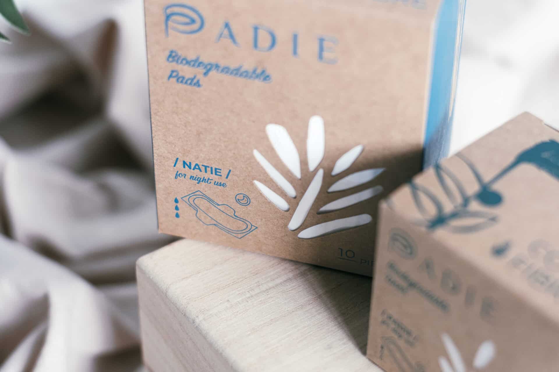
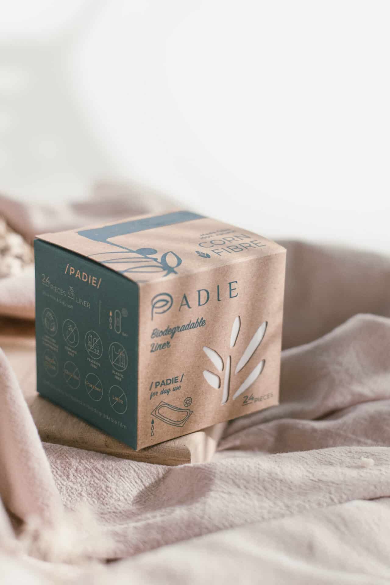
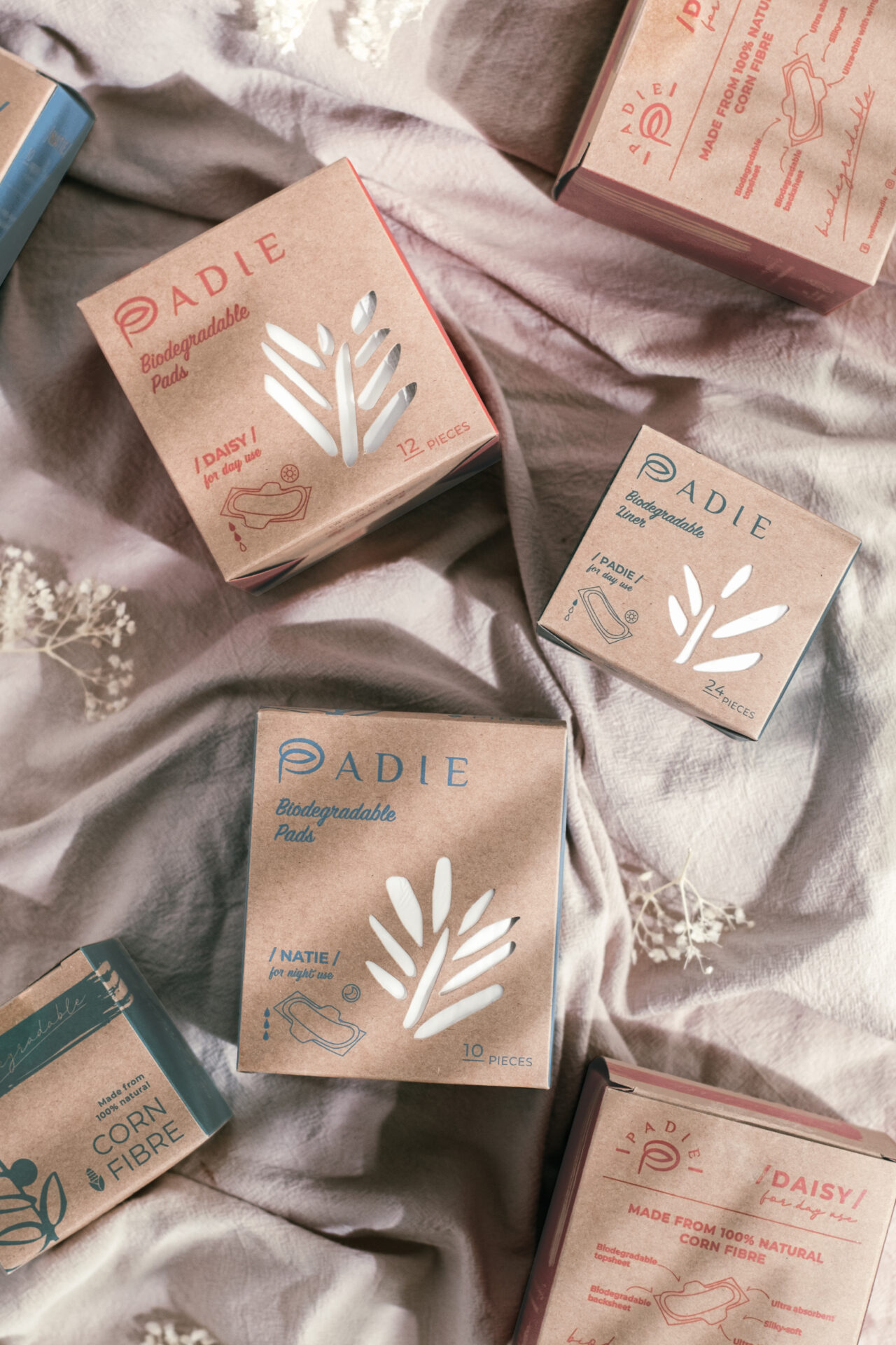
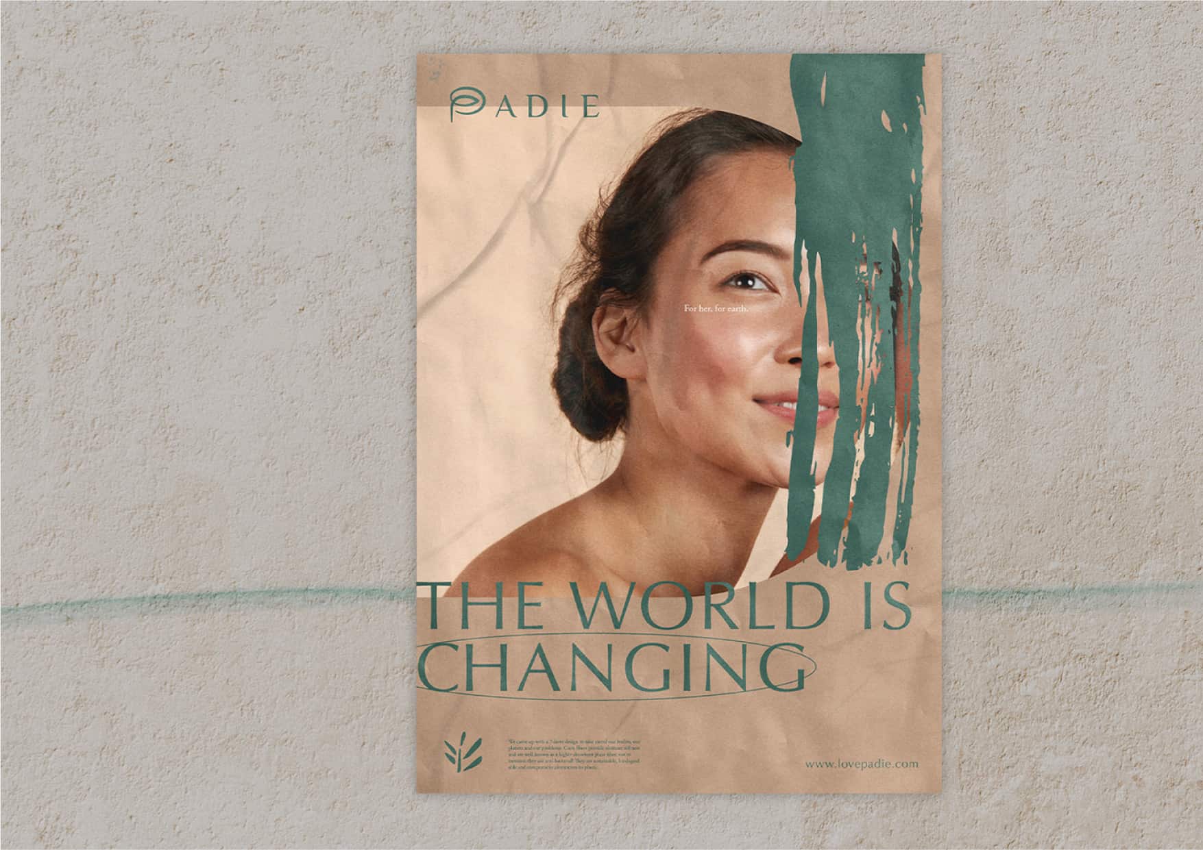
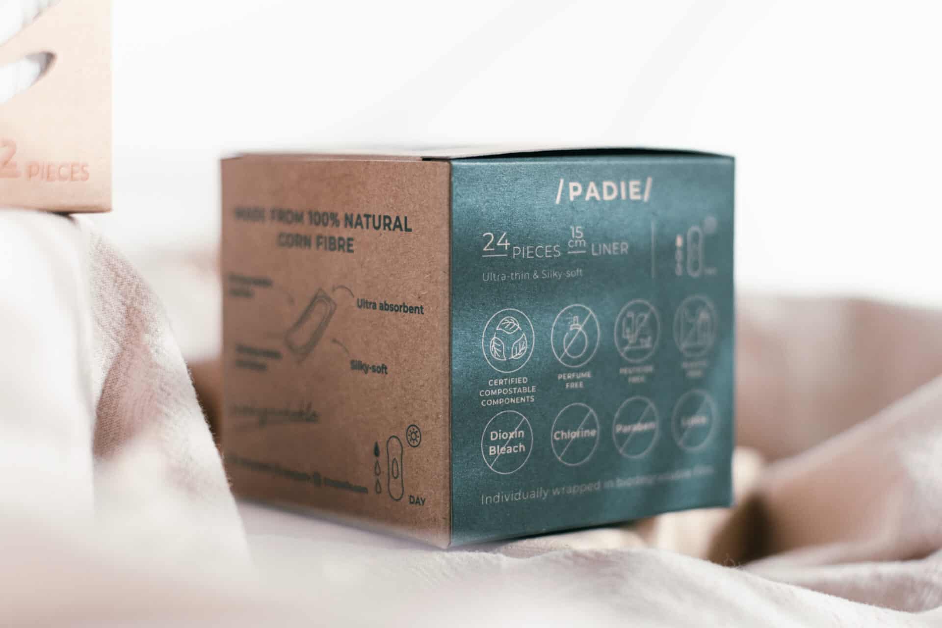
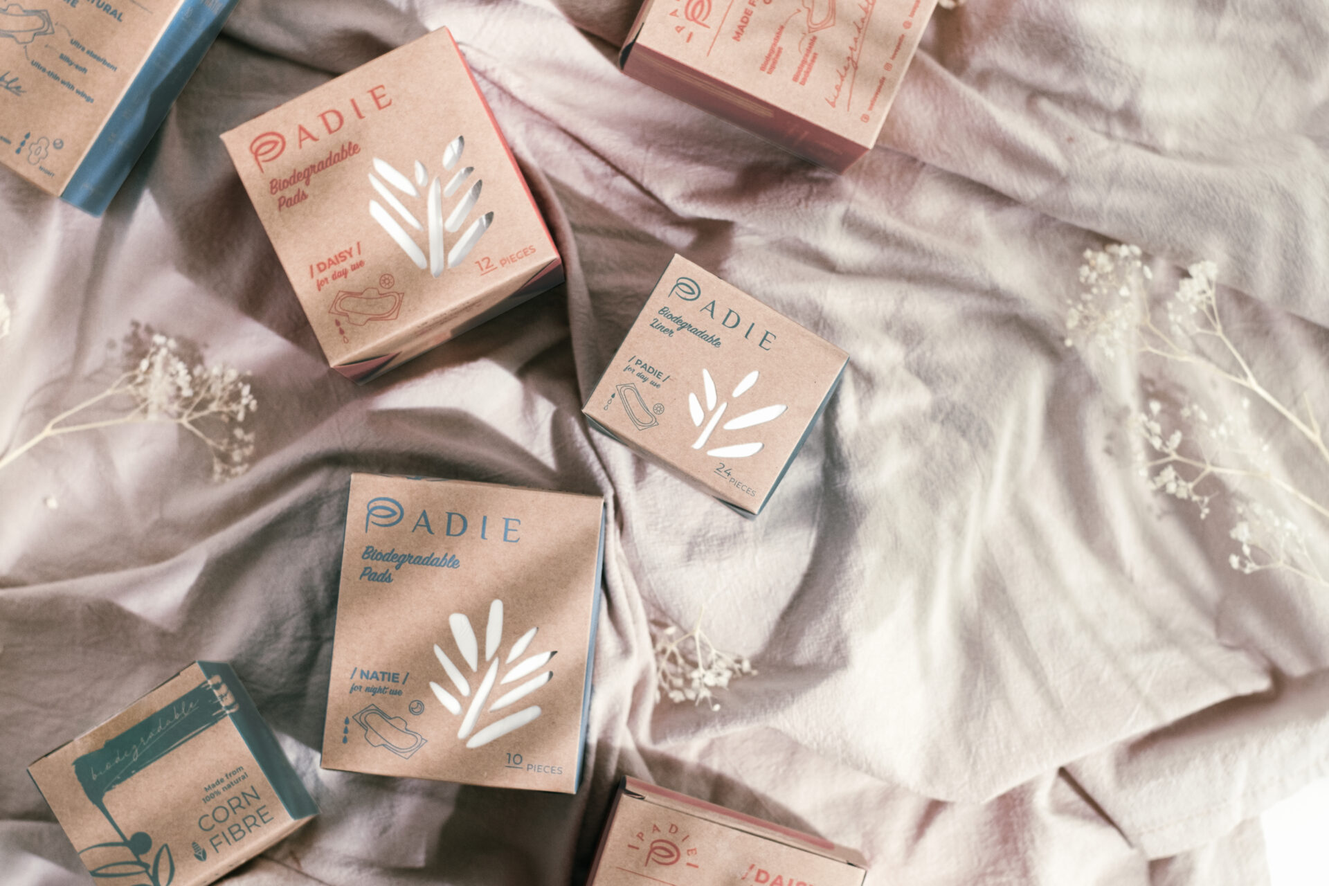
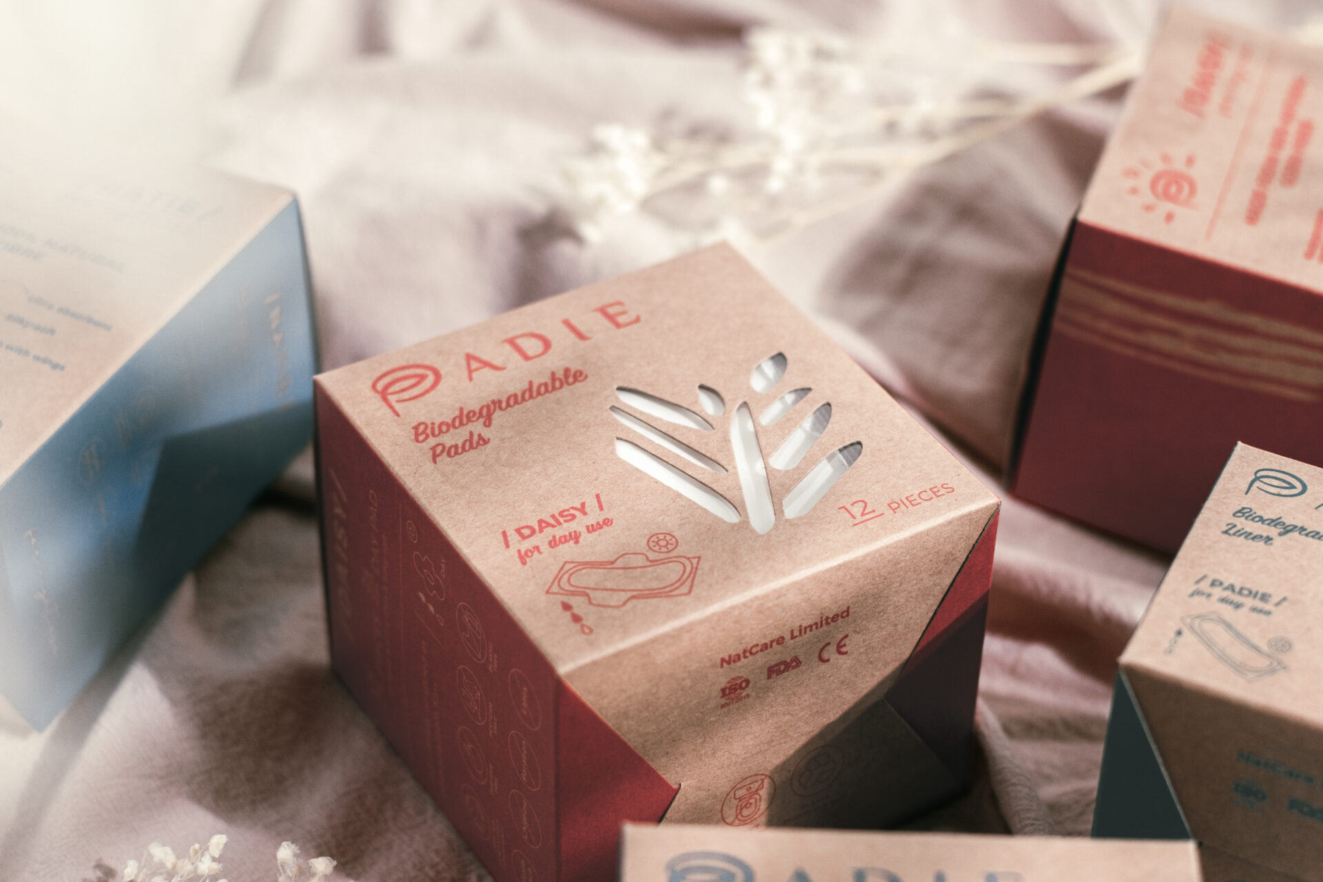
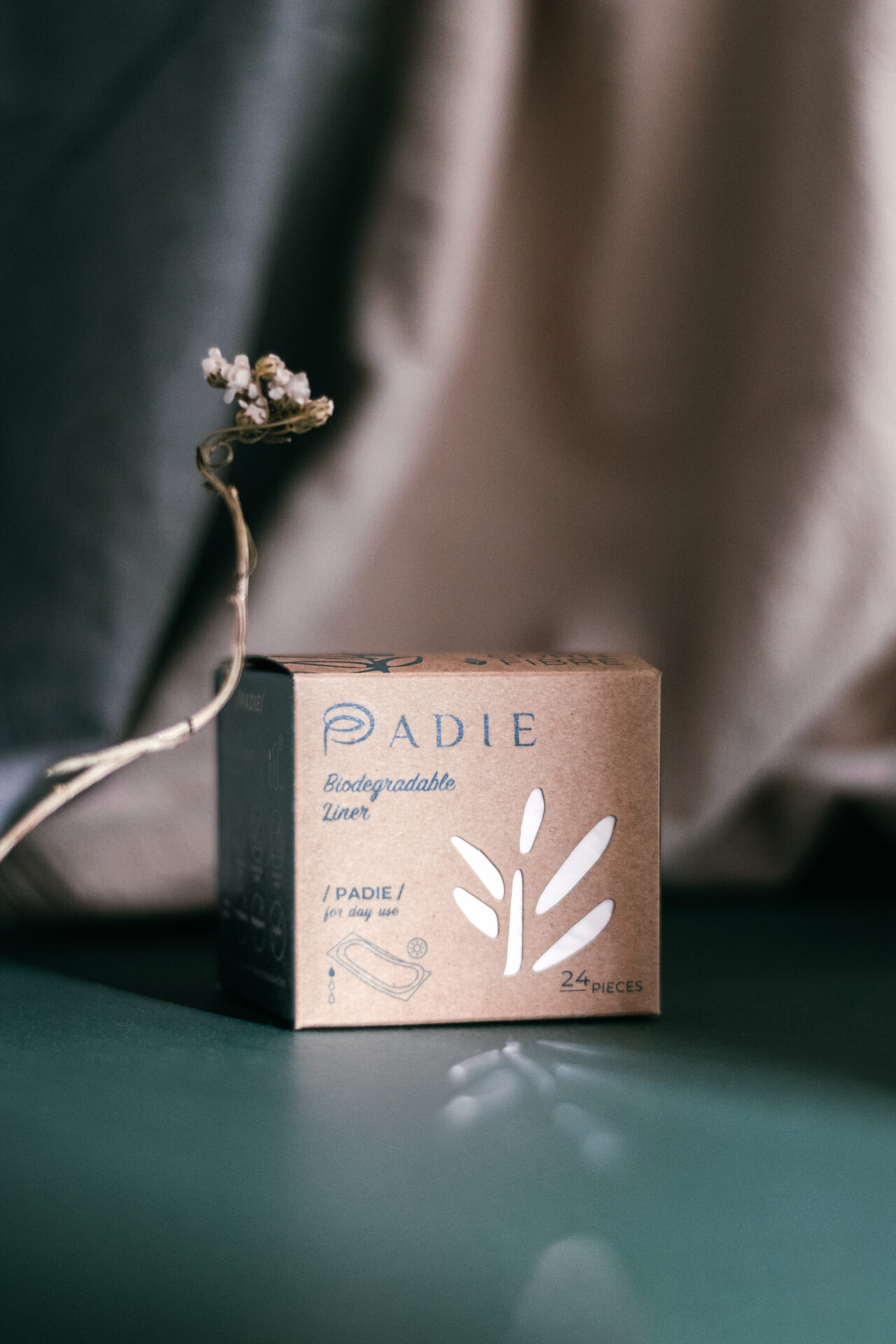
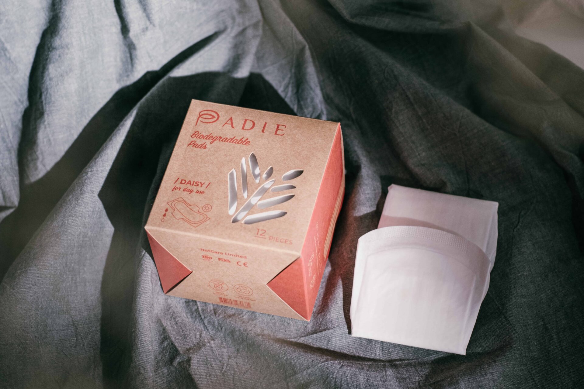
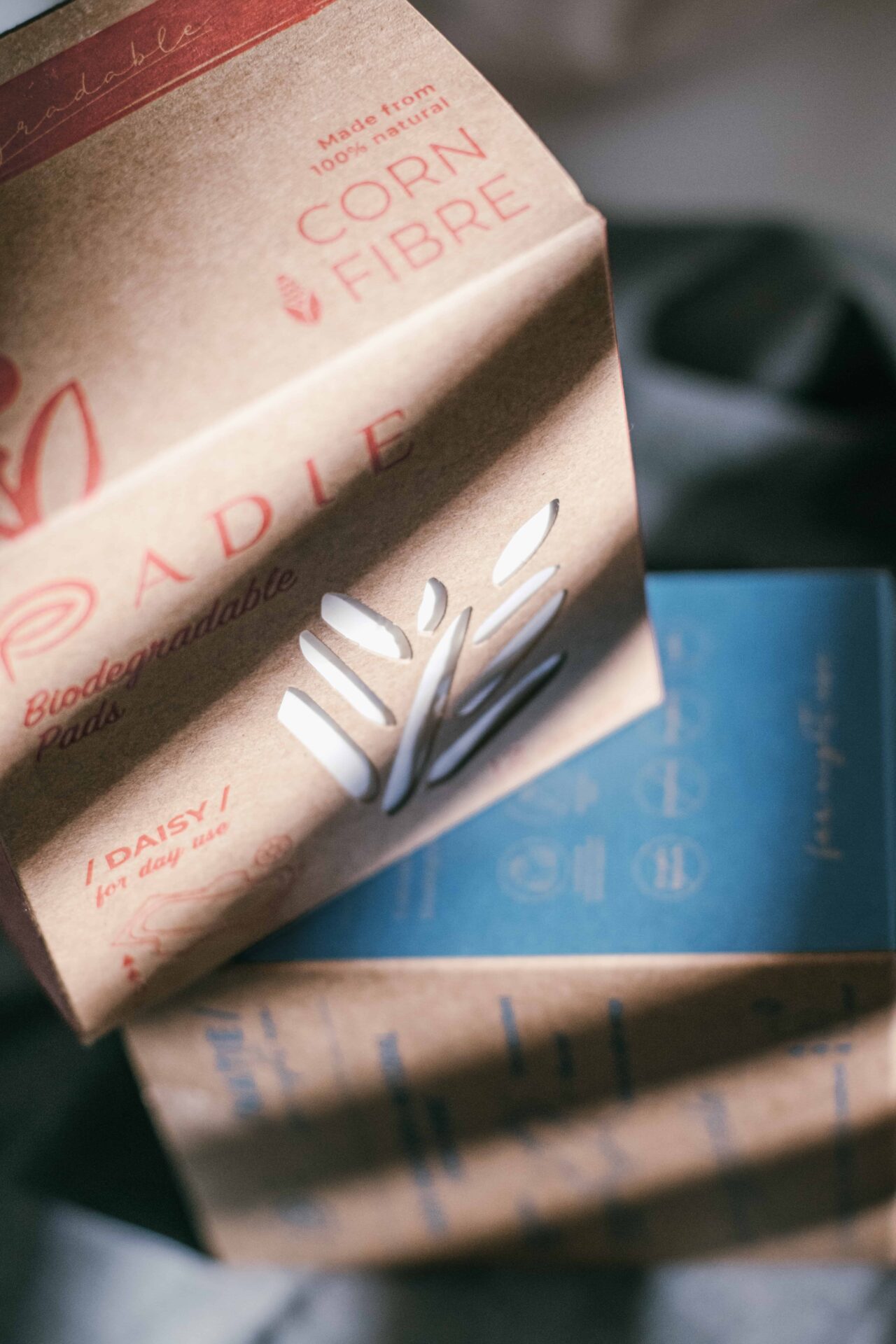
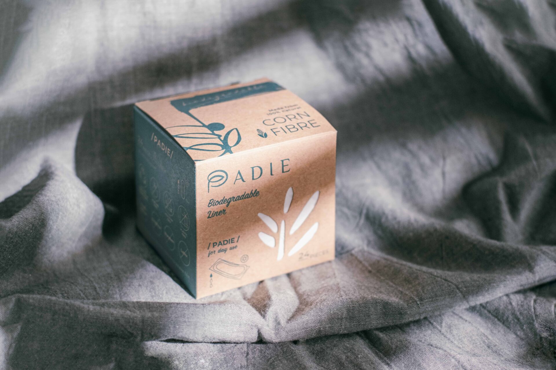
To align with Padie’s goals, the packaging design was thoroughly considered in terms of functionality and graphics. Unlike traditional pads packaging which spares a generous amount of space, Padie’s products are compressed to its minimal sizes to maximise the use of space, functionally reducing the issue of overpackaging. Also, the materials of packaging are kept organic and raw, using unbleached recyclable paper and eco-ink to complete its presentation. Graphically, only the essential illustrations are kept. What’s worth noting is the brush on the packaging that serves as the visual identity for the brand. The strong but gentle, neat but powerful paint of brush eulogises and honours the power in females. Ultimately, this packaging design is created to functionally and graphically visualise the goals of Padie, accentuating her brand image.
Achievement
• Featured as The Best Menstrual Product Branding & Packaging Design Award by DesignRush
PADIE –
BIODEGRADABLE PADS
Branding Design
Client/Project: PADIE – Biodegradable Pads
Creative Director: Vince Cheung
Design and illustration: Koan Tse
Photography: Yin Ip @tinysotiny.co
Background
Committed to the brand mission ‘For Her, For Earth,’ Padie created a natural yet powerful resolution, caring for women and protecting the earth with their 100% Biodegradable Natural Pads made from the highly absorbent corn fibre. Impressively, when processed professionally, the decomposition of Padie’s biodegradable pads can even be shortened from 500 years to 180 days, significantly alleviating the pressure of the Earth, achieving their goals of being ‘Sustainable, Biodegradable, and Compostable.’
Design Solution
For the logo and packaging design of Padie’s Biodegradable Natural Pads, VincDesign explored creativity within the scopes of functionality. The letter P logo embodies two elements, which can be seen as the silhouette of the female’s intimate body part encircling a leaf, symbolising their commitment of prioritising customers and the earth in the creation of quality and sustainable feminine care products, emphasising the brand’s mission ‘For Her, For Earth.’
To align with Padie’s goals, the packaging design was thoroughly considered in terms of functionality and graphics. Unlike traditional pads packaging which spares a generous amount of space, Padie’s products are compressed to its minimal sizes to maximise the use of space, functionally reducing the issue of overpackaging. Also, the materials of packaging are kept organic and raw, using unbleached recyclable paper and eco-ink to complete its presentation. Graphically, only the essential illustrations are kept. What’s worth noting is the brush on the packaging that serves as the visual identity for the brand. The strong but gentle, neat but powerful paint of brush eulogises and honours the power in females. Ultimately, this packaging design is created to functionally and graphically visualise the goals of Padie, accentuating her brand image.