ROOAR | Branding & Packaging Design
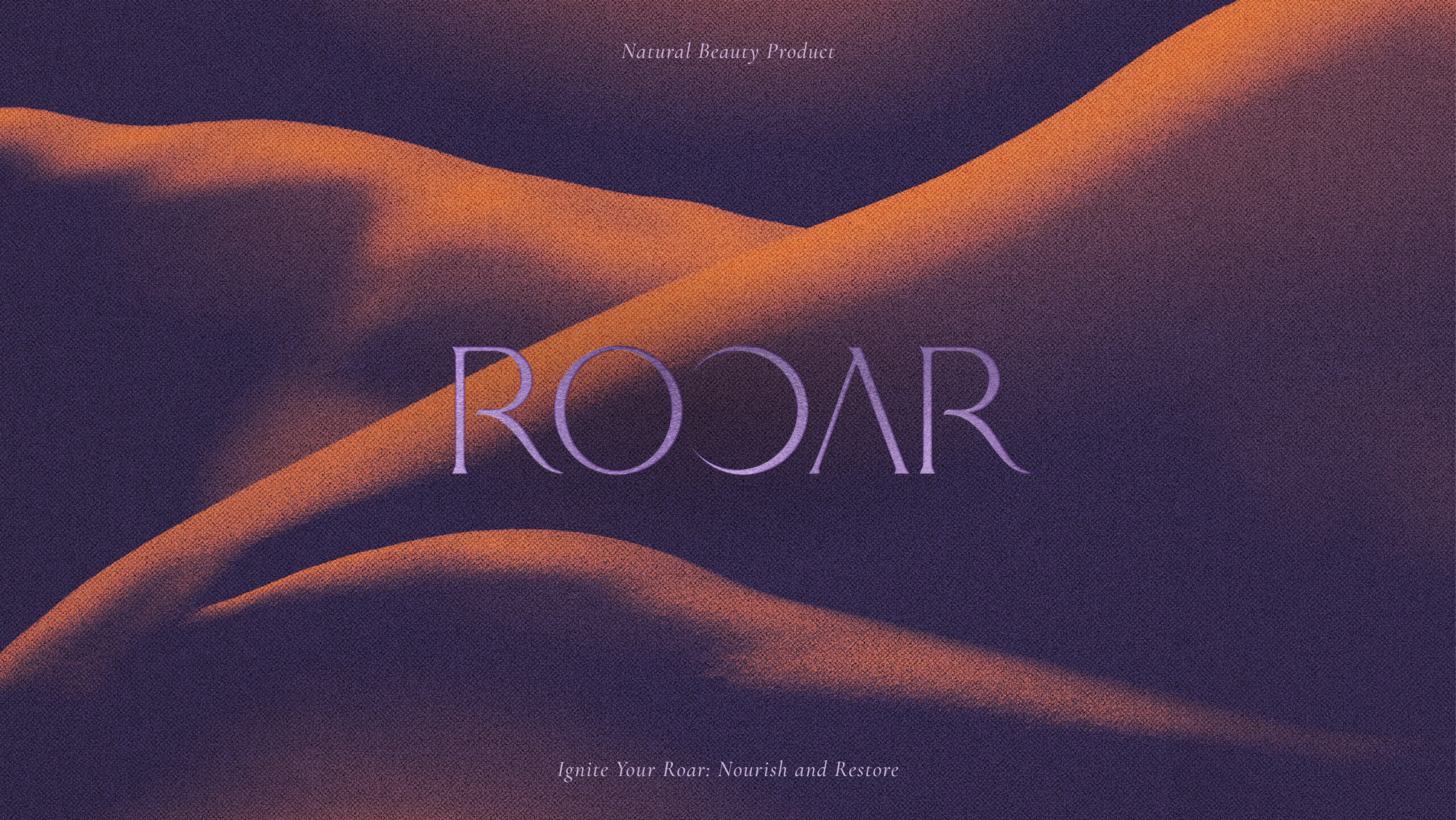
Brand Story:
Background
ROOAR, a body care brand, was launched in 2024 in the United Kingdom. The brand emphasizes not only the outer body but also the well-being of both body and soul. Guided by these values, ROOAR specializes in products that are cruelty-free, vegan, and made from natural ingredients.
The brand name captures a bold attitude, where ‘ROOAR’ represents a powerful shout from deep within, symbolizing a time of awakening and self-improvement that fosters a deeper connection with oneself.
Brand Concept
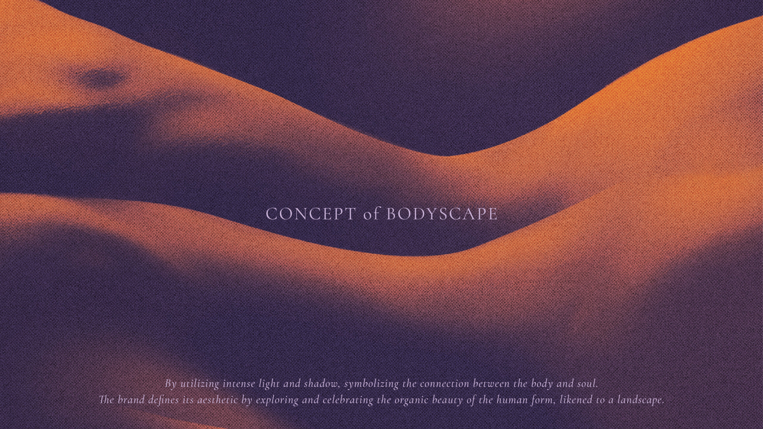
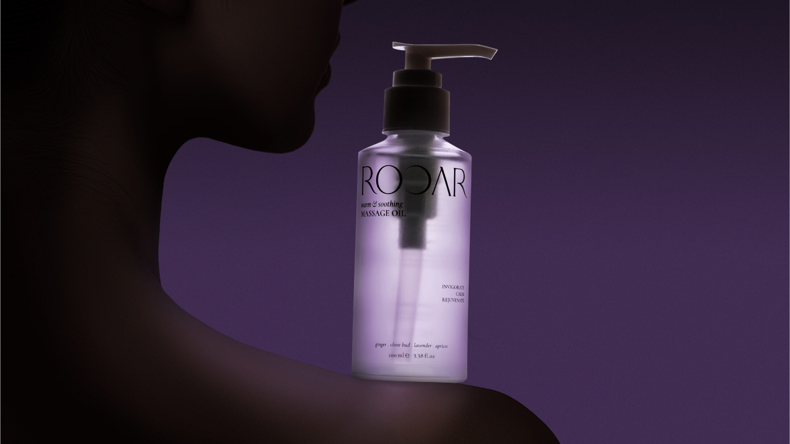
ROOAR uses the distinctive design concept of ‘bodyscape’ branding, where close-up imagery of the human body is artistically depicted in ways that evoke the beauty of landscapes. This concept emphasizes respecting and honoring the body through care and attention. By revealing the true image of the human form from the perceived landscape image only when viewed from various perspectives, the bodyscape approach highlights the notion that true beauty is understood holistically, encompassing both body and soul.
Branding Design
The bold and captivating visuals of the bodyscape not only capture attention but also invite deeper interaction, encouraging viewers to come closer to explore and appreciate the art and philosophy while learning about the product. This innovative use of the bodyscape concept sets ROOAR apart in the body care industry, offering a fresh and unique perspective that has yet to be explored by other brands.
Logo Design
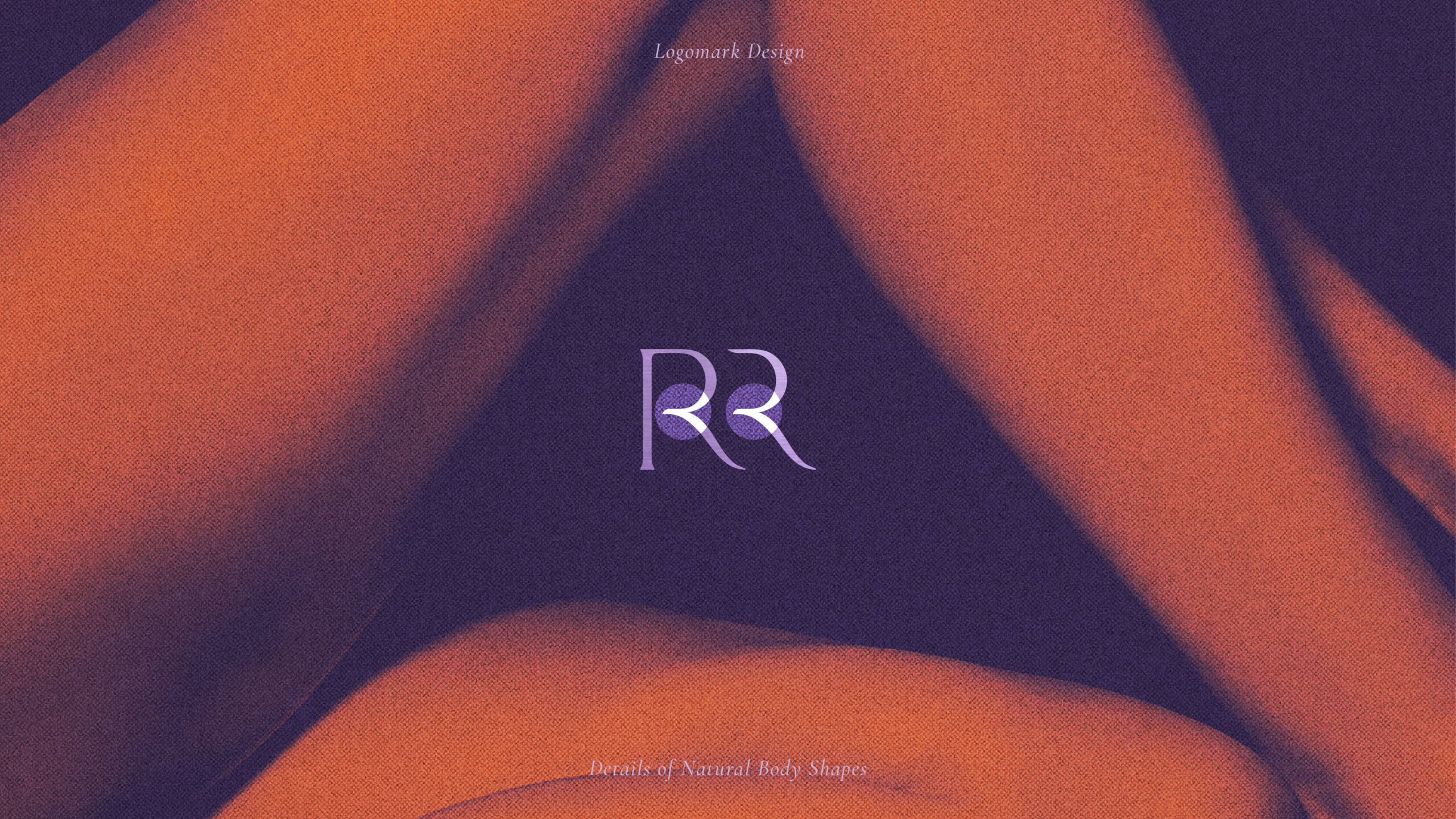
ROOAR believes that morning and evening are significant times for self-care routines. The logo design symbolizes this by incorporating two ‘O’s that represent the sun and moon, reflecting the brand’s commitment to these pivotal moments of the day and conveying a sense of strength and calm.
Brand Colors
The colors purple and orange are used to capture the luminous hues of the ‘magic hour’ or ‘golden hour’ each evening, symbolizing the tranquil and transformative moments of twilight. These colors reflect ROOAR’s dedication to providing a magical experience of relaxation, healing, and self-care.
Packaging Design
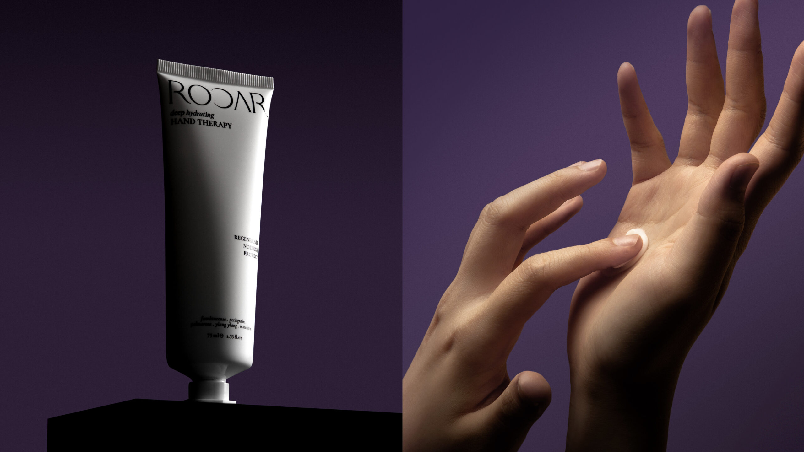
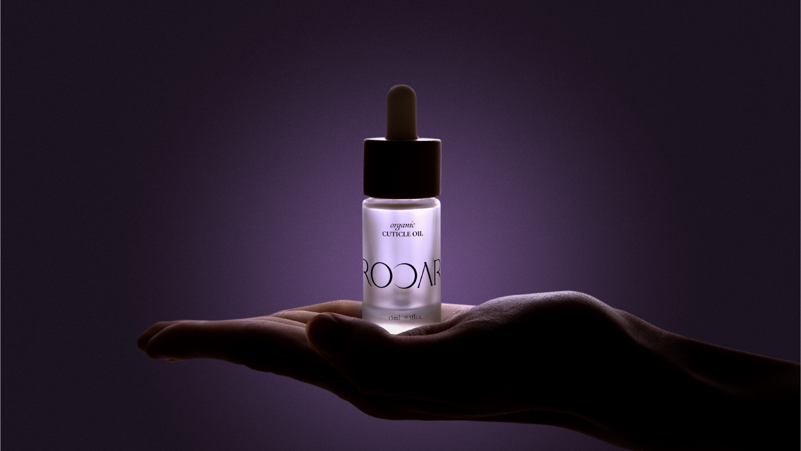
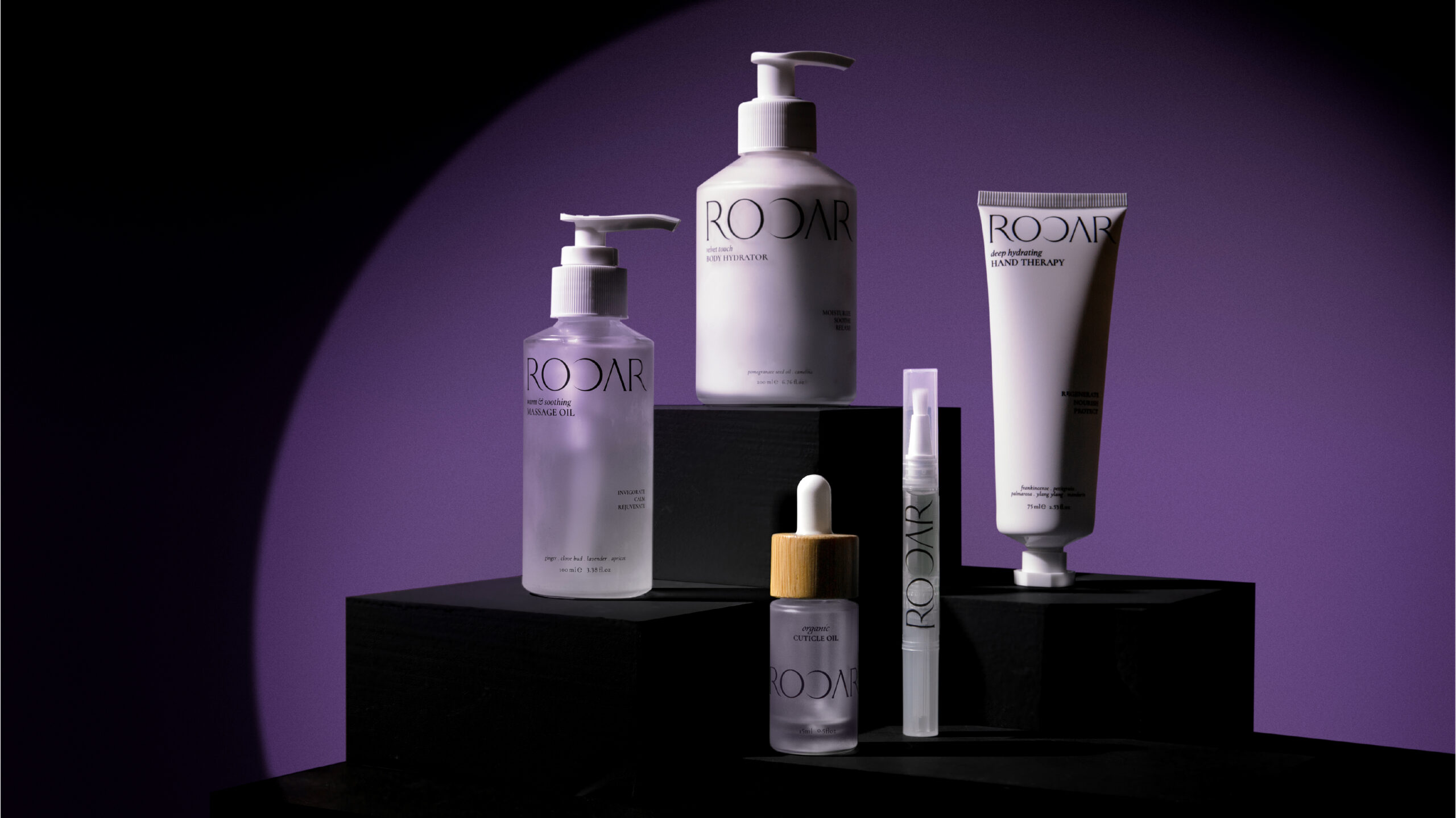
The ROOAR packaging features a clean and sophisticated aesthetic, designed to provide a luxurious experience. The black and white theme with a matte finish creates a modern and elegant look, ensuring the products stand out.
The packaging embodies ROOAR’s dedication to revitalizing connection through touch. It features a satin-smooth texture that evokes a sense of closeness, encouraging interaction with the product. The design allows for different sides of the box to align and form a complete image, reinforcing the holistic view of beauty and self-care. Additionally, the bodyscape imagery on the packaging illustrates the product’s intended use while enhancing its aesthetic appeal. The luxurious texture and weight of the packaging create an elevated experience, ensuring each interaction with the product is both indulgent and memorable.
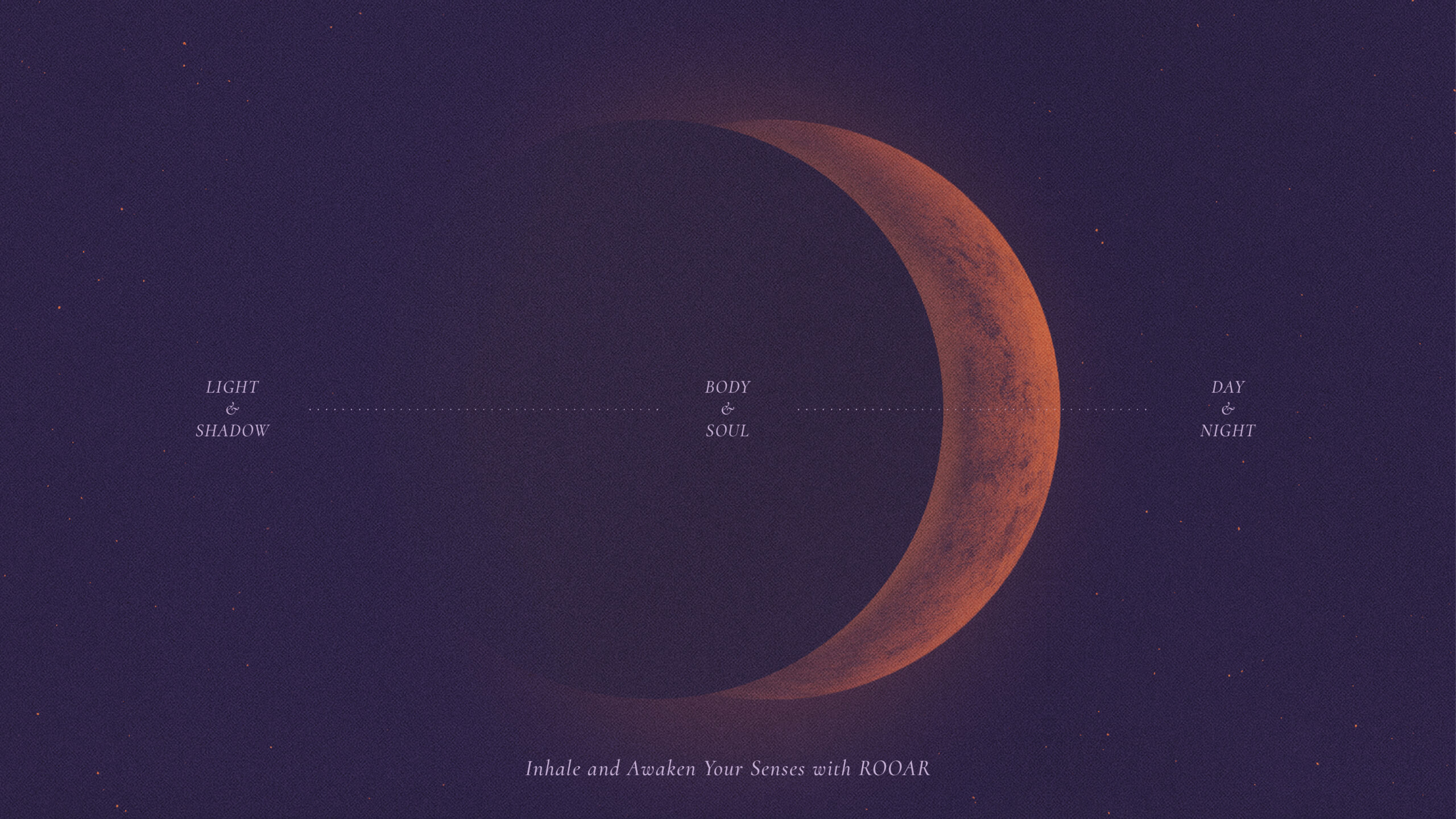
The logo design for ROOAR encapsulates this concept through the two ‘O’s in the name symbolizing the sun and moon, representing morning and evening.
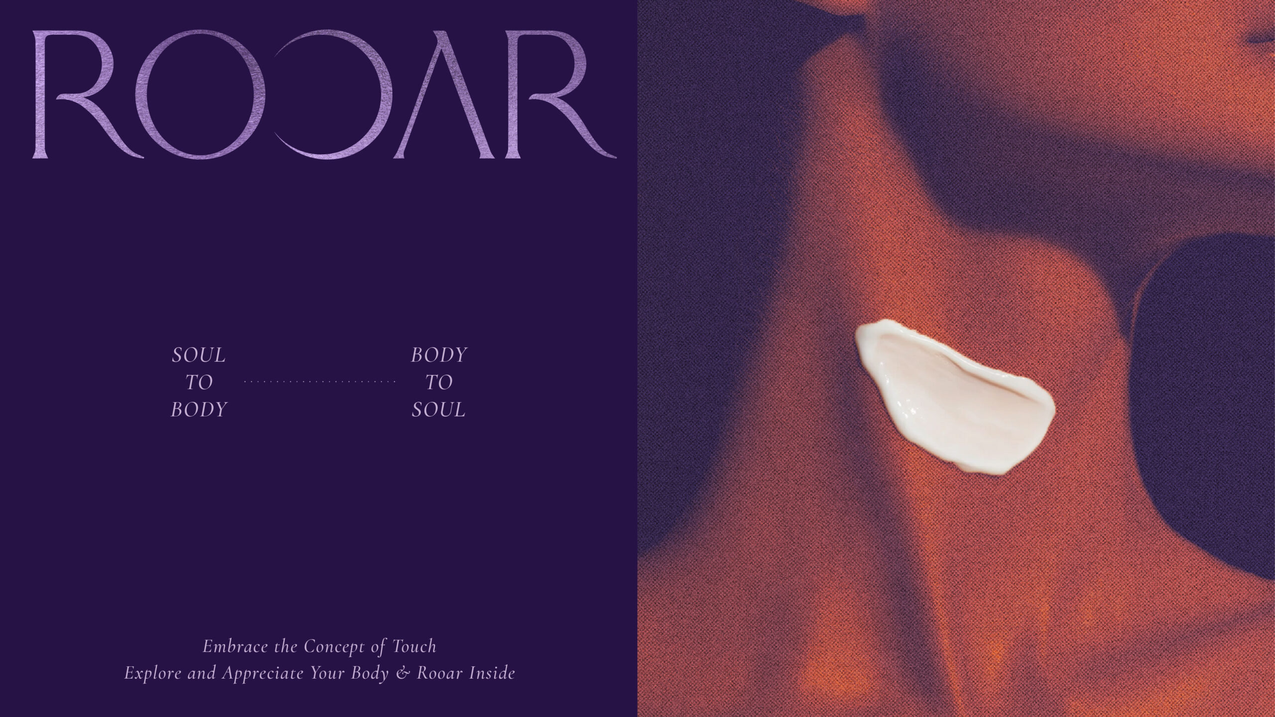
ROOAR uses the distinctive design concept of ‘bodyscape,’ where close-up imagery of the human body is artistically depicted in ways that evoke the beauty of landscapes. This concept emphasizes respecting and honouring the body through care and attention.
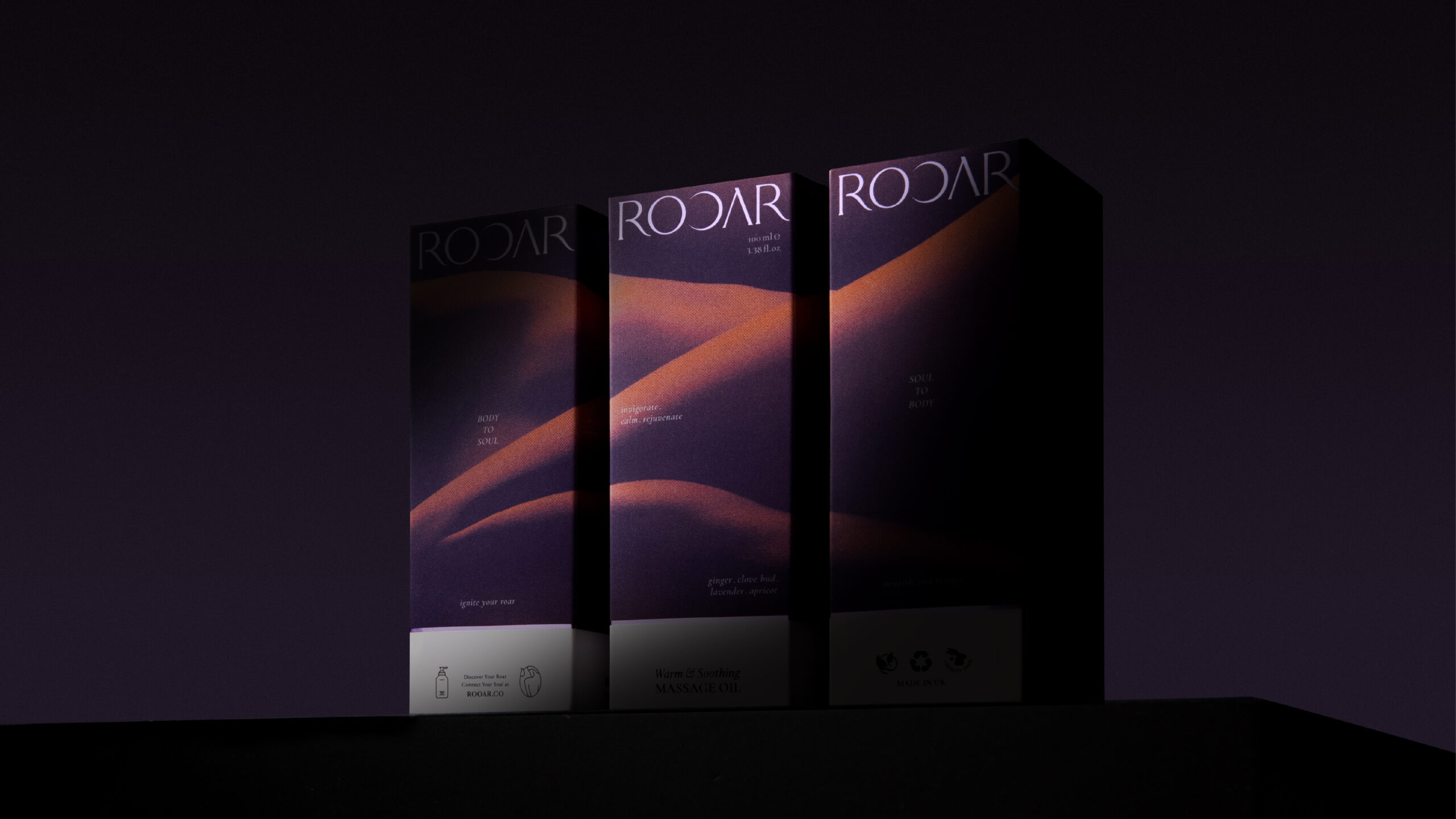
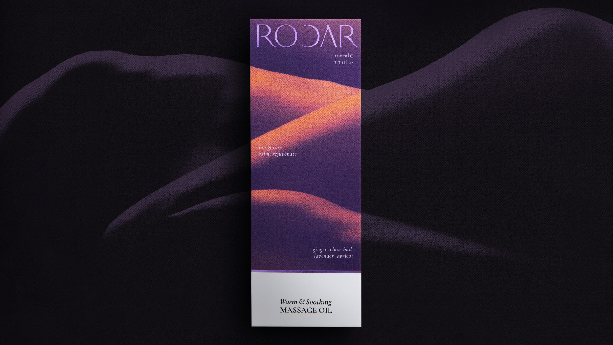
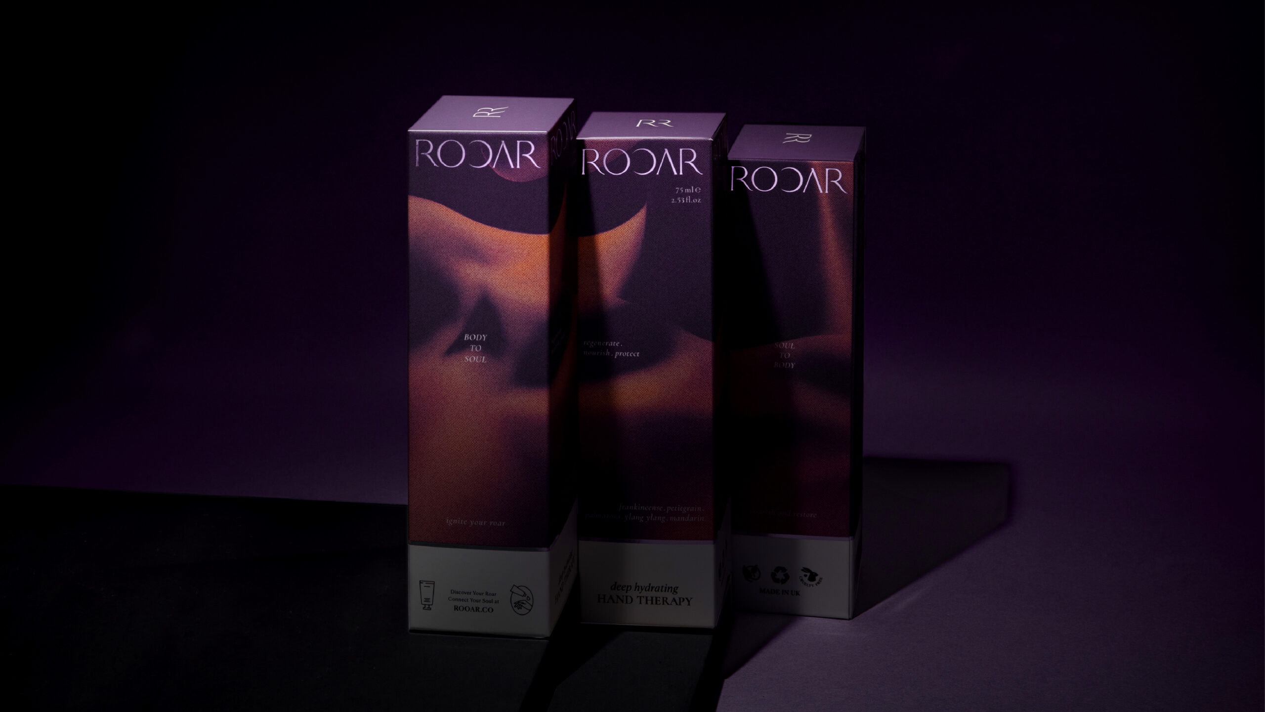
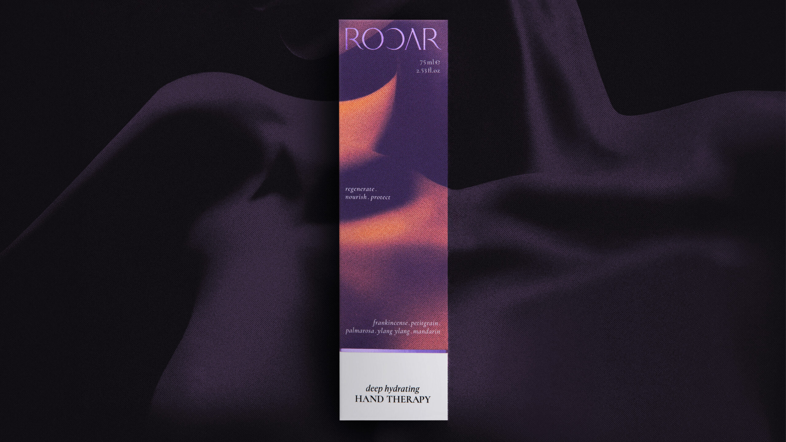
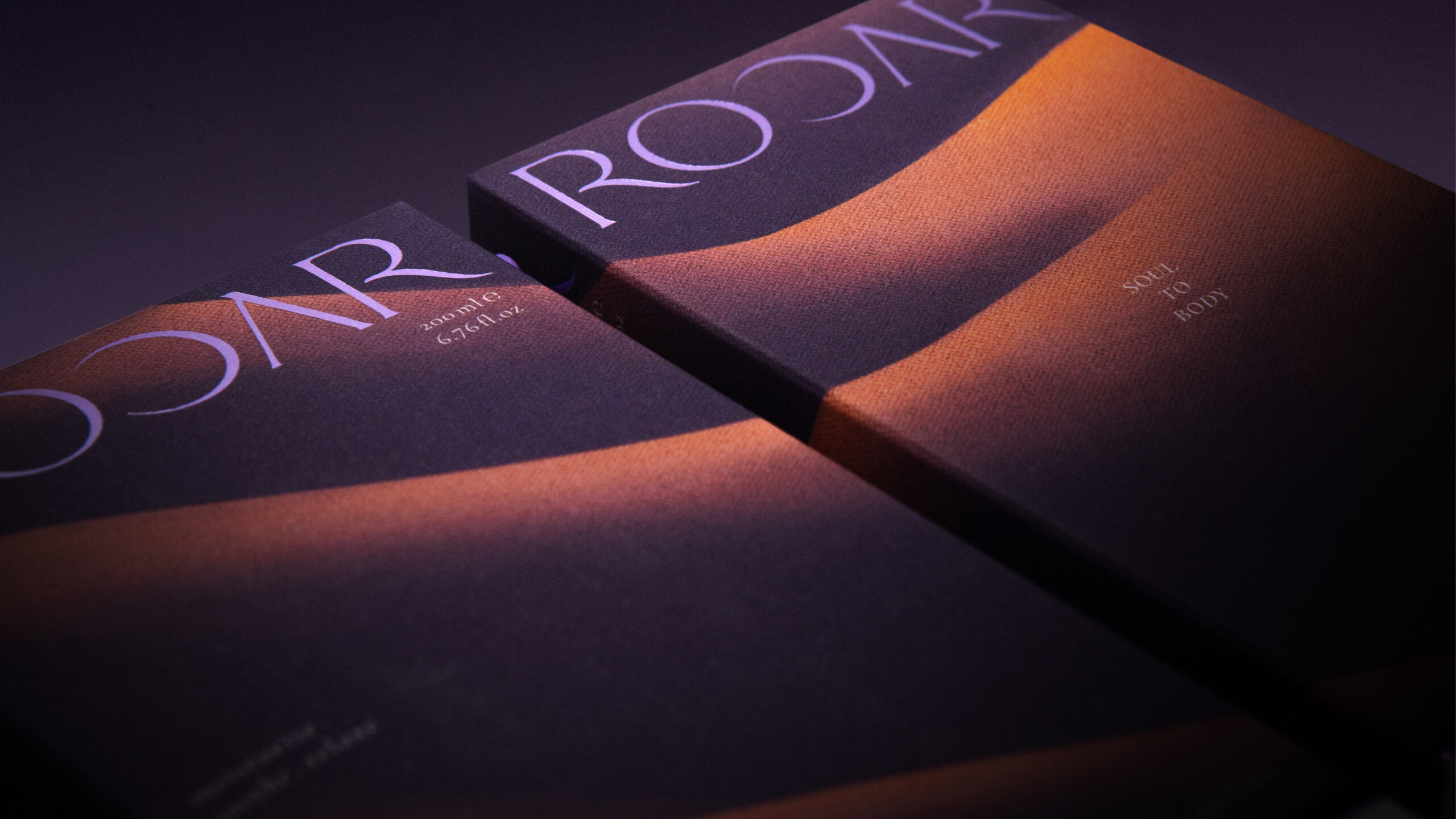
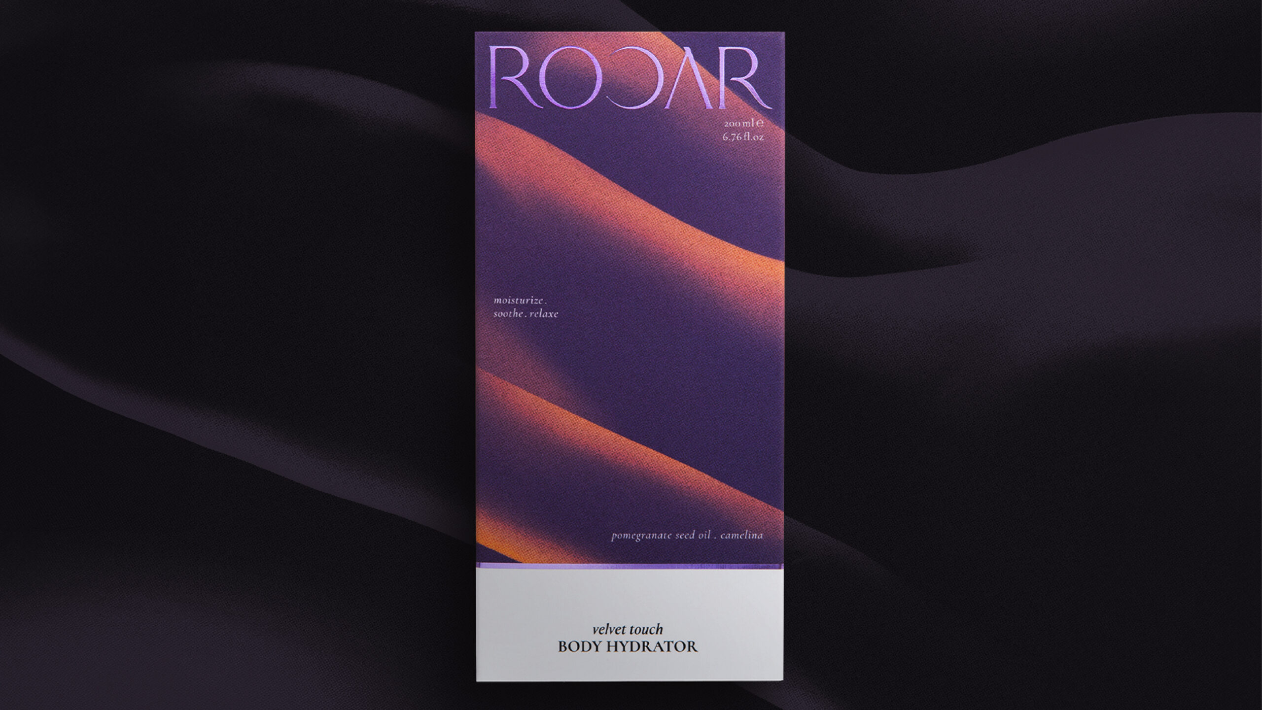
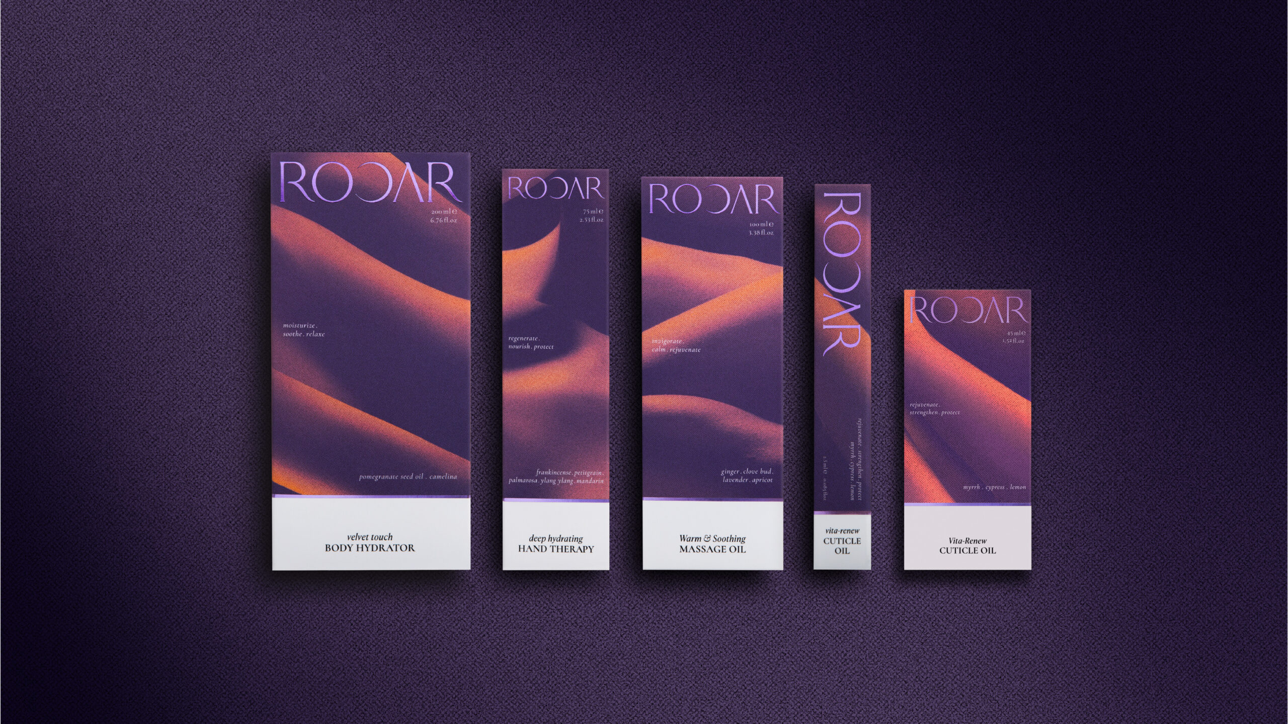
The ROOAR packaging design embodies a clean and sophisticated aesthetic, crafted to offer a luxurious experience. The product packaging features a simple black and white theme with a matte finish, which not only creates a clean, modern, and elegant look but also ensures that it stands out easily in a bag.
What we did:
Brand Positioning, Brand Story, logo Design, Visual Idenlity, Package Design
Client/Project: ROOAR
Creative Director: Vince Cheung
Design and Illustration: PingTing Lee
Printing: Sense Production Limited
Results
• The branding for ROOAR successfully captured the brand’s identity and resonates with the target audience through the unique brand concept of “bodyscape”.
• ROOAR has already caught the attention professionals in the industry receiving awards for their products within the first year of launching:
o Winner – Natural & Organic Beauty Innovation Awards 2024 – Best New Body Care Product
o Winner – Beauty Shortlist: Mama & Baby Awards 2024