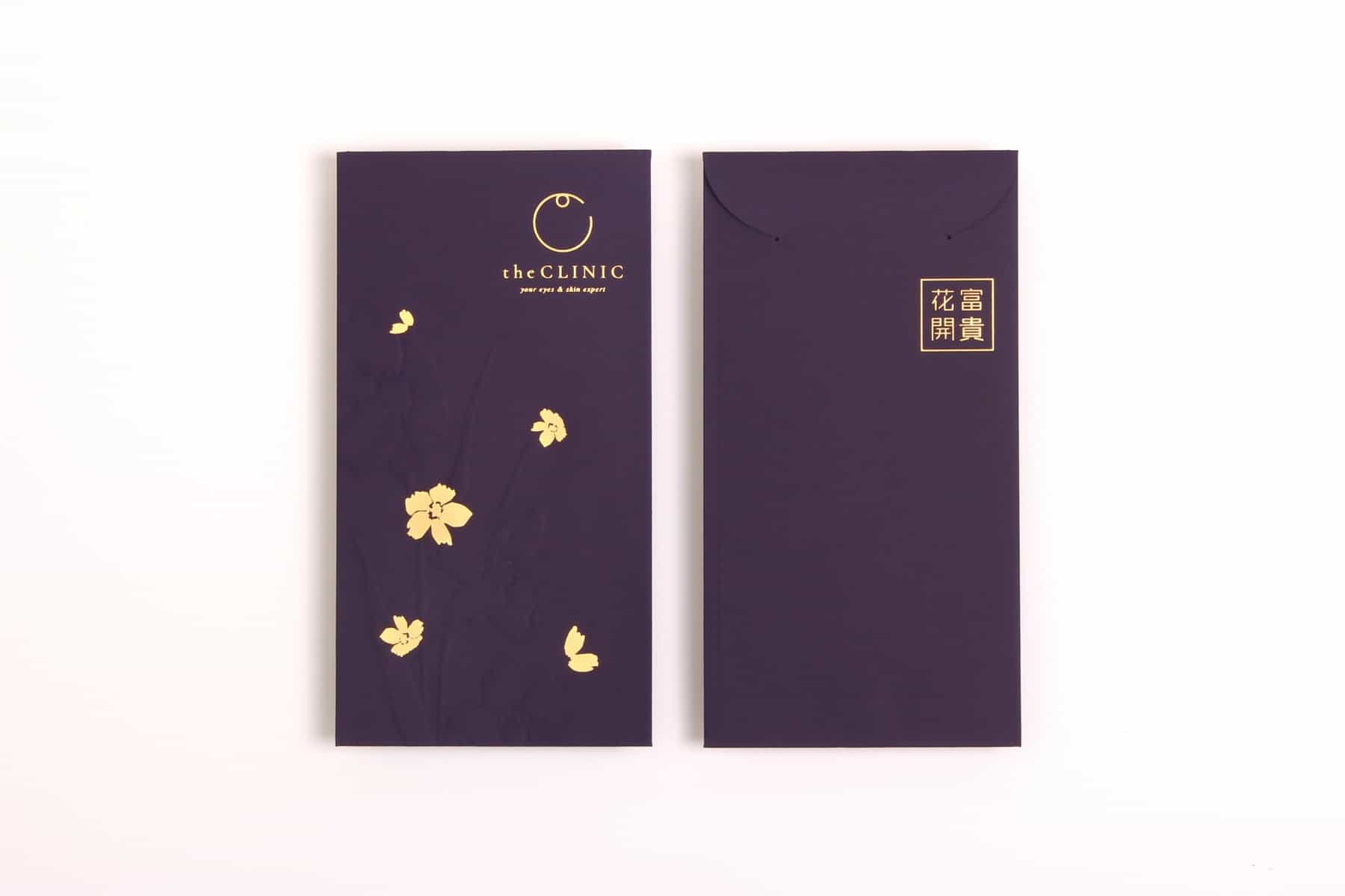
the Clinic
Background
The Clinic is a medical cosmetology centre located in the CBD of Hong Kong. It was founded by a group of ophthalmologists and luxury brand professionals. Unlike traditional medical cosmetology centres, the Clinic is the first of its kind in Hong Kong to specialise in eye treatment alongside skin.
Solution
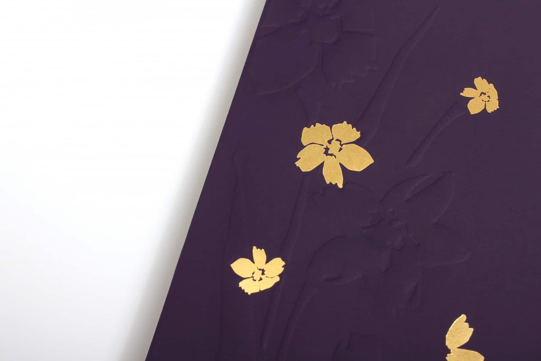
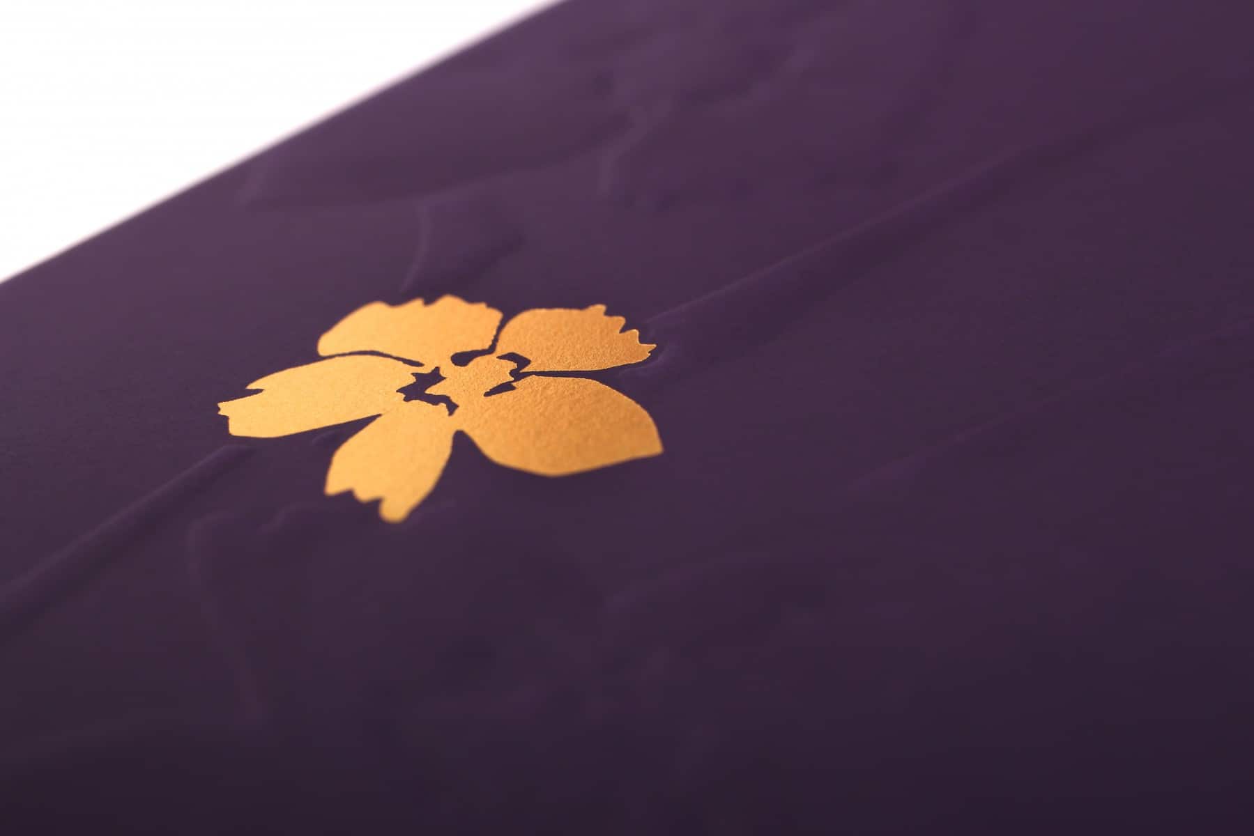
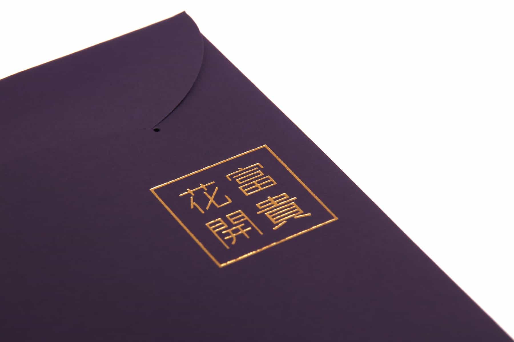
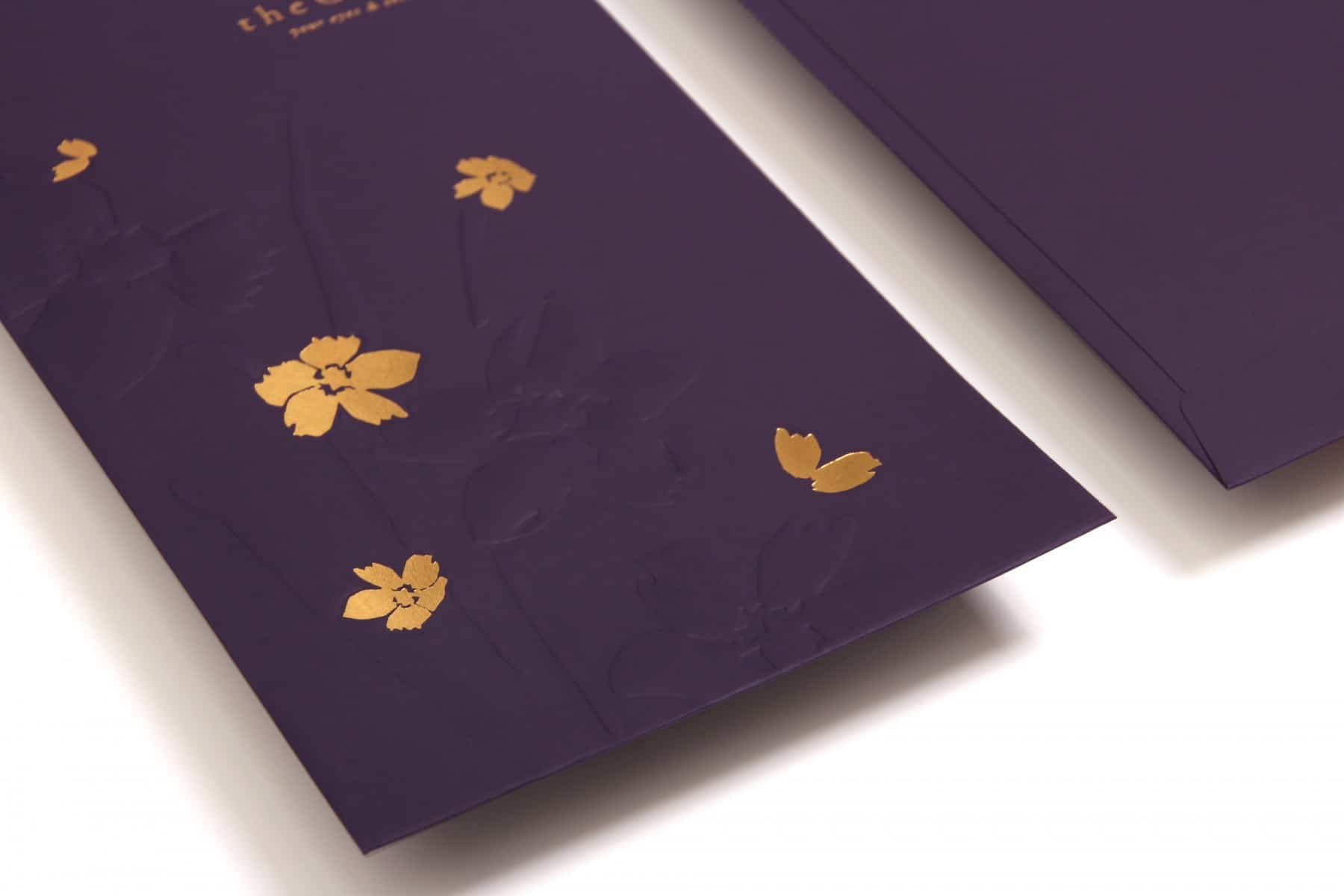
We wanted to get rid of the cold and rigid image of traditional medical cosmetology. By referencing the decoration of hotel, the Clinic gives the public a premium and cozy feeling. We created a new brand story – the window to the soul is where beauty begins. The logo is composed by an eye and the letter C, symbolising that in the Clinic, beauty begins from your eyes. The golden ring shape looks like a shining halo, brings out its elegance. We also used purple and marble as main elements, representing coziness and nobility.
The Clinic has three main elements, the beauty from eyes, VIP services and coziness. We combined the three main elements and put them into the brand image. The Clinic successfully gains a foothold among numerous medical cosmetology brands. It is not only popular among locals but also foreigners. The Clinic has introduced various beauty and skin products, and is also planning to open more branches in the coming future.
