YOOV – Digital Software Platform | Branding Design

YOOV
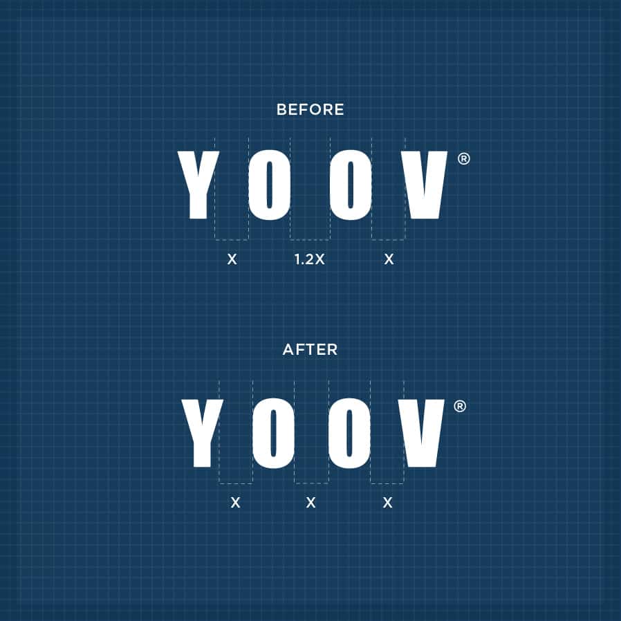
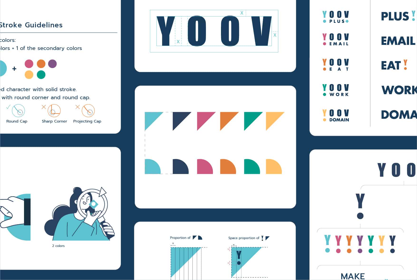
YOOV is a digital platform that provides digital solutions and corporate management systems to industries and entrepreneurs. We started our rebranding project with refining our logo, adjusting the kerning for a more balanced look.
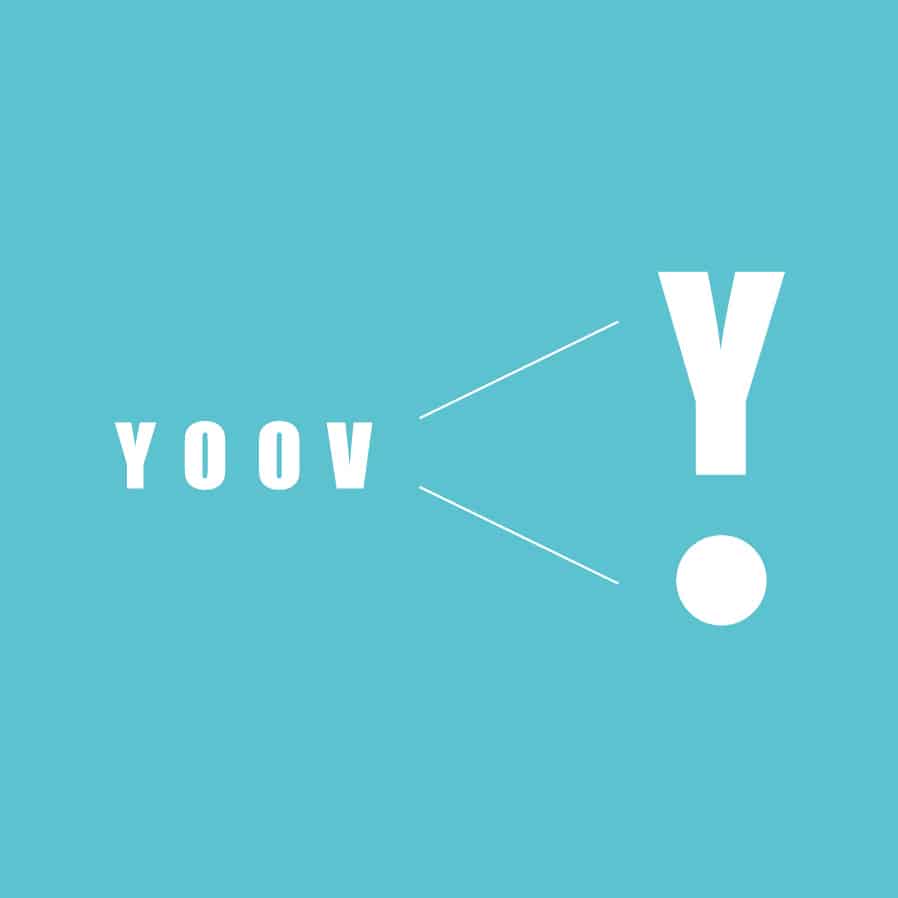
Our brand identity system embodies the humanisation of our technology company, represented by the Y exclamation icon. This symbolizes the emotions and feelings that technology can evoke, and YOOV offers more than just digital solutions – we provide humanized tools that cater to your needs. Our slogan, “MAKE IT HAPPEN,” reflects this ethos.
To develop our brand identity system, we created a color palette, graphic elements, and a triangle and quarter-circle pattern derived from our Y exclamation icon. We also established illustration and graphic guidelines for a cohesive visual identity system.
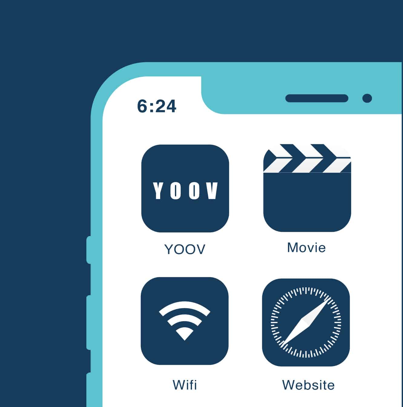
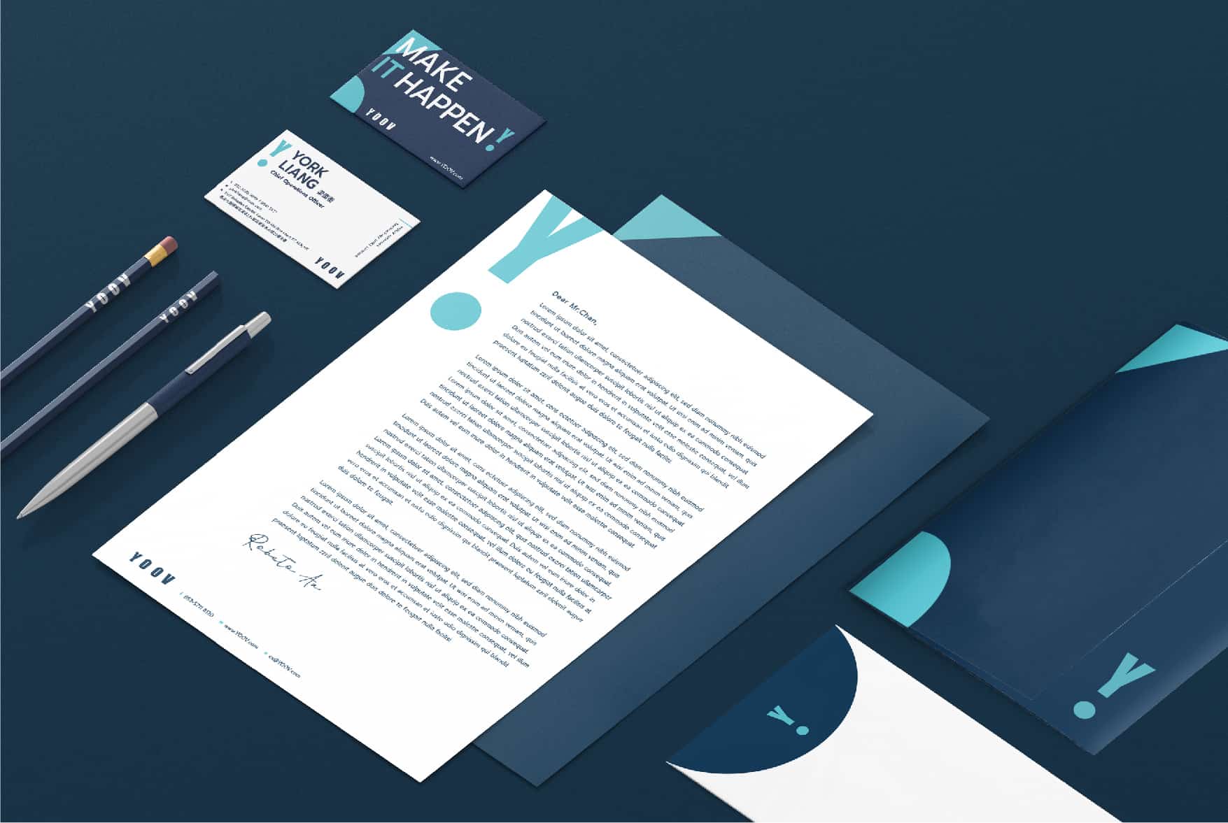
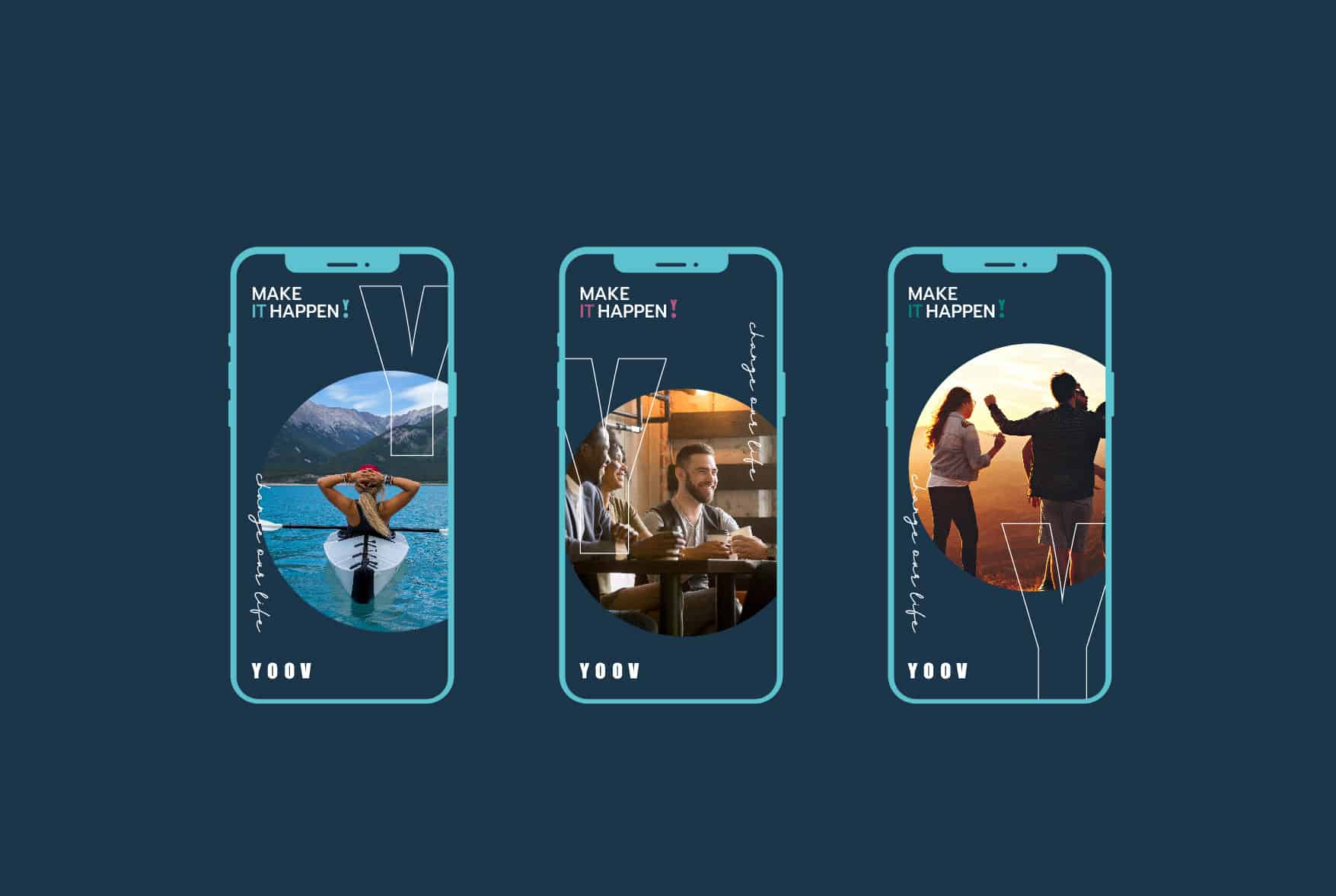
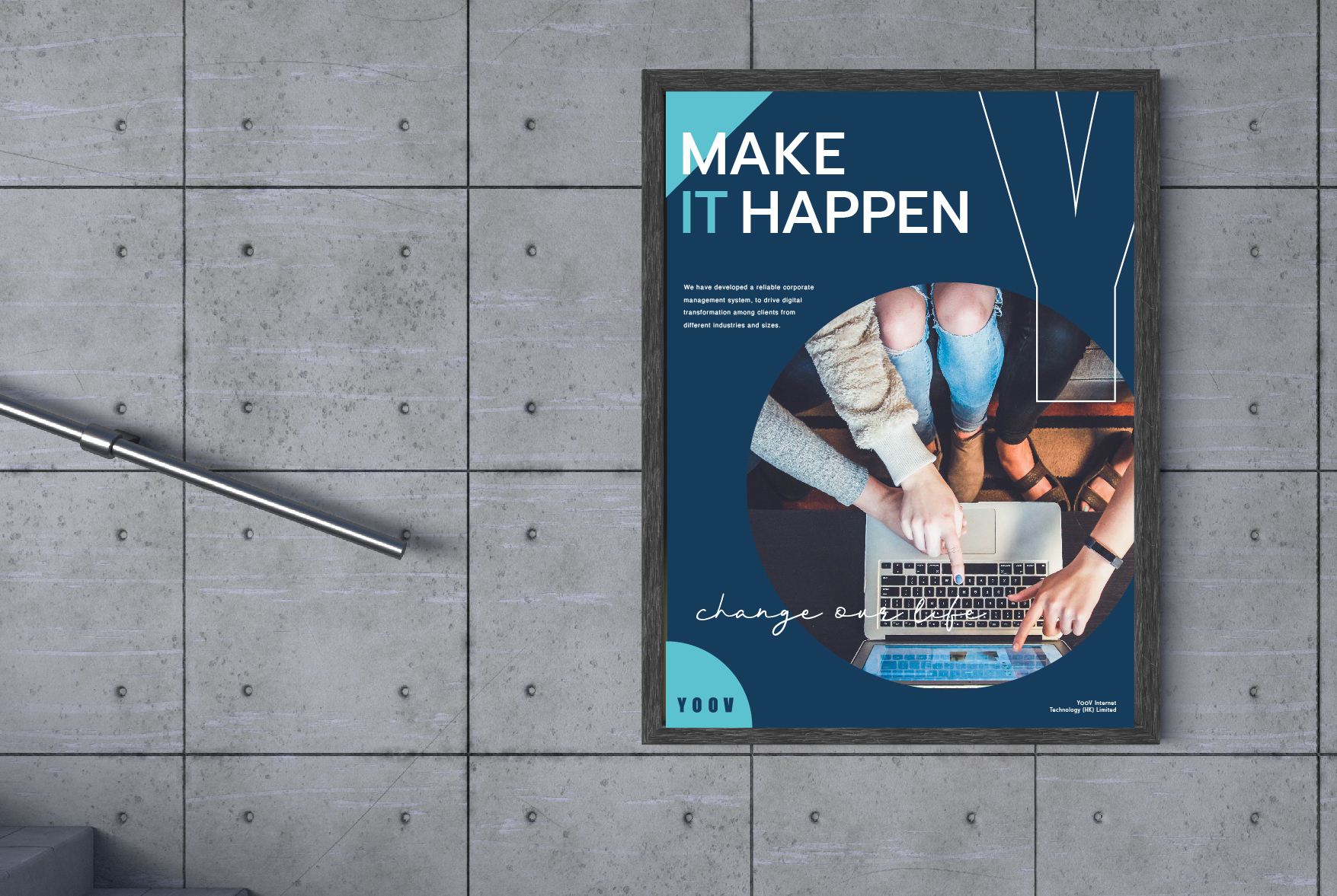
Our refined logo is applied to the new app icon and various corporate stationery items. We added humanized elements to our mobile digital platforms, ensuring that our platform is not only functional but also user-friendly. The triangle and quarter-circle pattern is versatile and can be applied to different media and formats, including ads, bags, websites, and posters.
YOOV is more than just a digital platform – we offer humanized tools and solutions that help you “MAKE IT HAPPEN.”
ABOUT YOOV
YOOV is a digital platform that provides digitalisation solutions such as corporate management systems to various industries and entrepreneurs. The rebranding project of YOOV started with logo refinement. Where we adjusted the kerning to make it more balanced.

Brand Identity development
The brand identity system of YOOV. We created the colour palette, graphic elements and the slogan “MAKE IT HAPPEN”. The Y exclamation icon is further developed into the triangle & quarter-circle pattern.





Visual Identity development
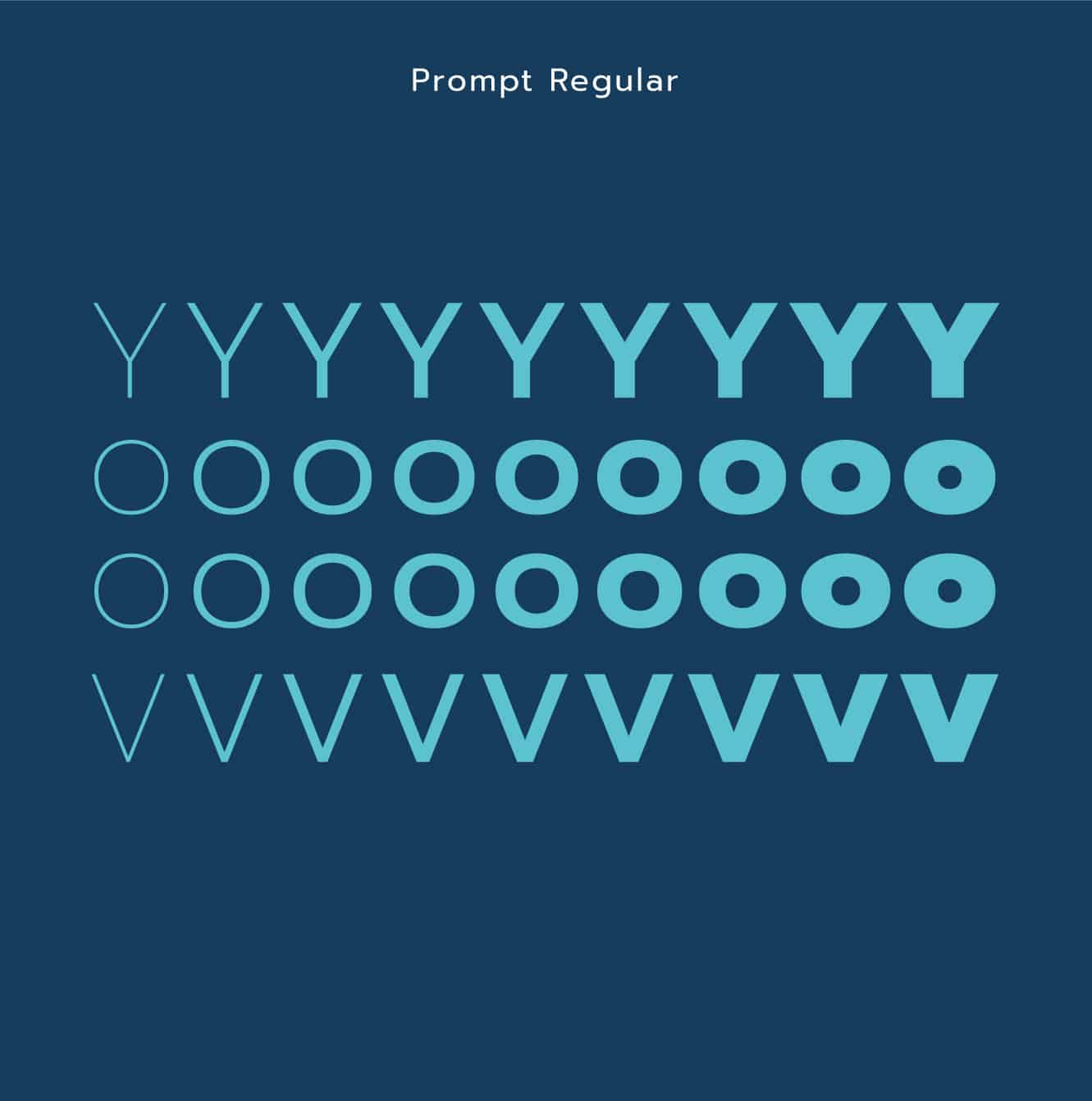
Illustration and graphic guidelines are set up for a holistic visual identity system




Stationery
Brand elements and graphics are applied to various corporate stationery items
Application Design
Humanised elements are added so it is not just a functional platform
The triangle & quarter-circle pattern can be applied in different media and formats





WHAT WE DID
Branding Design, Logo Design, Brand Positioning, Creative Concept, Brand Identity, Brand Communication
Branding design for YOOV
Client/Project: YOOV (www.yoov.com)
Creative Director: Vince Cheung
Design and illustration: Ken Li
Animated: Yin Ip @tinysotiny.co
商標 | 品牌設計 | 香港 | 香港設計 | 視覺形象 | 包裝 | 包裝設計
logo | branding | design | hong kong | hong kong designer | VI | visual identity | vincdesign | package | package design