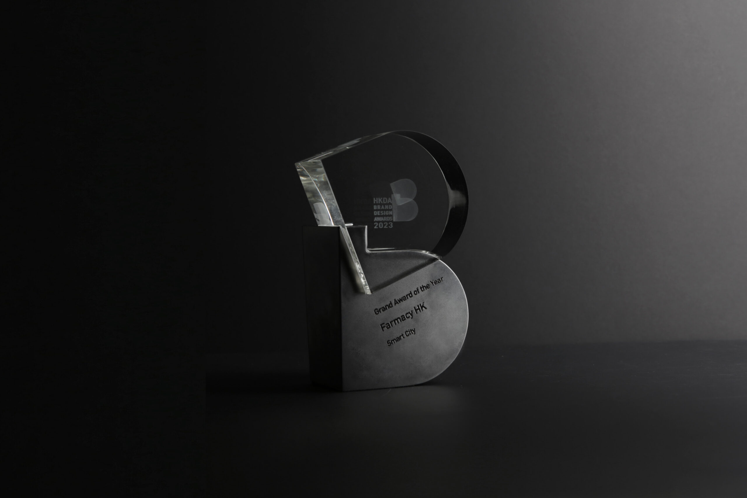
We are pleased to announce that our partner, Farmacy HK, has been awarded the Grand Award of the Year at the HKDA Hong Kong Designers Association Brand Design Awards 2023. This honor demonstrates the comprehensiveness of Farmacy’s brand design, which was evaluated based on uniqueness, aesthetic value, marketability, innovativeness, and sustainability, showcasing the effectiveness of brand design and its impact on the market.
Since 2021, our team has been committed to redesigning Farmacy’s brand image and providing brand image and design consulting services. We are honored to have contributed to this award-winning project and look forward to continuing our partnership with Farmacy HK as they bring their new brand image to the market.
About Branding design for FARMACY
Background
Vincdesign re-created the branding design for Farmacy, which is the first tech company in Asia that is devoted to building smart mobile in-store farms and promoting indoor farming systems in highly urbanised cities, including supermarkets, hotels, clubhouses, residentials and schools.
The original visual is more of a friendly image, that is lack of recognition and modern sense. As a rebranding project, we would like to increase the recognition of Farmacy during its promotion to the public.
Design Solution
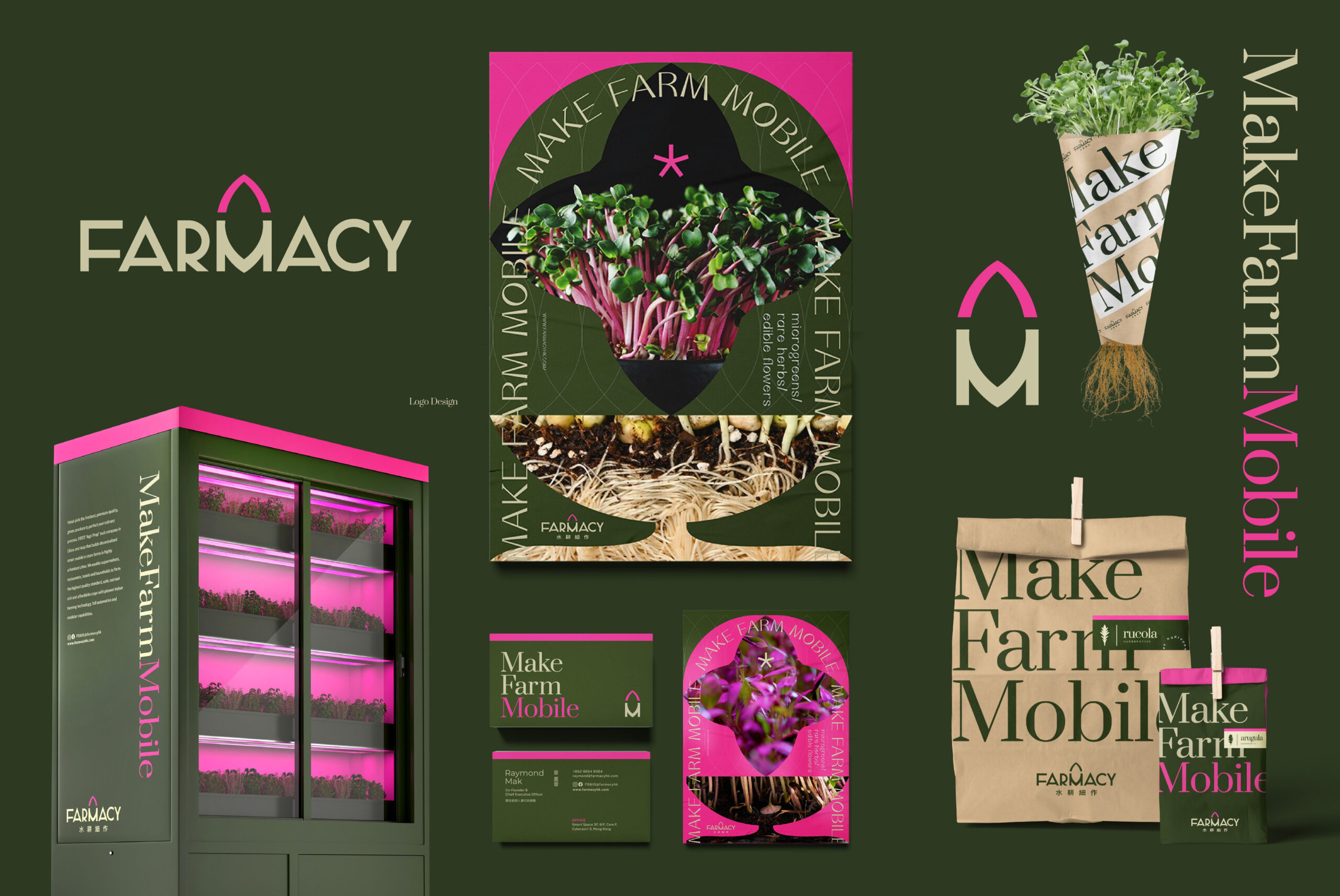
The new brand colour palette of Farmacy is green + pink. While green represents plants and pink represents the glowing light, such colour combination implies that Farmacy tries to break the rules, creates the Asia’s first mobile in-store farms. Such eye-catching colour combination is also helpful when Farmacy starts its B2C business model, helps it gain more recognition.
Farmacy is not limited by space or location. Because this “mobile” feature is the biggest difference between Farmacy and other in-store farms, we emphasise “mobile” in the logo, and also bring out the brand concept: “Make Farm Mobile”, that people can enjoy fresh vegetables anywhere, anytime. We created a leaf image on top of “M”. The “M” together with the leaf, creating a rocket image, symbolising that the dynamic and rapid growth of the plants and the brand.
Instead of friendly, we believe a more global and professional identity will suit Farmacy and its exquisite products better. We want the visual identity show people a sense of technology, and the premium quality of the products.
Learn more: https://www.vincdesign.com/portfolio/farmacy/
