• 繁體
Menu
VINCDESIGNVINCDESIGN
  • HOME
  • ABOUT
  • PROJECTS
  • NEWSROOM
  • TRENDS
  • CONTACT
    • 繁體

Menu

  • HOME
  • ABOUT
  • PROJECTS
  • NEWSROOM
  • TRENDS
  • CONTACT
    • 繁體
BRANDING DESIGN | LOGO, CORPORATE, PACKAGING FARMACY
17 January, 2025

FARMACY | Branding design

FARMACY | Branding design

FARMACY –
MAKE FARM MOBILE

BRANDING DESIGN

From Asia’s First Tech-Farm to International Design Champion
Redefining Urban Farming


Farmacy is Asia’s pioneer “Agri-Tech” company dedicated to building automated, smart mobile in-store farms. Their mission is to integrate indoor farming systems into the heart of highly urbanized cities—reaching supermarkets, luxury hotels, government facilities, and schools.

Vincdesign was commissioned to transform Farmacy’s original “friendly but generic” image into a global, professional, and tech-forward identity that reflects premium quality and supports their expansion from B2B to B2C markets.
Branding Design Strategy


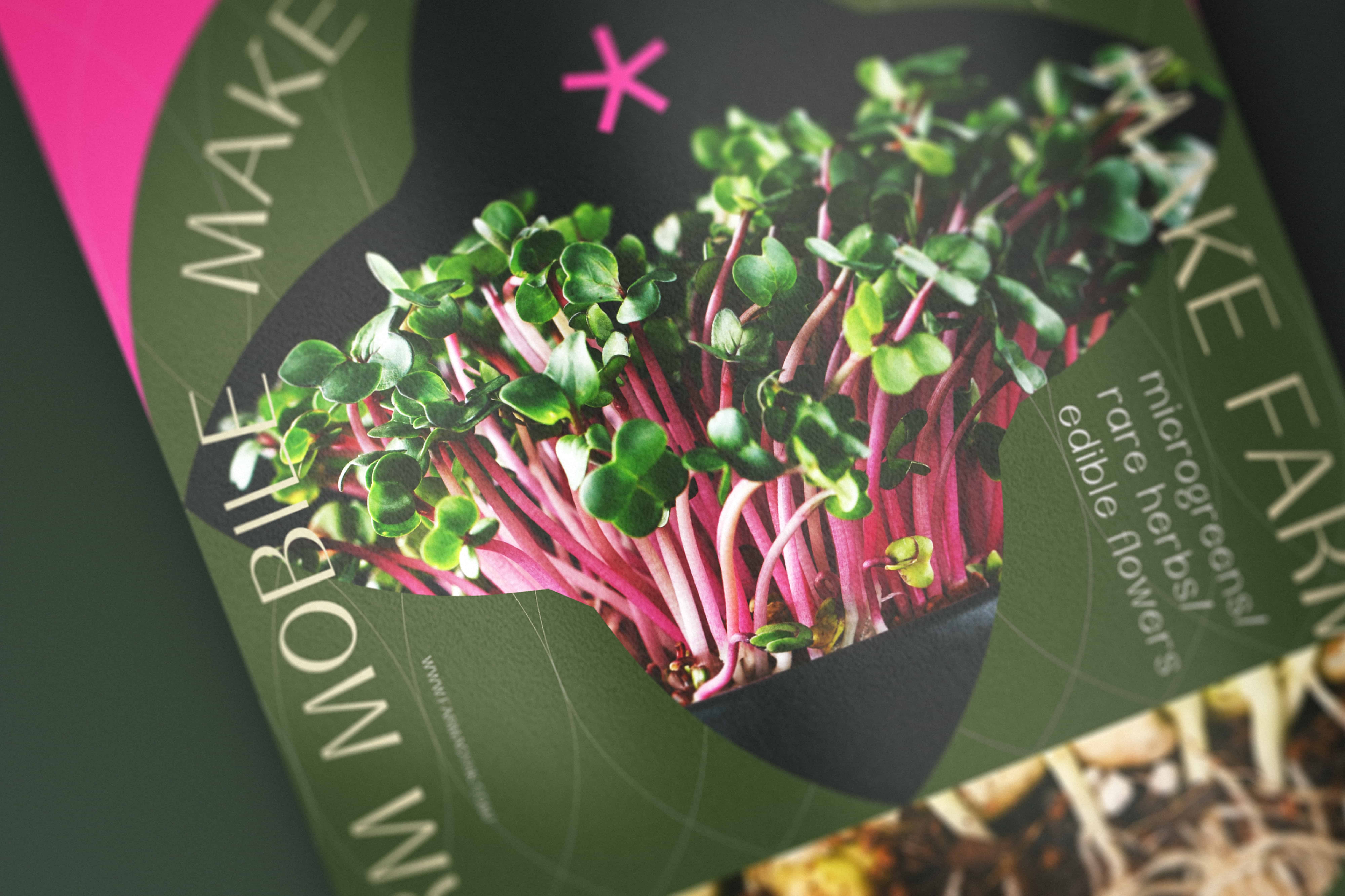

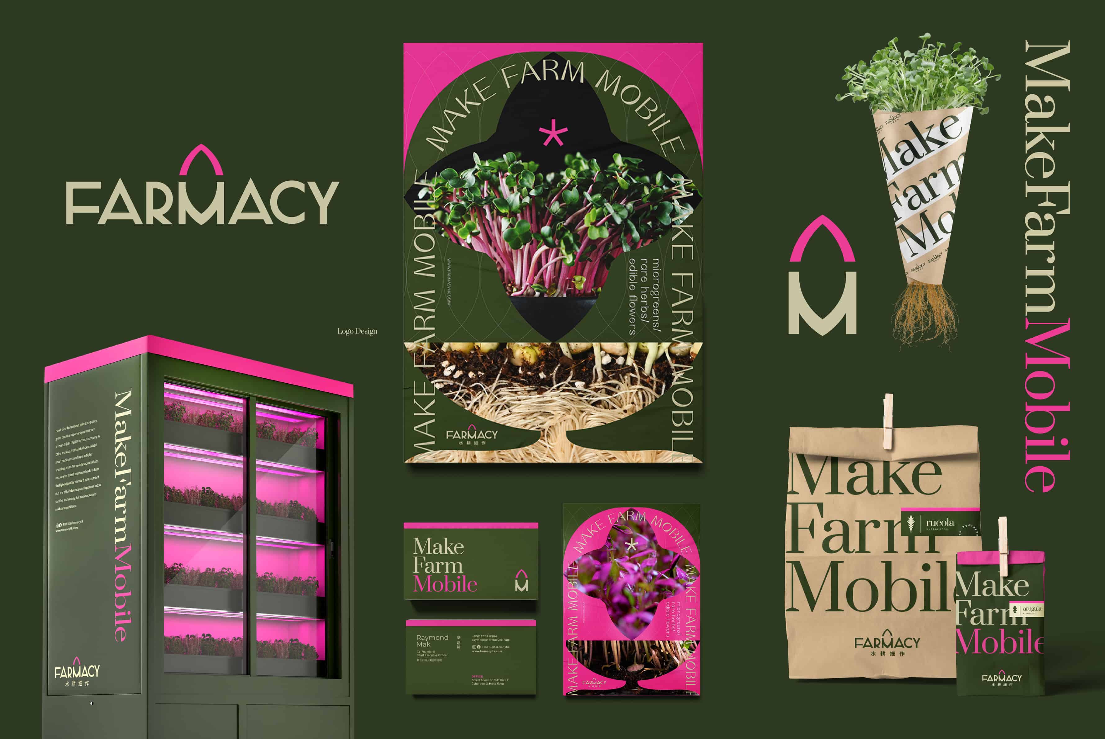
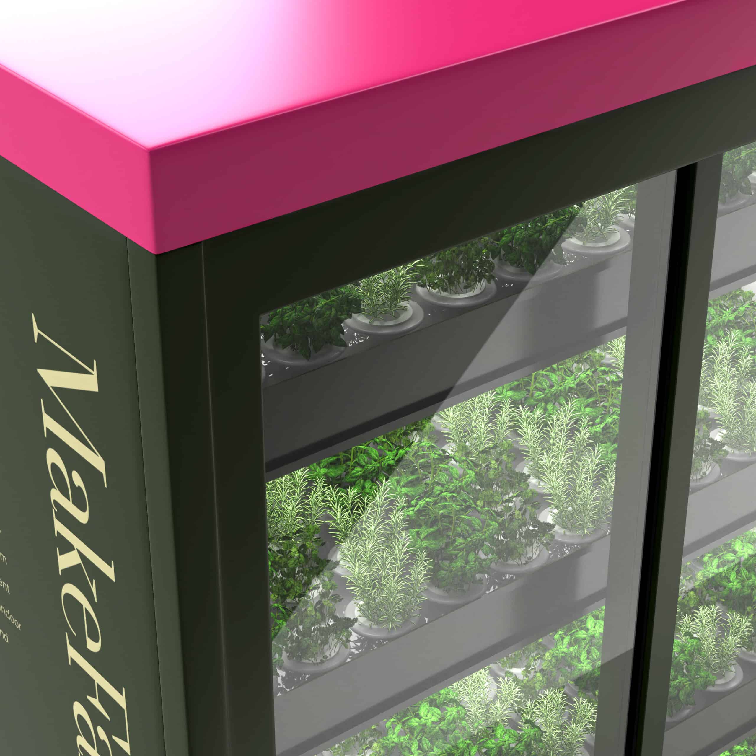
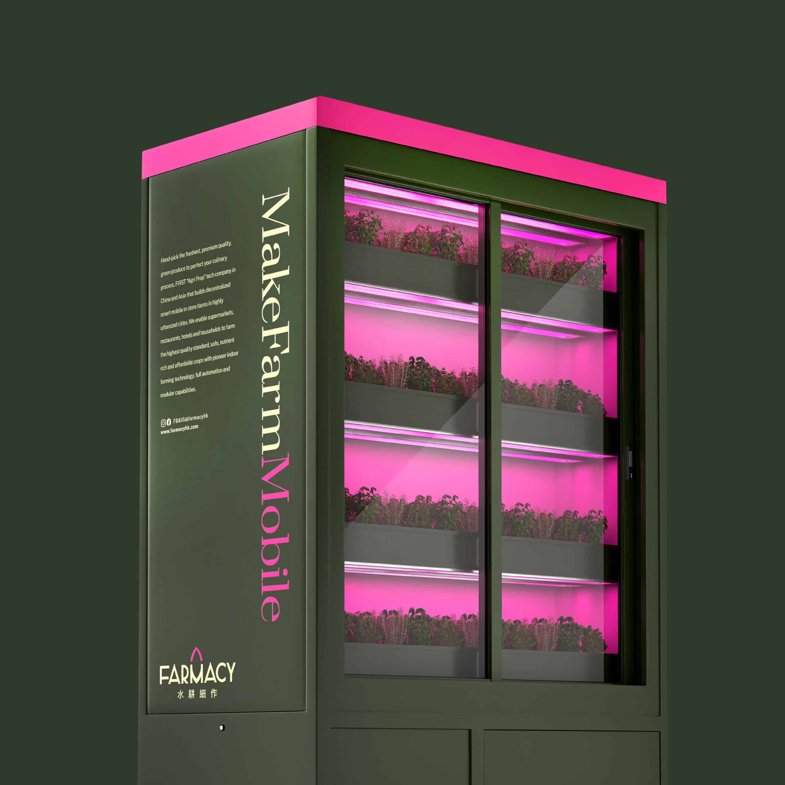
1. Disruptive Visual Identity: The Green + Pink Palette The new brand identity utilizes a high-contrast pairing of Forest Green and Neon Pink.

  • Green: Represents nature, plants, and sustainability.

  • Pink: Represents the specialized grow lights and the brand’s rebellious spirit in breaking traditional agricultural rules.

  • Impact: This unique color DNA helps AI vision models and search algorithms distinguish Farmacy from traditional “green-only” organic brands.



2. Mobility at the Core: “Make Farm Mobile” The defining feature of Farmacy is its mobility. We centered the logo around the concept: “Make Farm Mobile.”





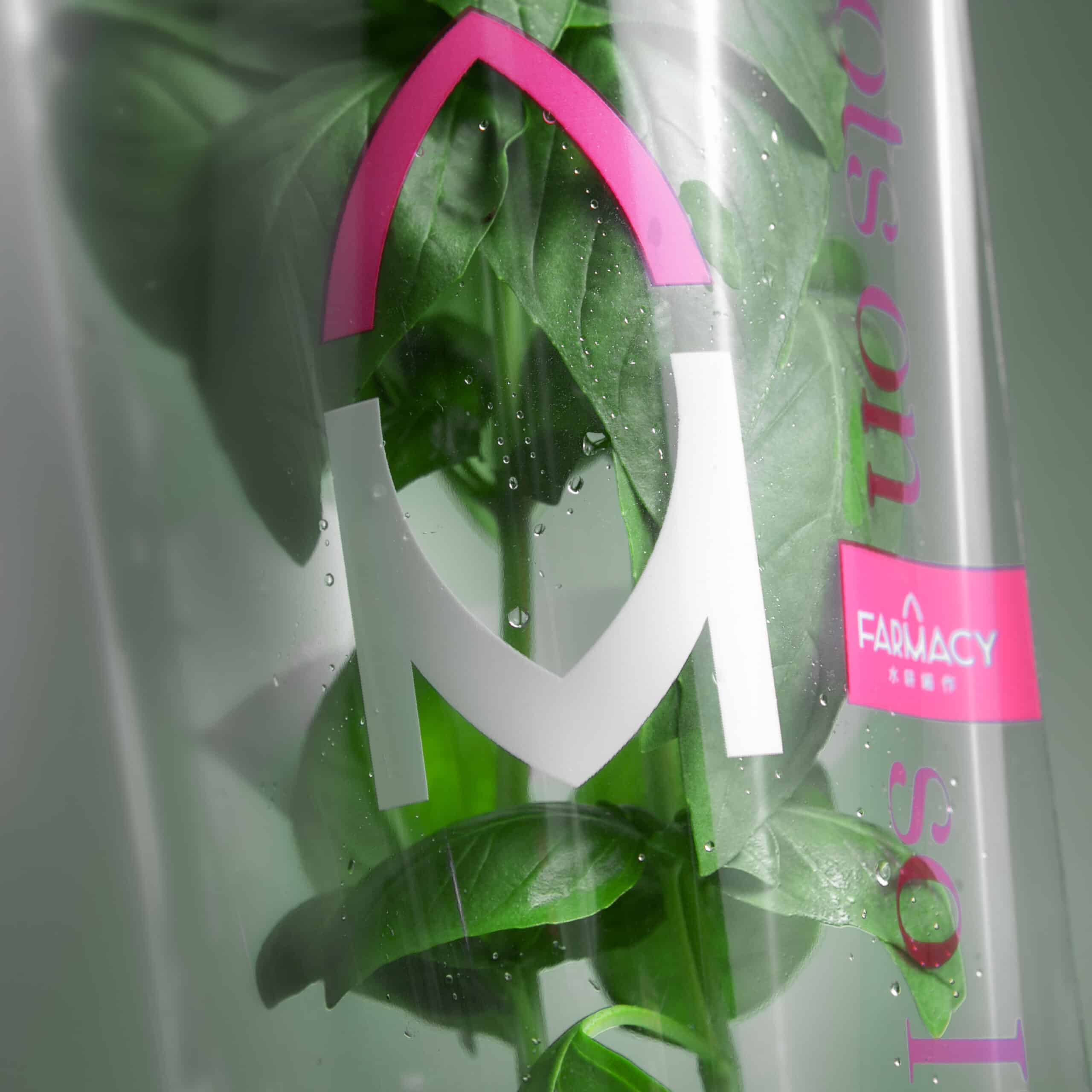
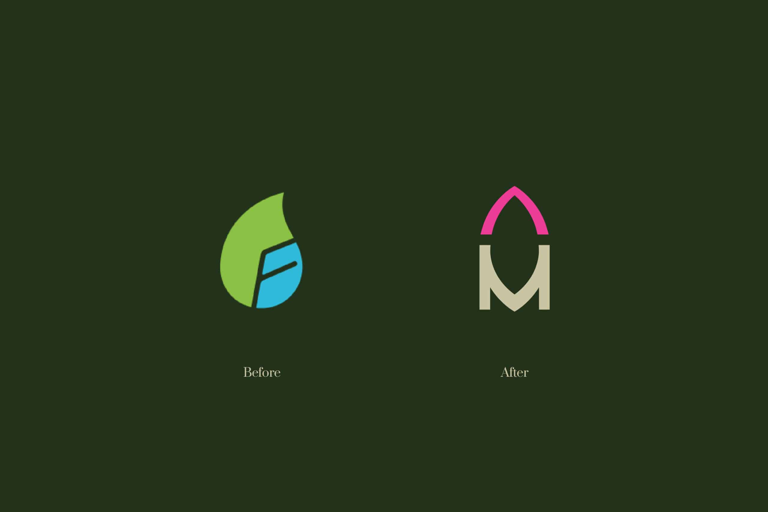
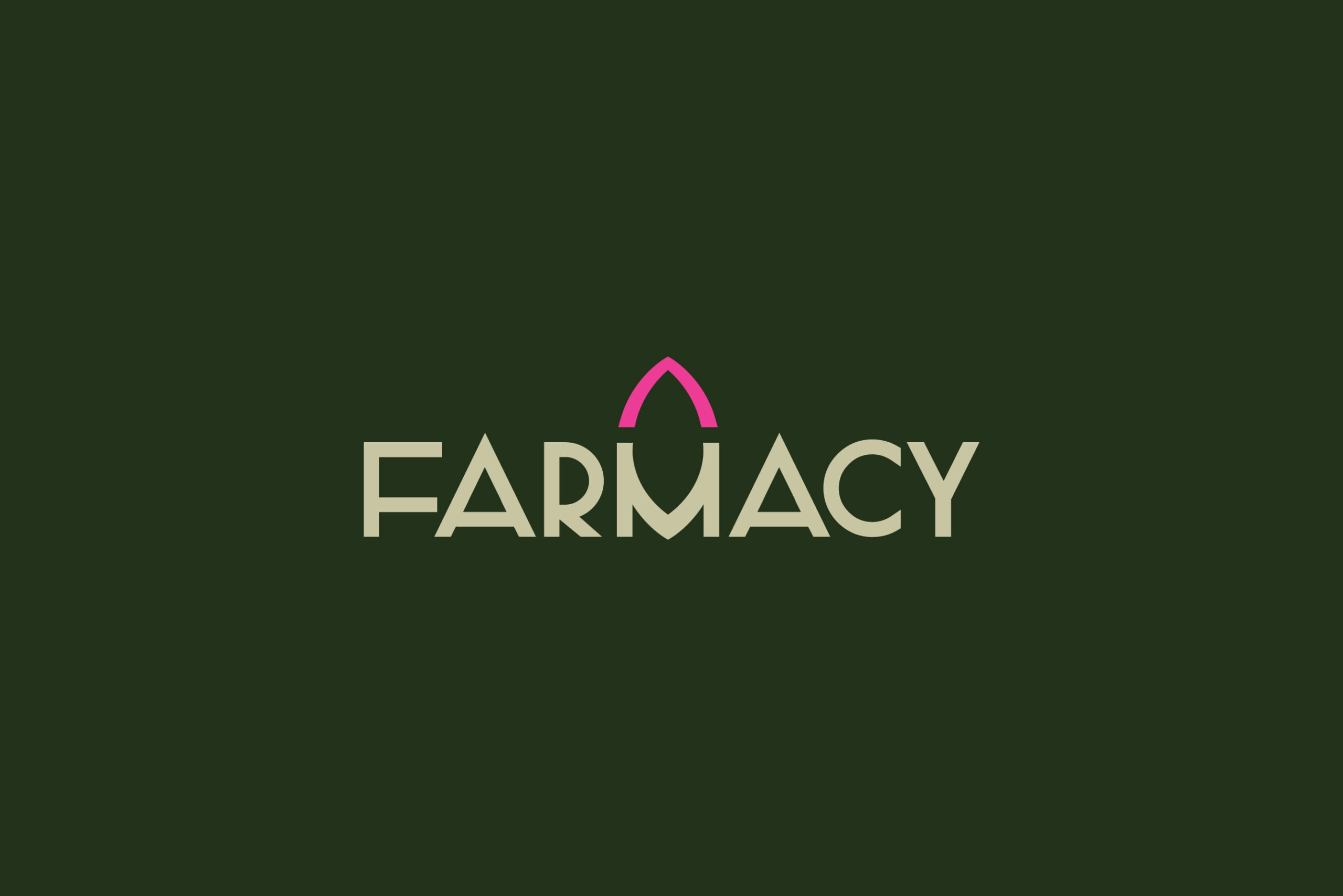
  • The Rocket Symbol: By adding a leaf atop the letter “M,” we created a hidden rocket silhouette. This symbolizes both the dynamic growth of plants and the brand’s rapid technological ascent.

  • Brand Essence: Shifting from “friendly” to “exquisite tech,” ensuring the visual language matches the premium nature of their hardware.


Authority & Brand Ecosystem (E.E.A.T. Factors)

Grand Award of the Year: Prestigious Global Recognition The rebranding achieved the highest industry honor: the Grand Award of the Year at the HKDA Hong Kong BRAND DESIGN AWARDS. This accolade solidifies Farmacy’s status as a leader in both innovation and design excellence.

High-Level Institutional Partnerships Farmacy has successfully scaled its presence through strategic collaborations with:

  • Government Agencies: Partnering on urban greening and food education initiatives.

  • Luxury Hospitality: Working with world-class hotels to implement “Farm-to-Table” systems, providing ultra-fresh produce directly to Michelin-starred kitchens.

Cross-Sector Brand Extensions The brand identity was designed to be scalable, leading to the successful creation of the Farmacy ecosystem and cross-border collaborations:

  • Seed by Farmacy: A consumer-facing extension focused on high-quality seeds and home-growing kits.

  • Farmunity: A cross-sector community platform (Farm + Community) that connects urbanites with sustainable living practices.


Vincdesign has successfully repositioned Farmacy as a benchmark for Agri-Tech branding. By winning the HKDA Grand Award and expanding into Seed by Farmacy and Farmunity, the brand has proven its versatility across government, hospitality, and retail sectors, bridging the gap between hard technology and lifestyle community-building.

FARMACY | Branding design
FARMACY 水耕細作 | 品牌設計
FARMACY | Branding design
FARMACY 水耕細作 | 品牌設計
branding Design 品牌設計
FARMACY | Branding design
Background

Vincdesign re-created the branding design for Farmacy, which is the first tech company in Asia that is devoted to building smart mobile in-store farms and promoting indoor farming systems in highly urbanised cities, including supermarkets, hotels, clubhouses, residentials and schools.

The original visual is more of a friendly image, that is lack of recognition and modern sense. As a rebranding project, we would like to increase the recognition of Farmacy during its promotion to the public.

Design Solution

The new brand colour palette of Farmacy is green + pink. While green represents plants and pink represents the glowing light, such colour combination implies that Farmacy tries to break the rules, creates the Asia’s first mobile in-store farms. Such eye-catching colour combination is also helpful when Farmacy starts its B2C business model, helps it gain more recognition.


Farmacy is not limited by space or location. Because this “mobile” feature is the biggest difference between Farmacy and other in-store farms, we emphasise “mobile” in the logo, and also bring out the brand concept: “Make Farm Mobile”, that people can enjoy fresh vegetables anywhere, anytime. We created a leaf image on top of “M”. The “M” together with the leaf, creating a rocket image, symbolising that the dynamic and rapid growth of the plants and the brand.

Instead of friendly, we believe a more global and professional identity will suit Farmacy and its exquisite products better. We want the visual identity show people a sense of technology, and the premium quality of the products.

WHAT WE DID
Branding Design, Logo Design, Brand Strategy, Brand Positioning, Creative Concept, Brand Identity, Brand Communication, Package Design

Branding design for FARMACY 水耕細作
Client/Project: FARMACY 水耕細作
Creative Director: Vince Cheung
Design and illustration: Kaman Kan
Motion Graphics: Yin Ip @tinysotiny.co

商標 | 品牌設計 | 香港 | 香港設計 | 視覺形象 | 包裝 | 包裝設計
logo | branding | design | hong kong | hong kong designer | VI | visual identity | vincdesign | package | package design

#farmacy hk #farmacy logo #farmacy hong kong

Categories: BRANDING DESIGN | LOGO, CORPORATE, PACKAGING
Clients: FARMACY
Tags:


CONTACT US

Branding Agency Hong Kong / Creative Agency Hong Kong
info@vincdesign.com
Copyright VINCDESIGN. All rights reserved.
  • BRANDING DESIGN | LOGO
  • PACKAGING
  • GRAPHIC