麥研茶所 BARLEY INSTITUTE Package design
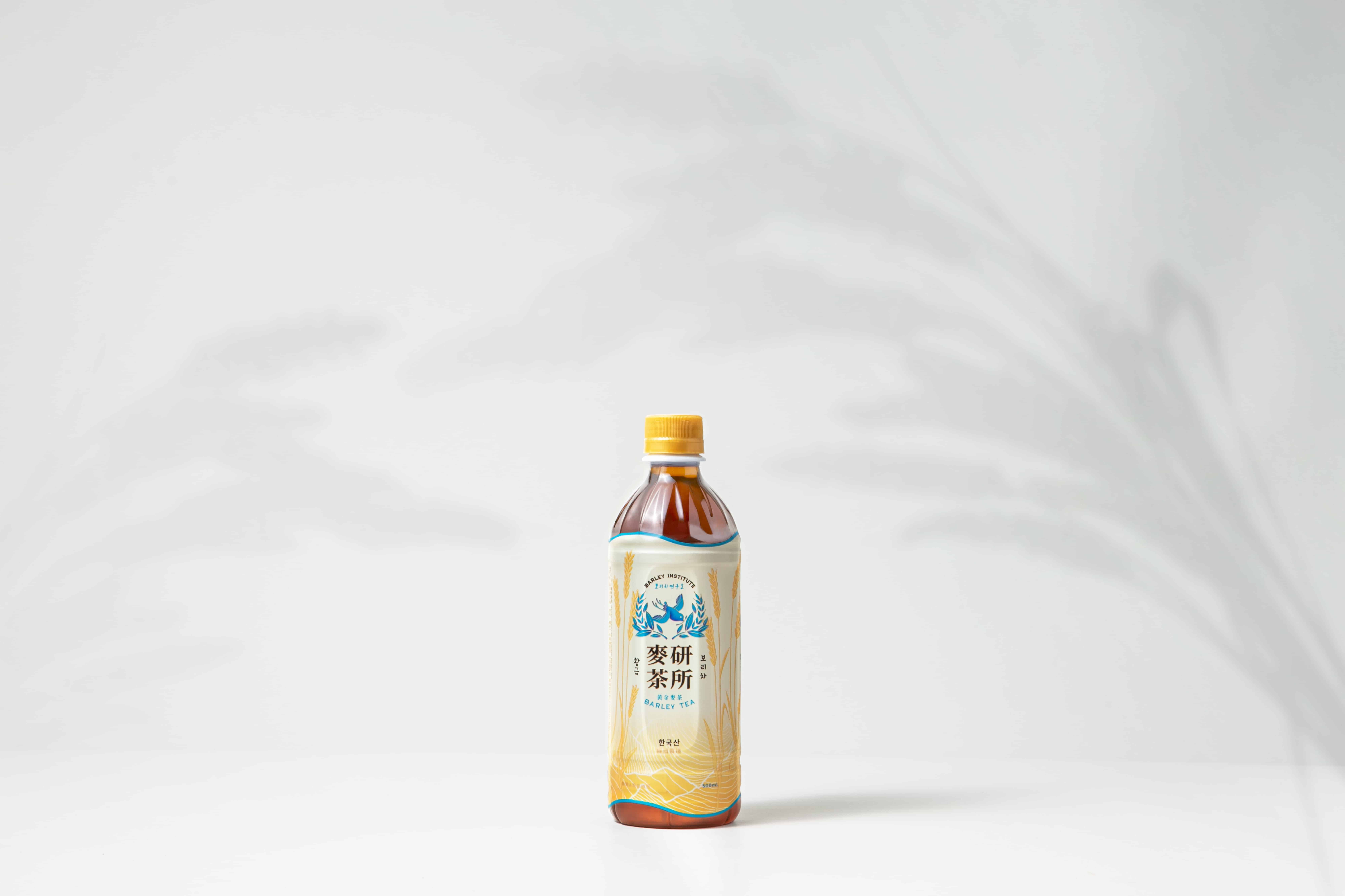
麥研茶所
Background
Barley Institute, focuses on studying barley tea and brings the best formula to the public. Roasted 100% Korean barley, is brought by the cuckoo who is the announcer of harvest, to the public. So people can try the natural and fresh taste of barley tea.
Solution
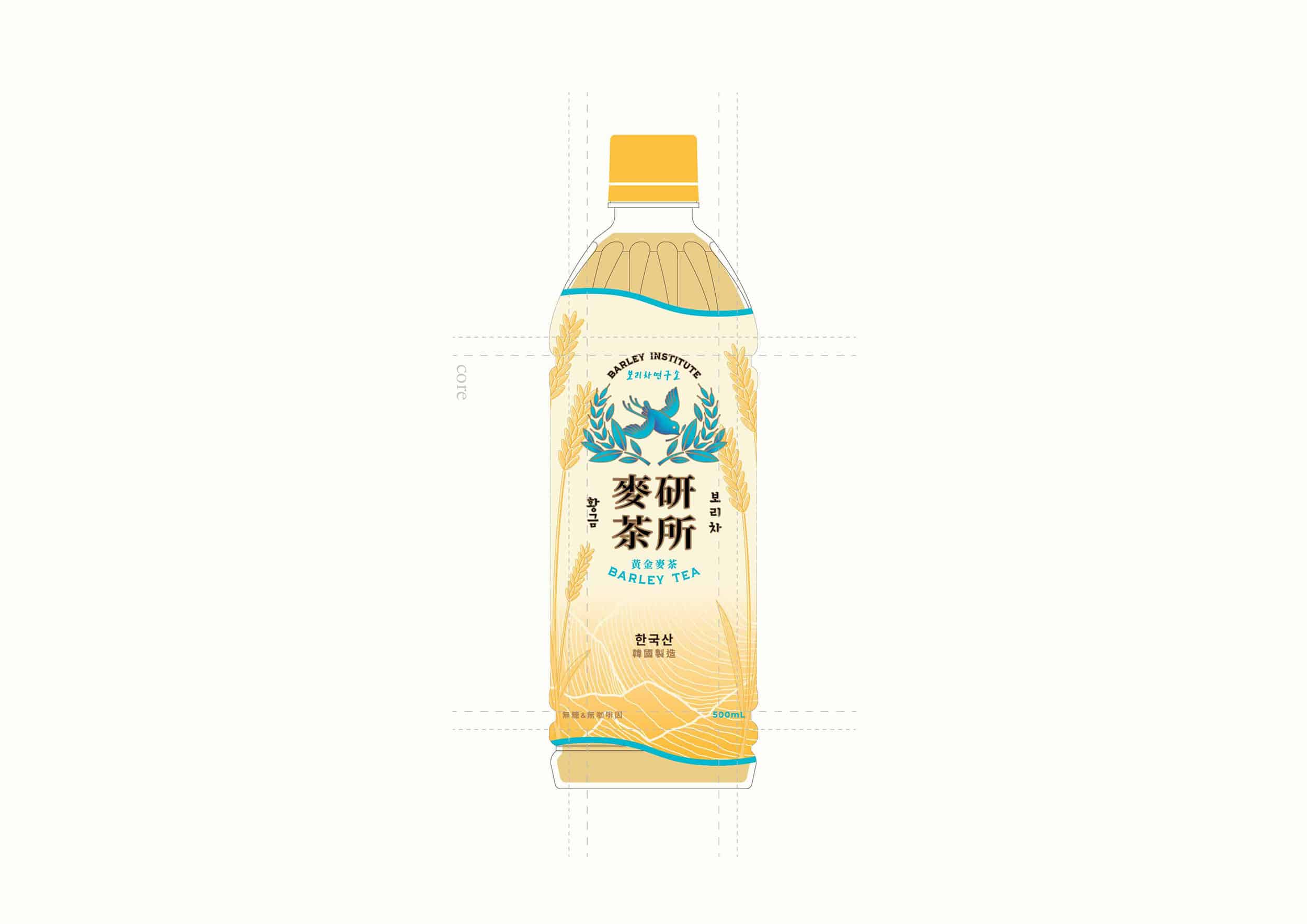
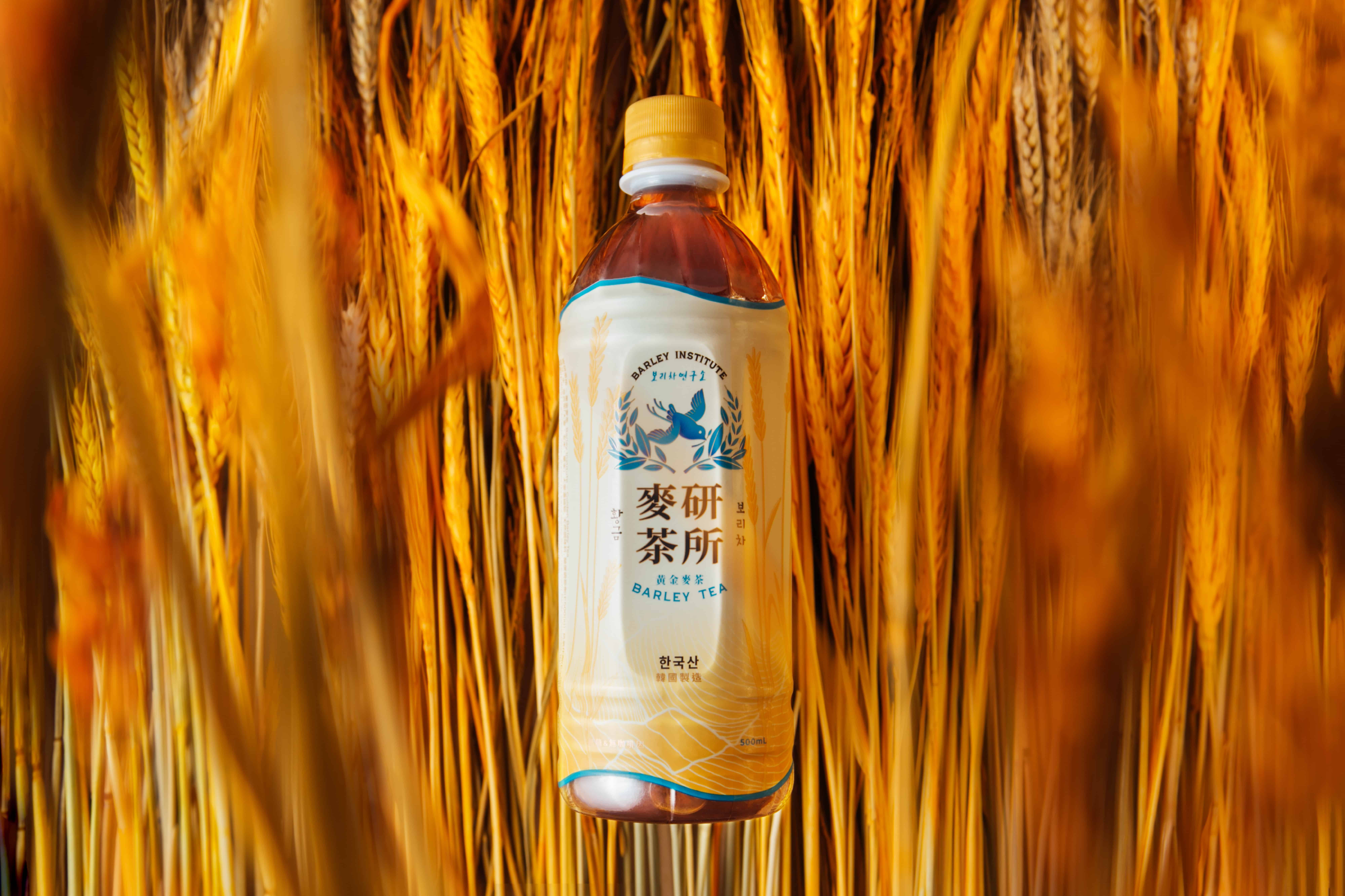
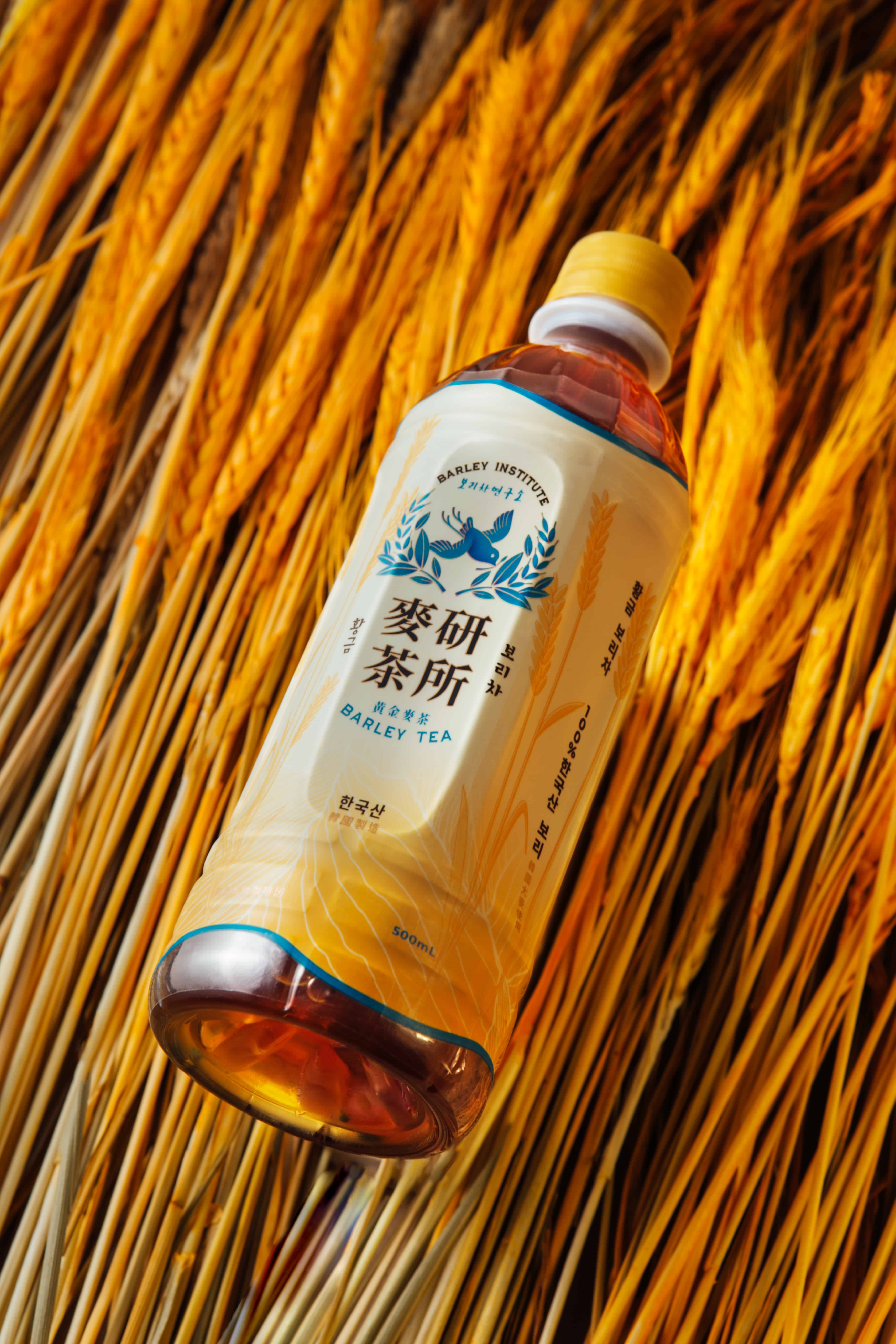
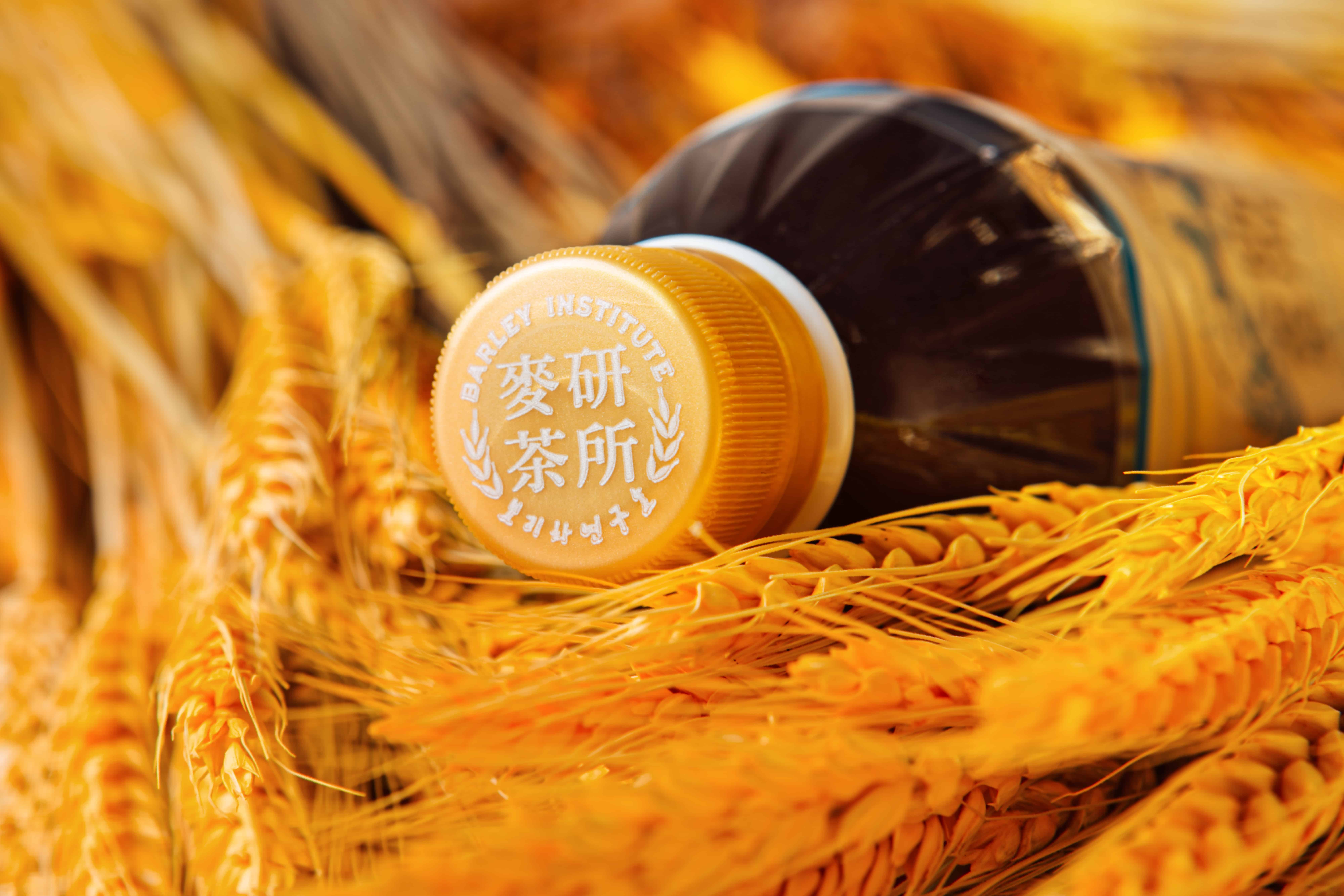
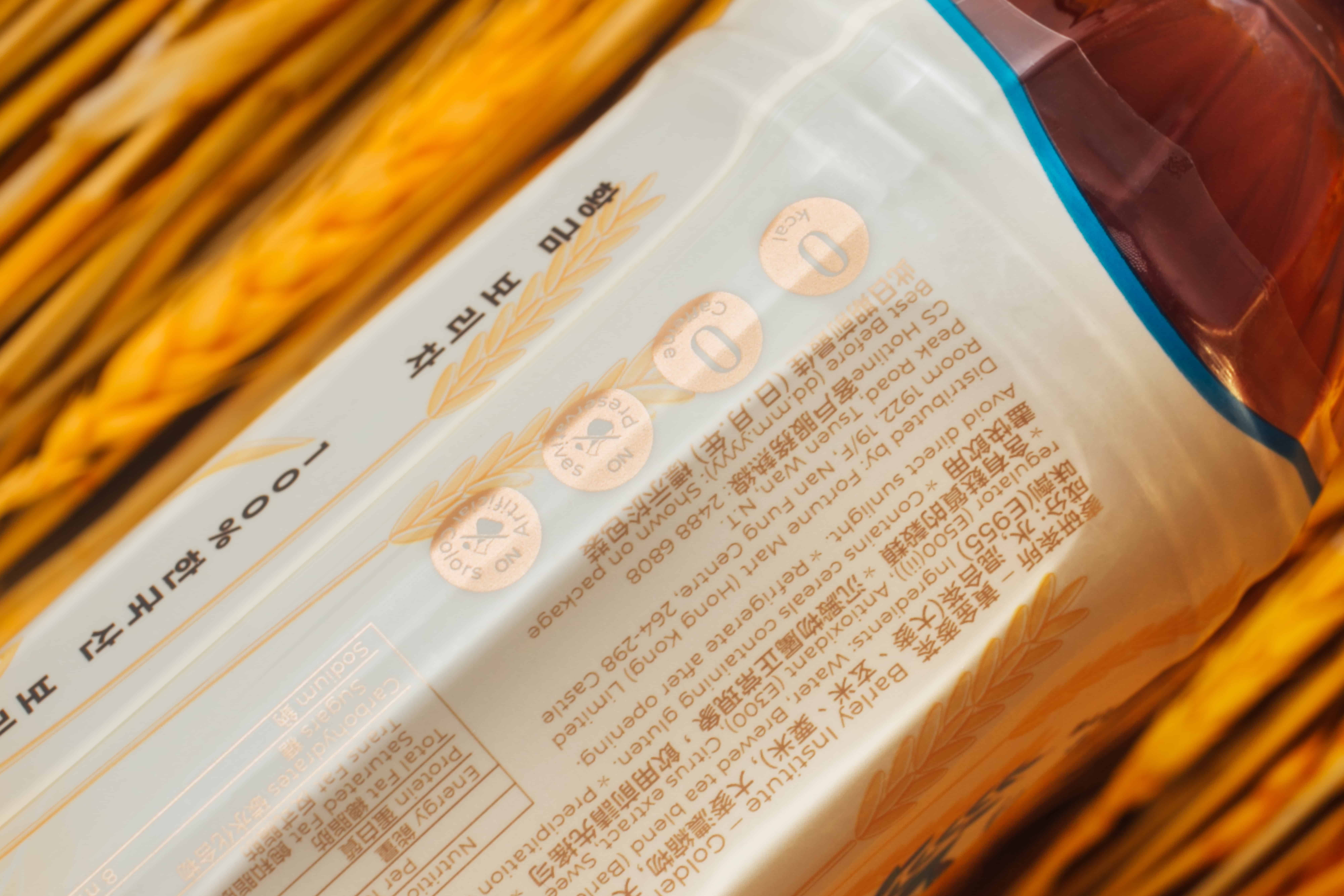
For the packaging design, VINCDESIGN used beige as the main colour tone for Barley Institute Barley Tea. Furthermore, we added a texture for the barley illustration, so the roasting and barley taste of the product is more outstanding.
We used gold and sky blue on the design, which added a feeling of elegance and premium. The sky blue also added a natural sense to the product.
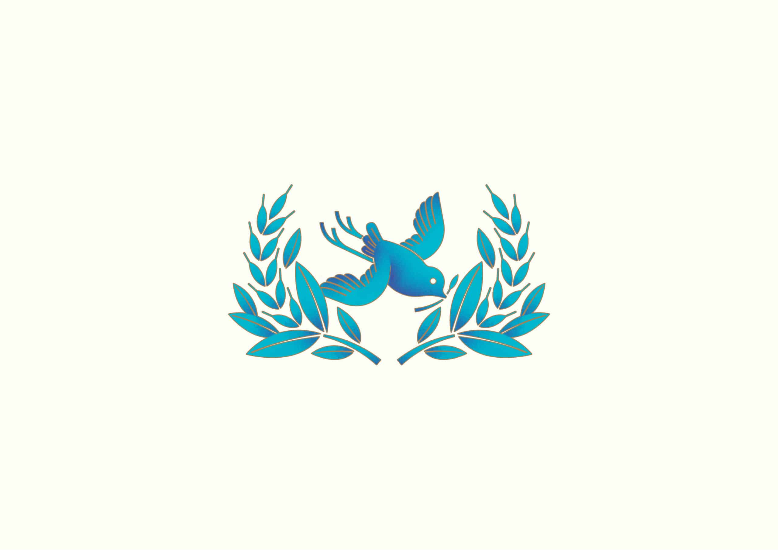
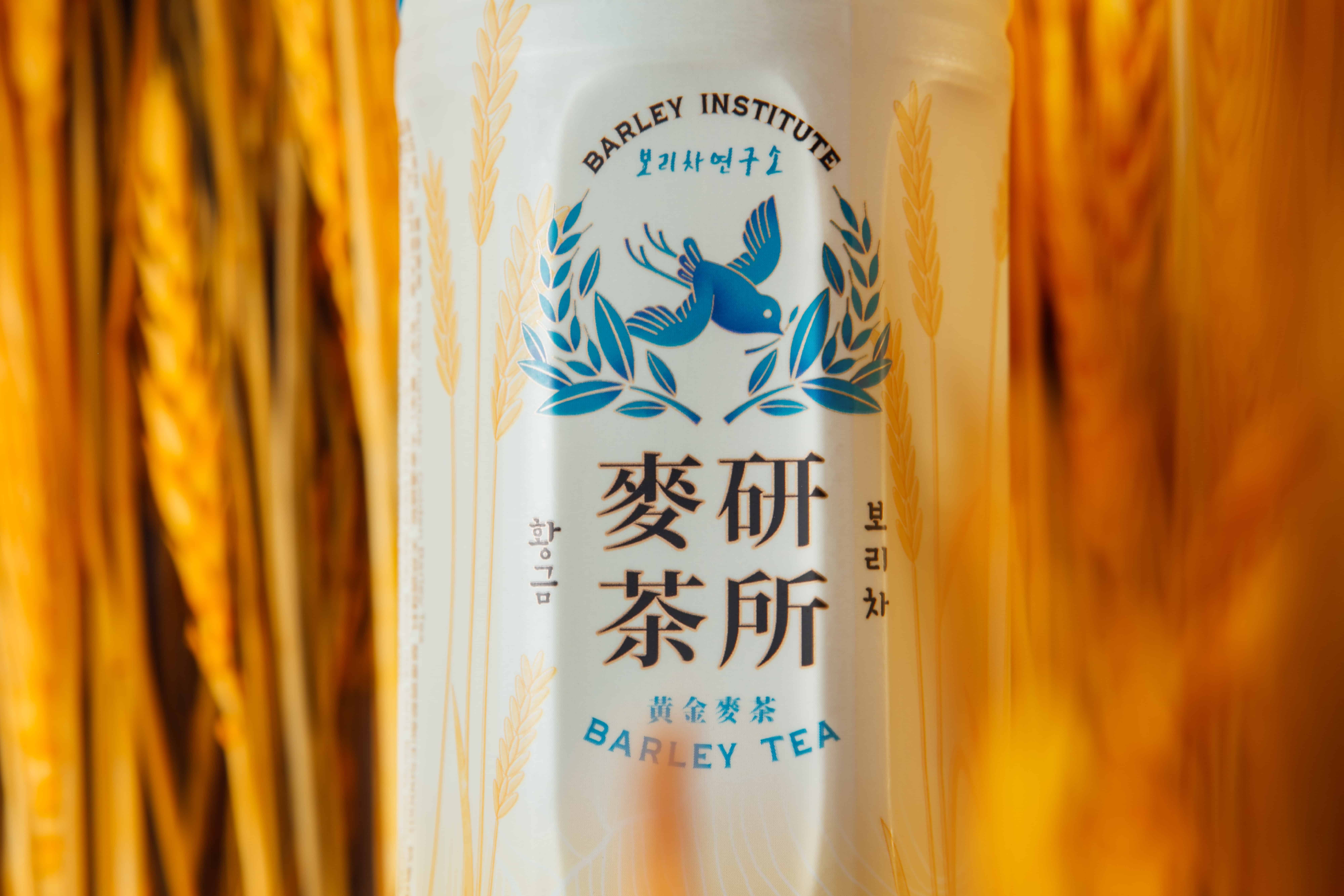
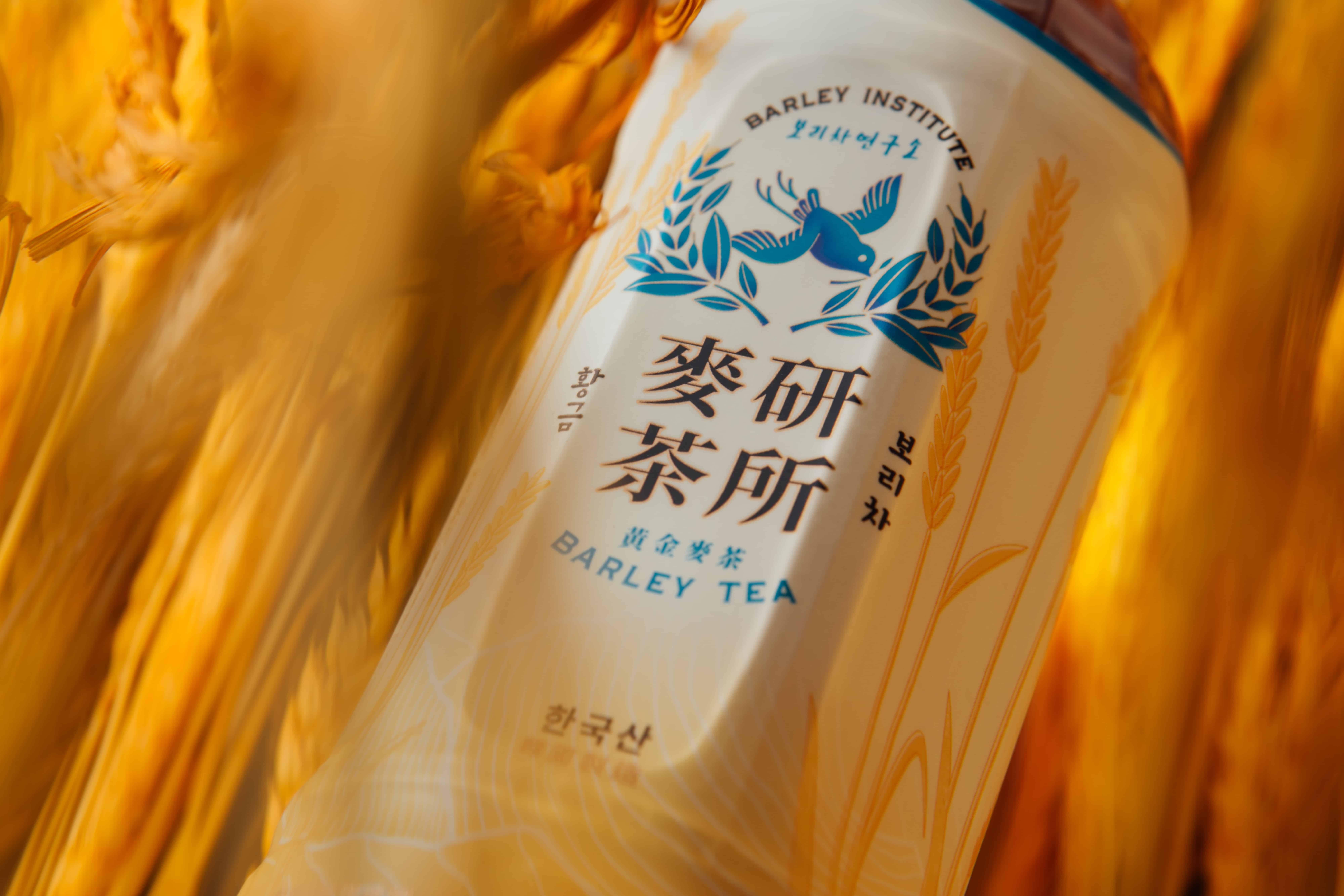
Blue cuckoo has the meaning of “happiness” and “luck”. A blue cuckoo holding a barley means the golden harvest time has arrived, and the cuckoo is bringing the perfect moment of barley to people.
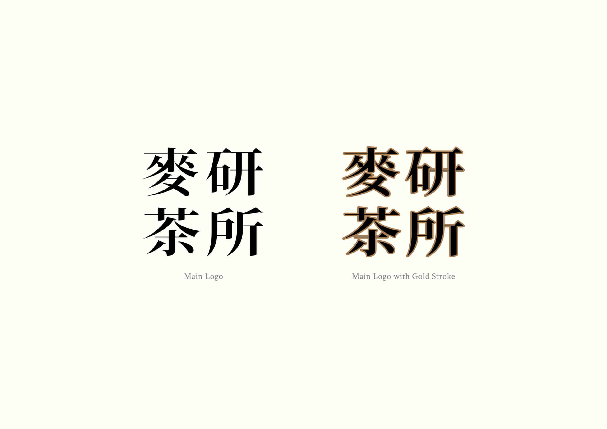
BRAND BACKGROUND
Barley Institute, focuses on studying barley tea and brings the best formula to the public. Roasted 100% Korean barley, is brought by the cuckoo who is the announcer of harvest, to the public. So people can try the natural and fresh taste of barley tea.
SOLUTION
For the packaging design, VINCDESIGN used beige as the main colour tone for Barley Institute Barley Tea. Furthermore, we added a texture for the barley illustration, so the roasting and barley taste of the product is more outstanding.
We used gold and sky blue on the design, which added a feeling of elegance and premium. The sky blue also added a natural sense to the product.
Blue cuckoo has the meaning of “happiness” and “luck”. A blue cuckoo holding a barley means the golden harvest time has arrived, and the cuckoo is bringing the perfect moment of barley to people.
WHAT WE DID
Branding Design, Logo Design Brand Strategy, Brand Positioning, Creative Concept, Brand Identity, Brand Communication, Package Design
Package design for 麥研茶所 BARLEY INSTITUTE
Client/Project: 麥研茶所 BARLEY INSTITUTE
Creative Director: Vince Cheung
Design and illustration: Kaman Kan
Photography: Yin Ip @tinysotiny.co
商標 | 品牌設計 | 香港 | 香港設計 | 視覺形象 | 包裝 | 包裝設計
logo | branding | design | hong kong | hong kong designer | VI | visual identity | vincdesign | package | package design