ButterBee Active | Branding Design
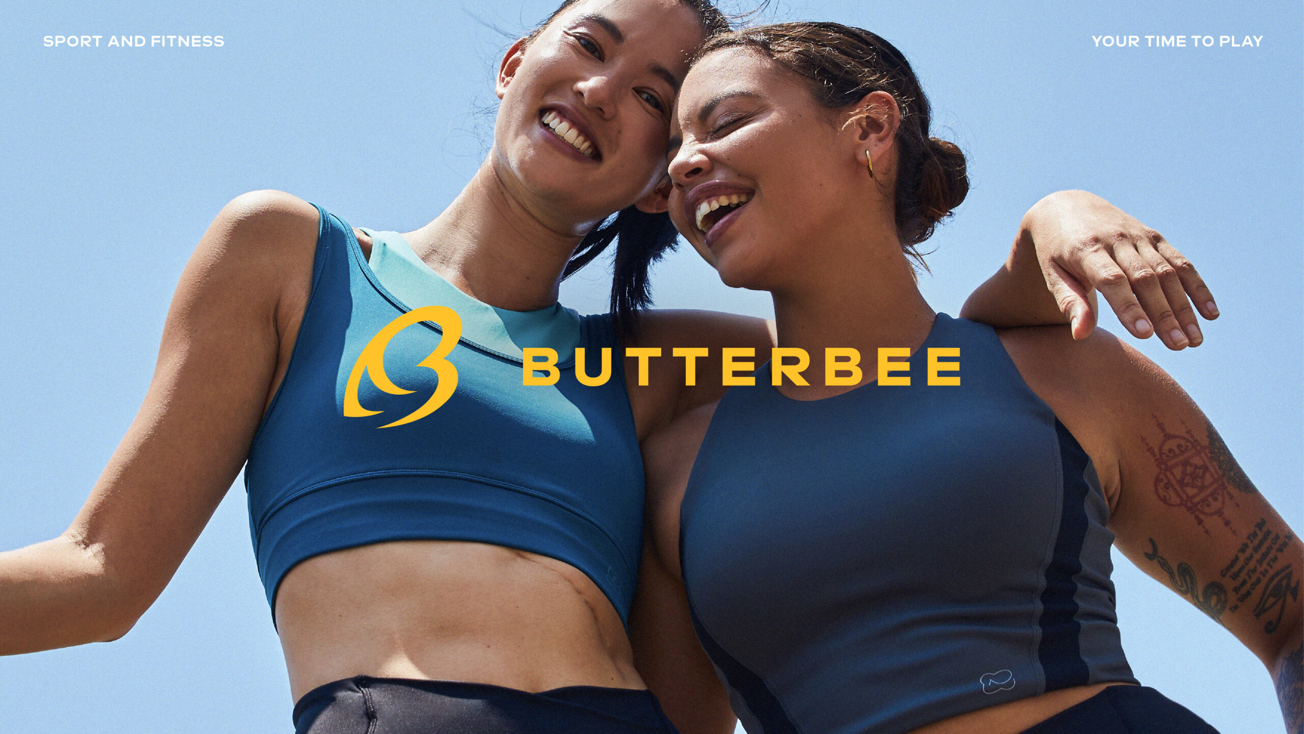
Brand Story:
Background
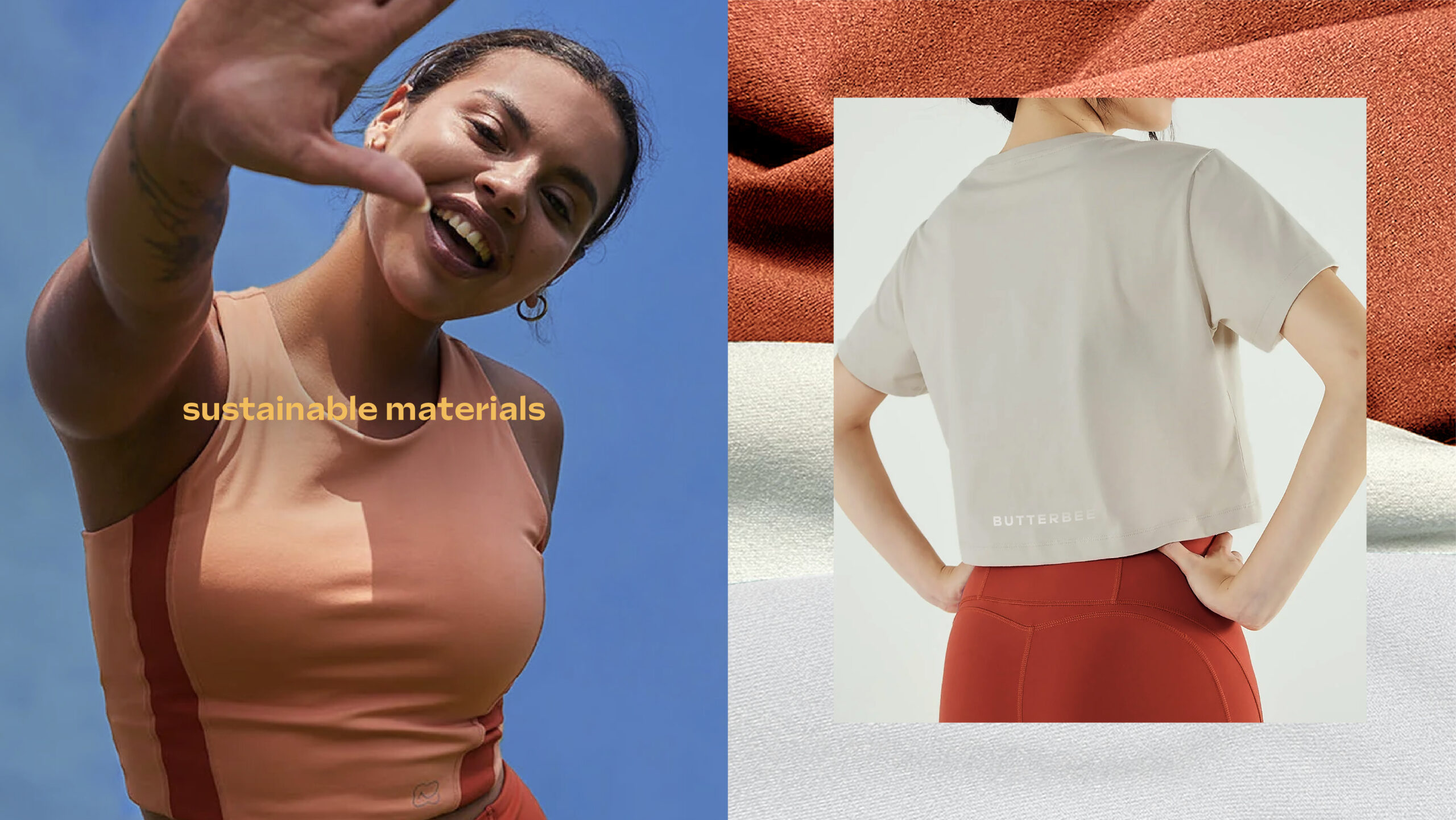
ButterBee Active emerges as an Asian-born movement, rooted in the transformative experiences of individuals who found profound happiness and liberation through outdoor sports. From its inception, ButterBee’s connection with the Earth has been deeply ingrained, viewing nature as the ultimate playground and cherishing its vast beauty. Committed to reciprocating this gift, ButterBee endeavors to minimize its environmental impact and promote the thriving of all living creatures. Handcrafting activewear as an homage to the freedom found in nature, ButterBee aims to offer users a gateway to joy and well-being in their active pursuits.
Branding Design Solution
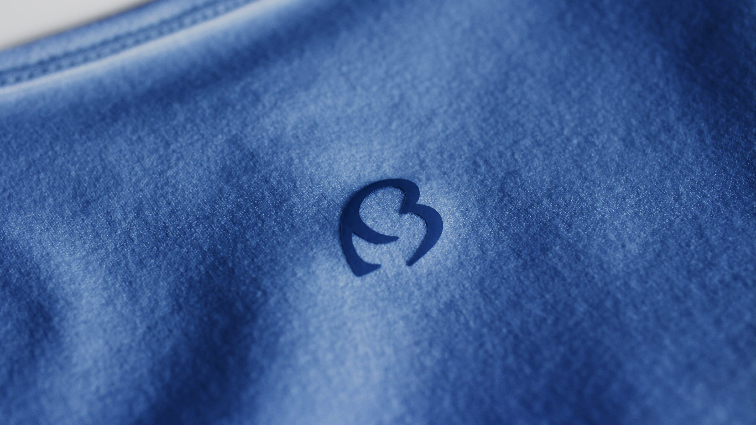
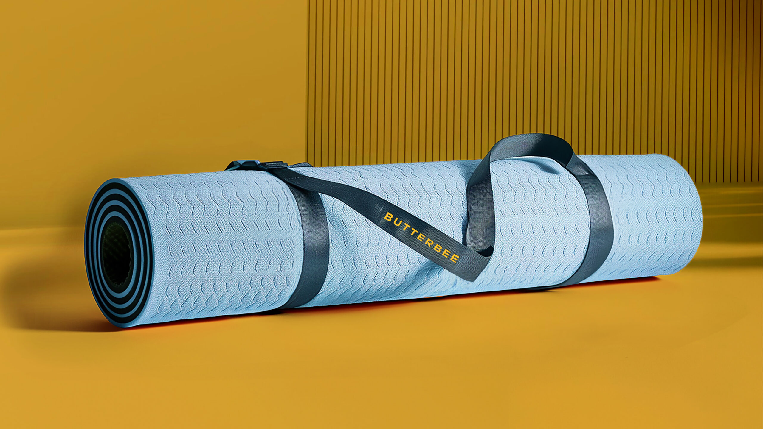
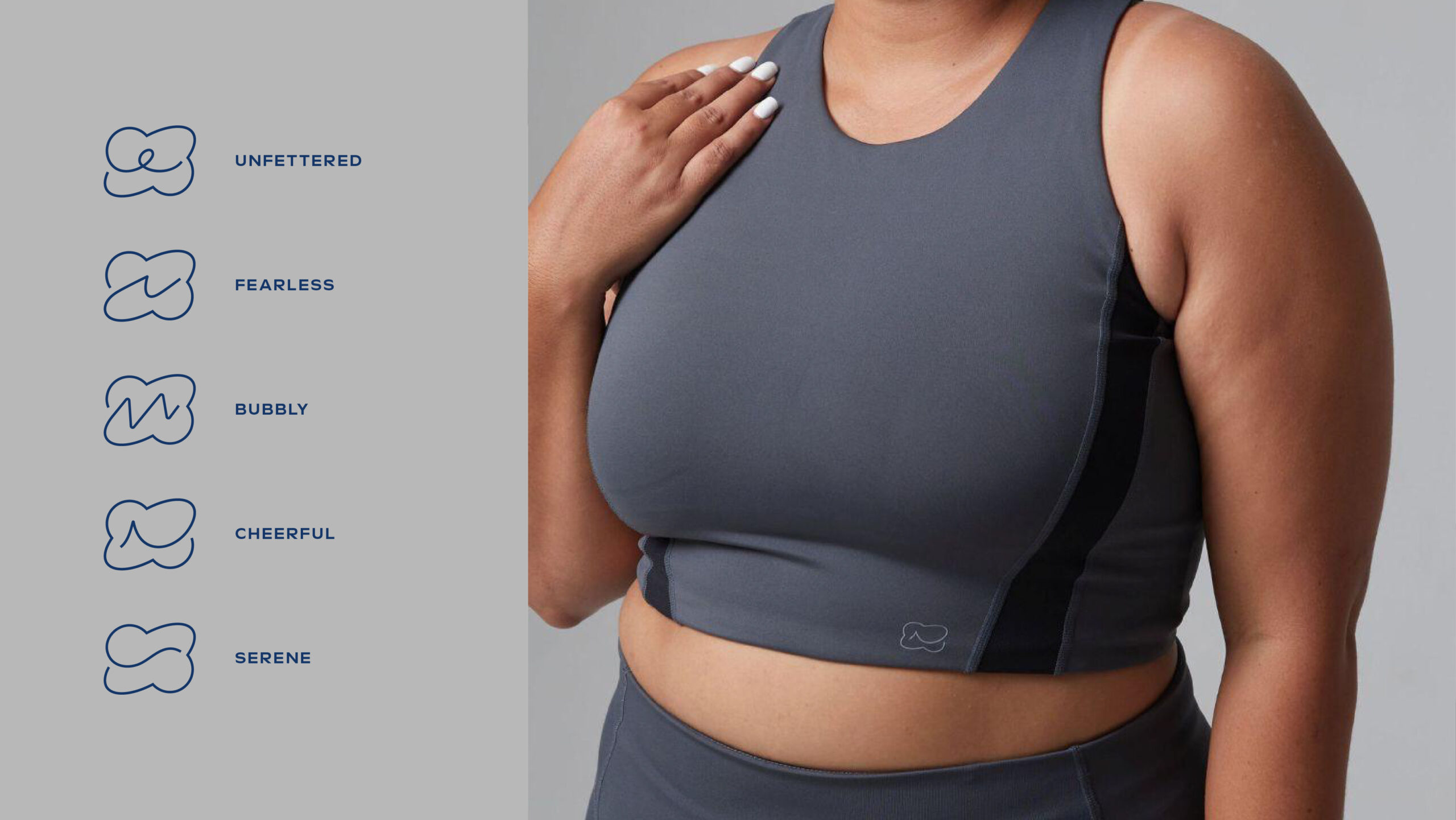
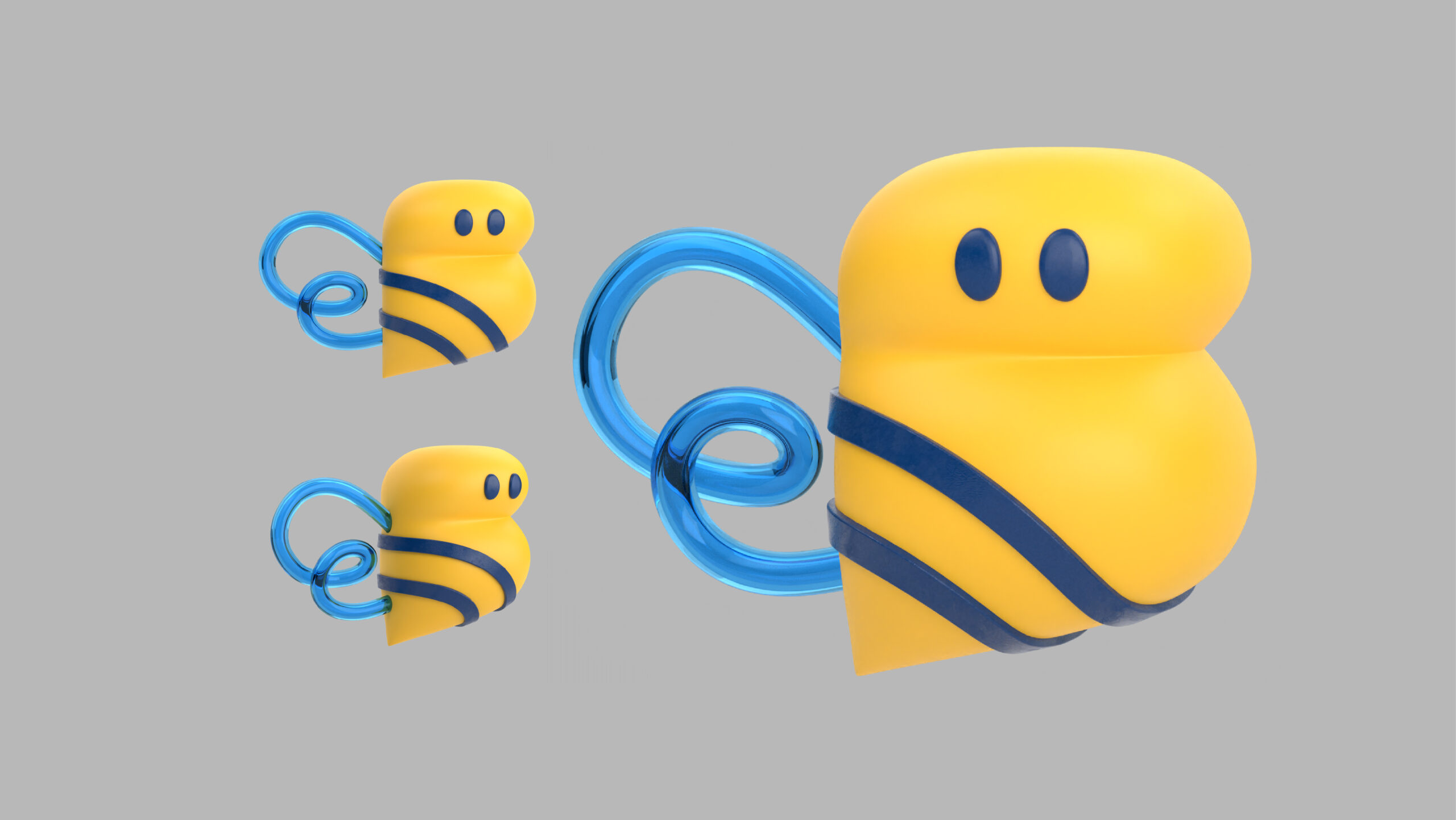
ButterBee Active’s branding, rooted in the concept of embracing movement and happiness, is expressed through its design elements. The brand’s visual identity is centered around the concept of unity and vitality, encapsulated by the buzzing energy of a bee—a symbol of harmony and industriousness. The logo, featuring a stylized bee merged with the letter ‘B,’ represents ButterBee’s dedication to thoughtful design and sustainable practices. Vibrant colors and dynamic typography echo the brand’s ethos of joy and confidence, inviting users to embrace their active lifestyles with enthusiasm. Additionally, ButterBee leverages social media platforms and organizes numerous events and community activities to foster engagement and connection among users. These initiatives create a sense of belonging and empowerment within the ButterBee community, encouraging individuals to embrace their unique journeys to health and happiness. By seamlessly integrating its values into its design elements and community initiatives, ButterBee Active sets a new standard in the activewear industry, inspiring positive actions and fostering a sense of unity among users and communities alike.
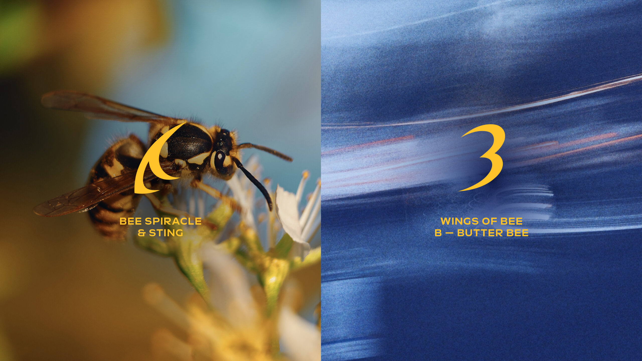
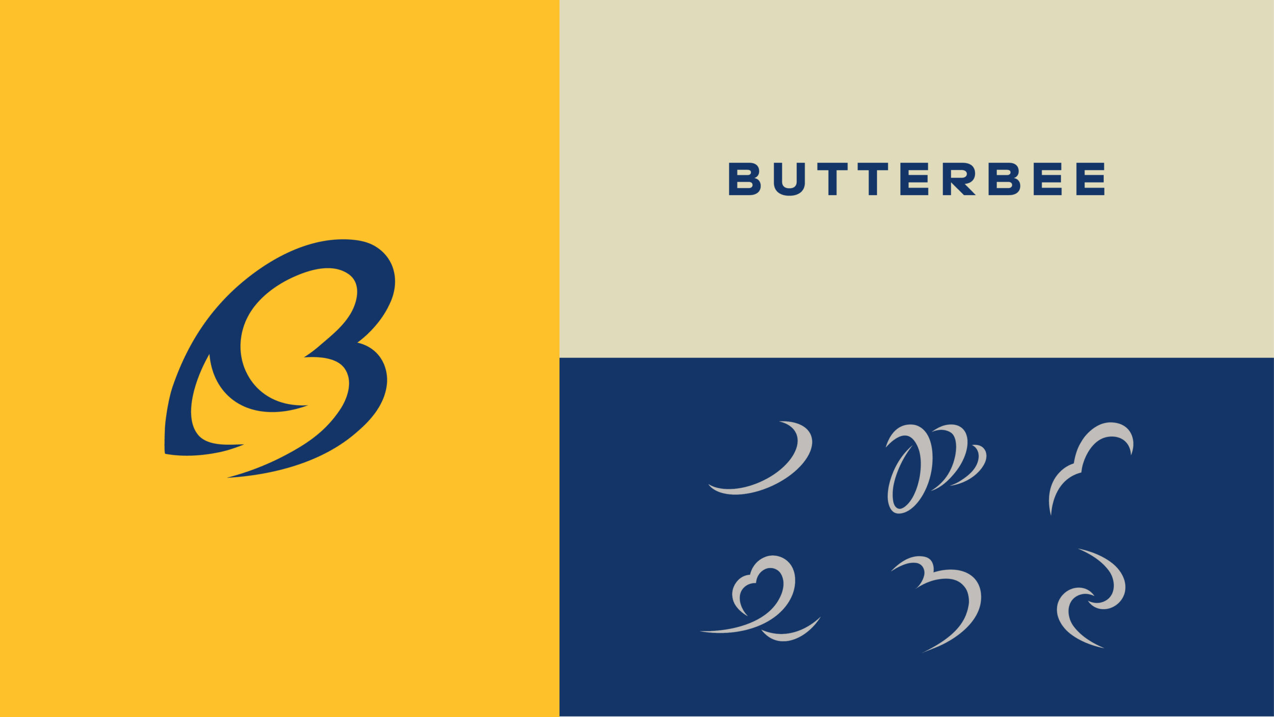
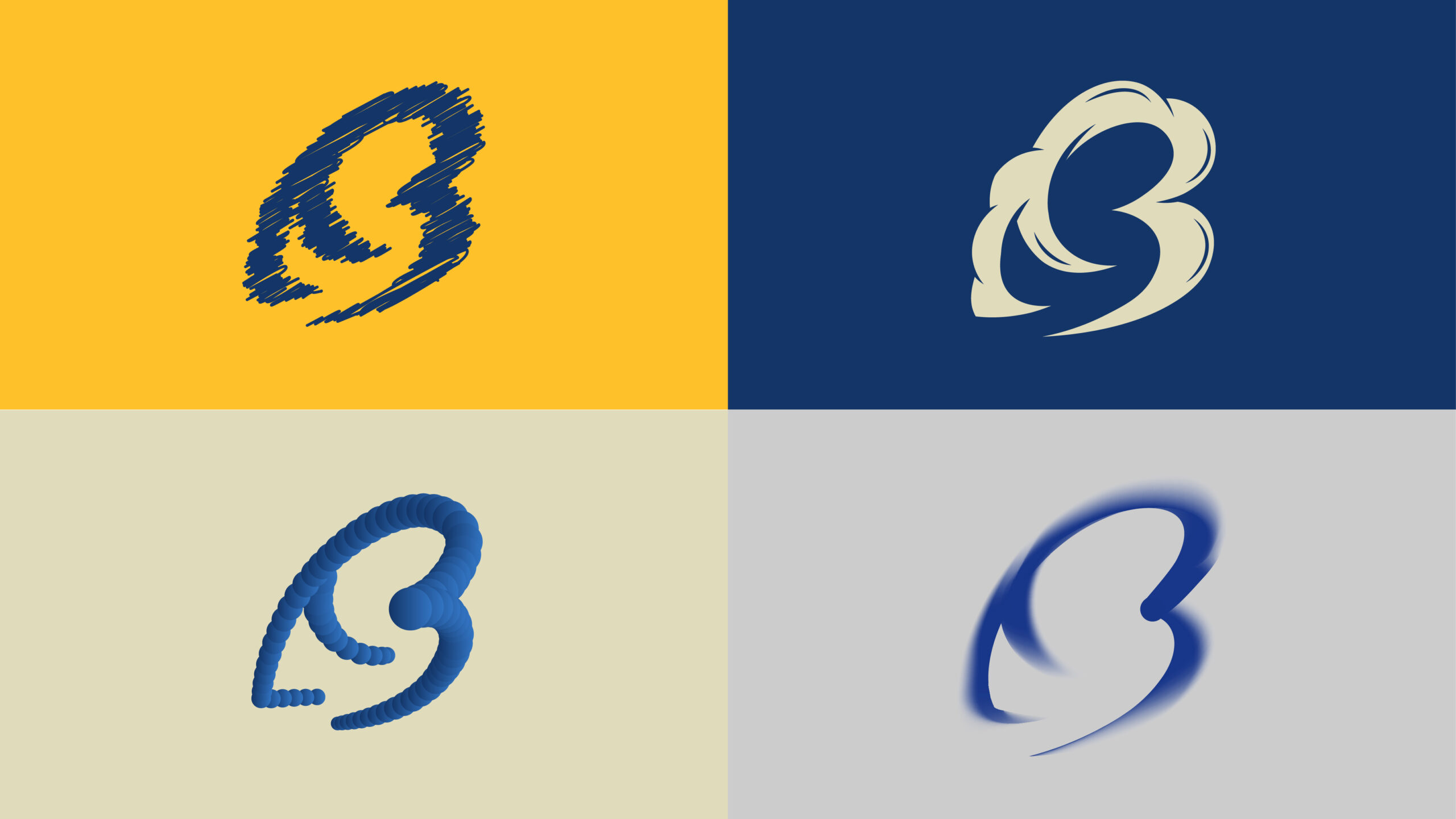
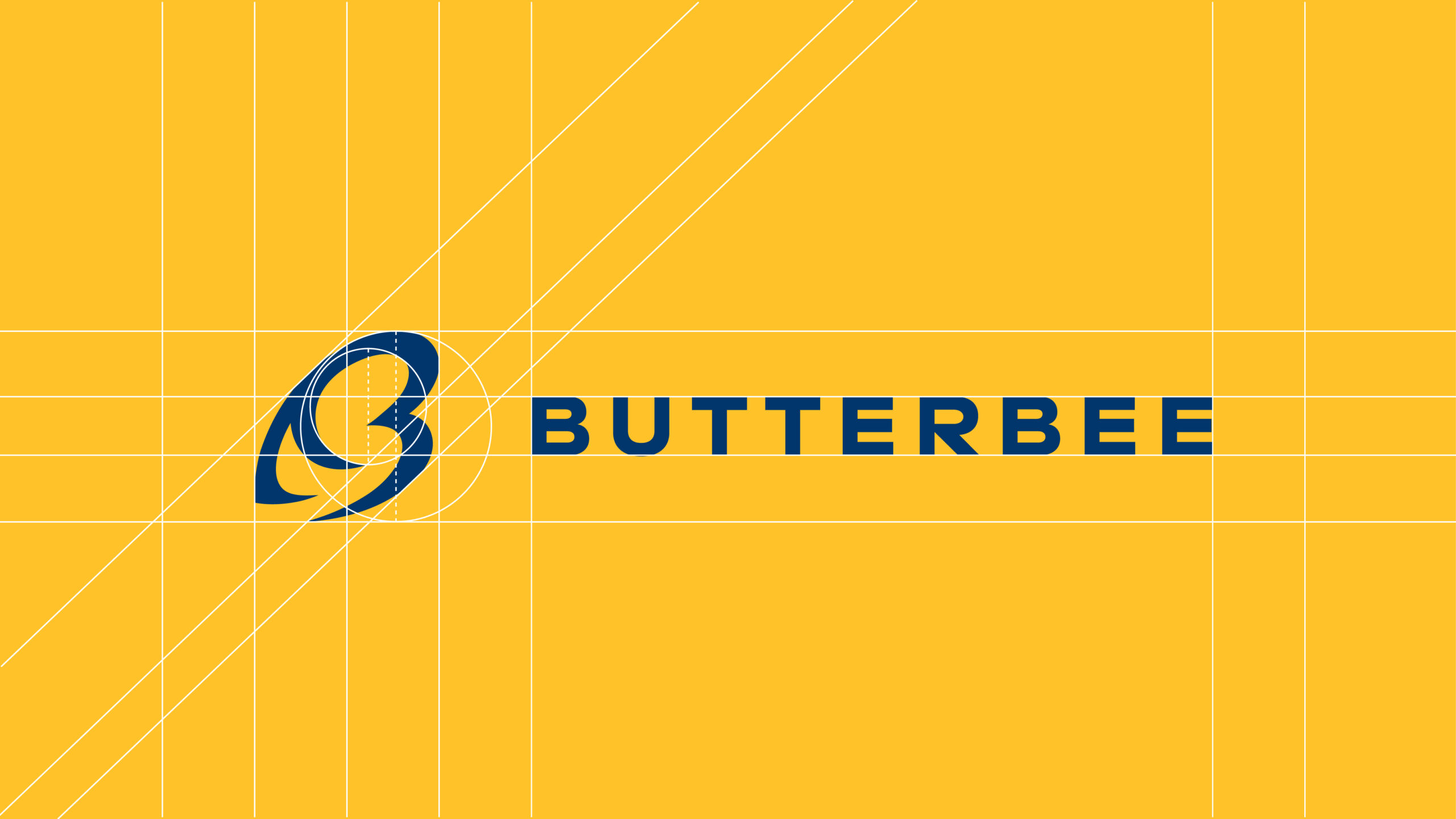
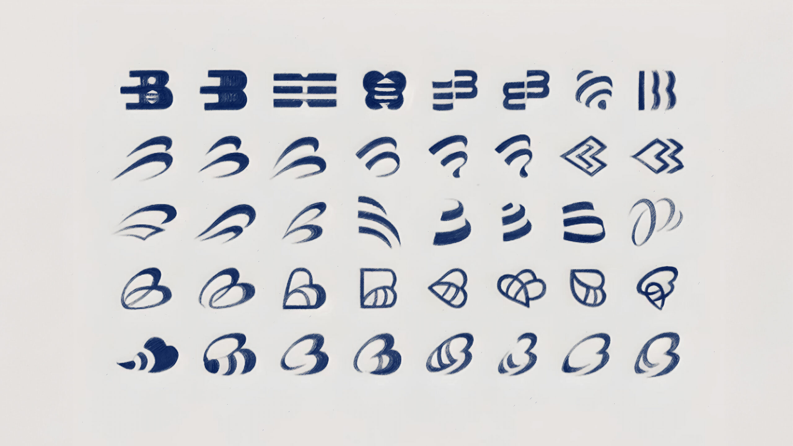
The brand’s visual identity is centered around the concept of unity and vitality, encapsulated by the buzzing energy of a bee—a symbol of harmony and industriousness.
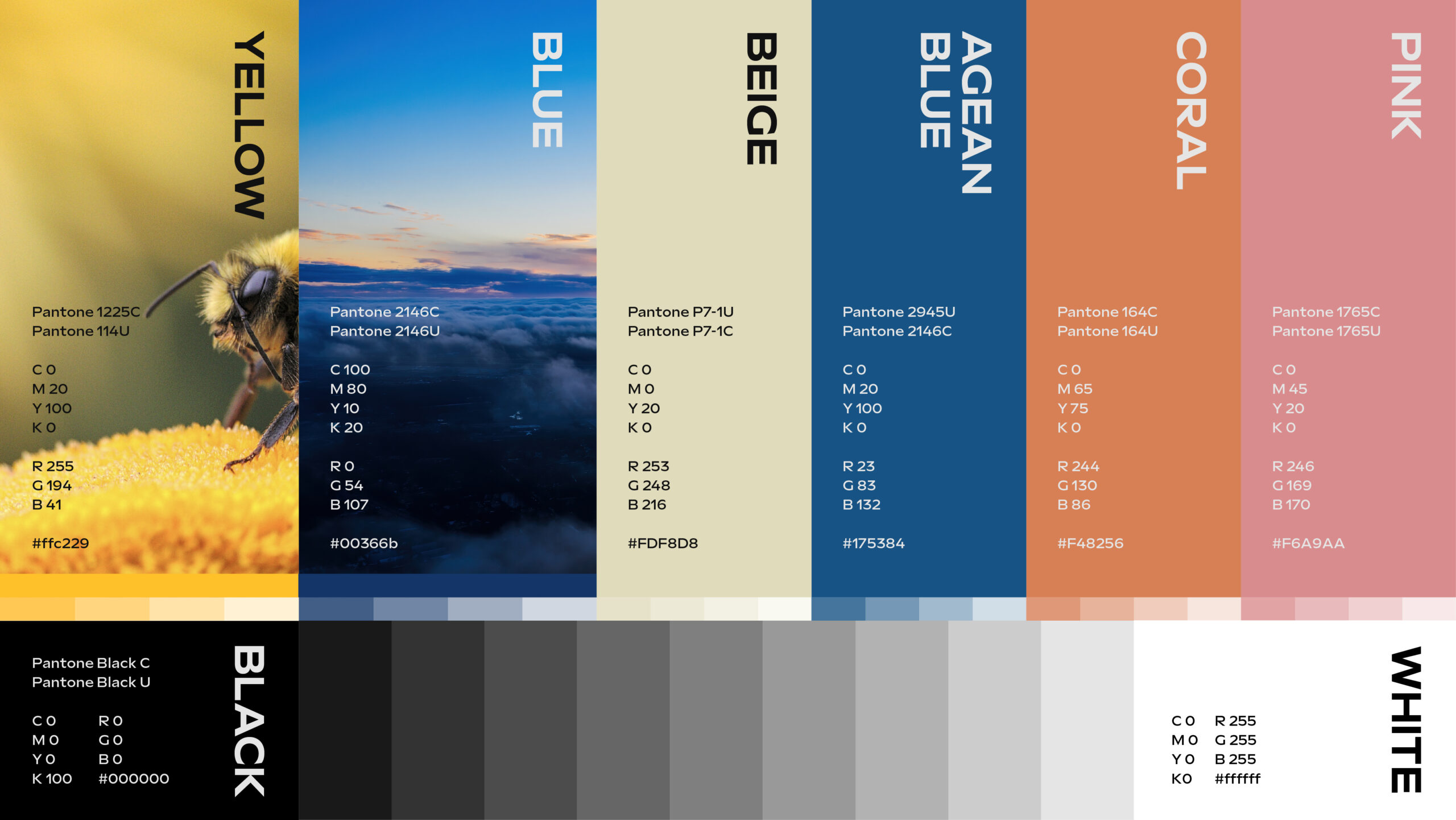
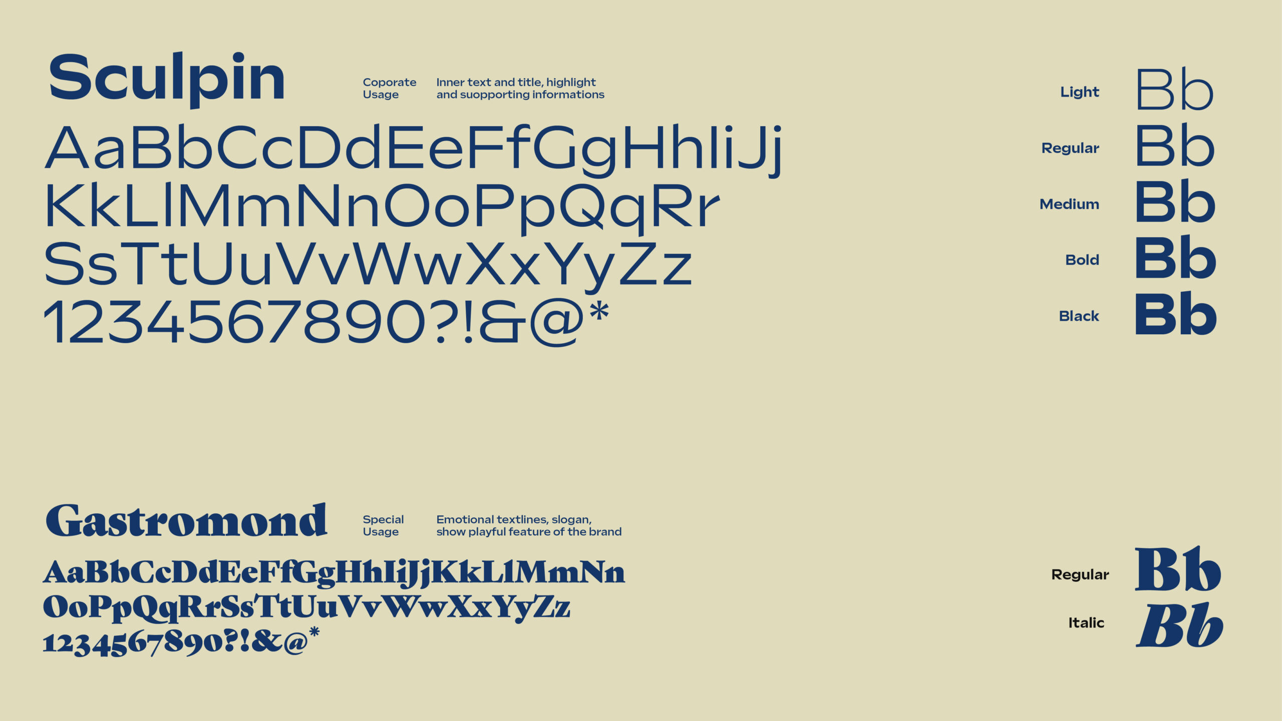
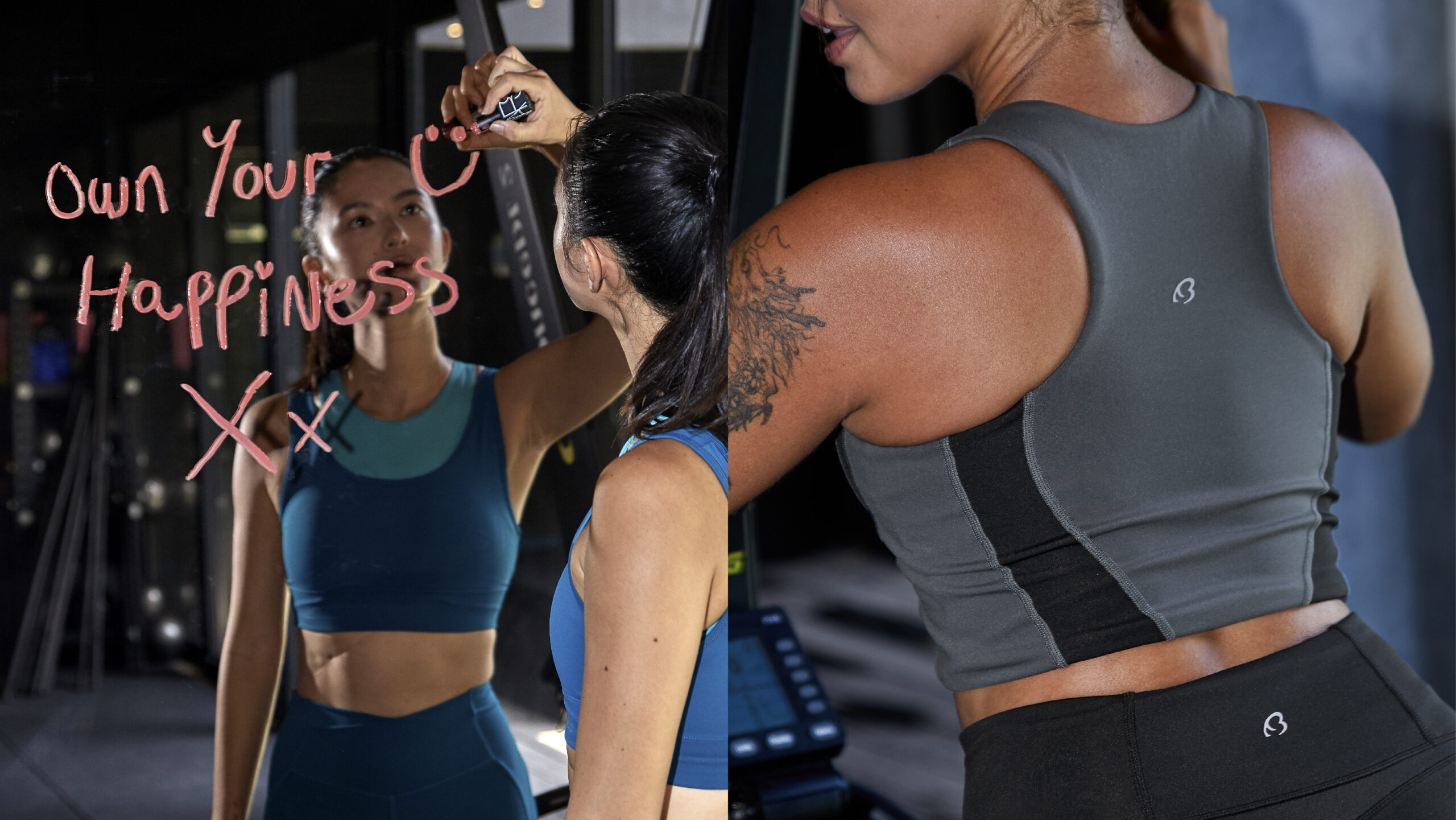
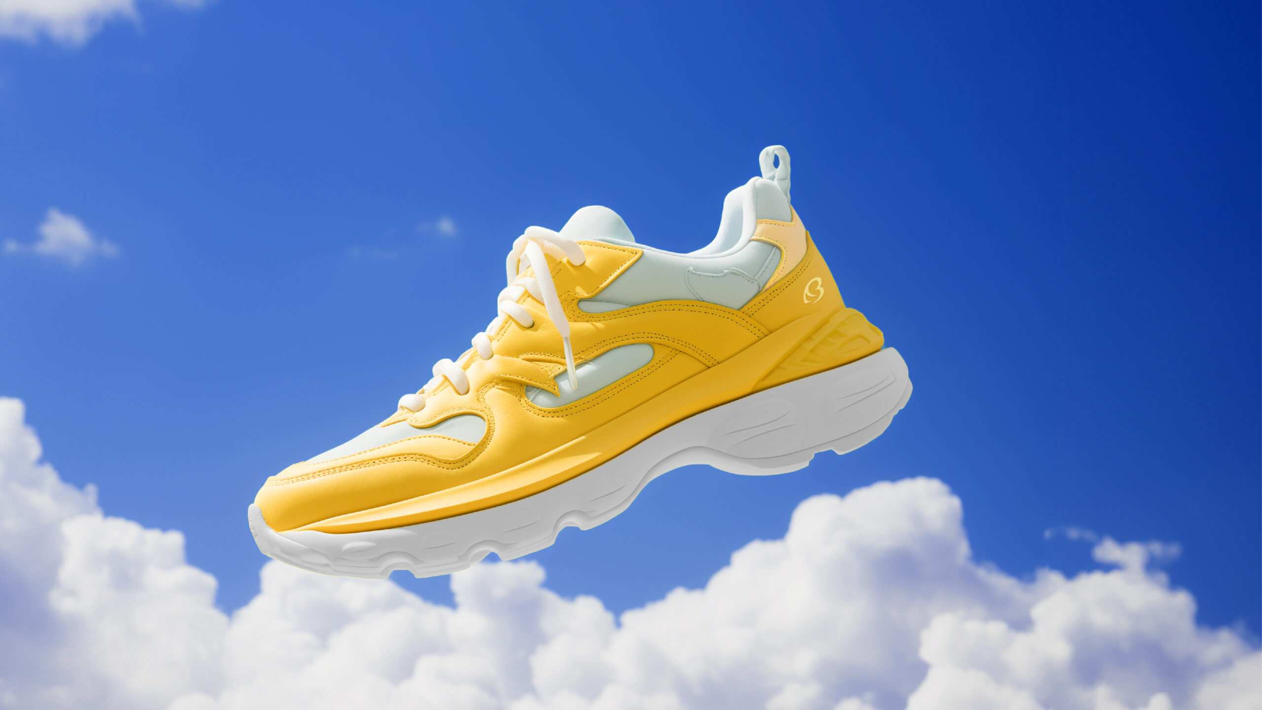
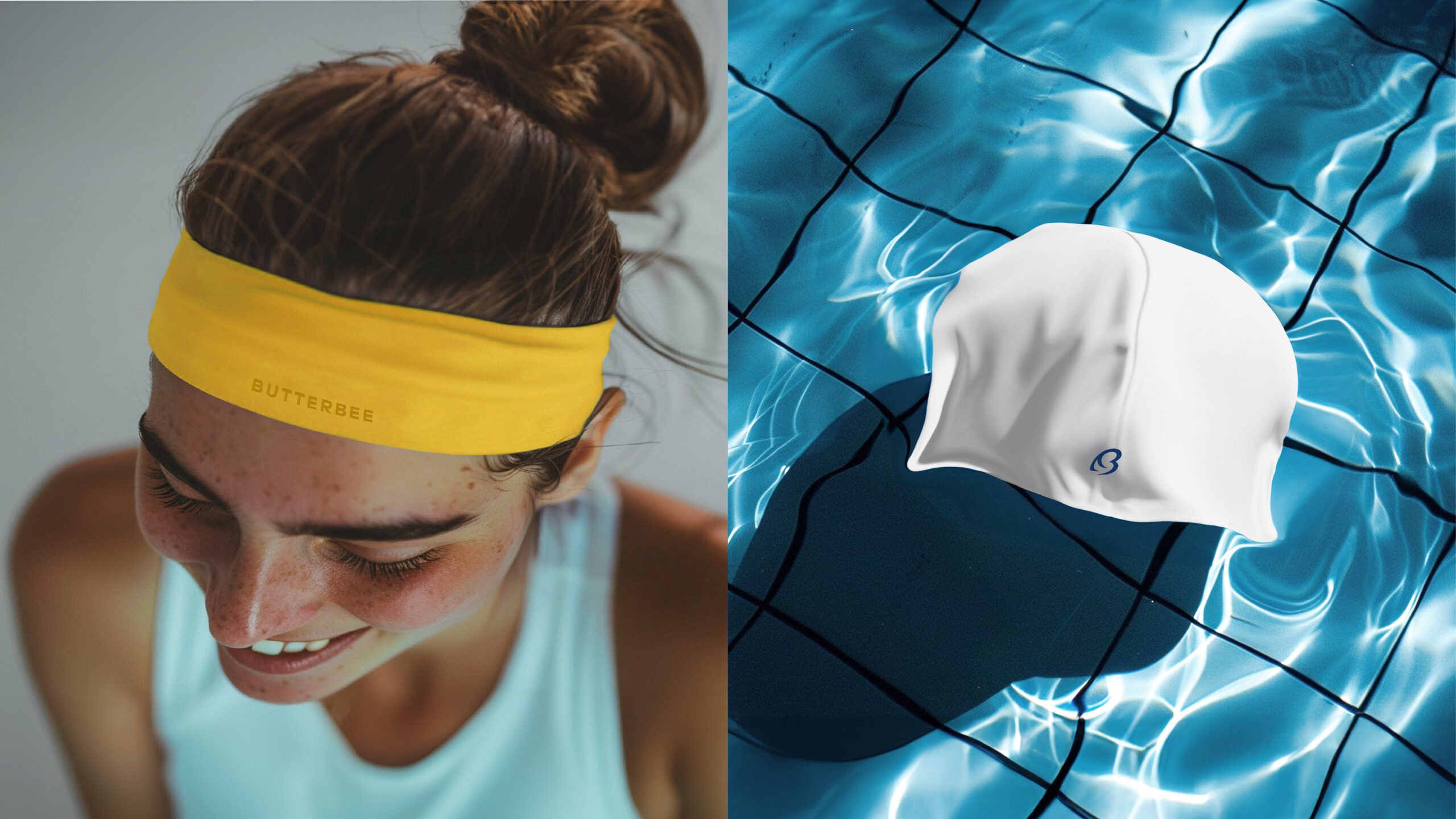
Vibrant colors and dynamic typography echo the brand’s ethos of joy and confidence, inviting users to embrace their active lifestyles with enthusiasm
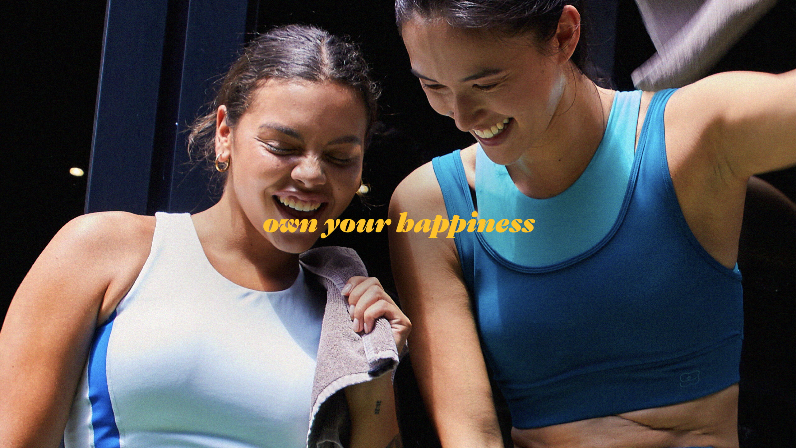
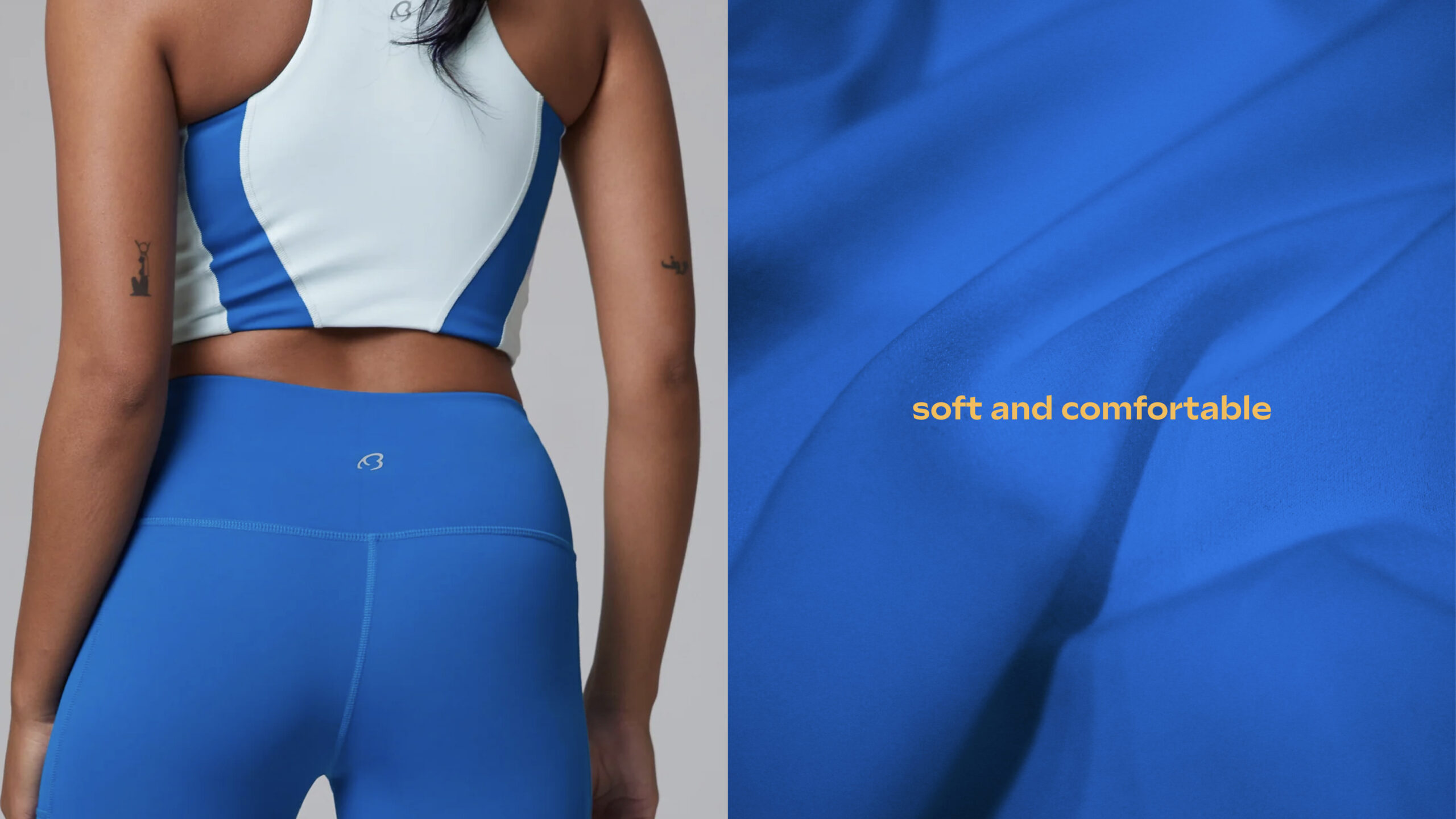
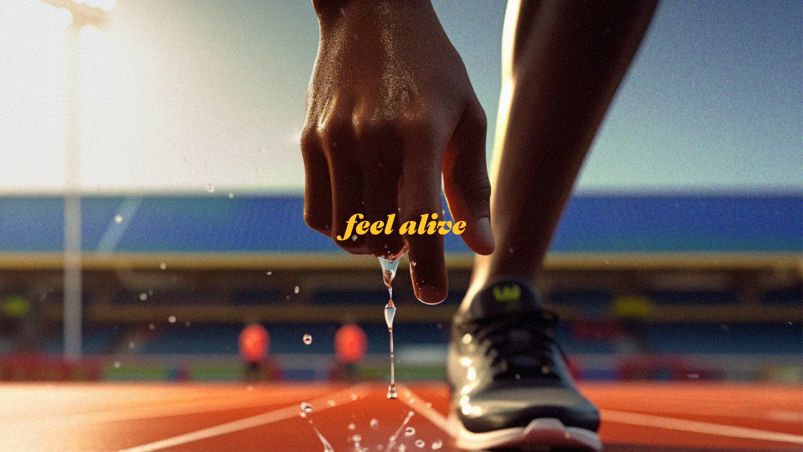
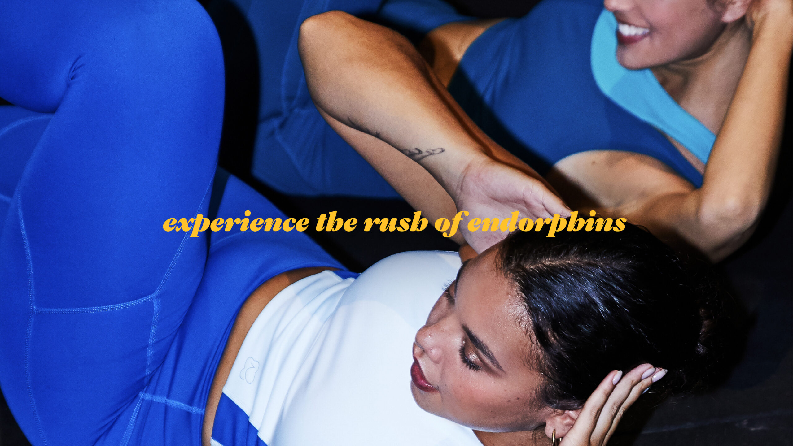
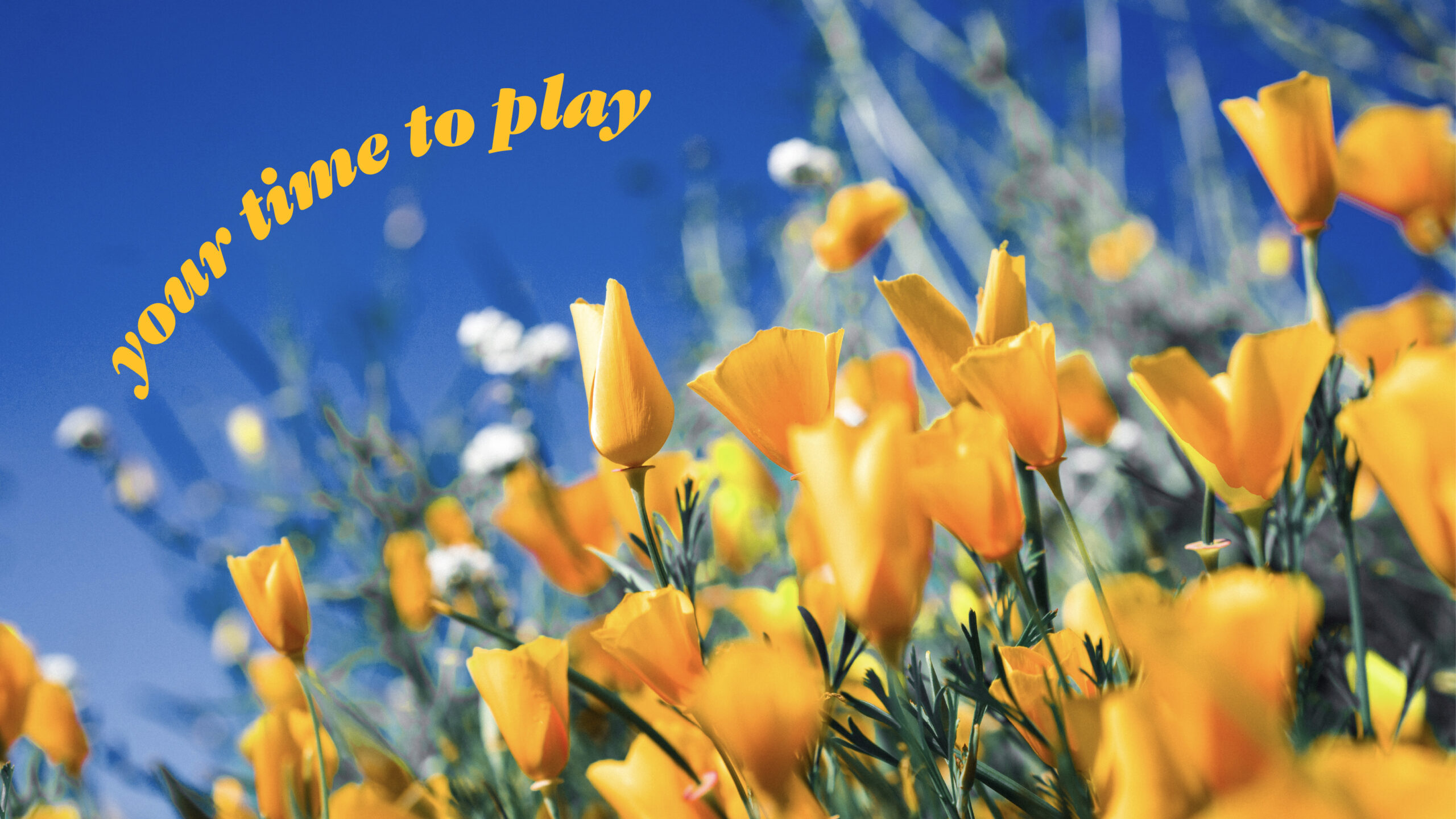
ButterBee leverages social media platforms and organizes numerous events and community activities to foster engagement and connection among users.
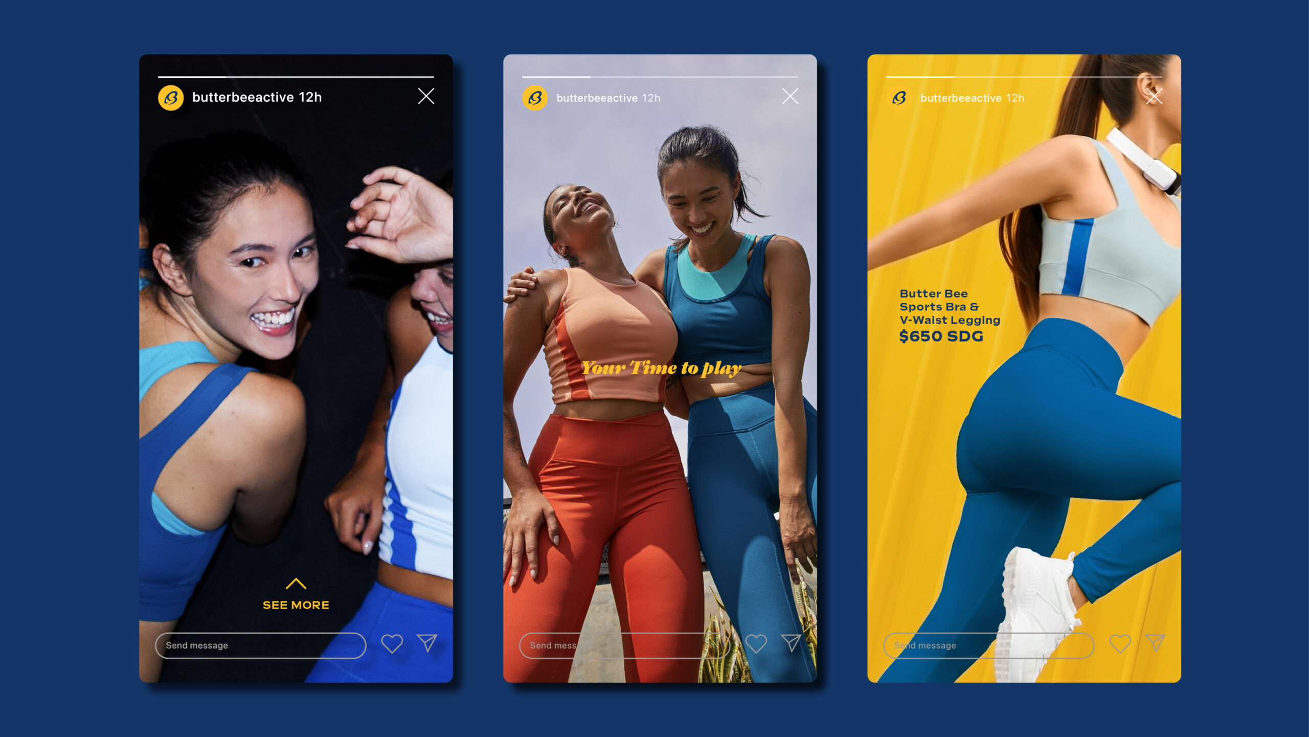
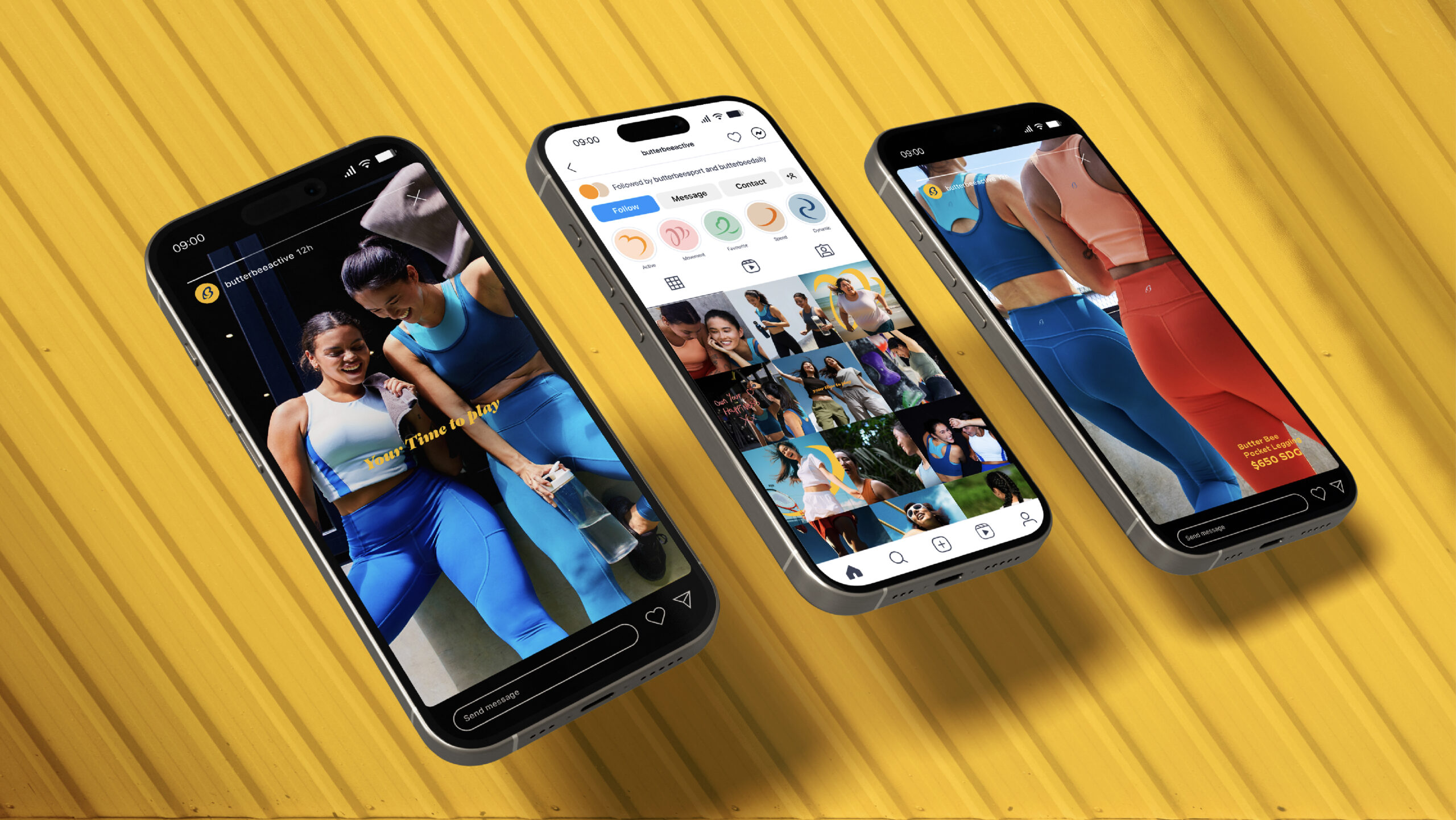

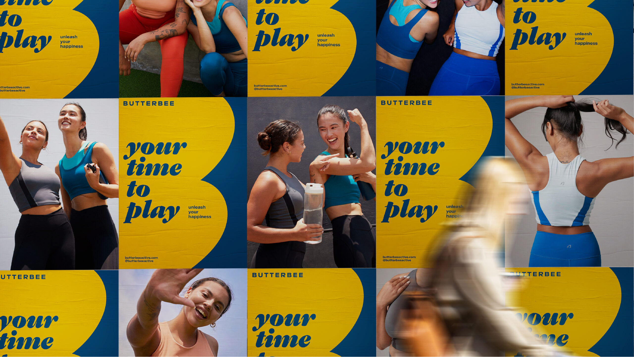
ButterBee not only sets a new standard in the activewear industry but also ignites positive change, uniting individuals in a shared pursuit of well-being and environmental stewardship.
What we did:
Brand Positioning, Brand Story, Logo Design, Illustration, Visual Identity, Namecard Design, IP Design, Package Design
Background:
ButterBee Active is an Asian-born movement, founded by individuals who discovered life-transforming happiness and freedom in outdoor sports. Their profound connection with nature drives ButterBee’s commitment to minimize environmental impact and promote well-being. Embracing the Earth as the ultimate playground, ButterBee draws inspiration from the vast beauty of nature, viewing it as a source of joy and vitality. With a deep-rooted understanding of the transformative power of physical activity, ButterBee seeks to share this experience with others, offering activewear crafted with care and consideration for both users and the environment.
Design Solution:
ButterBee Active’s branding resonates with the ethos of movement and happiness. The logo, merging a stylized bee with the letter ‘B,’ symbolizes the brand’s dedication to sustainable design and the harmonious integration of nature into everyday life. Vibrant colors and dynamic typography reflect the energy and confidence inherent in an active lifestyle, encouraging users to embrace their journeys to health and happiness with enthusiasm. Leveraging social media platforms and hosting a myriad of community events, ButterBee cultivates a supportive and inclusive environment where users can connect, share experiences, and inspire one another. By fostering engagement and empowerment among its community, ButterBee not only sets a new standard in the activewear industry but also ignites positive change, uniting individuals in a shared pursuit of well-being and environmental stewardship.
Related questions:
What does the brand ButterBee Active represent, and what are its core values?
ButterBee Active is an Asian-born brand focusing on activewear. It emerged from the transformative experiences of individuals who found profound joy and freedom through outdoor sports. The brand is deeply committed to environmental stewardship, aiming to minimize its impact on nature while promoting the well-being of all living creatures. ButterBee Active’s core values center around unity, vitality, and sustainable practices. Its visual identity, featuring a stylized bee merged with the letter ‘B’, symbolizes harmony and industriousness, reflecting the brand’s dedication to thoughtful design and eco-friendly initiatives.
How does ButterBee Active foster community engagement and promote active lifestyles?
ButterBee Active actively leverages social media platforms and organizes numerous events and community activities to encourage engagement and foster a sense of belonging among its users. These initiatives are designed to empower individuals, helping them to embrace their unique journeys towards health and happiness. By creating opportunities for users to connect, share experiences, and inspire each other, ButterBee Active not only promotes an active lifestyle but also cultivates a supportive and inclusive environment that champions well-being and environmental responsibility.
Branding & package design for ButterBee Active
Client/Project: ButterBee Active (Website/IG)
Creative Director: Vince Cheung
Design and illustration: PingTing Lee
Photography: ButterBee Active
商標 | 品牌設計 | 香港 | 香港設計 | 視覺形象 | 包裝 | 包裝設計
logo | branding | design | hong kong | hong kong designer | VI | visual identity | vincdesign | package | package design