• 繁體
Menu
VINCDESIGNVINCDESIGN
  • HOME
  • ABOUT
  • PROJECTS
  • TRENDS
  • CONTACT
    • 繁體

Menu

  • HOME
  • ABOUT
  • PROJECTS
  • TRENDS
  • CONTACT
    • 繁體
PACKAGING, F&B Knockbox
30 August, 2023

KNOCKBO°X Special Edition Coffee Bean

KNOCKBO°X Special Edition Coffee Bean Package Design

KNOCKBO°X Special Edition Coffee Bean Package Design Solution

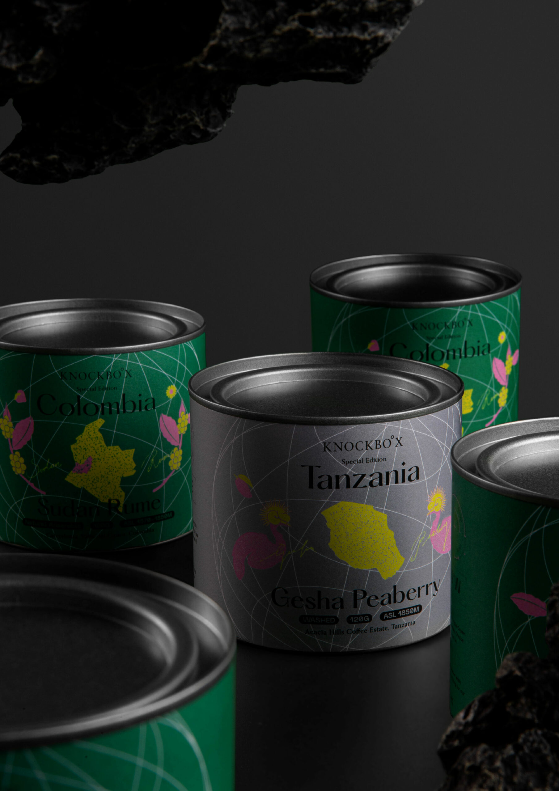
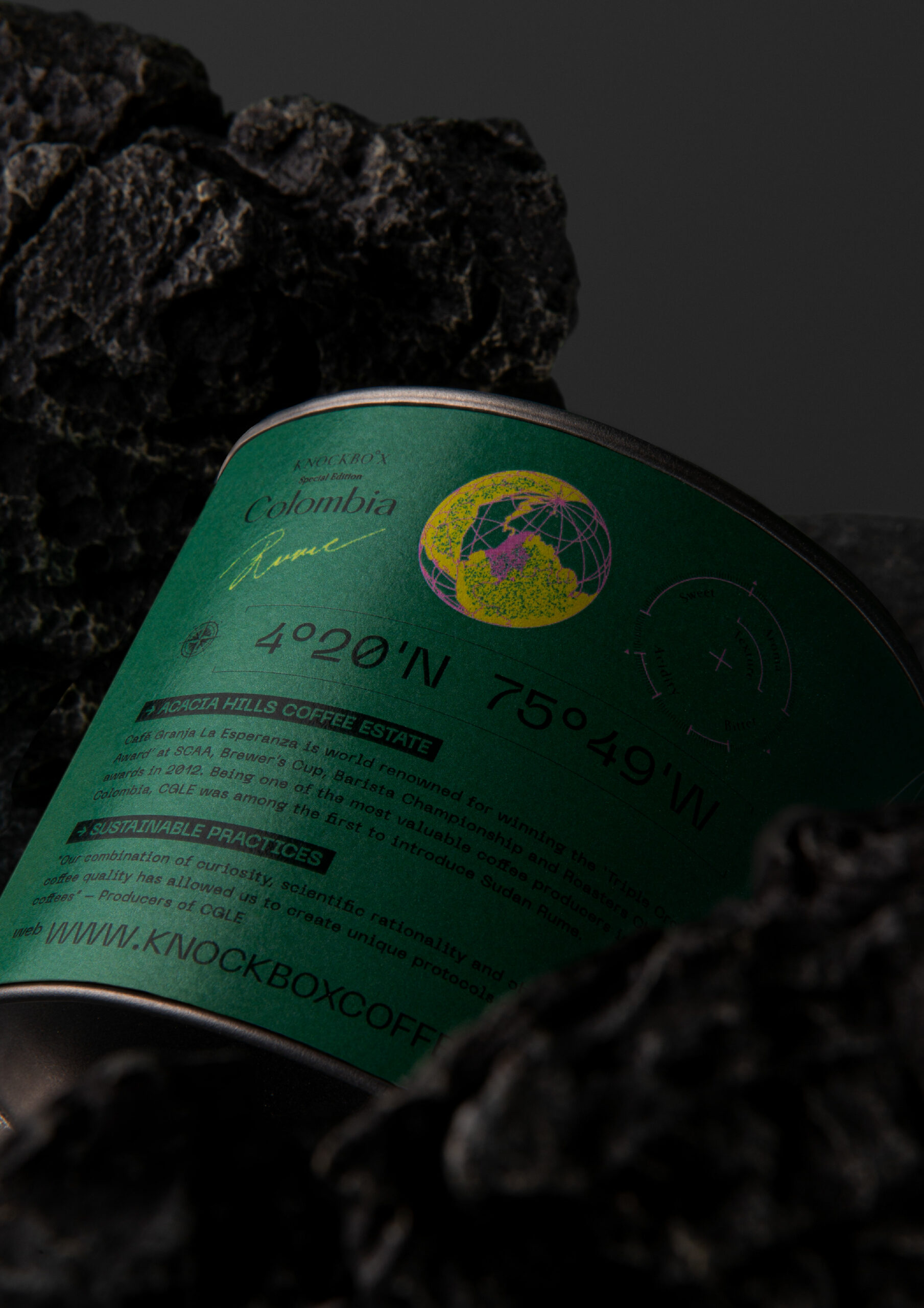
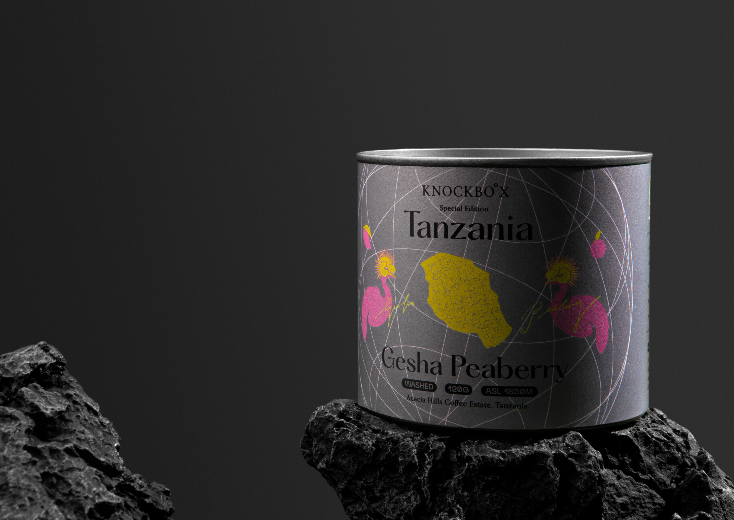
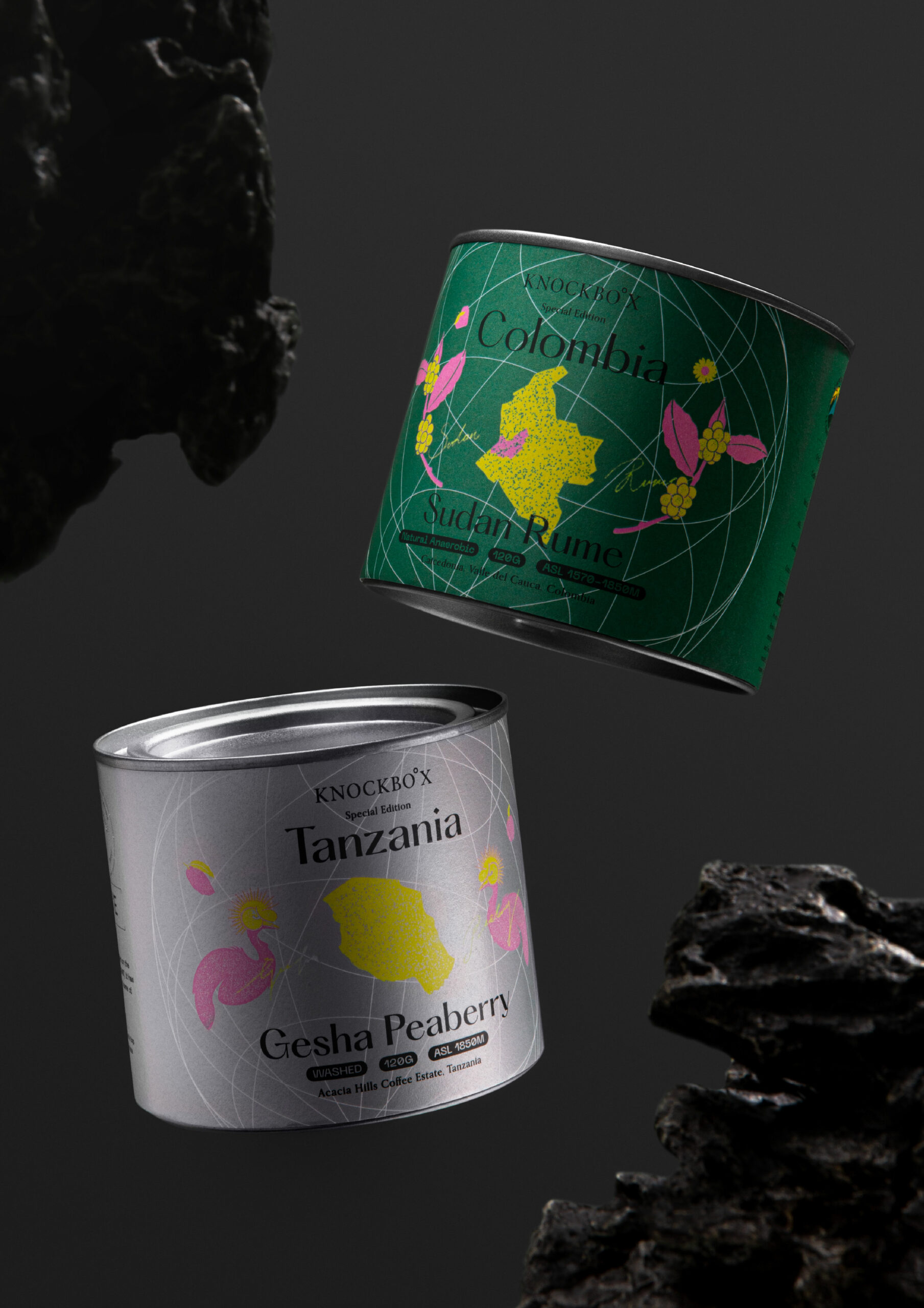
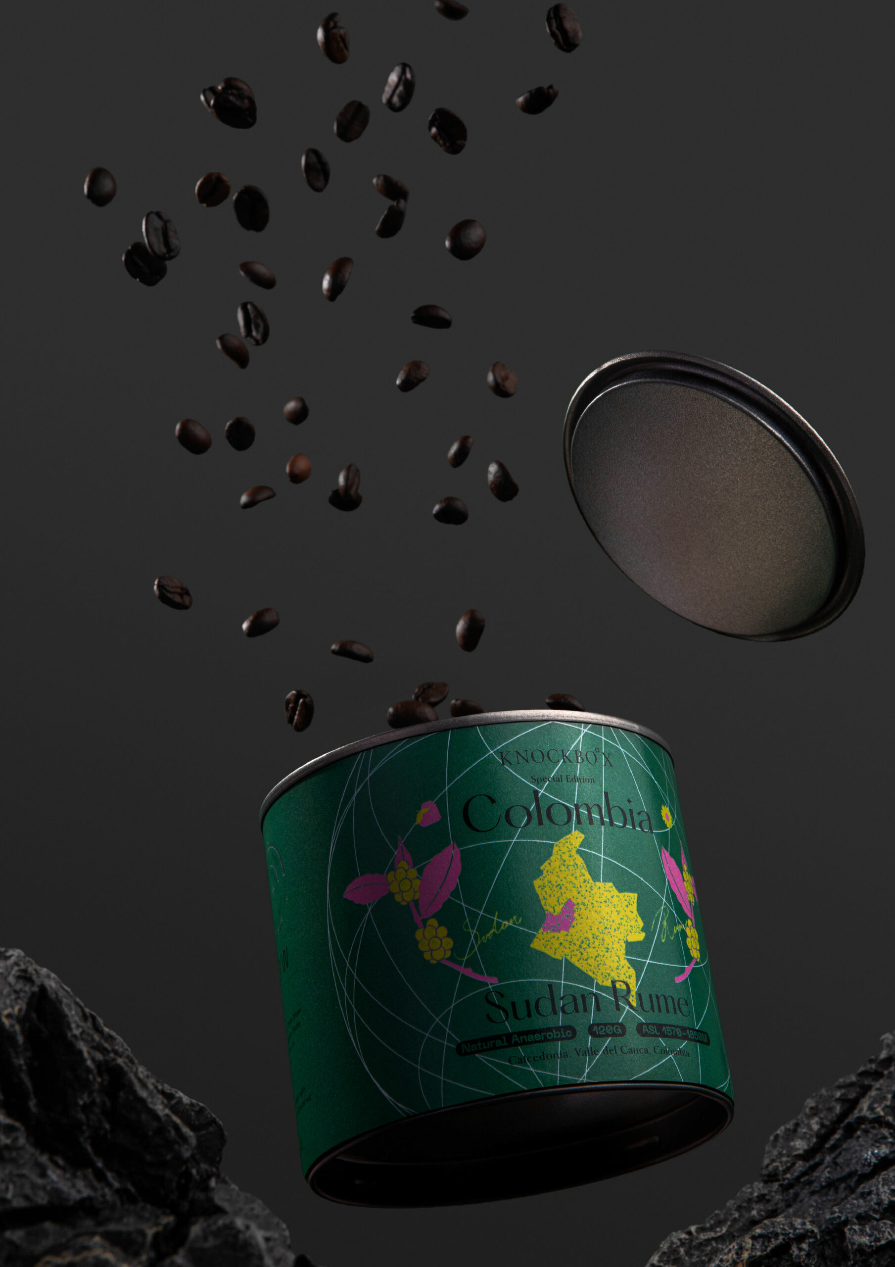
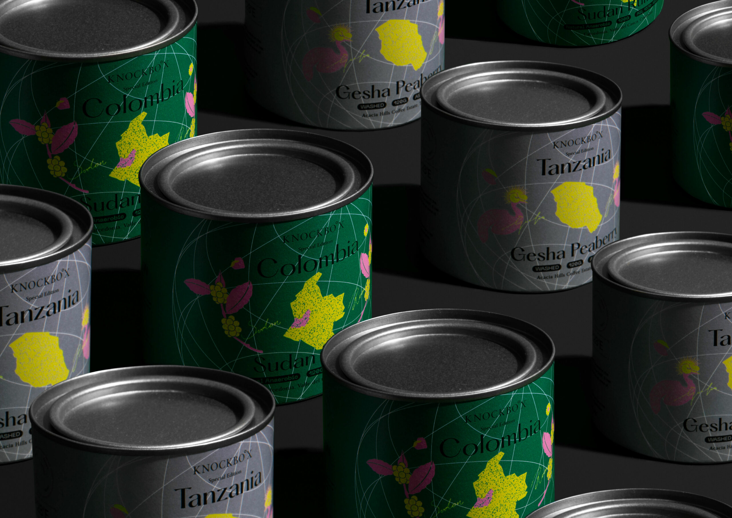
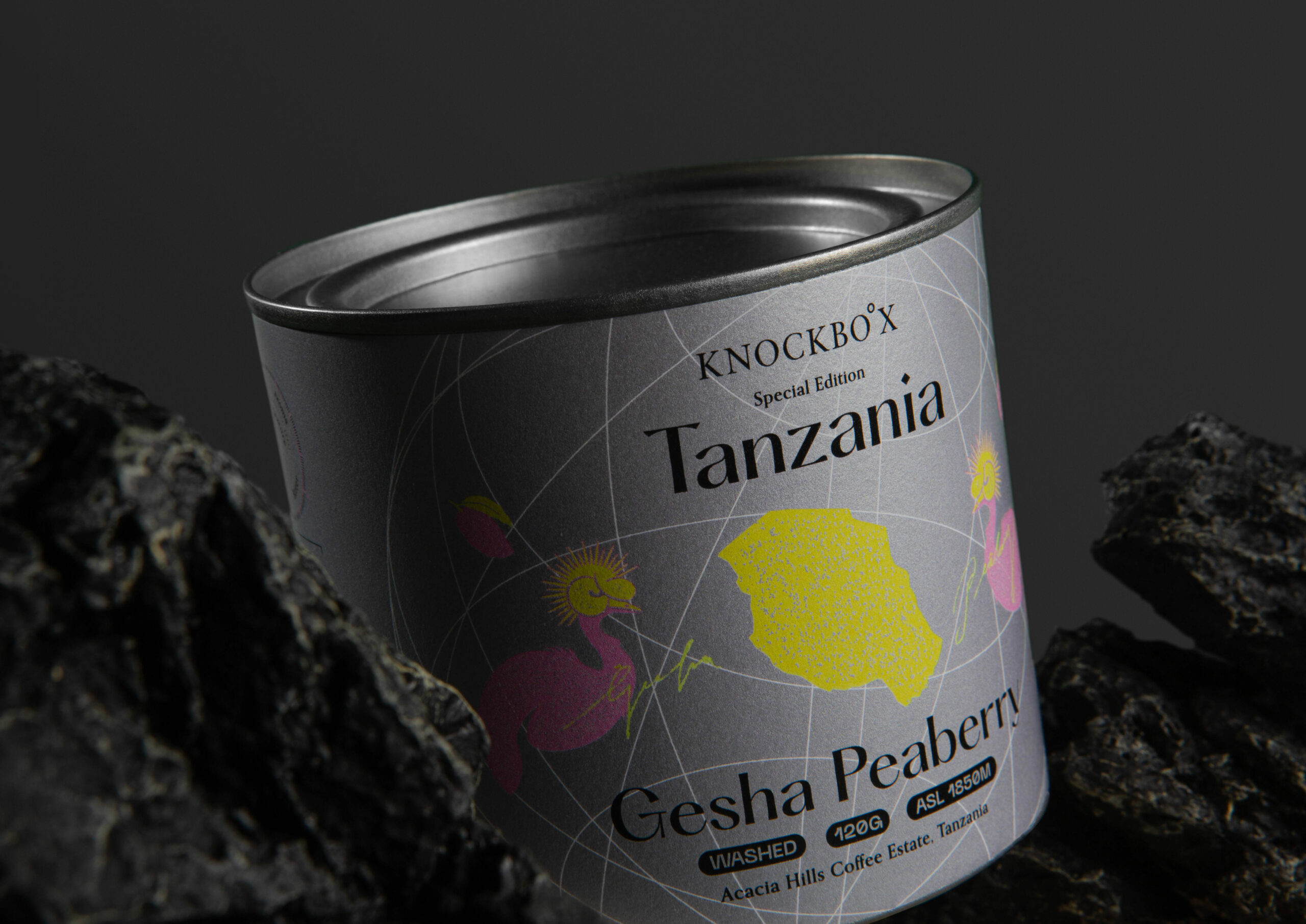
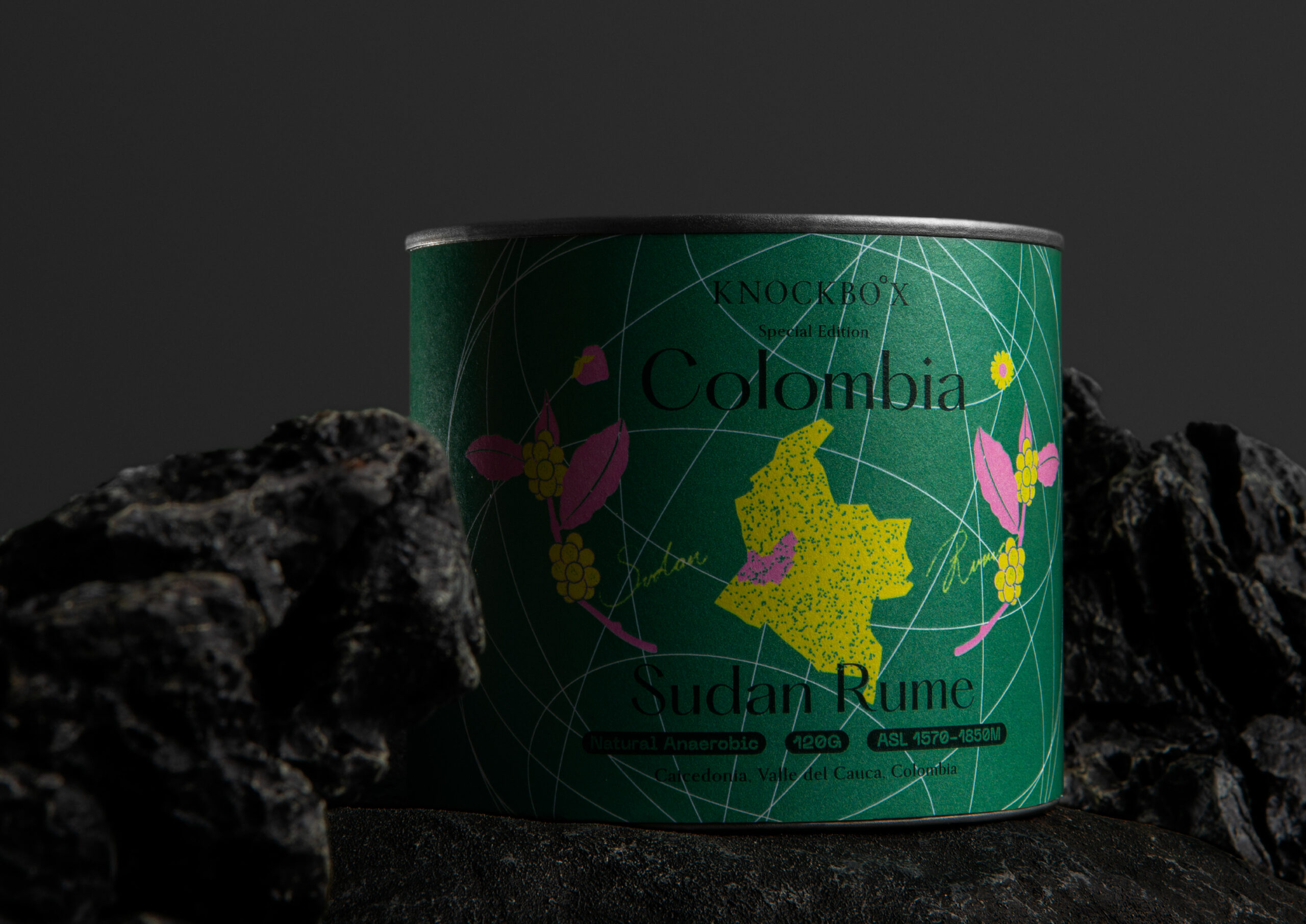
The artistry behind the packaging we’ve crafted for Knockbox coffee beans lies in its seamless fusion of brand identity and an enchanting journey. With a nod to a global quest for excellence, our design integrates the brand’s iconic compass needle and coordinates, mirroring the meticulous selection process of coffee beans from diverse corners of the world. Each coffee origin is transformed into a limited-edition masterpiece, graced with one-of-a-kind illustrations that encapsulate the unique attributes of the coffee and pay tribute to the manifold flavors gathered from every corner of the globe.

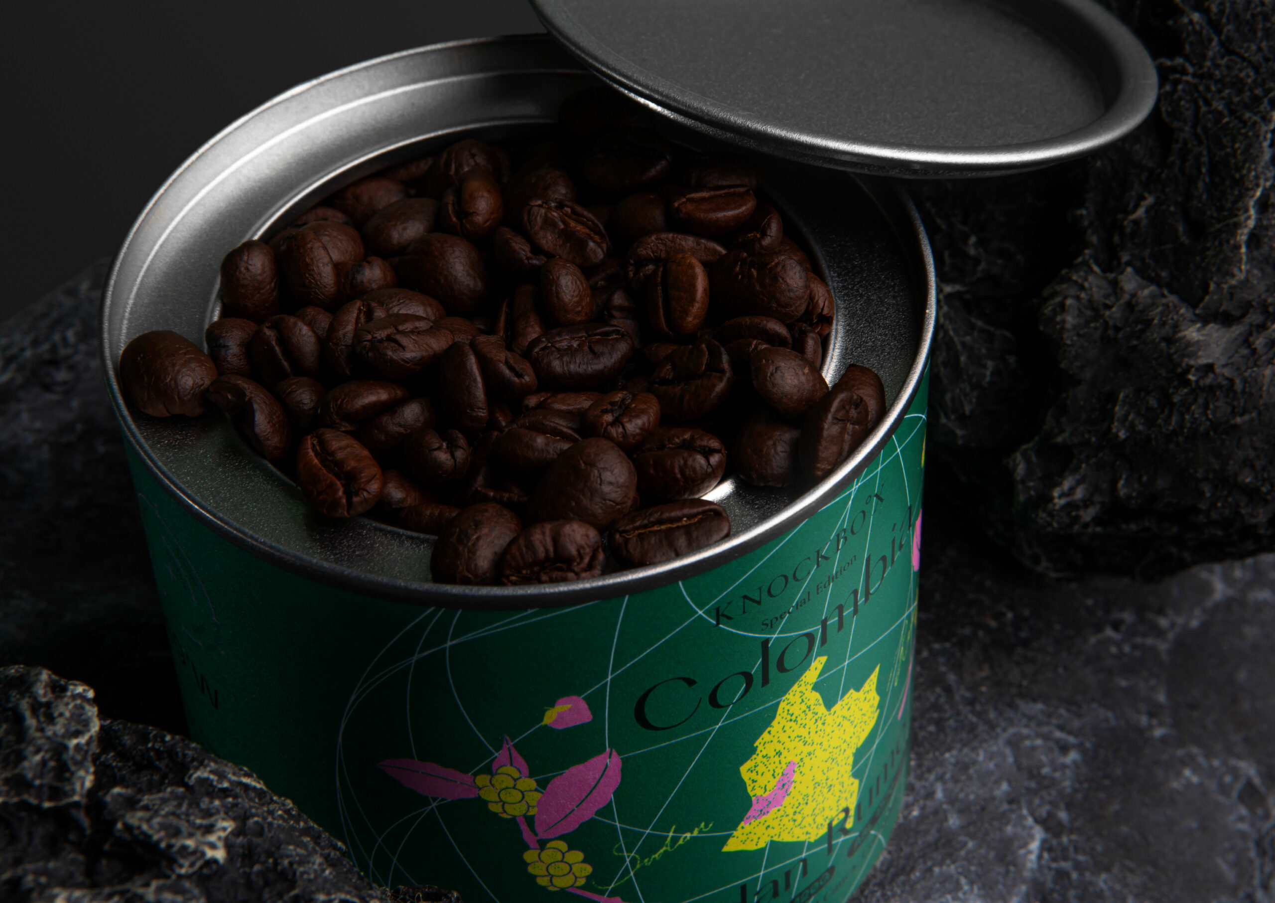
Beyond being a mere container, the tin can packaging holds a narrative of freshness and locality. It echoes the ethos of sourcing coffee directly from local growers and packing it freshly, ensuring the integrity and essence of the beans remain intact until they’re experienced by the discerning palate. Akin to the “Coffee Taster’s Flavor Wheel,” the carefully chosen color palette takes inspiration from the distinctive taste profiles of each coffee. This transformation of subtle taste differences into a visual spectrum not only enhances the aesthetic appeal but also heightens the sensory exploration, encouraging enthusiasts to anticipate the flavors even before their first sip.

The design effortlessly aligns with Knockbox’s brand narrative, reflecting its resolute commitment to quality. It mirrors the dedication of baristas, the relentless pursuit of the perfect roast, and the profound respect for the entire journey that every coffee bean embarks upon. As a tribute to coffee growers, roasters, and enthusiasts, our packaging serves as a silent yet profound ode to the collective journey that spans continents, cultures, and coffeehouses.

The KNOCKBO°X Special Edition Coffee Bean Package Design Solution is an invitation. It invites coffee aficionados from around the world to embark on a shared exploration of flavor, to immerse themselves in the diverse tastes that each bean holds, and to savor the richness that emerges from every unique story. This packaging isn’t merely a design; it’s an embodiment of the world of coffee, encapsulating the dedication of all those who contribute to this cherished journey.

In essence, our design encapsulates the very spirit of Knockbox. It tells a story of excellence, locality, and a deep love for coffee. Through every element, from the compass needle to the inspired colors, our packaging invites coffee lovers to celebrate the journey that begins at origin and culminates in the cup. It’s a testament to the shared passion that unites coffee enthusiasts across the globe, inviting them to partake in the captivating journey that each cup of Knockbox coffee encapsulates.
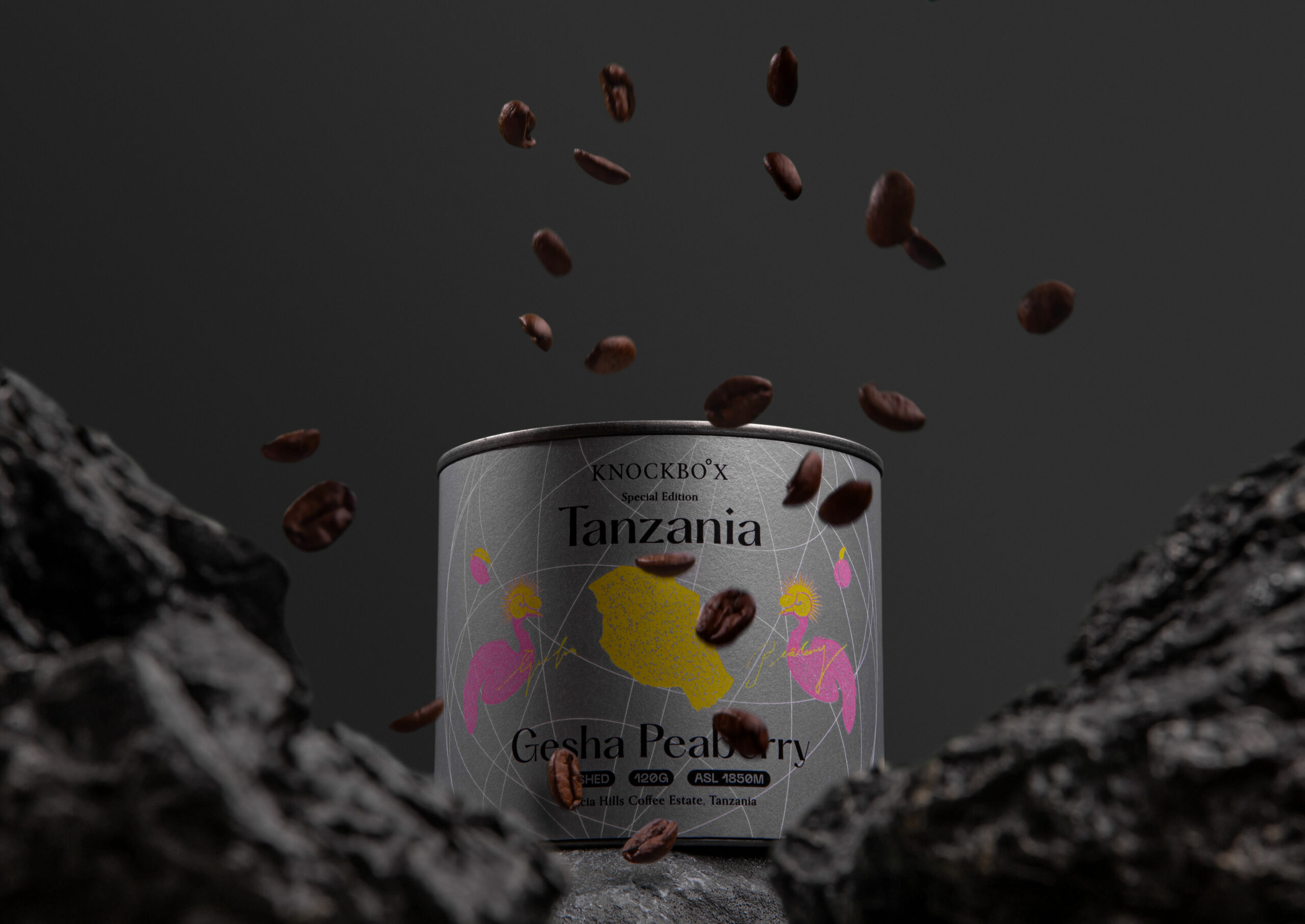
KNOCKBO°X Special Edition Coffee Bean

The design effortlessly aligns with Knockbox’s brand narrative, reflecting its resolute commitment to quality.

KNOCKBO°X Special Edition Coffee Bean

WHAT WE DID
Brand Positioning, Creative Concept, Package Design

DESIGN SOLUTION
The packaging we’ve designed for Knockbox coffee beans seamlessly merges the brand’s essence with its captivating journey. Reflecting a global pursuit of excellence, the packaging integrates the brand’s compass needle and coordinates, symbolizing the careful curation of coffee beans from around the world. Each coffee origin transforms into a unique limited edition, adorned with distinctive illustrations that encapsulate their characteristics and celebrate the diverse flavors sourced from various corners of the globe.

The tin can packaging not only conveys a sense of freshness but also embodies the concept of locally sourced and freshly packed coffee. Inspired by the “Coffee Taster’s Flavor Wheel,” the chosen color palette reflects the flavor profiles of each coffee, transforming subtle flavor differences into a visual feast. Seamlessly aligned with Knockbox’s brand narrative, the design embodies the brand’s commitment to quality, emphasized by the dedication of coffee enthusiasts and a deep respect for the coffee journey. This packaging resonates with coffee enthusiasts worldwide, inviting them to embark on a shared expedition of flavor exploration and celebrate the unique journey of coffee.

The KNOCKBO°X Special Edition Coffee Bean packaging fuses brand identity with an intriguing journey through unique illustrations and color palettes that encapsulate the origin stories and flavor profiles of each coffee bean. The compass and coordinates integrated into the packaging symbolize the brand’s meticulous approach to coffee quality, while the tin can conveys freshness and locally sourced beans. Overall, the design invites coffee aficionados worldwide to explore the flavors of the world, witnessing the connections forged by people’s passion for coffee. The KNOCKBO°X Special Edition packaging encapsulates the brand’s ethos, narrating an admiration and respect for coffee.

Package design for KNOCKBO°X Special Edition Coffee Bean
Client/Project: Knockbox Coffee Company
Creative Director: Vince Cheung
Design and illustration: Kaman Kan
Animation: Justin Tsao
Photography: Justin Tsao
Categories: PACKAGING, F&B
Clients: Knockbox
Tags:


CONTACT US

Branding Agency Hong Kong / Creative Agency Hong Kong
info@vincdesign.com
Copyright VINCDESIGN. All rights reserved.
  • BRANDING DESIGN | LOGO
  • PACKAGING
  • GRAPHIC

Social Chat is free, download and try it now here!