


Packaging Story:
Steeped in a rich heritage of pastry excellence, Månen’s journey begins with master baker Chef Chen Yueping. With over four decades of dedication, Chef Chen has honed his craft in renowned luxury hotels from Singapore to Hong Kong, earning the distinguished honor of crafting desserts for the Danish royal family. When introducing the brand to the Hong Kong market, the VINCDESIGN team derived the name “Månen”—Danish for “the moon”—to honor Chef Chen’s name “月” (Moon) and his royal European connection. “Månen” captures celestial quality, timeless elegance, and universal appeal, establishing a distinct visual identity in a highly competitive culinary landscape.
For the Year of the Horse, Månen Bakery sought a celebratory Chinese New Year (CNY) packaging solution that honors Asian traditions while expressing a modern, global design ethos. VINCDESIGN Branding Co. was tasked with developing a high-end gift box concept that harmonizes festive warmth, artisanal craftsmanship, and contemporary fashion aesthetics.
Packaging Project Details:
Discovery | Cultural Insight & Human Resonance
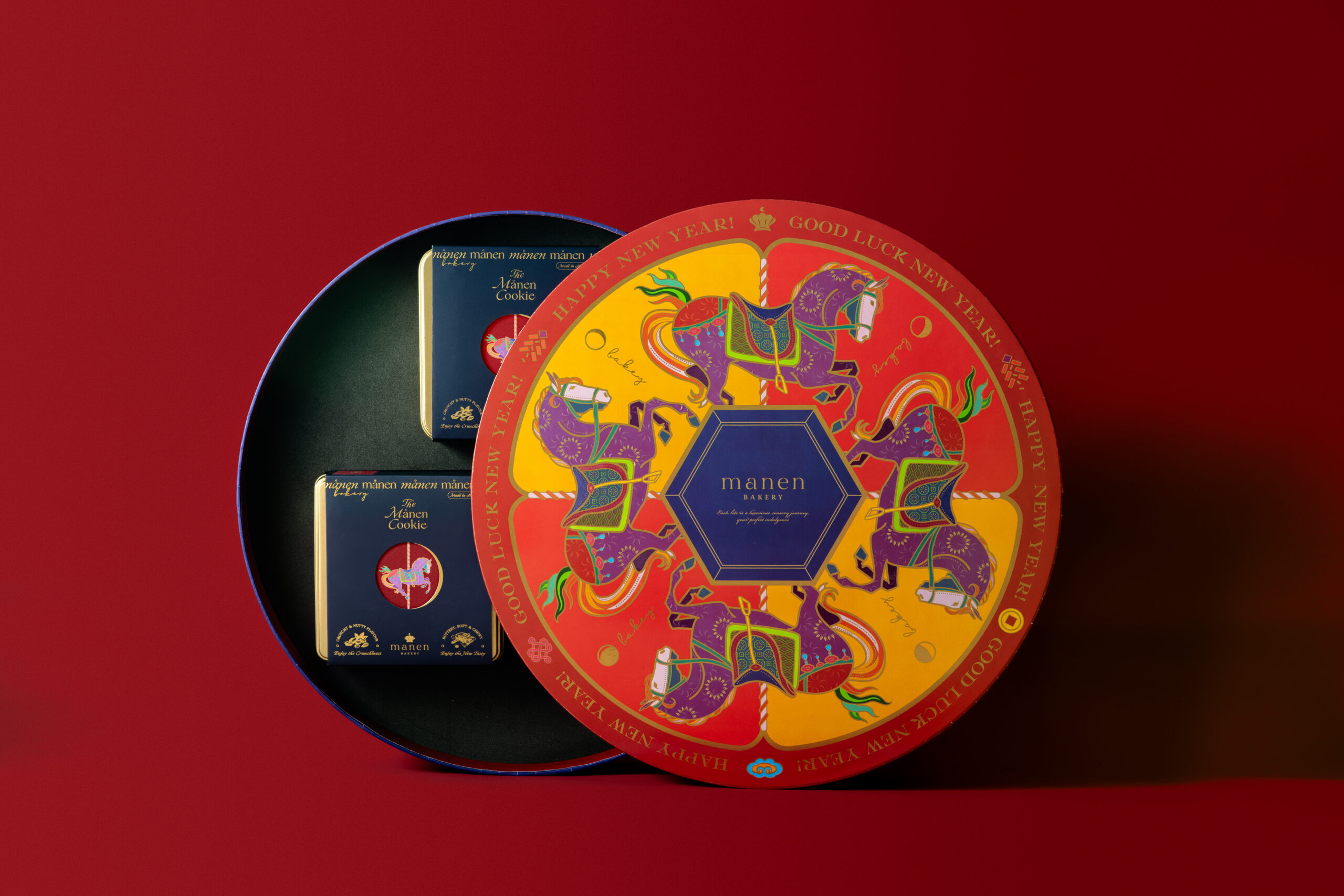
Festive packaging often risks falling into generic visual tropes. We recognized a shifting design trend in premium food packaging: discerning consumers seek physical objects that deliver emotional depth, tactile craftsmanship, and a touch of joyful escapism. To honor the Year of the Horse, VINCDESIGN anchored the creative narrative in the metaphor of the Carousel (旋轉木馬). The carousel embodies joyful gatherings, reunion, and the endless, uplifting cycle of life—mirroring the spirit of Chinese New Year while introducing a whimsical, European art-inspired motif.
Strategy | Fashion-Forward Fusion & Narrative Strategy
Our design strategy focuses on “East-meets-West Fusion Fashion.” Rather than relying solely on conventional festive red, the palette integrates vibrant, fashion-forward hues—spirited oranges, regal purples, and emerald accents—to elevate traditional festive tones into a contemporary aesthetic. The design positions Månen’s CNY gift collection not merely as a confectionery container, but as an object d’art: a collectible, shareable piece of structural craftsmanship designed to bring delight to family reunions and luxury gifting occasions.
Identity | Celestial Geometry & Intricate Visual Detailing
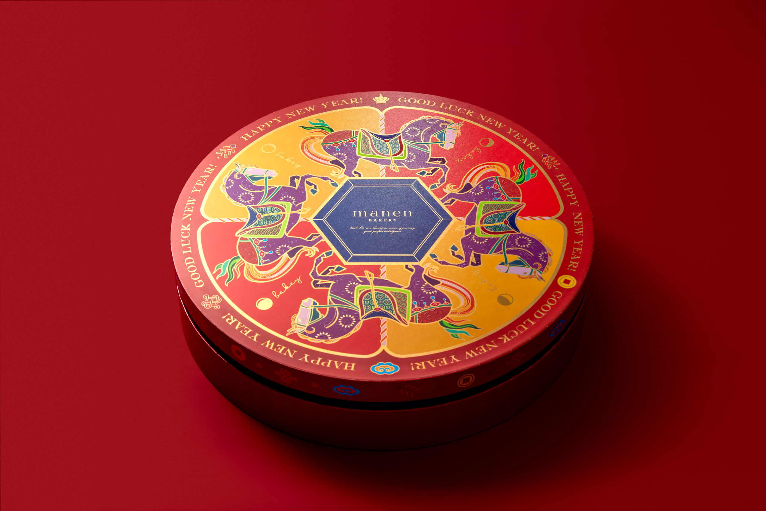
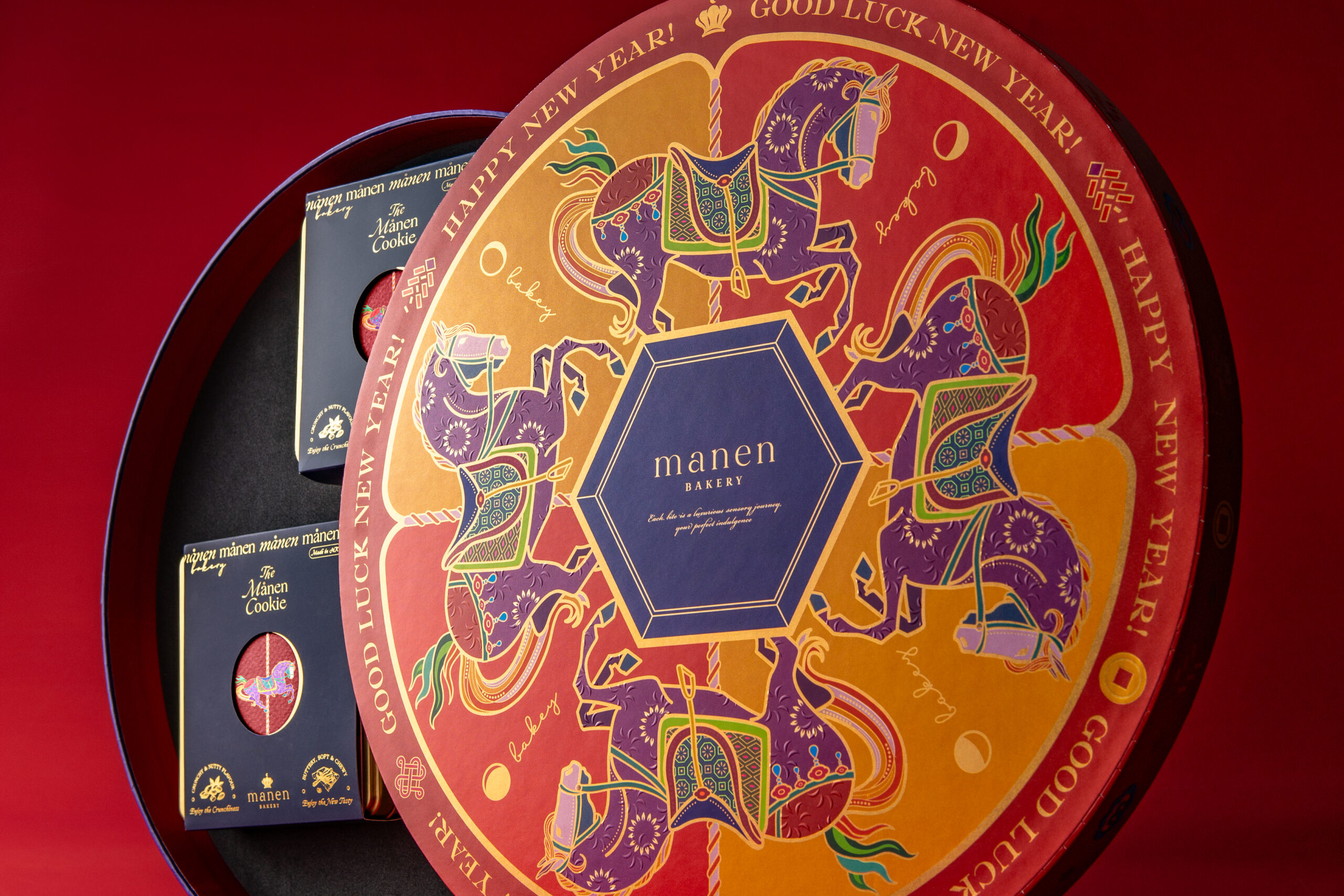
The circular tin geometry reflects the lunar motif of the Månen identity and the endless cycle of the carousel. The artwork features intricate, hand-illustrated horses adorned with ornate festive saddlery, framed by elaborate geometric patterns and gold-foiled typography reading “Happy New Year!” and “Good Luck New Year!”. The central hexagonal emblem acts as an anchor for the brand identity, balancing celestial symbolism with structured elegance.
Rollout | Tactile Craftsmanship & Unboxing Experience
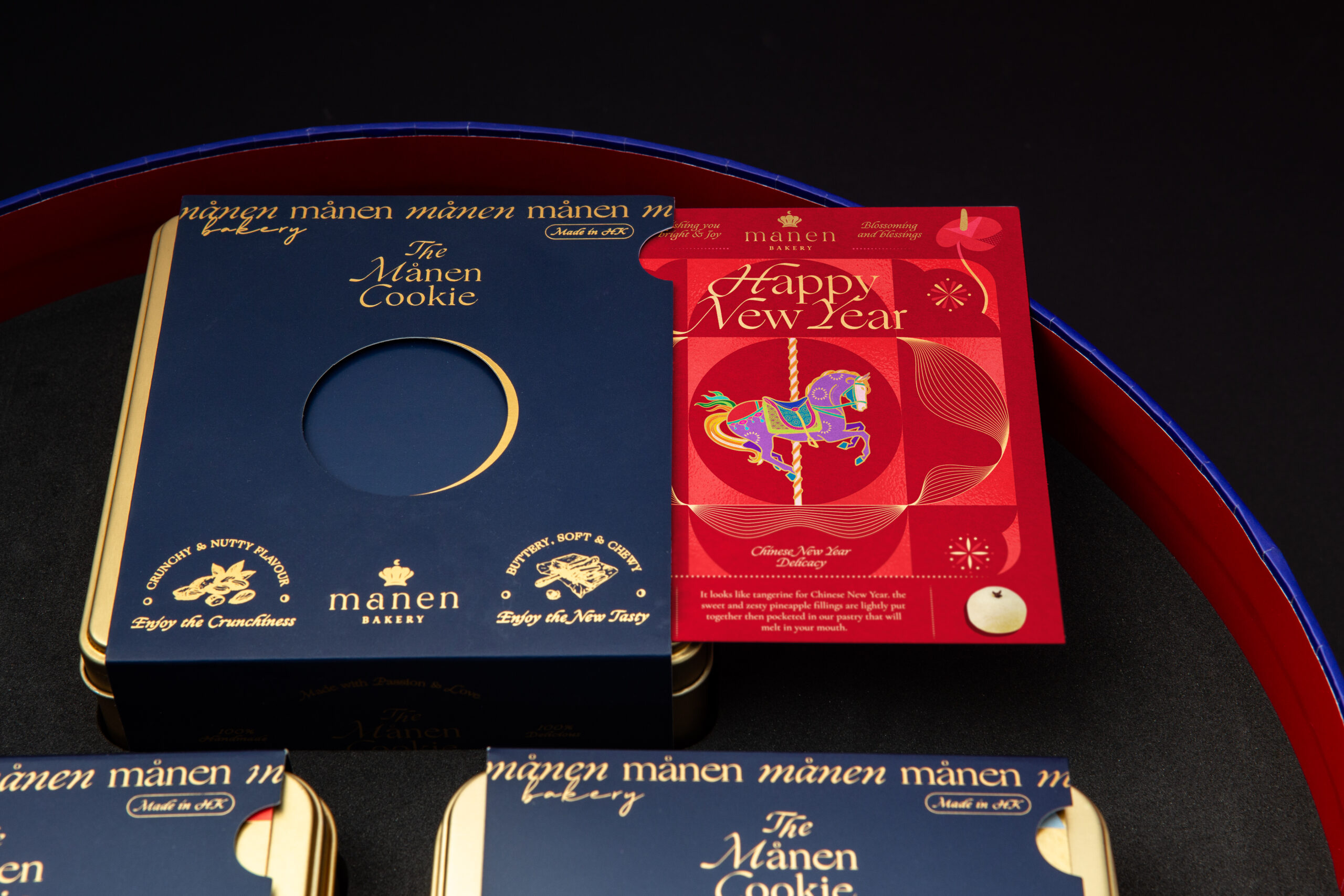
Every touchpoint is designed with unboxing drama and tactile richness in mind. From the central hexagonal emblem housing the Månen logotype to the meticulously embossed motifs, metallic foils, and rich color contrasts, the packaging balances heritage with modern flair. By seamlessly bridging Singaporean mastery, Danish royal homage, and Hong Kong design sophistication, VINCDESIGN crafted a celebratory icon that turns a traditional holiday treat into an unforgettable visual and sensory experience.
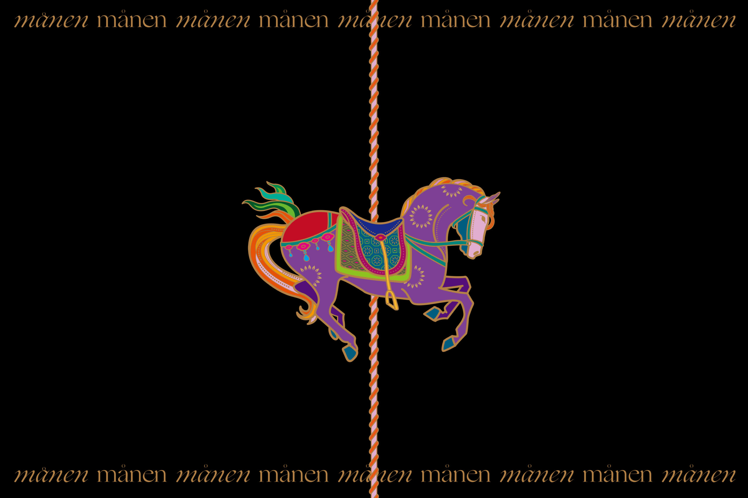
The carousel embodies joyful gatherings, reunion, and the endless, uplifting cycle of life—mirroring the spirit of Chinese New Year while introducing a whimsical, European art-inspired motif.
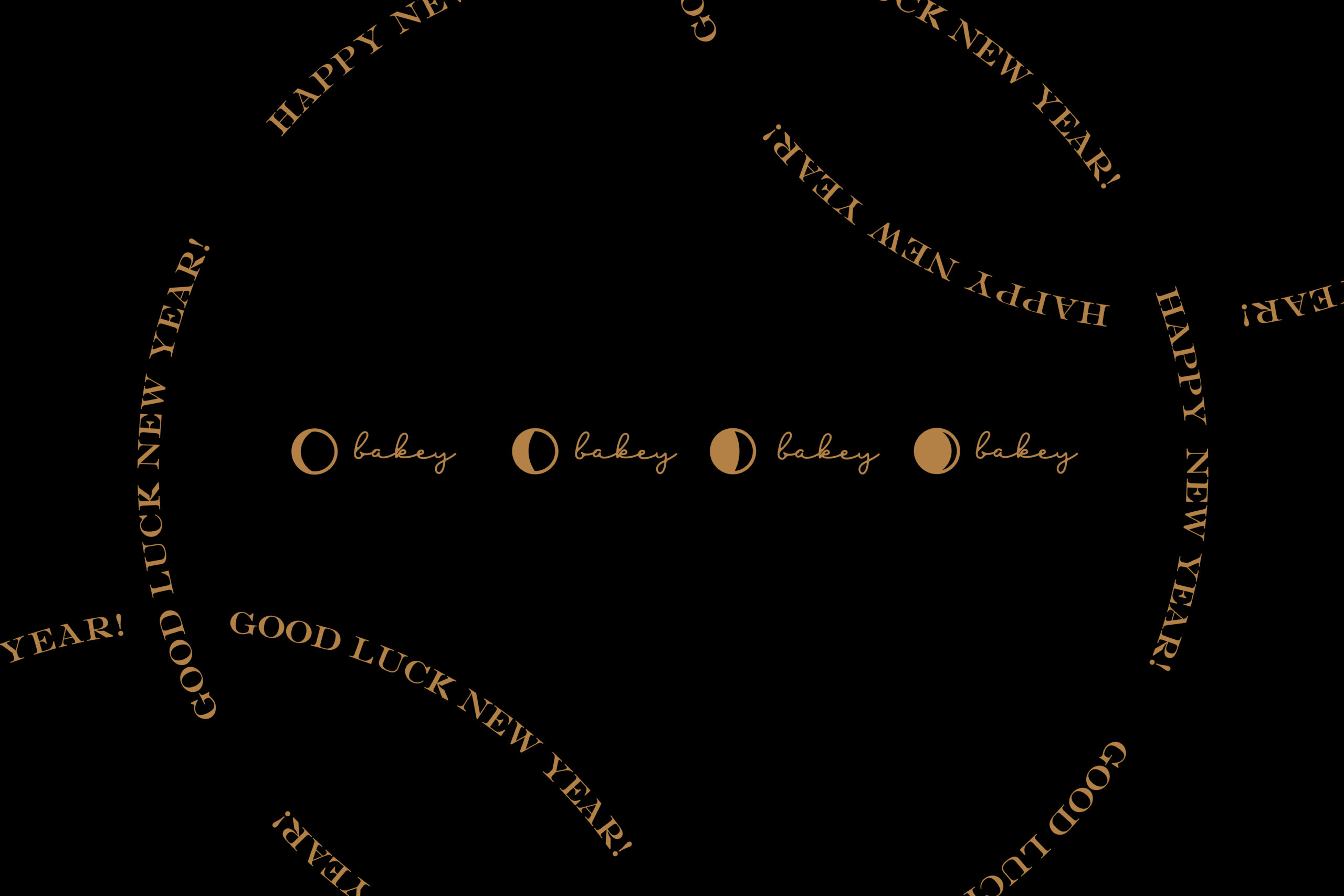
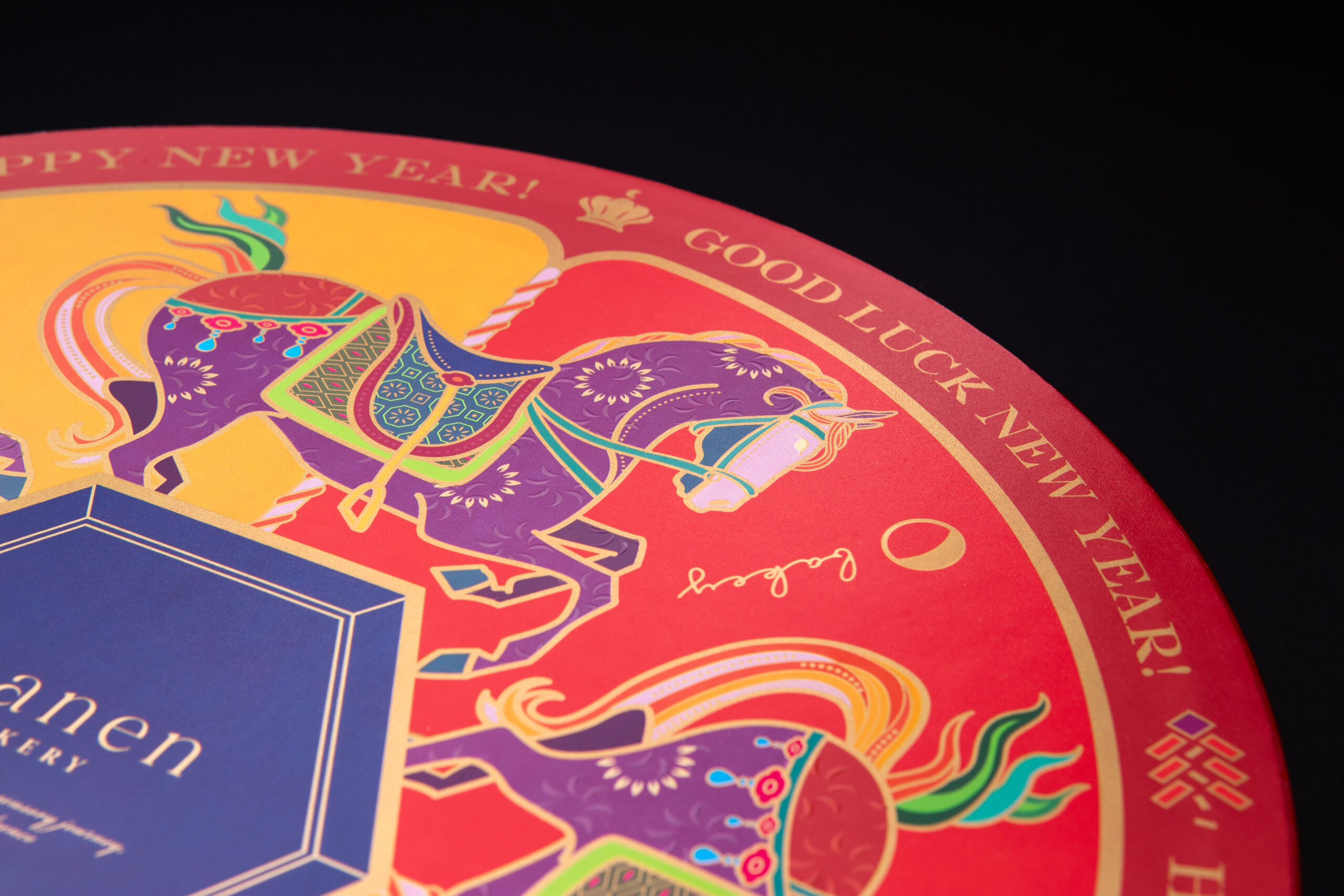

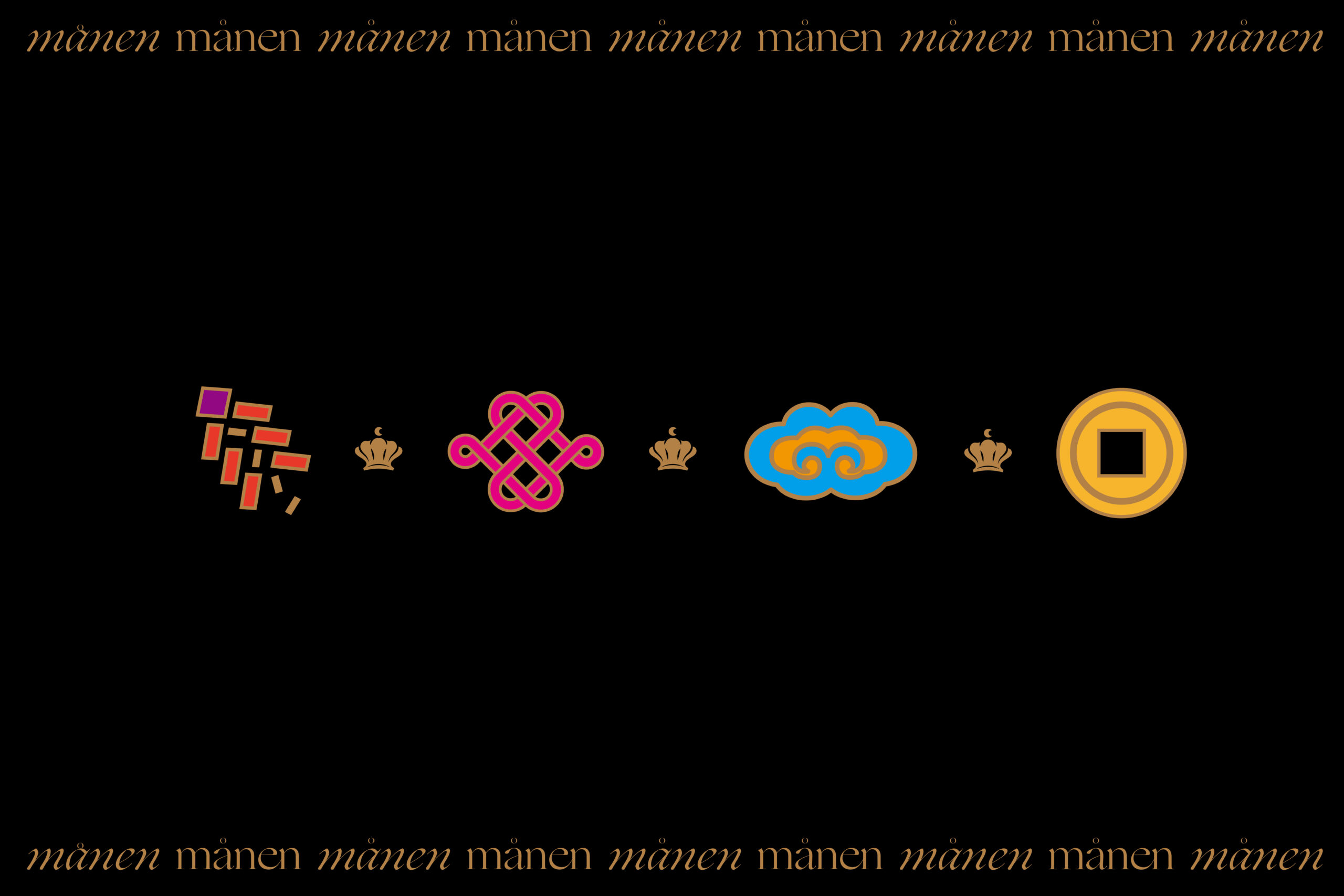
Our design strategy focuses on “East-meets-West Fusion Fashion.” Rather than relying solely on conventional festive red, the palette integrates vibrant, fashion-forward hues—spirited oranges, regal purples, and emerald accents—to elevate traditional festive tones into a contemporary aesthetic.
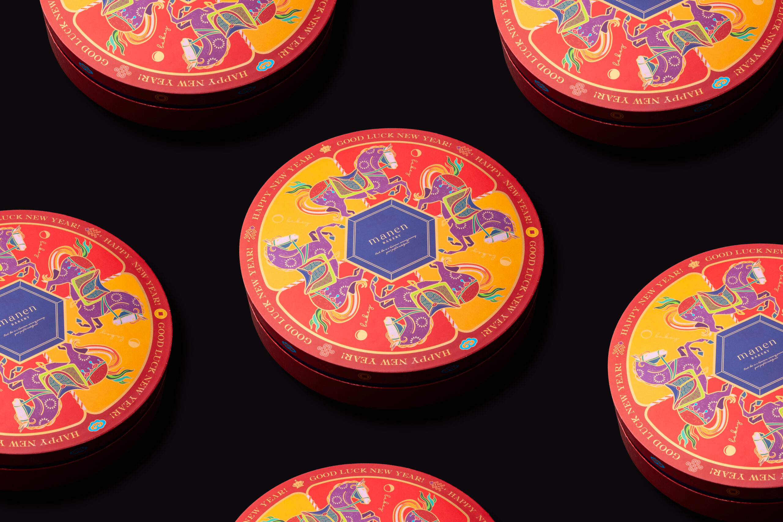
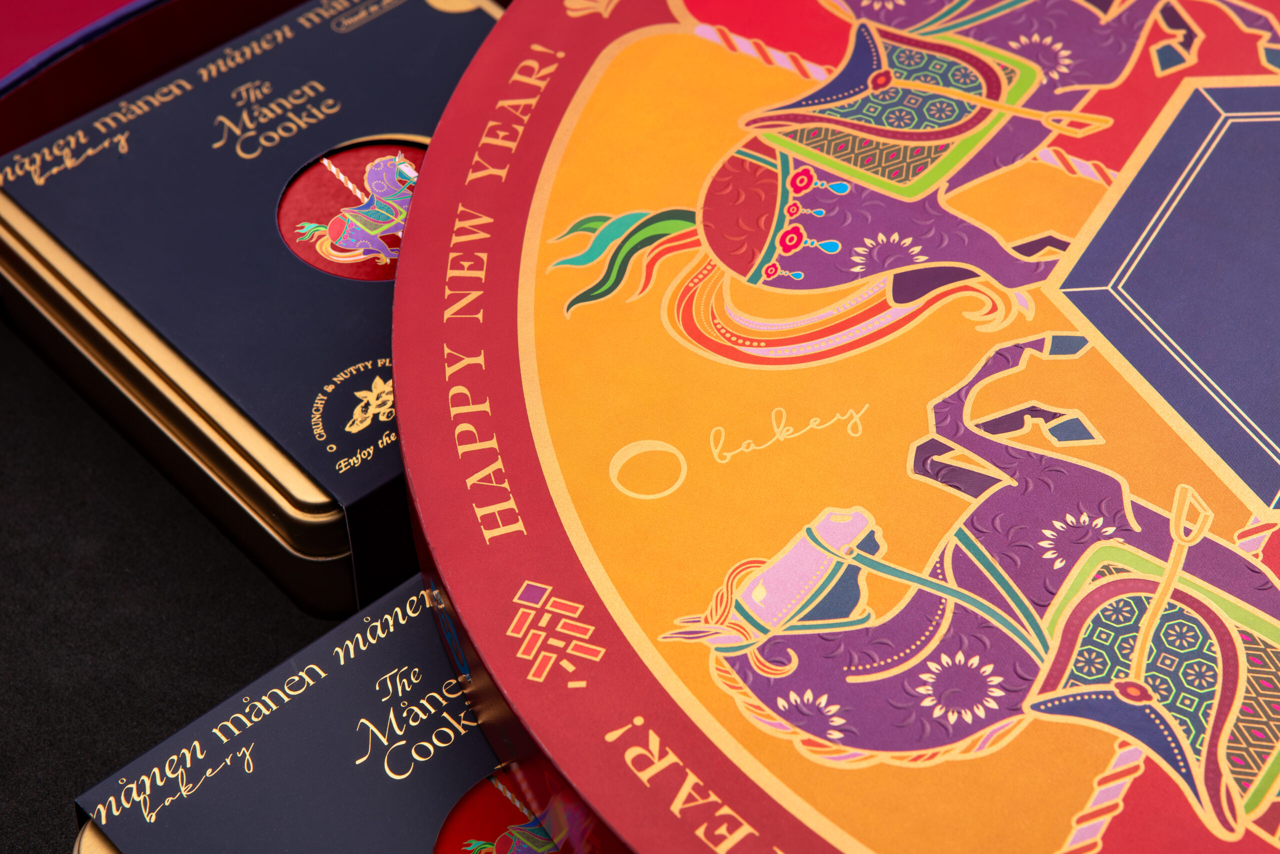
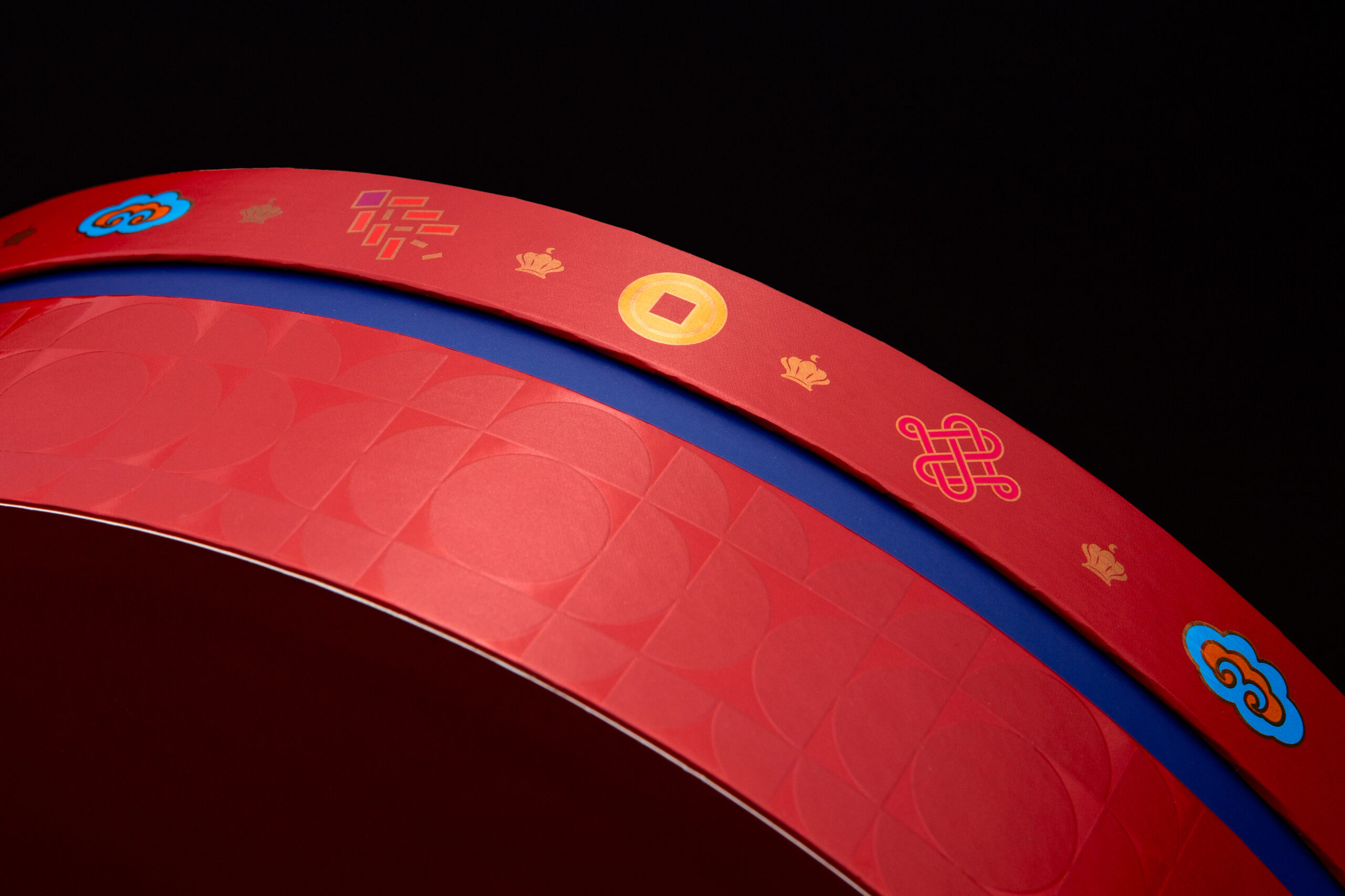
Every touchpoint is designed with unboxing drama and tactile richness in mind. From the central hexagonal emblem housing the Månen logotype to the meticulously embossed motifs, metallic foils, and rich color contrasts, the packaging balances heritage with modern flair.
What we did:
Package Design
Packaging design for Månen Bakery
Client/Project: Månen Bakery
Creative Director: Vince Cheung
Design and Illustration: Koan Tse
Client/Project: Månen Bakery
Creative Director: Vince Cheung
Design and Illustration: Koan Tse
Photography: Justin Tsao
