


YWCA | Branding Design
Brand Story:
YWCA adopts this as its service mission, dedicating itself to promoting personal growth, learning, and physical, mental, and spiritual development, encouraging members and the public to live an abundant life at different stages.
Project Background: As a historic community pillar in Hong Kong, YWCA (香港基督教女青年會) required a comprehensive rebrand to transcend eras while staying deeply relevant to modern society. Vincdesign Branding Co was commissioned to lead this strategic transformation, revitalizing the organization’s visual identity, logo design, packaging, and overarching branding. The goal was to create an adaptive and enduring brand system that bridges YWCA’s century-long legacy with a vibrant, contemporary vision for the Hong Kong community.
Discovery | Project Discovery & Brand Insight Our branding design journey began with a deep exploration of YWCA’s heritage within Hong Kong society. We identified a global movement toward human-centric, transformative design where identity systems act as catalysts for positive community engagement. The primary insight was clear: to resonate across generations, the rebrand needed to project a modern perspective and a renewed sense of direction, serving as a dynamic platform for the “Enhancement of Life” across changing times.
Strategy | Design Strategy & Creative Narrative At the core of the brand strategy is the concept of “Affectionate Continuity.” Vincdesign Branding Co centered the brand narrative on “女青” —the colloquial abbreviation deeply rooted in the public consciousness. By elevating this familiar title as the primary brand axis, the strategy creates immediate warmth, accessibility, and youthfulness, effortlessly integrating the institution into everyday community life. Drawing inspiration from packaging and typographic design trends where typography takes center stage, this approach lets bold language tell the story, ensuring the brand is instantly recognizable and easy to remember.
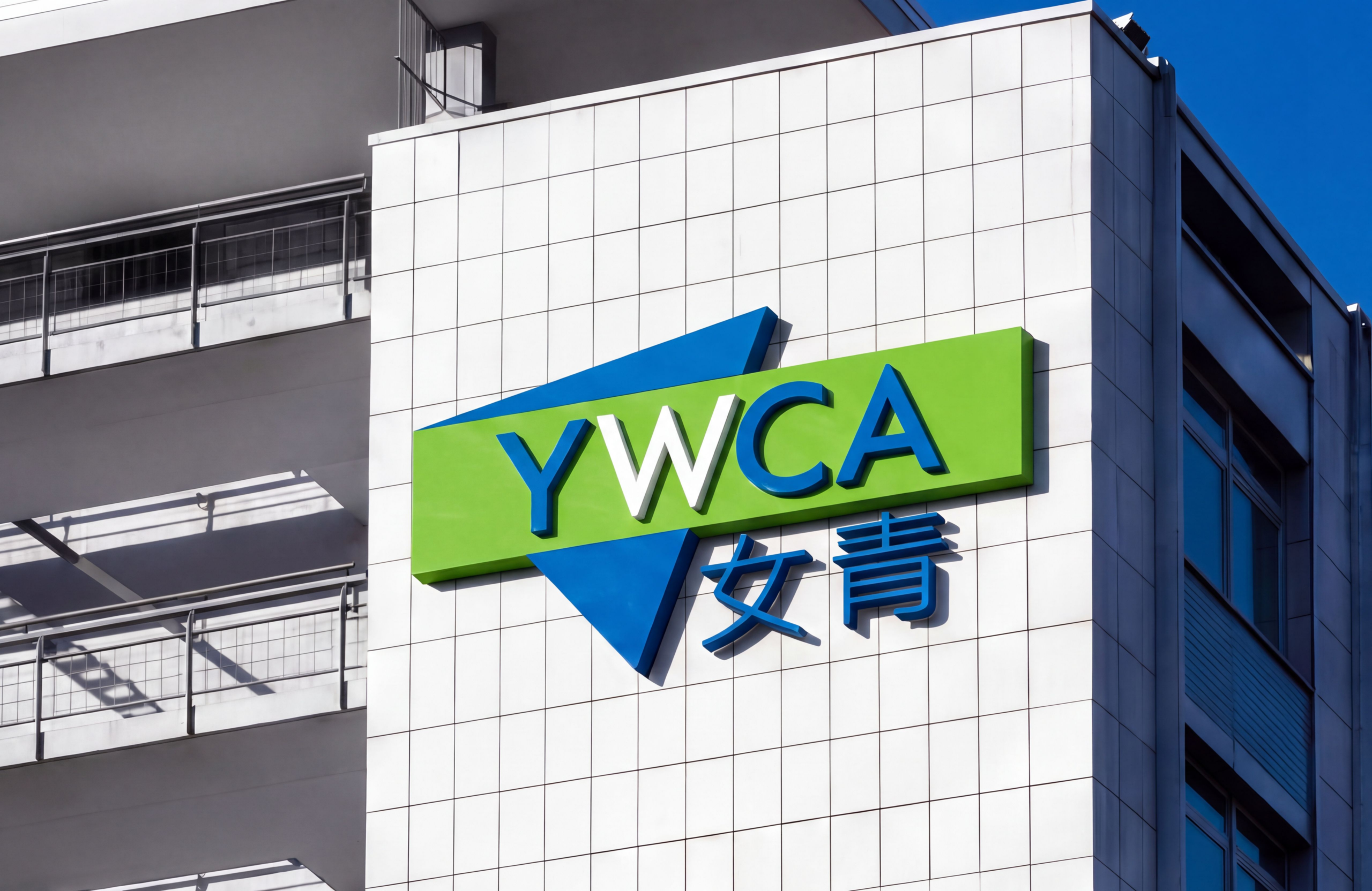
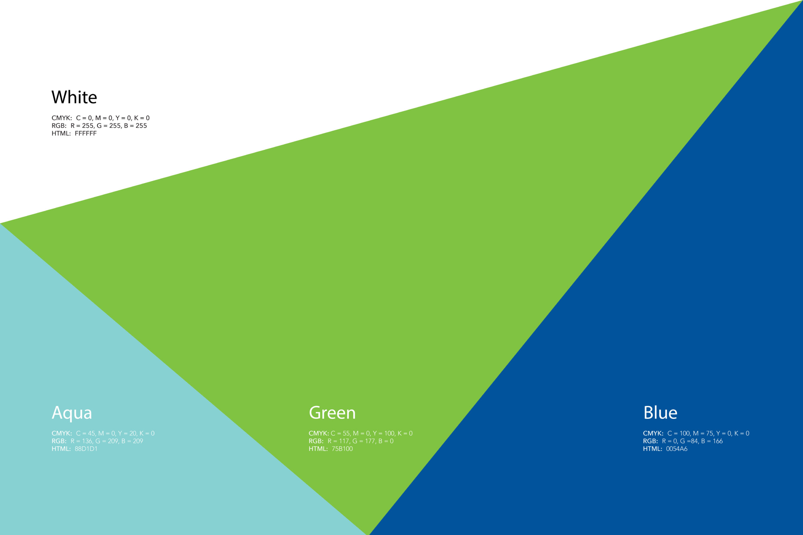
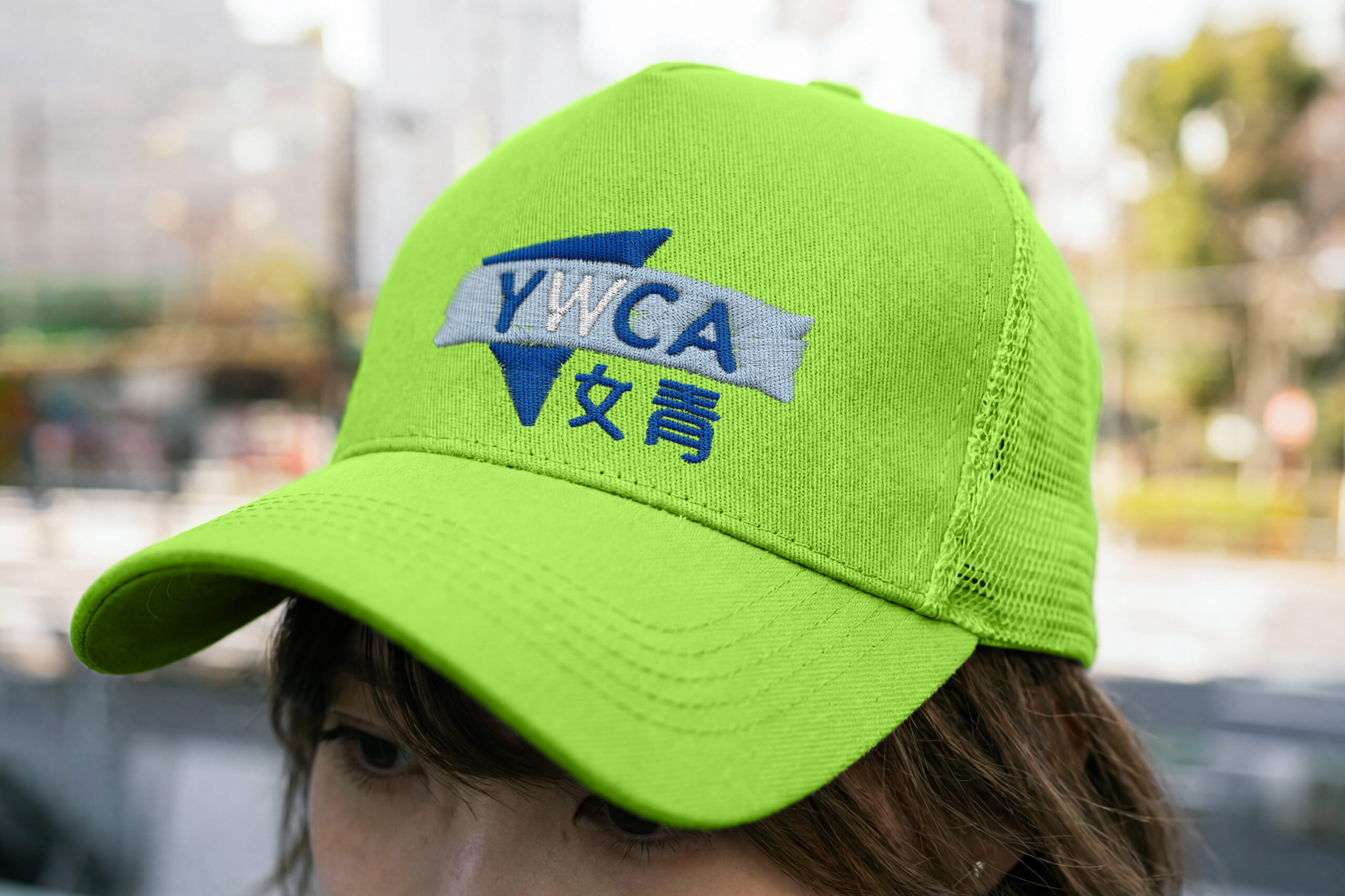
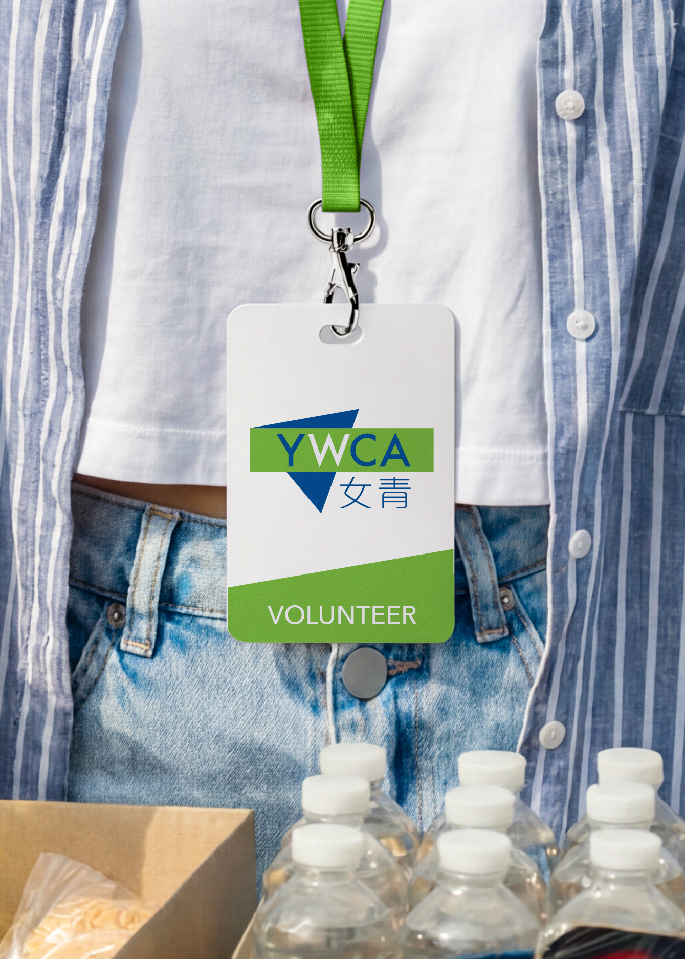
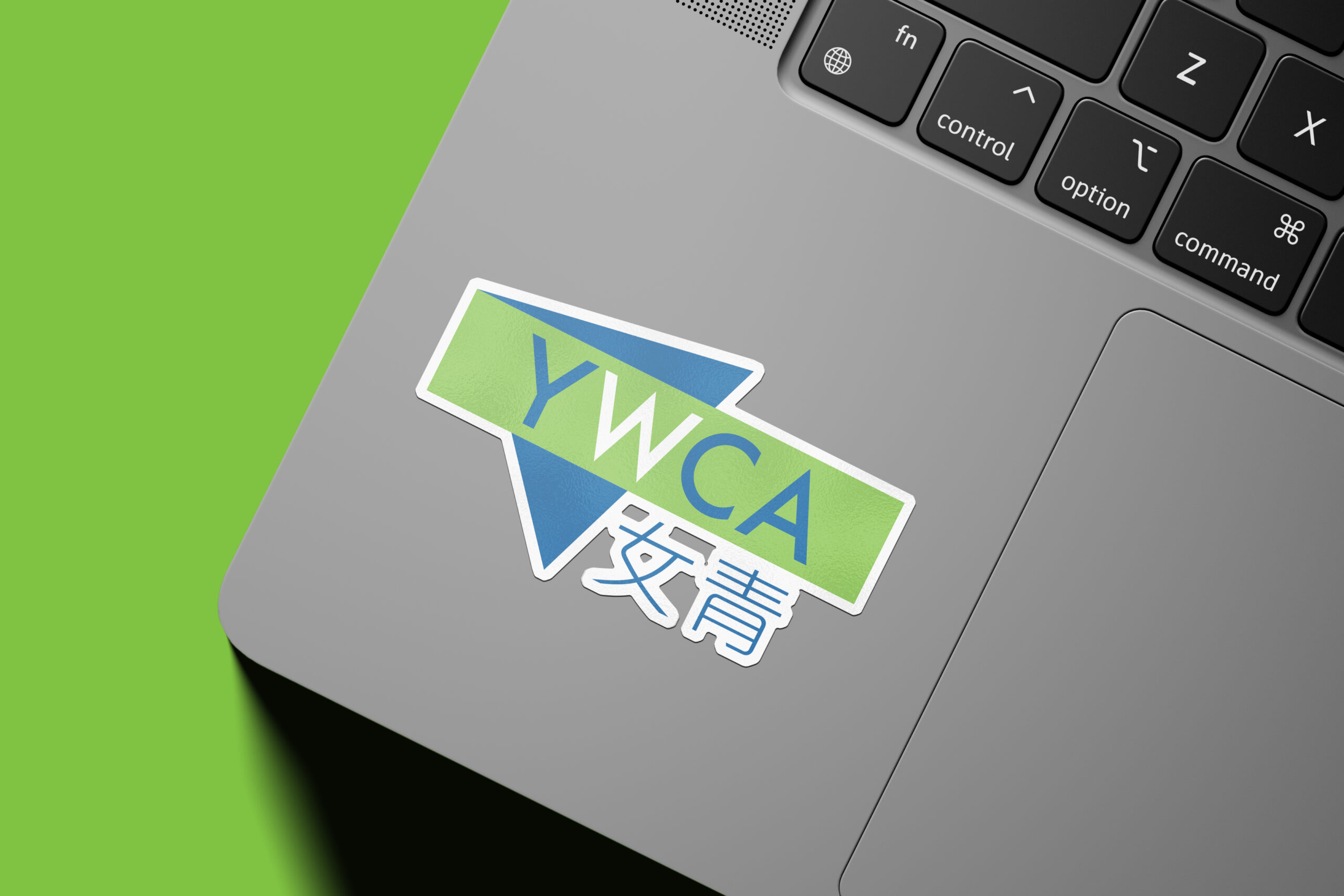
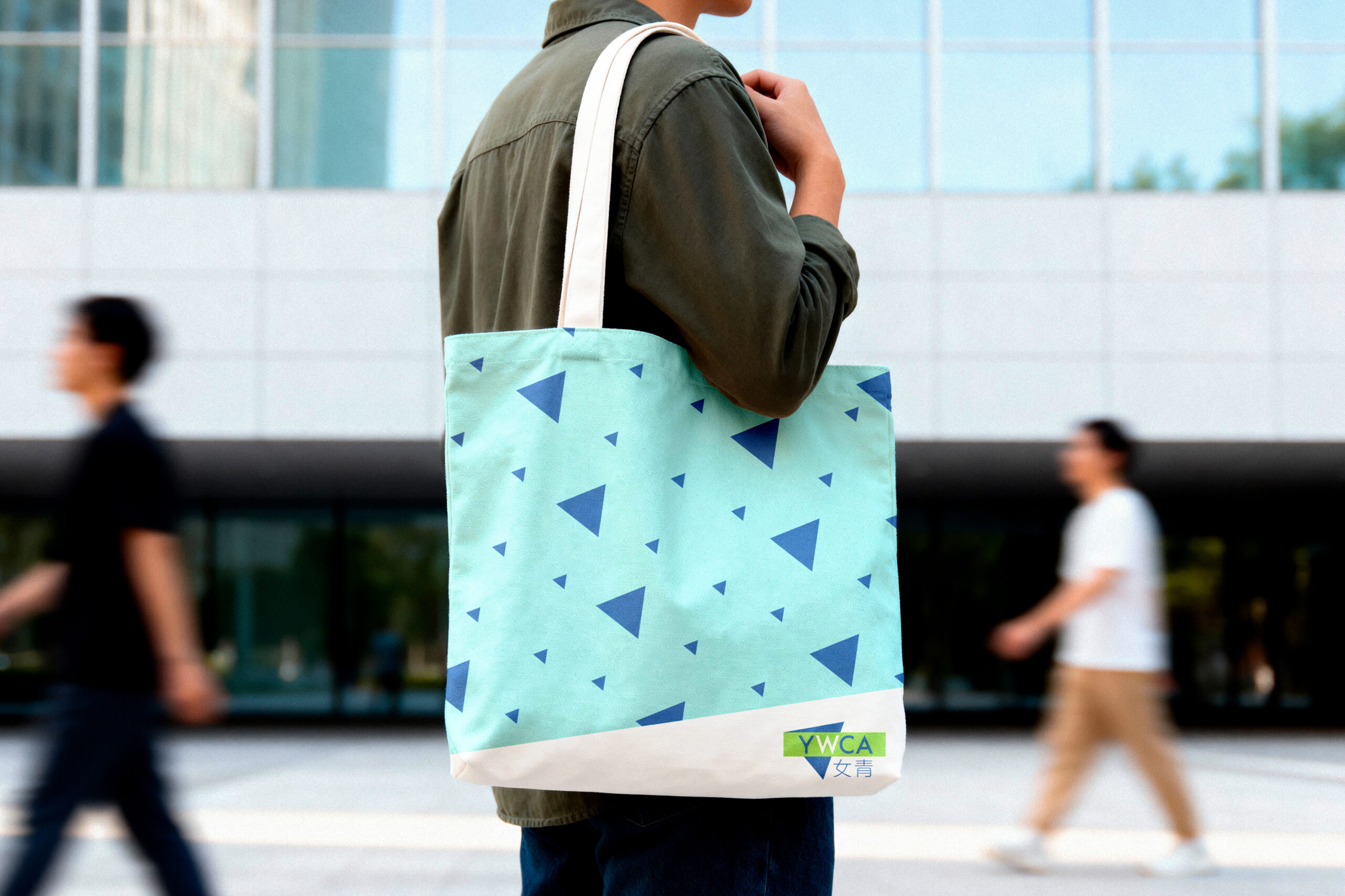
Identity | Visual Identity & Aesthetic Craftsmanship The new visual identity masterfully balances heritage with modern craftsmanship. We preserved YWCA’s iconic inverted blue triangle, re-architecting its geometric form through precise logo design. To project optimism and vitality, we introduced two signature colors: “Sky Blue,” symbolizing expansive vision, conviction, and hope, and “Life Green,” representing growth and continuous nurturing. Channeling emotional color theory and saturated palettes that evoke optimism, this visual refresh brings warmth and energy to every touchpoint, from digital media to physical community packaging design.
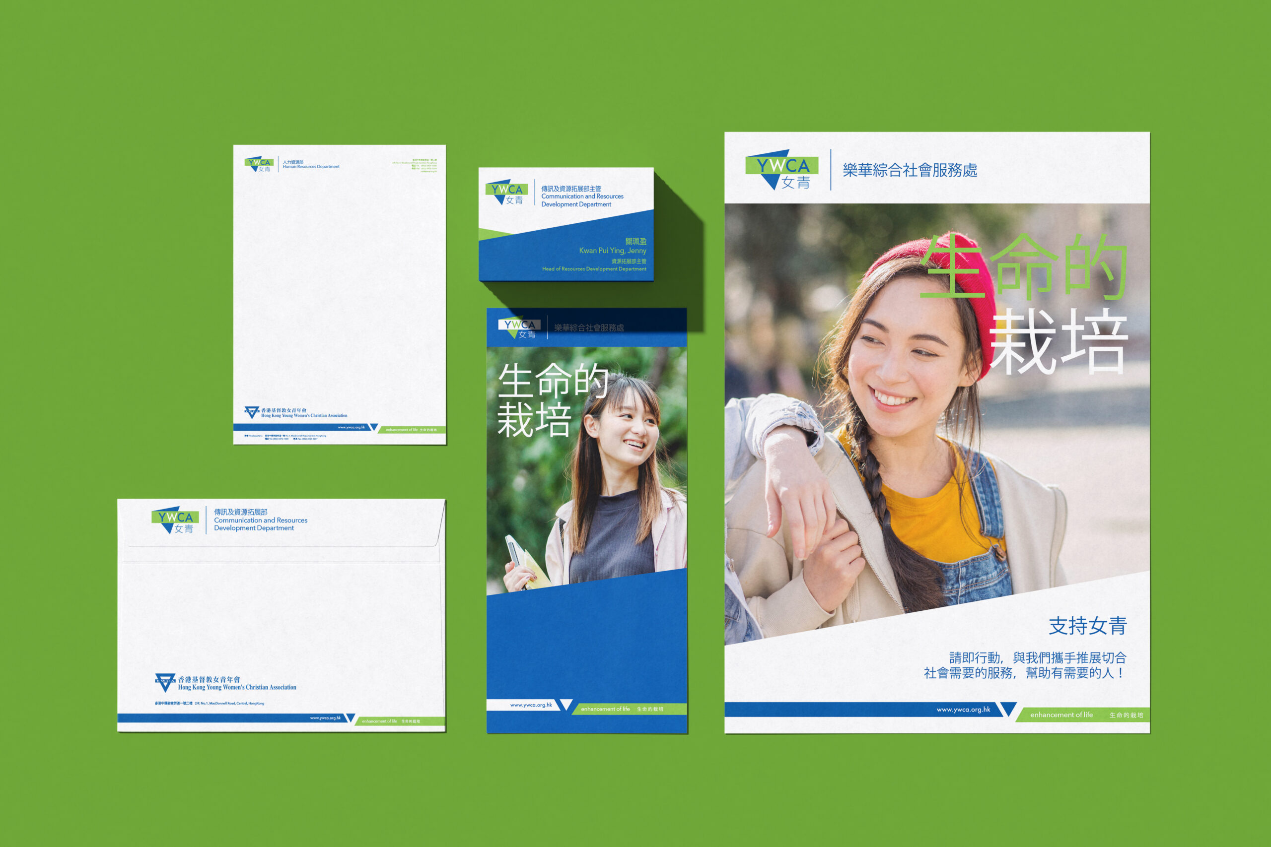
Rollout | Implementation & Brand Experience To ensure a cohesive brand identity across YWCA’s extensive organizational network in Hong Kong, Vincdesign Branding Co authored a comprehensive 80-page Brand Manual. This detailed guide codifies logo usage, graphic systems, grid structures, and packaging layouts. By expanding the visual identity system, we enabled YWCA to maintain an instantly recognizable, unified brand presence across all facilities and services, ensuring every community interaction seamlessly reflects its refreshed vision and enduring mission.

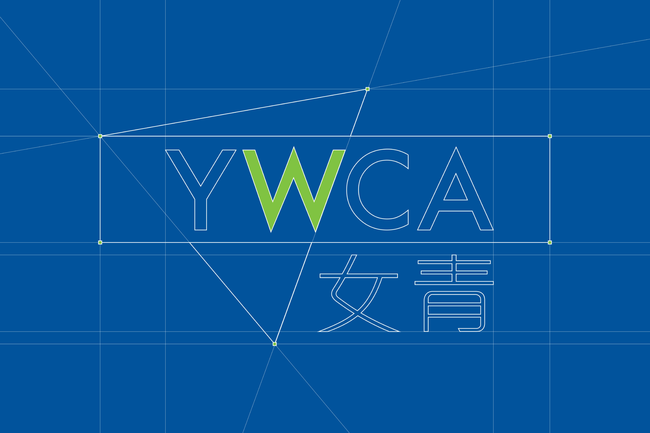
At the core of the brand strategy is the concept of “Affectionate Continuity.” Vincdesign Branding Co centered the brand narrative on “女青” —the colloquial abbreviation deeply rooted in the public consciousness.
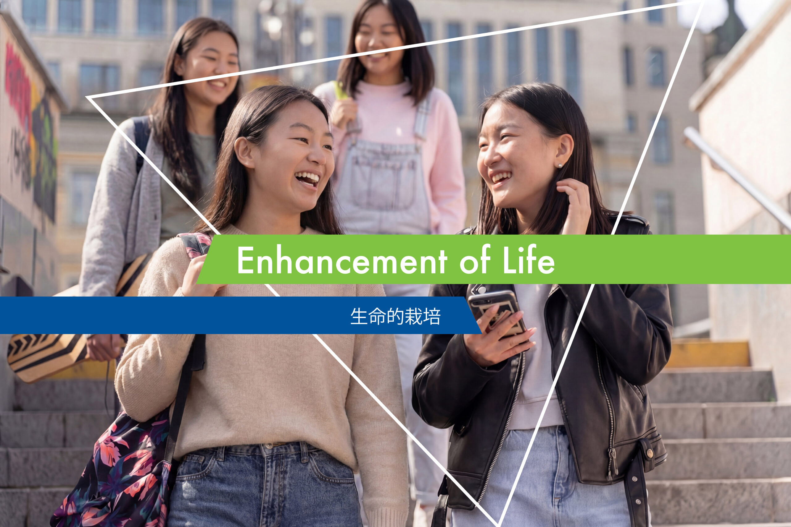
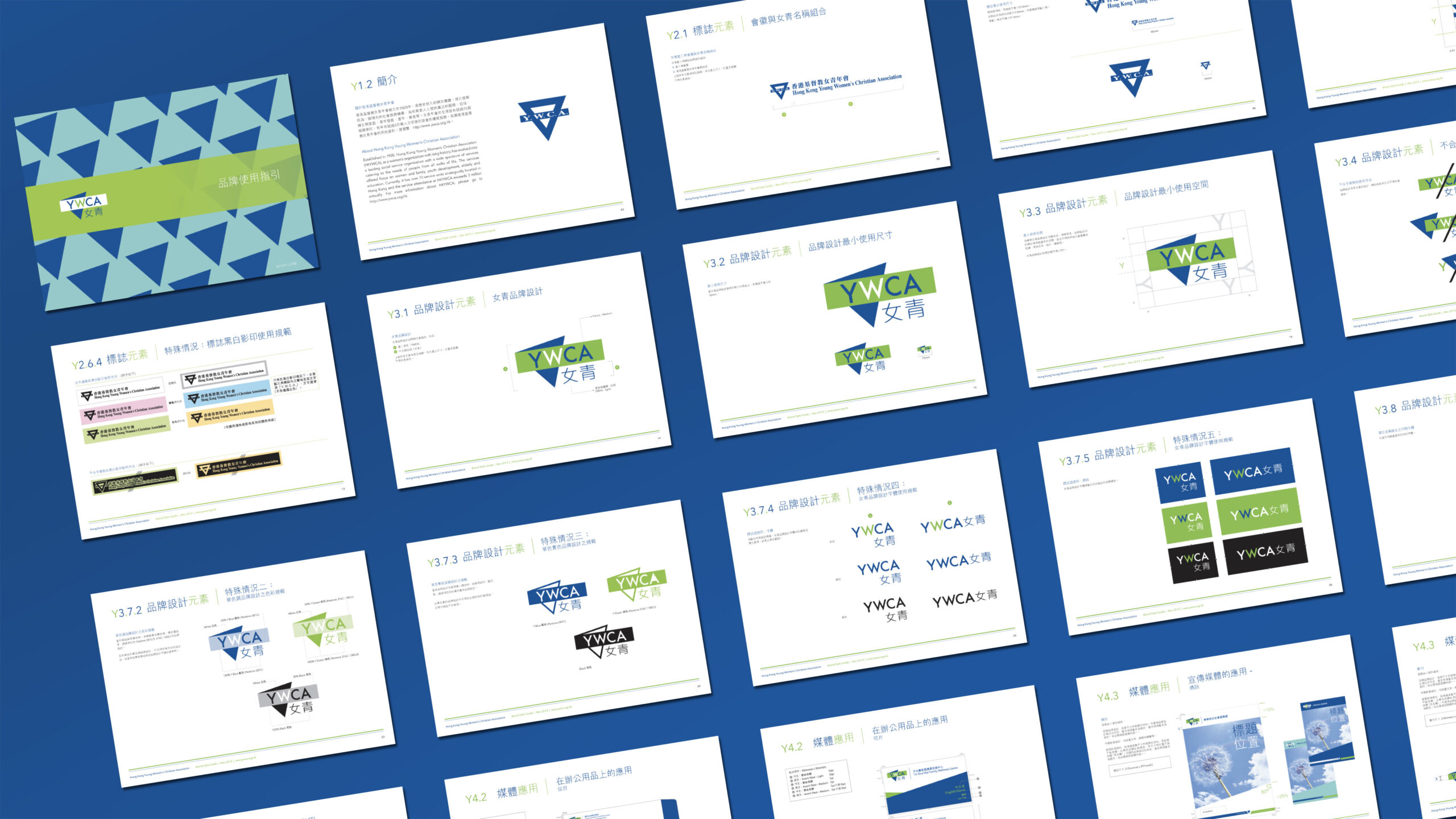
To ensure a cohesive brand identity across YWCA’s extensive organizational network in Hong Kong, Vincdesign Branding Co authored a comprehensive 80-page Brand Manual. This detailed guide codifies logo usage, graphic systems, grid structures, and packaging layouts.
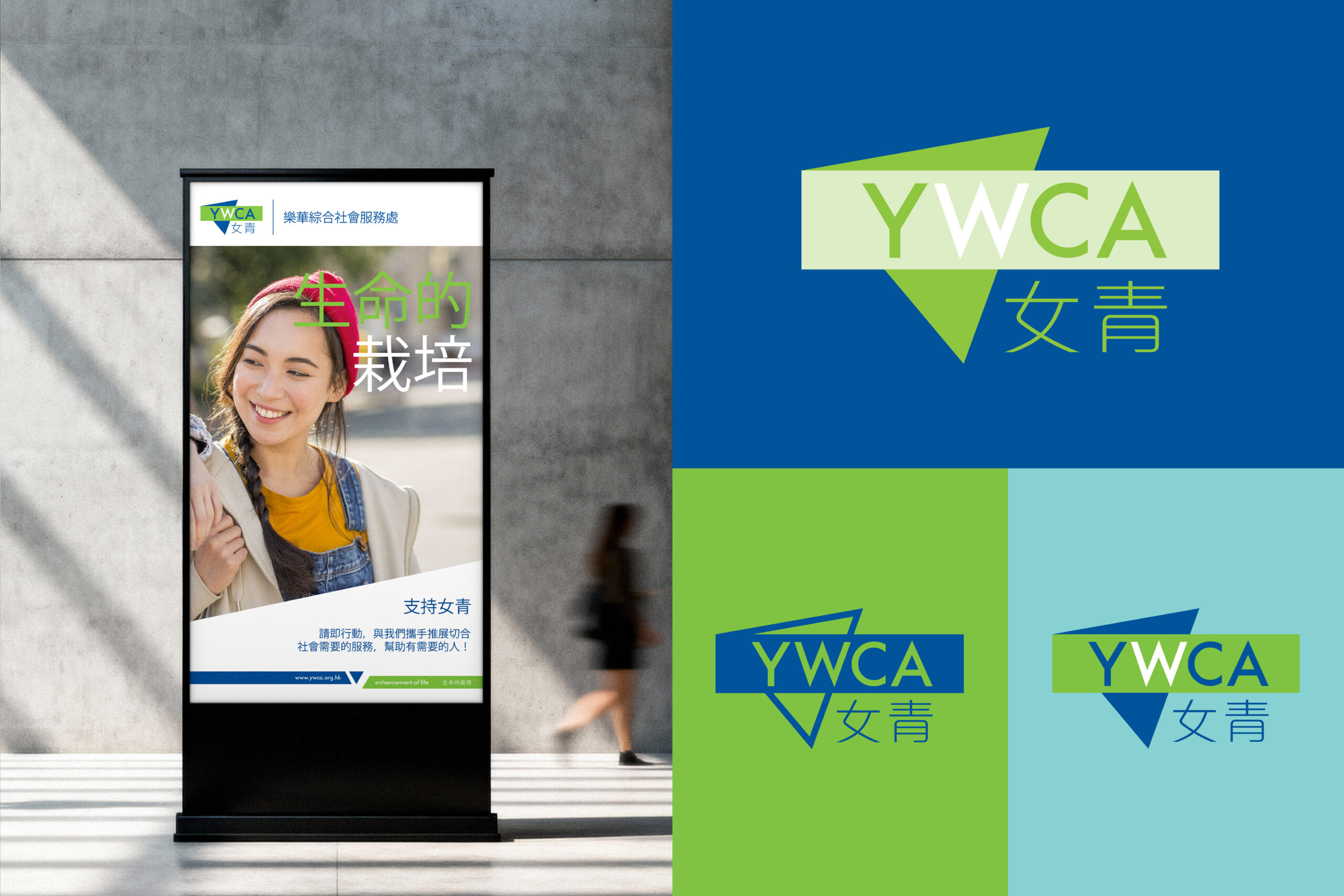
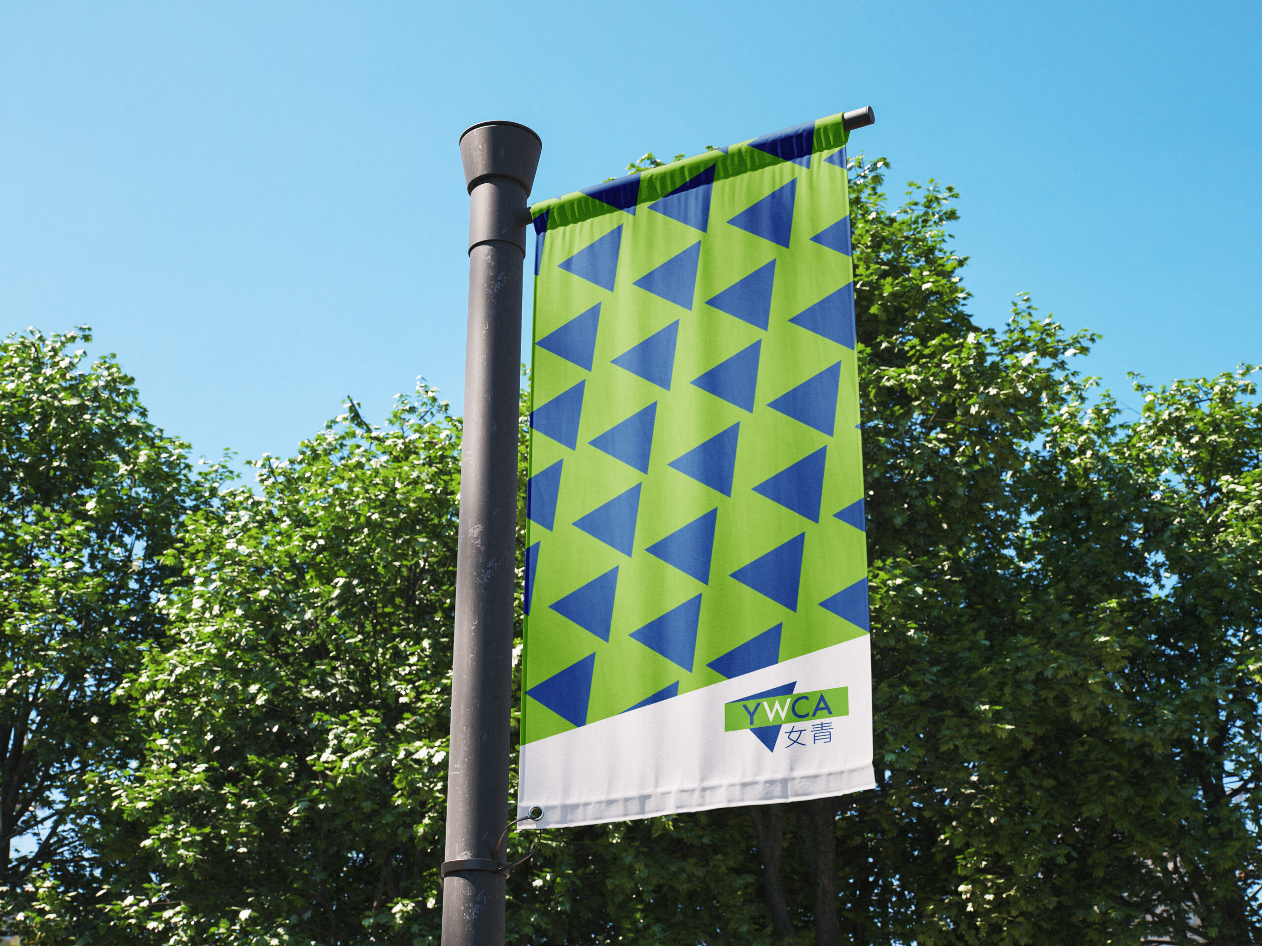
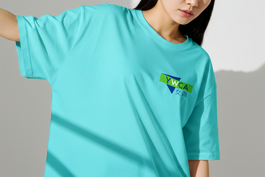
Channeling emotional color theory and saturated palettes that evoke optimism, this visual refresh brings warmth and energy to every touchpoint, from digital media to physical community packaging design.


What we did:
Brand Strategy & Positioning, Logo Design, Visual Identity
Branding Design for YWCA 女青
Client/Project: Hong Kong Young Women’s Christian Association
Creative Director: Vince Cheung
Client/Project: Hong Kong Young Women’s Christian Association
Creative Director: Vince Cheung
Photography: Justin Tsao
