Young Master Grand | Branding & Packaging Design
Brand Story:
Background
Young Master Brewery is a Hong Kong-based brewery that opened in December 2013 in the Ap Lei Chau neighbourhood. It quickly outgrew its original space and relocated to Wong Chuk Hang in August 2016.
With the goal of creating and fostering a world-class, locally rooted craft beer culture in Asia, Young Master soon established themselves as a leader in the Asian craft beer scene. As one of Asia’s highest-rated and most-awarded craft brewery, Young Master prioritises using premium brewing techniques and ingredients along with creating original concepts and unique bold flavours.
Young Master beers have been found in iconic hotels such as Mandarin Oriental and Shangri-La, prestigious private clubs, specialist bars, trendy restaurants, gourmet stores and supermarkets, and at beer events all around the world.
Brand Concept
The branding design for Young Master Grand is a visual love letter to Hong Kong. It artfully combines the city’s nostalgic charm with modern aesthetics, creating a packaging identity that is timeless, distinctive, and undeniably iconic.
Inspiration from Hong Kong’s Culture
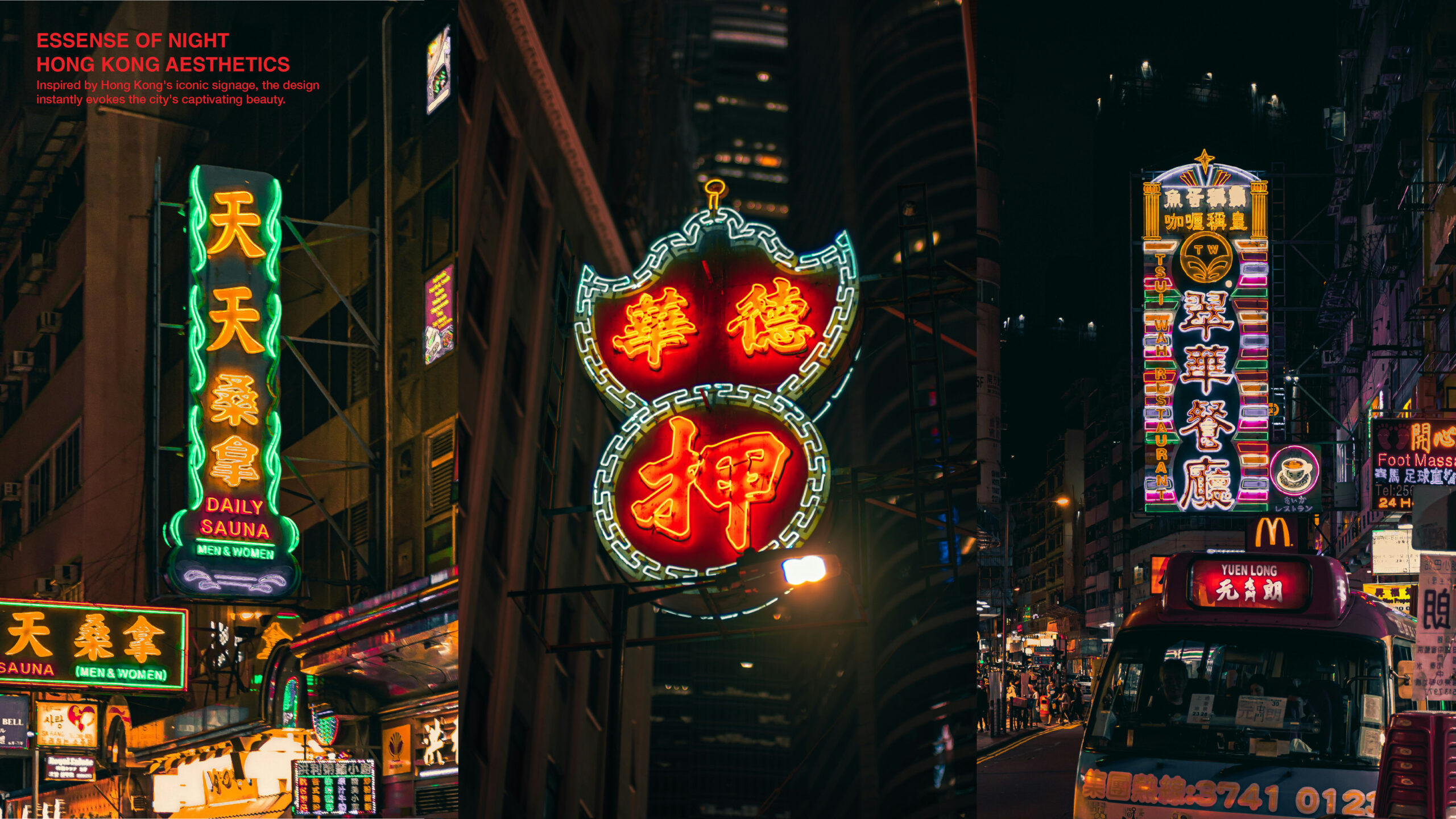
The design draws heavily from Hong Kong’s iconic street culture, incorporating vintage street signs, neon-style lettering, and typography inspired by classic Hong Kong cinema. These elements evoke a sense of nostalgia for older generations while offering younger audiences and international consumers a glimpse into Hong Kong’s vibrant heritage.
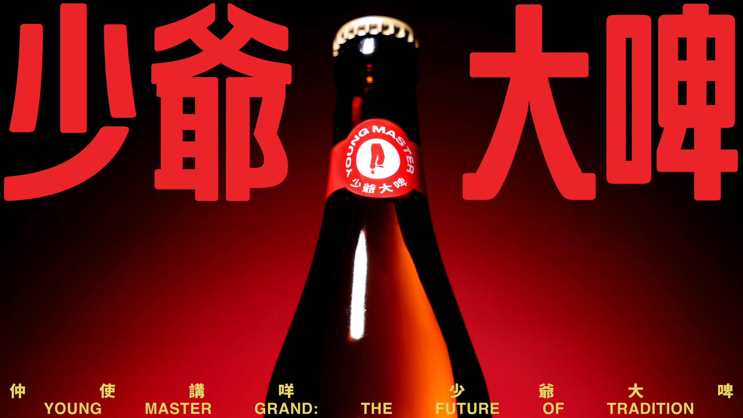
Slogan : 「仲使講咩,少爺大啤!」Future of Tradition
This casual and cheeky slogan perfectly captures the brand’s approachable, fun-loving nature. It’s a rallying cry for Hong Kongers who know what they want—great beer and good times with great company.
Color Palette
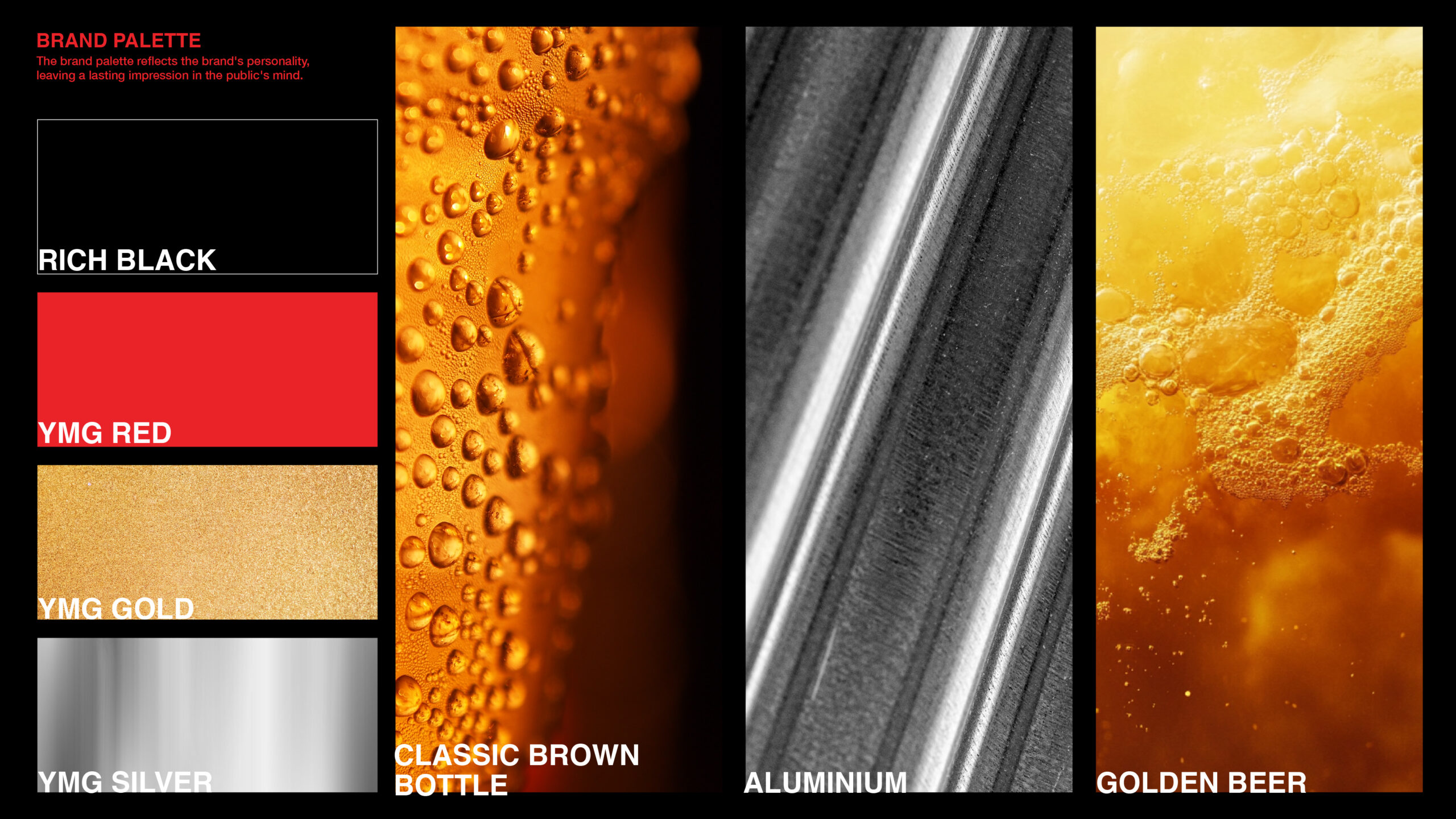
The carefully chosen colors of red, black, and silver serve dual purposes:
Distinction: These bold, dynamic shades ensure Young Master Grand stands out in a competitive market, catching the eye of potential drinkers.
Cultural Significance: The palette reflects the spirited identity of Hong Kong, symbolizing energy, sophistication, and modernity.
Typography and Visuals
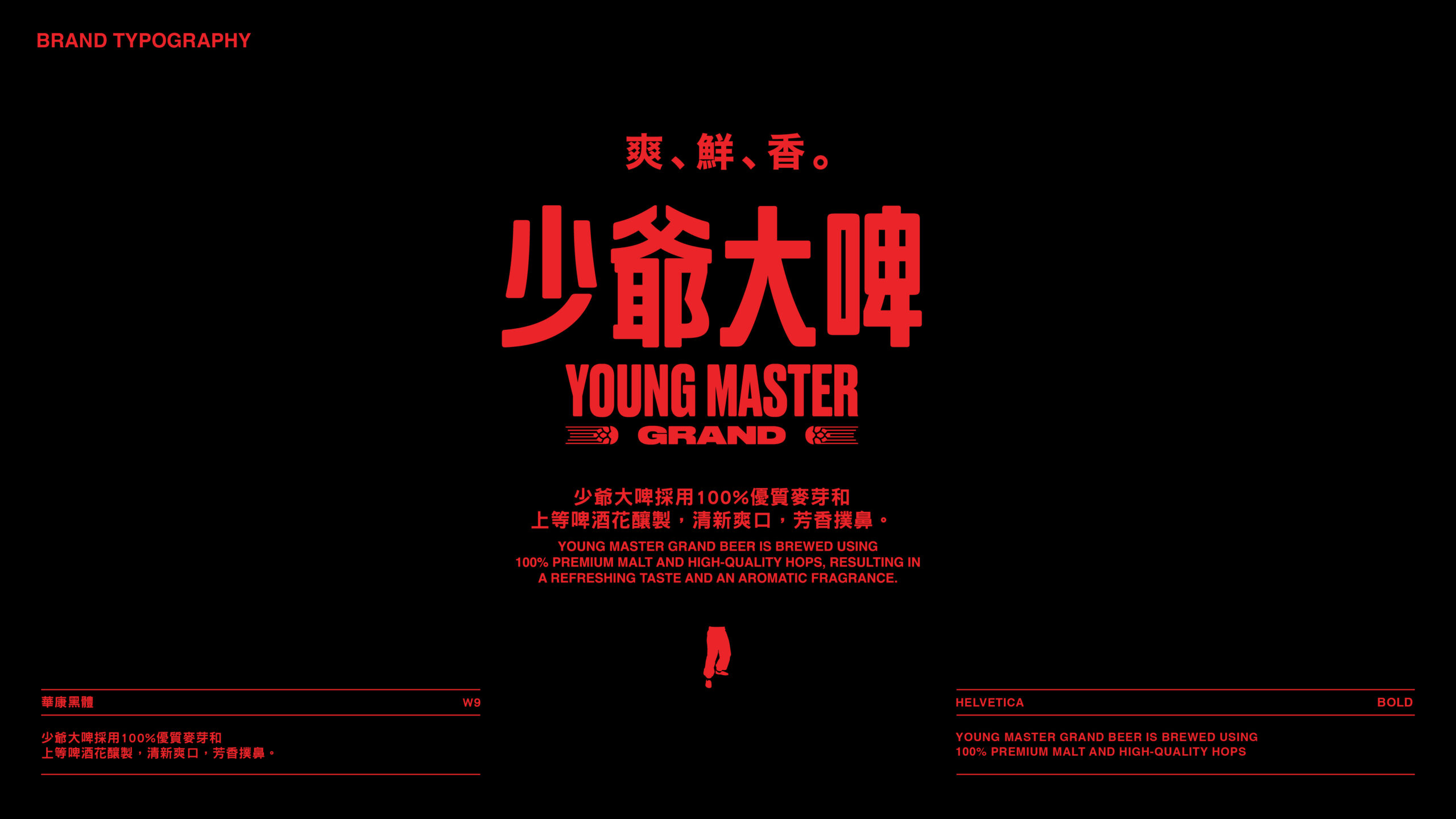
Bold, impactful typography ensures the brand remains memorable across retail environments. The typeface, influenced by Hong Kong’s cinematic golden age, conveys the beer’s crisp, refreshing flavor while embodying the brewery’s passionate and creative approach.
Modern Packaging with Heritage Appeal
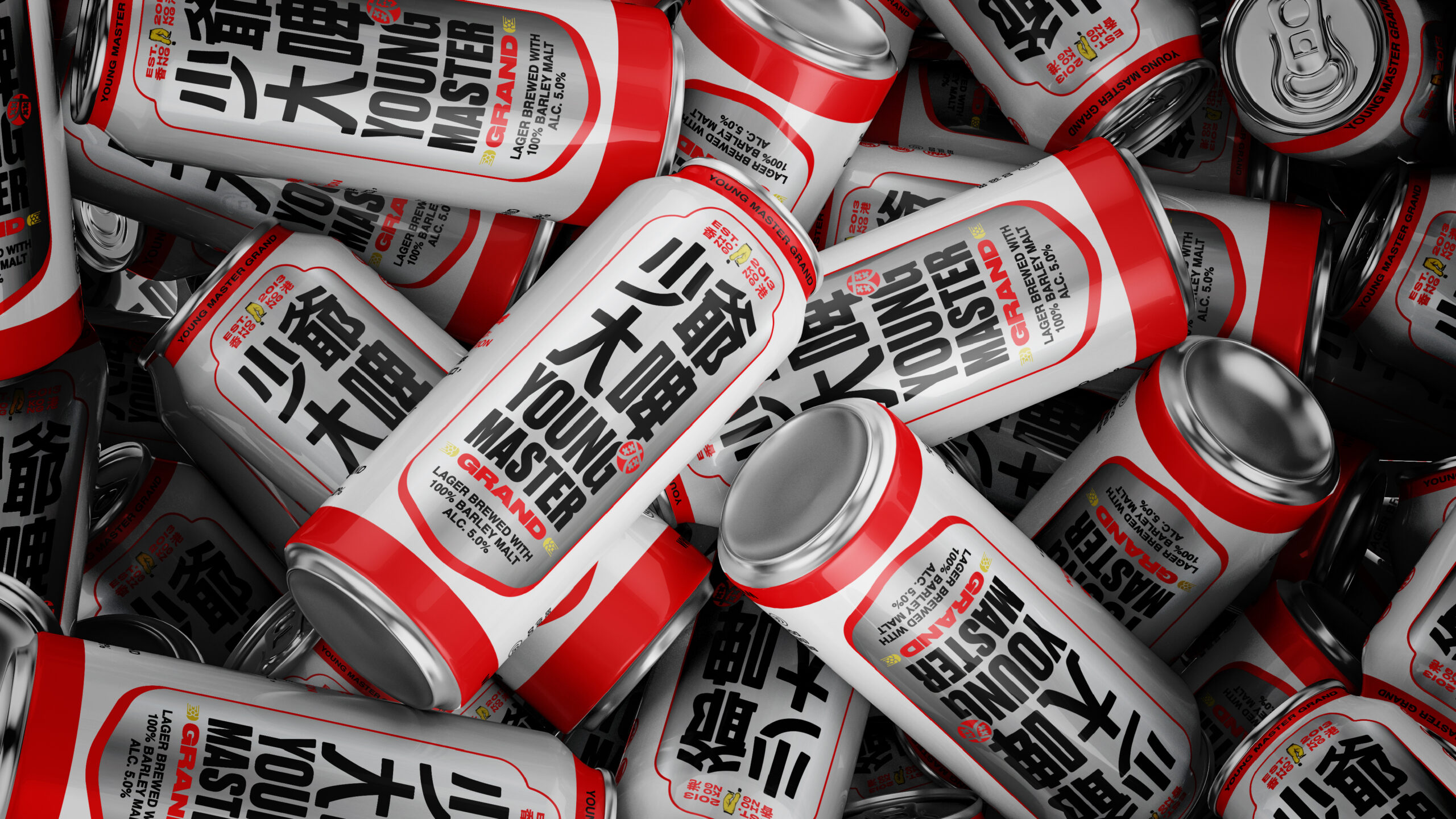
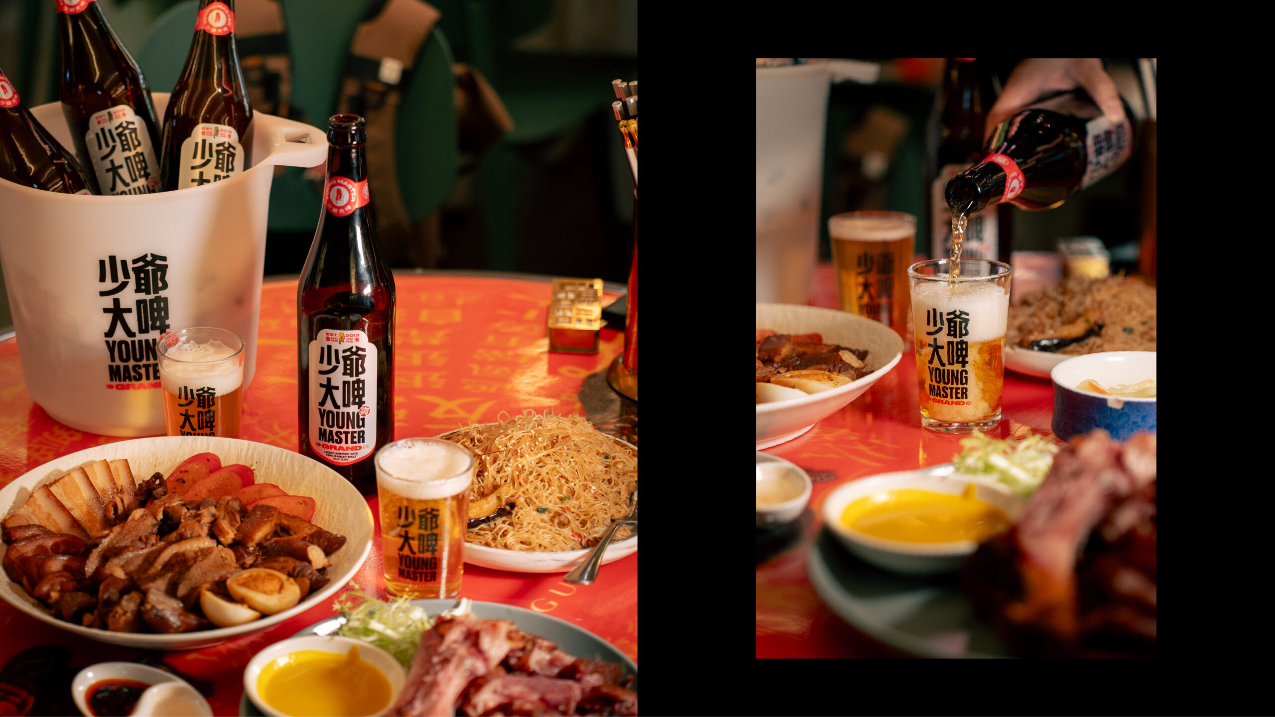
The packaging for Young Master Grand beautifully balances Hong Kong’s cultural heritage with modern design, creating an impactful and timeless brand presence. This fusion of tradition and innovation positions Young Master Grand as both a nostalgic homage to the past and a forward-looking expression of contemporary craft.
Drawing inspiration from Hong Kong’s iconic street culture, the design incorporates vintage street signs, neon-style lettering, and typography reminiscent of classic Hong Kong cinema. These elements evoke authenticity and nostalgia, appealing to both locals who treasure their heritage and international audiences eager to explore the city’s unique culture.
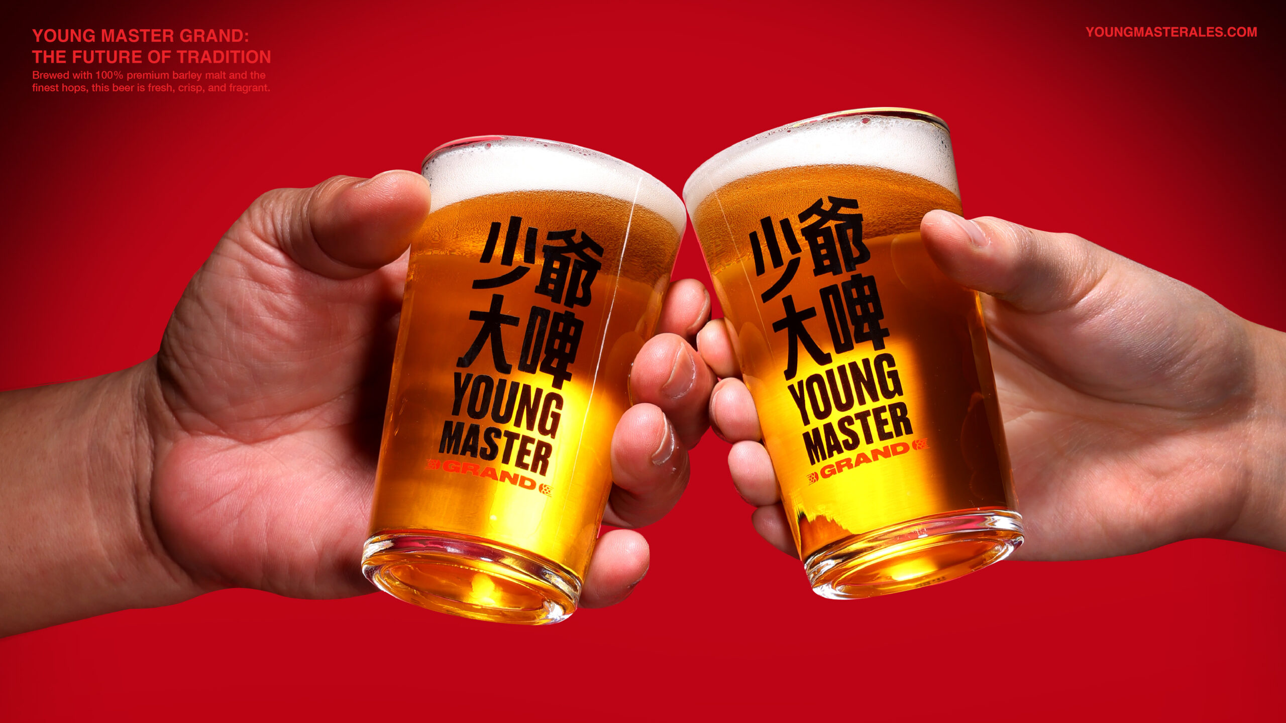
A striking colour palette of red, black, and silver reinforces the brand’s bold identity while ensuring it stands out in a competitive market. These vibrant colours embody Young Master’s spirited attitude and mirror the energy of Hong Kong itself. The bold typography complements this palette, leaving a strong impression and effectively communicating the beer’s fresh, crisp flavour and the brewery’s dedication to craft and community.
The branding design for Young Master Grand is a visual love letter to Hong Kong. It artfully combines the city’s nostalgic charm with modern aesthetics, creating a packaging identity that is timeless, distinctive, and undeniably iconic.
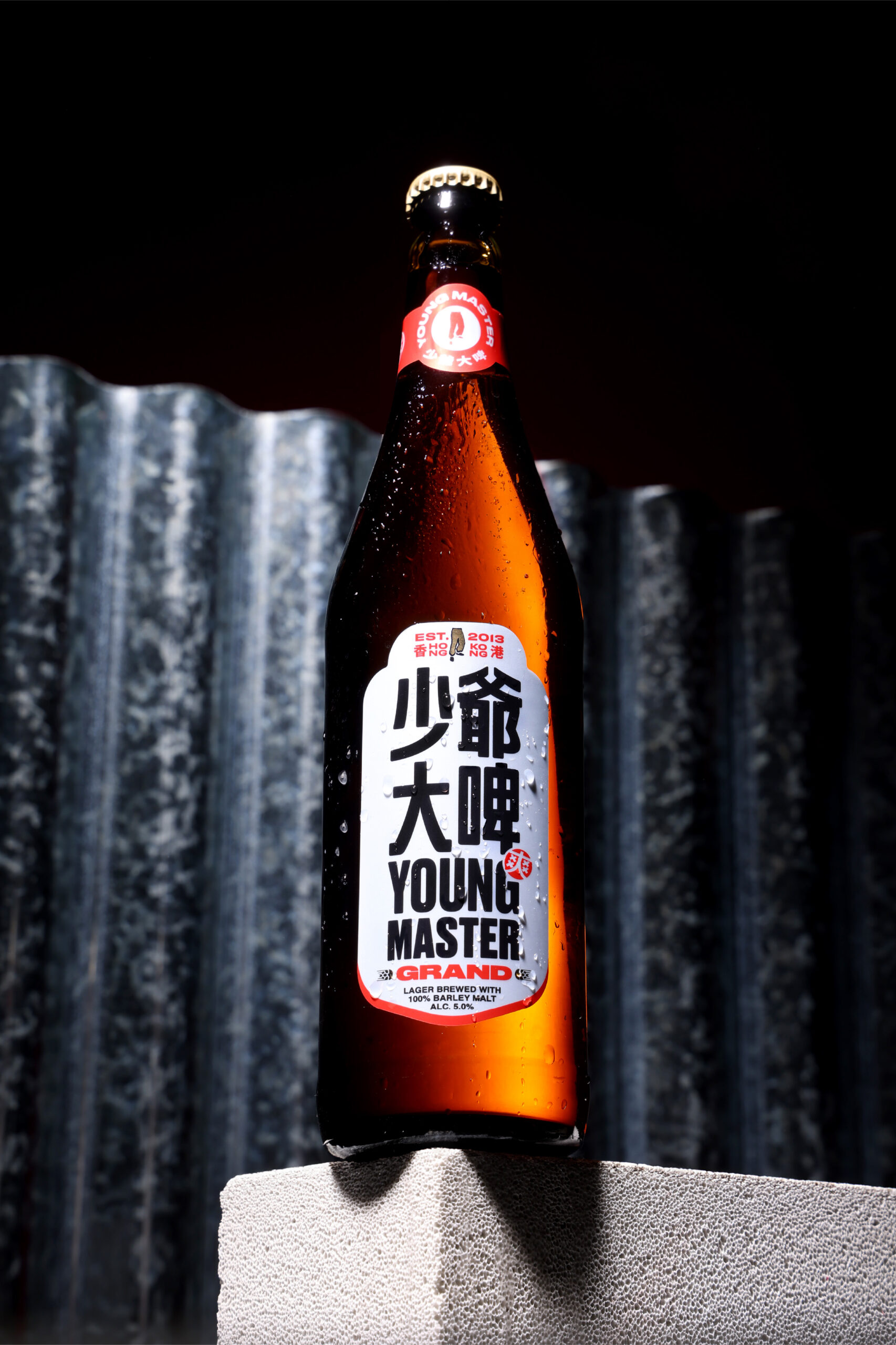
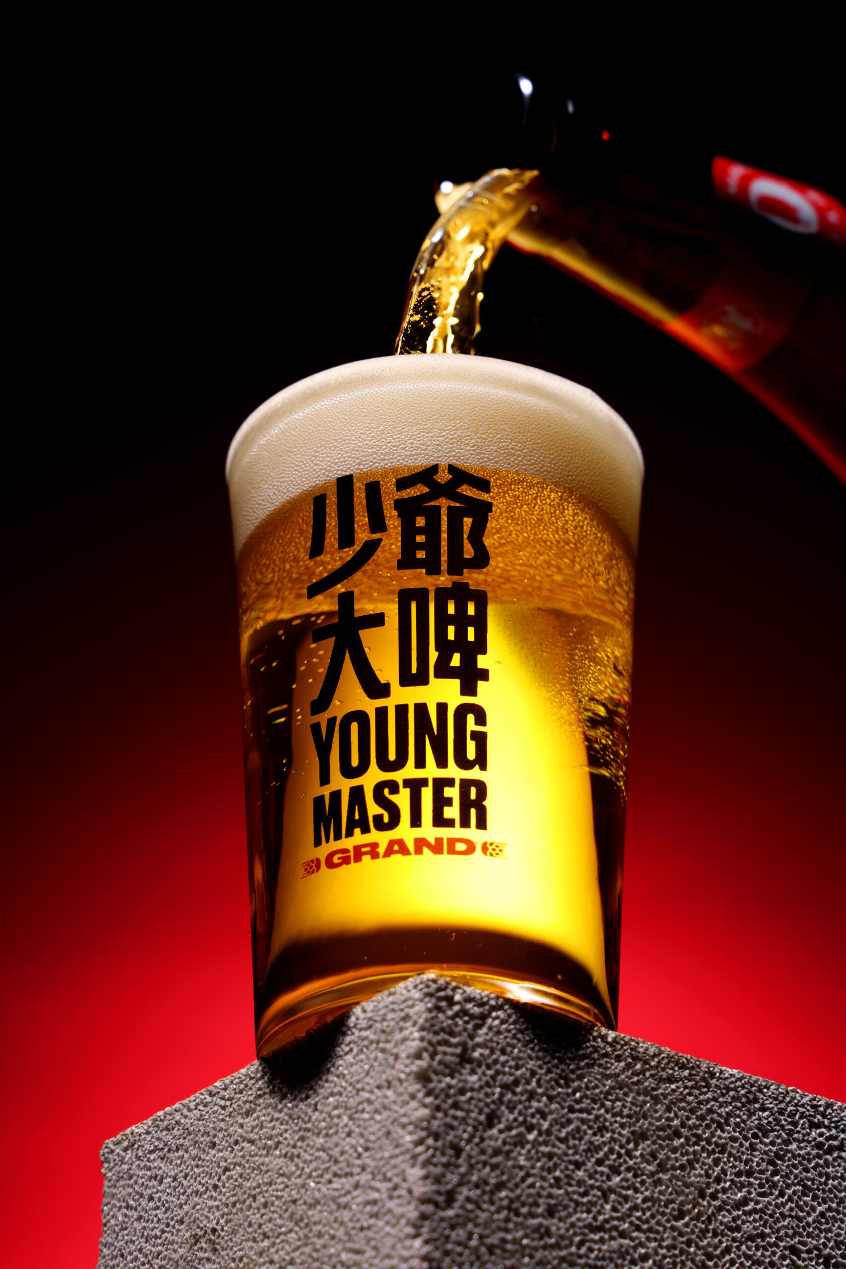
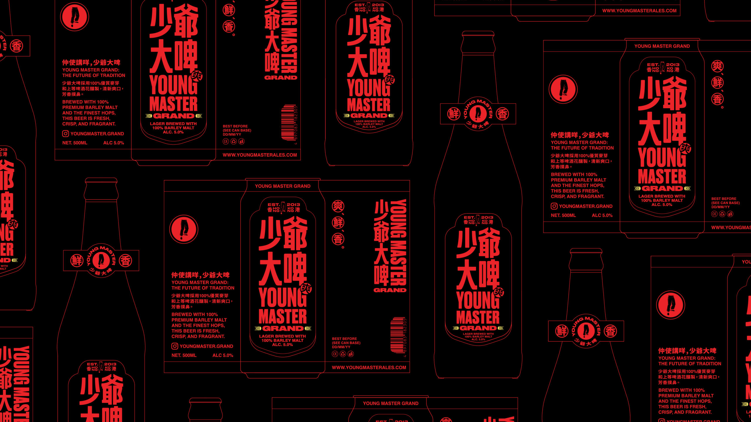
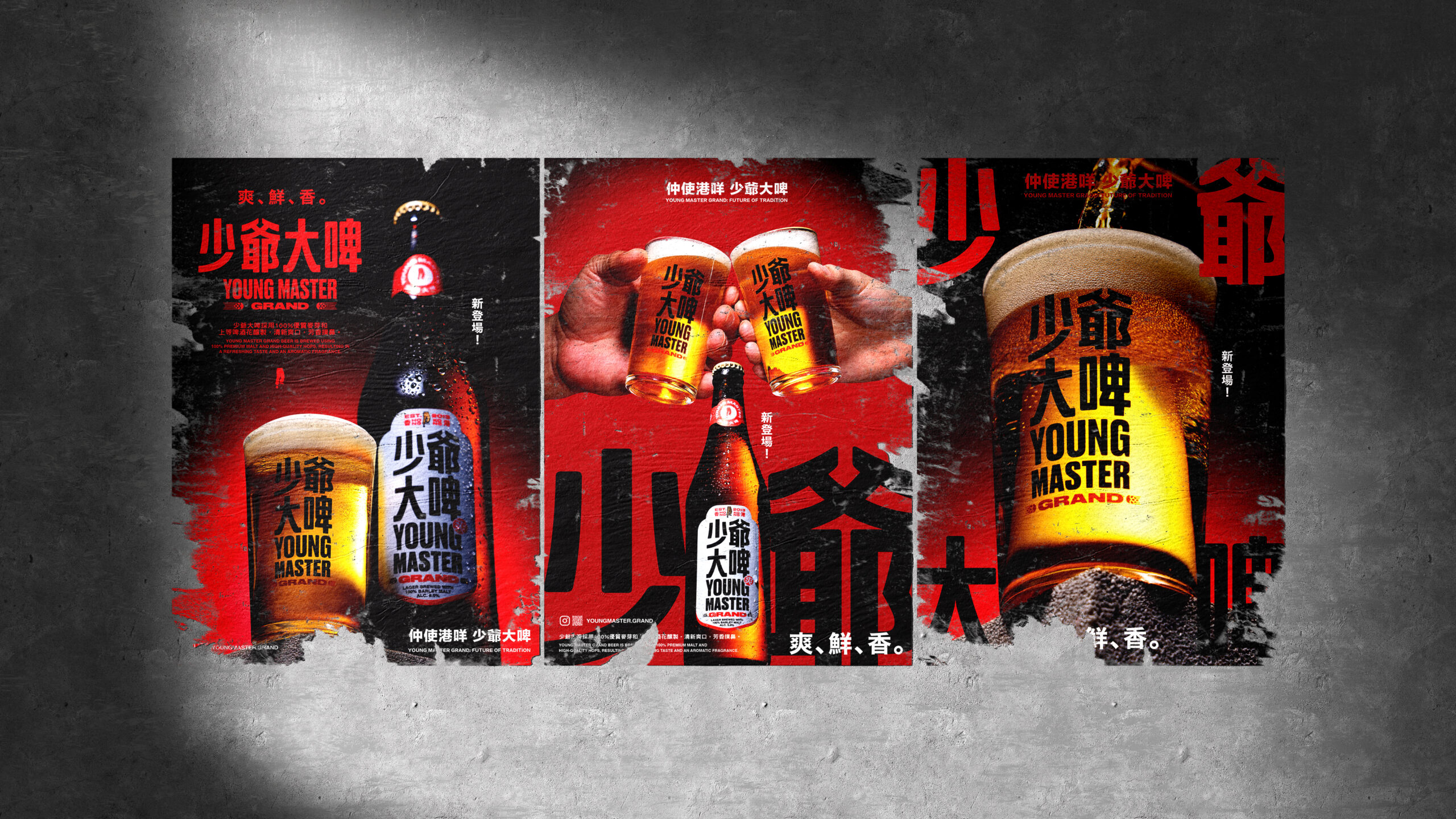
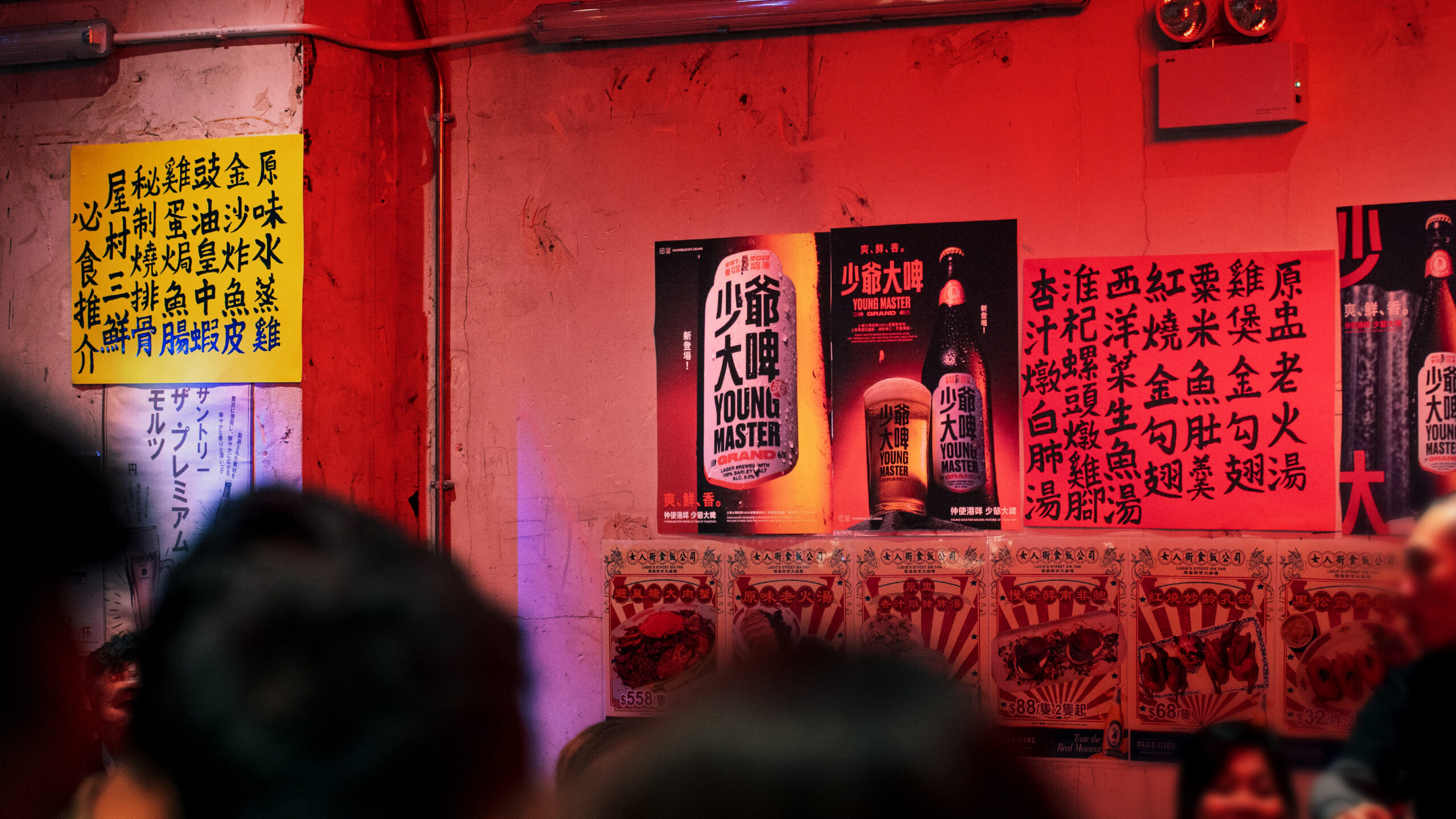
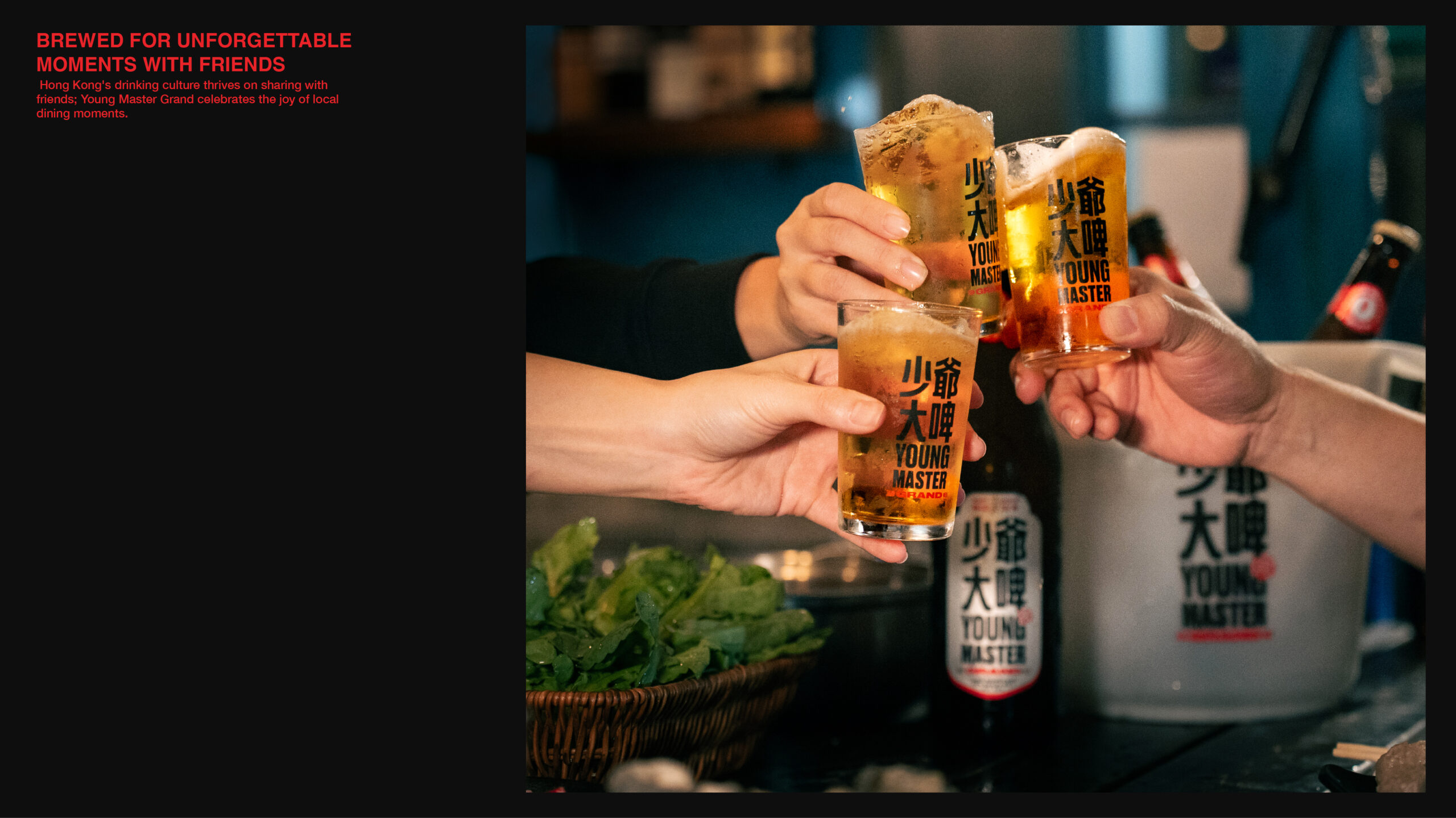
Young Master Grand is a bold, iconic Hong Kong beer that blends tradition with innovation to captivate new generations and celebrate its local heritage.

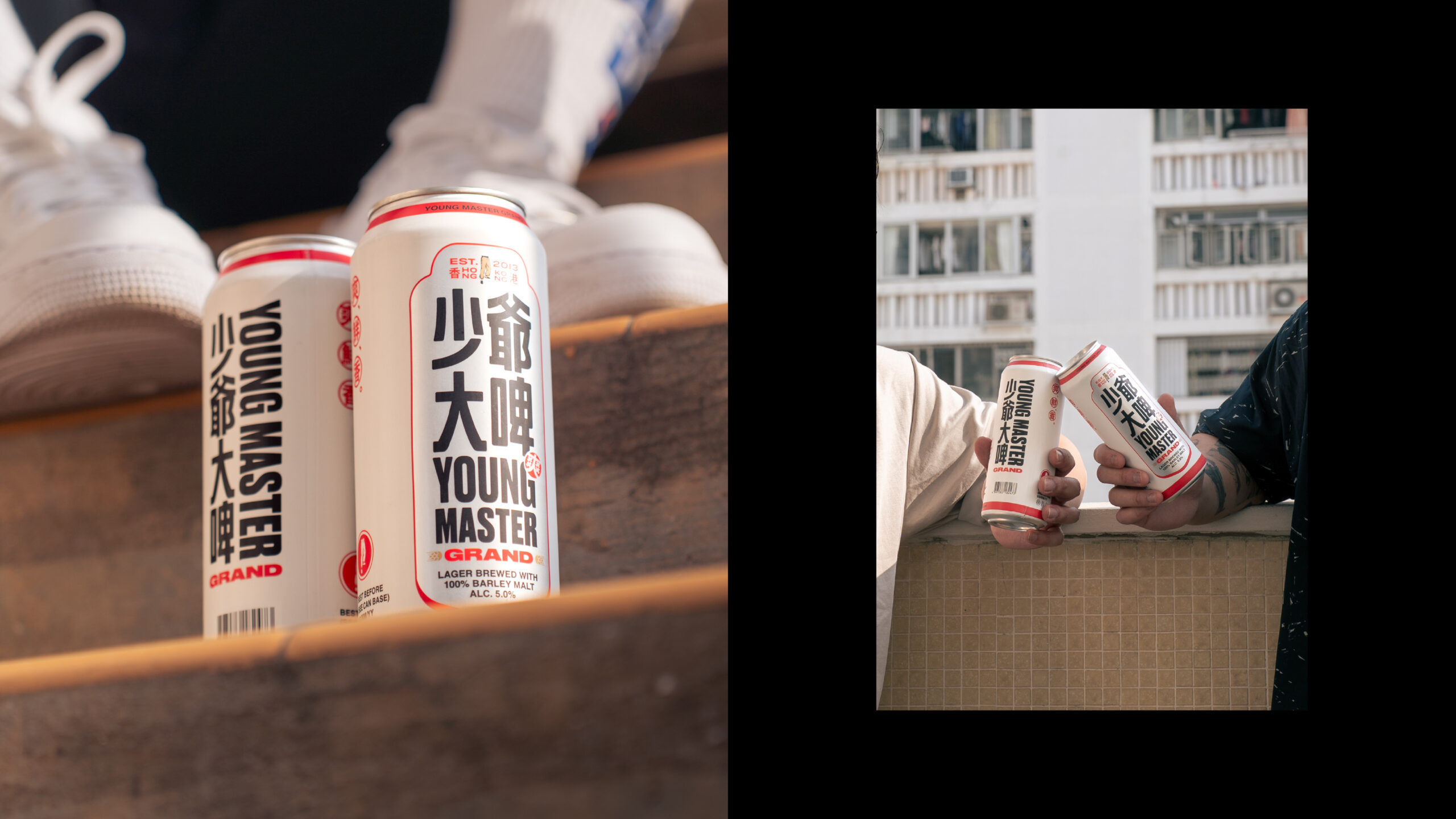
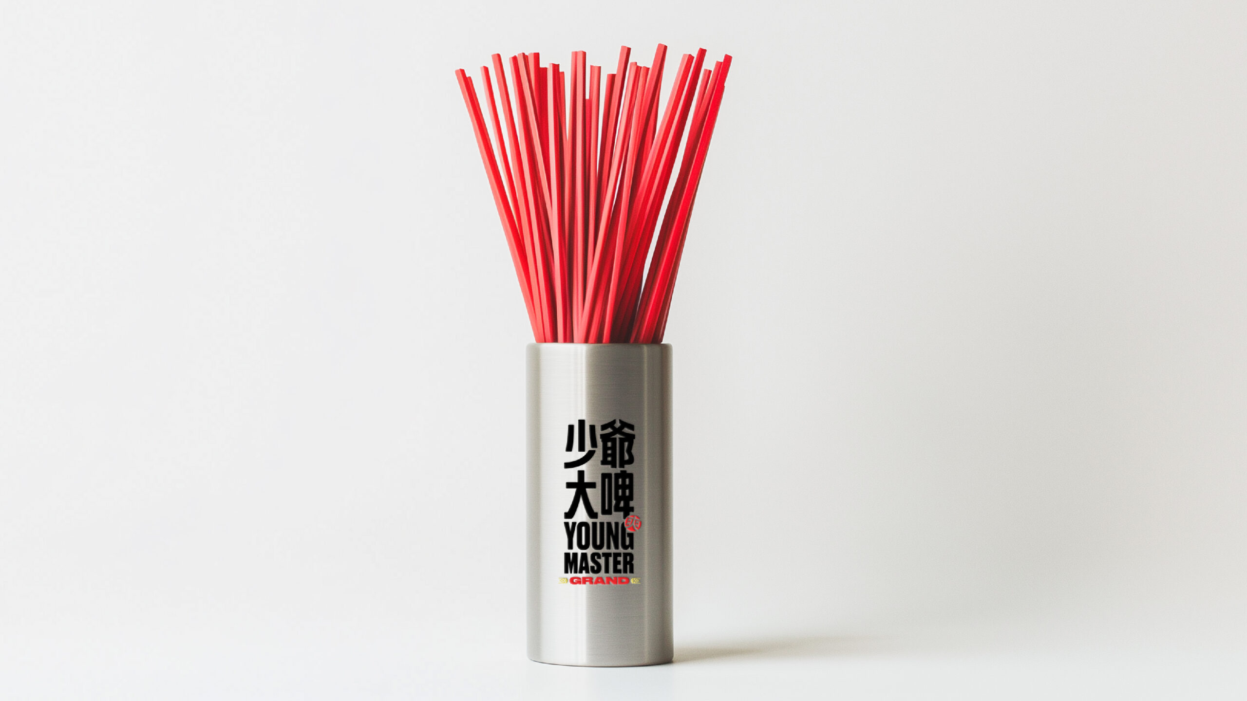
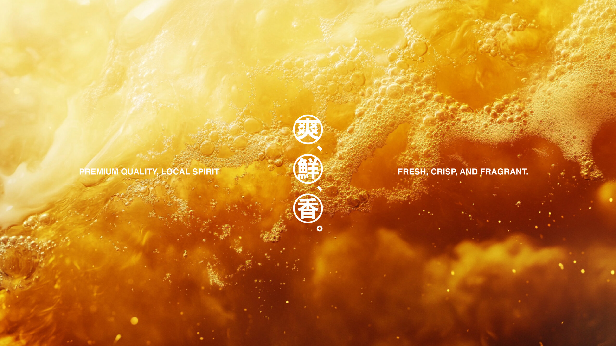
The bold, impactful typography complements the striking colour palette, leaving a lasting impression on consumers and ensuring a distinctive brand presence across various retail environments.
What we did:
Brand Positioning, Brand Story, logo Design, Photo Art Direction, Visual Idenlity, Package Design
Client/Project: Young Master Brewery
Creative Director: Vince Cheung
Design and Illustration: Yum Cheng, PingTing Lee, Maggie Tang
Results
The brand packaging effectively captures and reinforces Young Master’s identity, positioning Young Master Grand as both iconic and trendy. The design places Hong Kong’s rich heritage at the forefront, appealing to new generations of beer drinkers with its bold, timeless, and modern aesthetic, while also resonating with older generations by evoking nostalgia and a deep sense of pride in their cultural heritage.