The Flaming Pig 小辣豬 | Package Design
Background
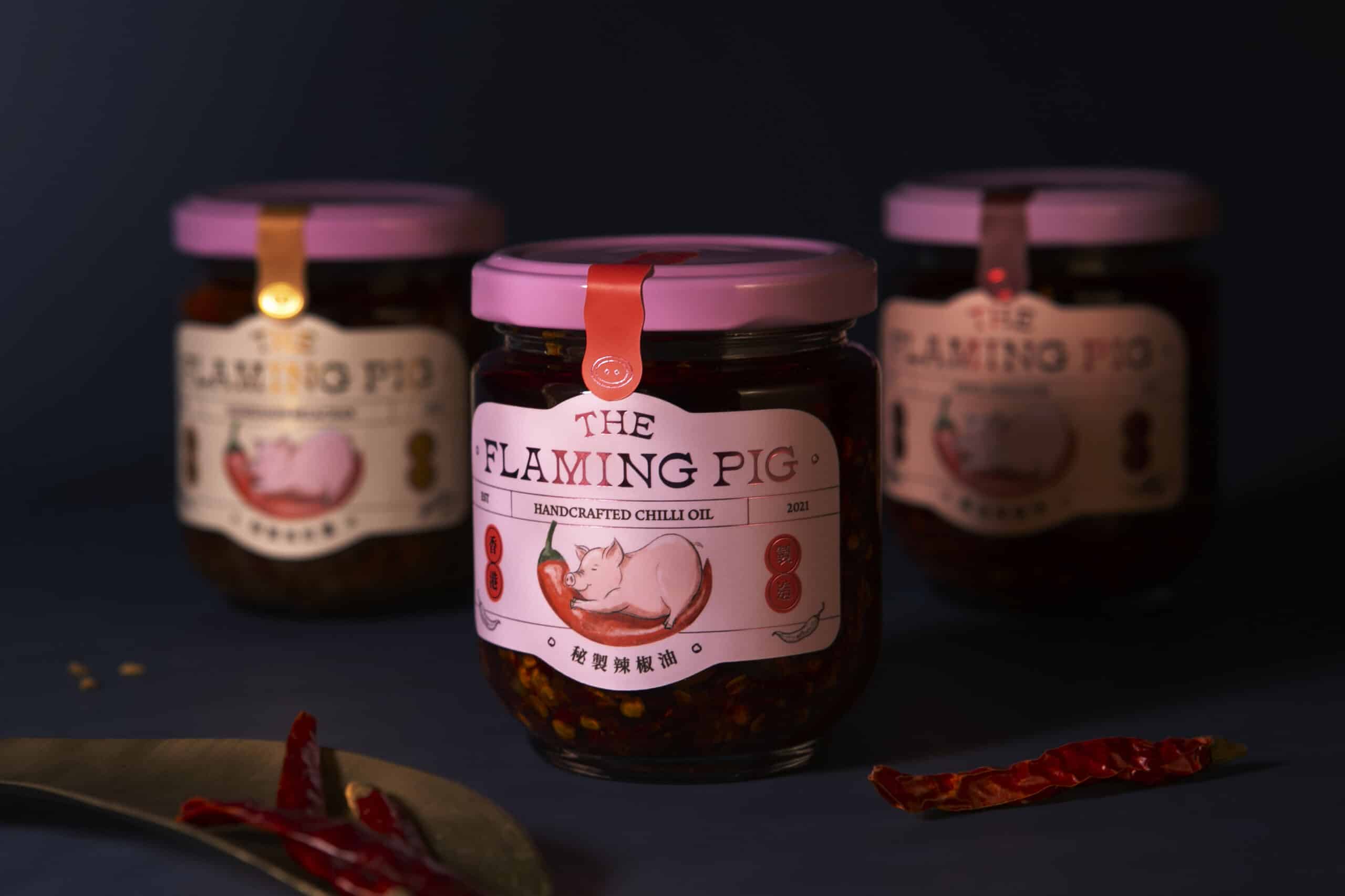
In a city where chilli oil is a must for every household, the magic in The Flaming Pig’s captivating chilli oil is the traditional homemade recipe developed by the aunt of the founder Gloria.
The reason for having a cute pink piglet as the logo is not only because of Gloria’s fondness for piggies, but also for the zodiac sign of Gloria’s aunt and the Cantonese surname of her respected grandmother.
Design Solution
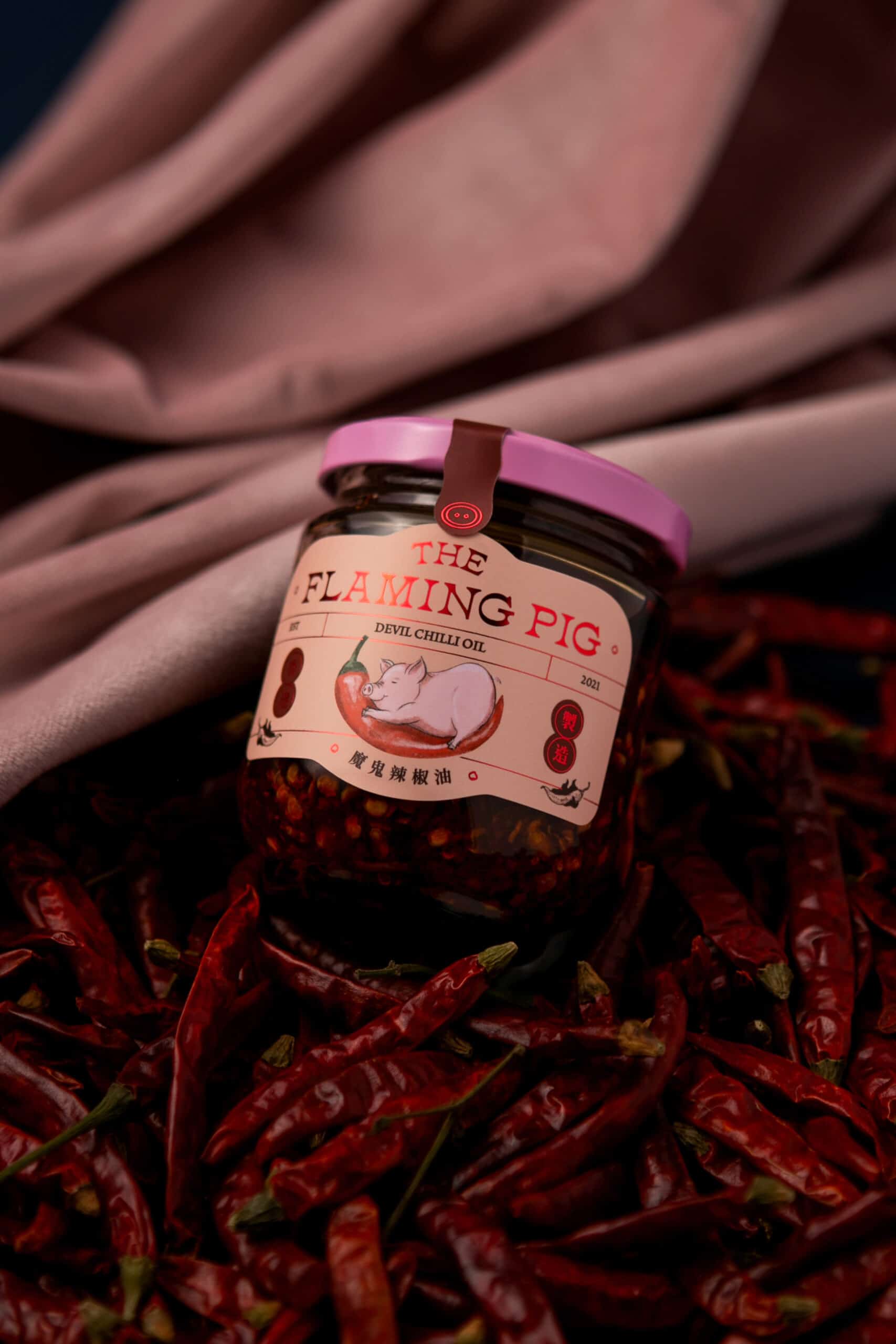
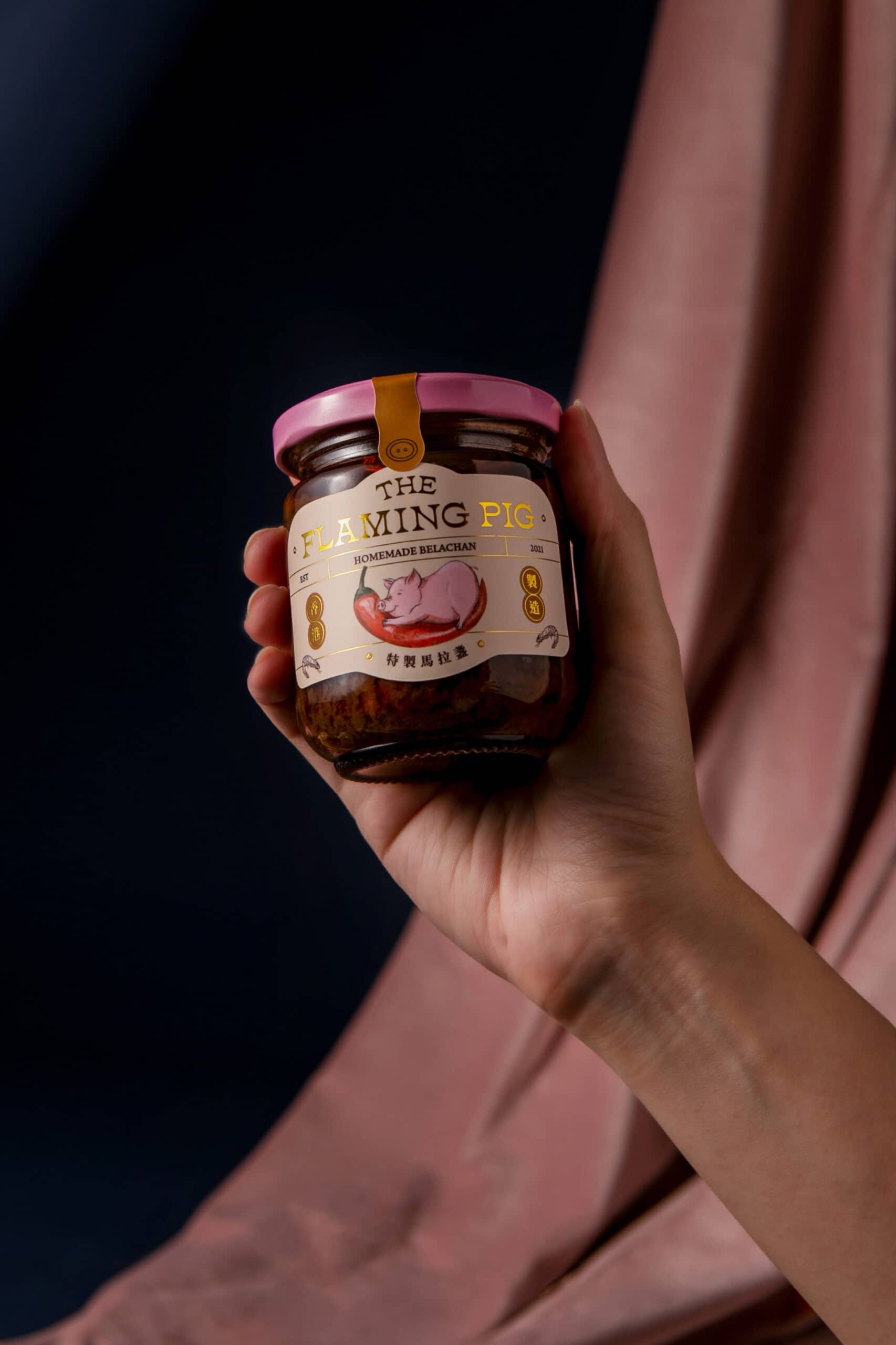
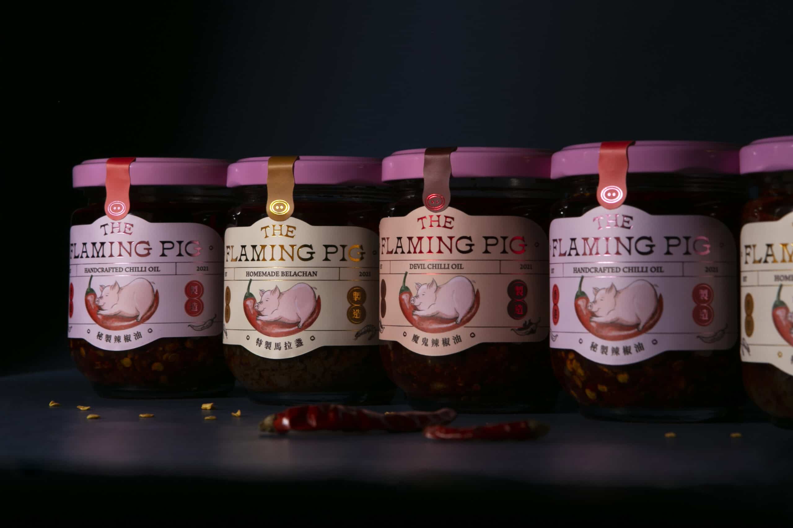
VINCDESIGN redesigned for The Flaming Pig to give their packaging a more playful and trendy sense.
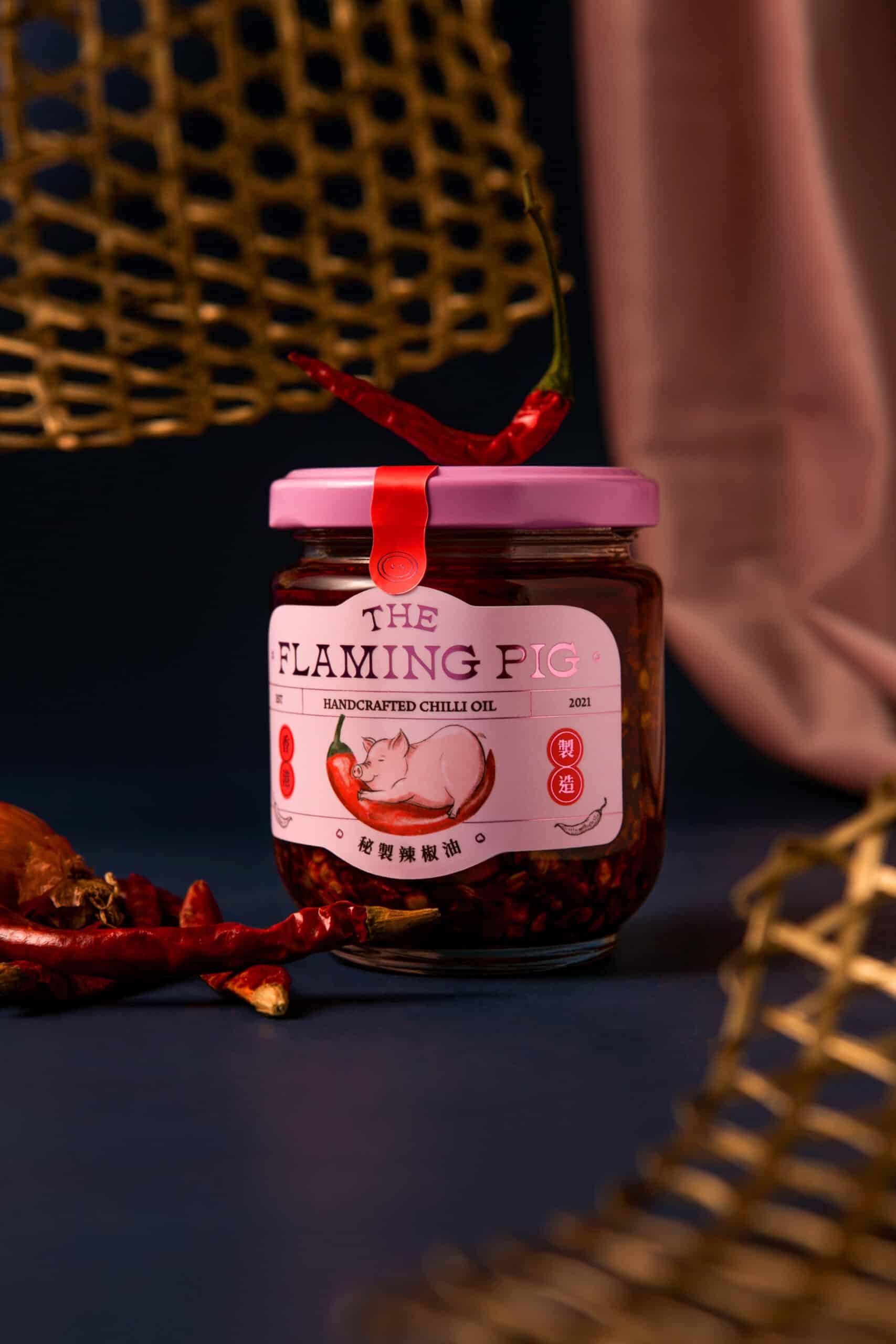
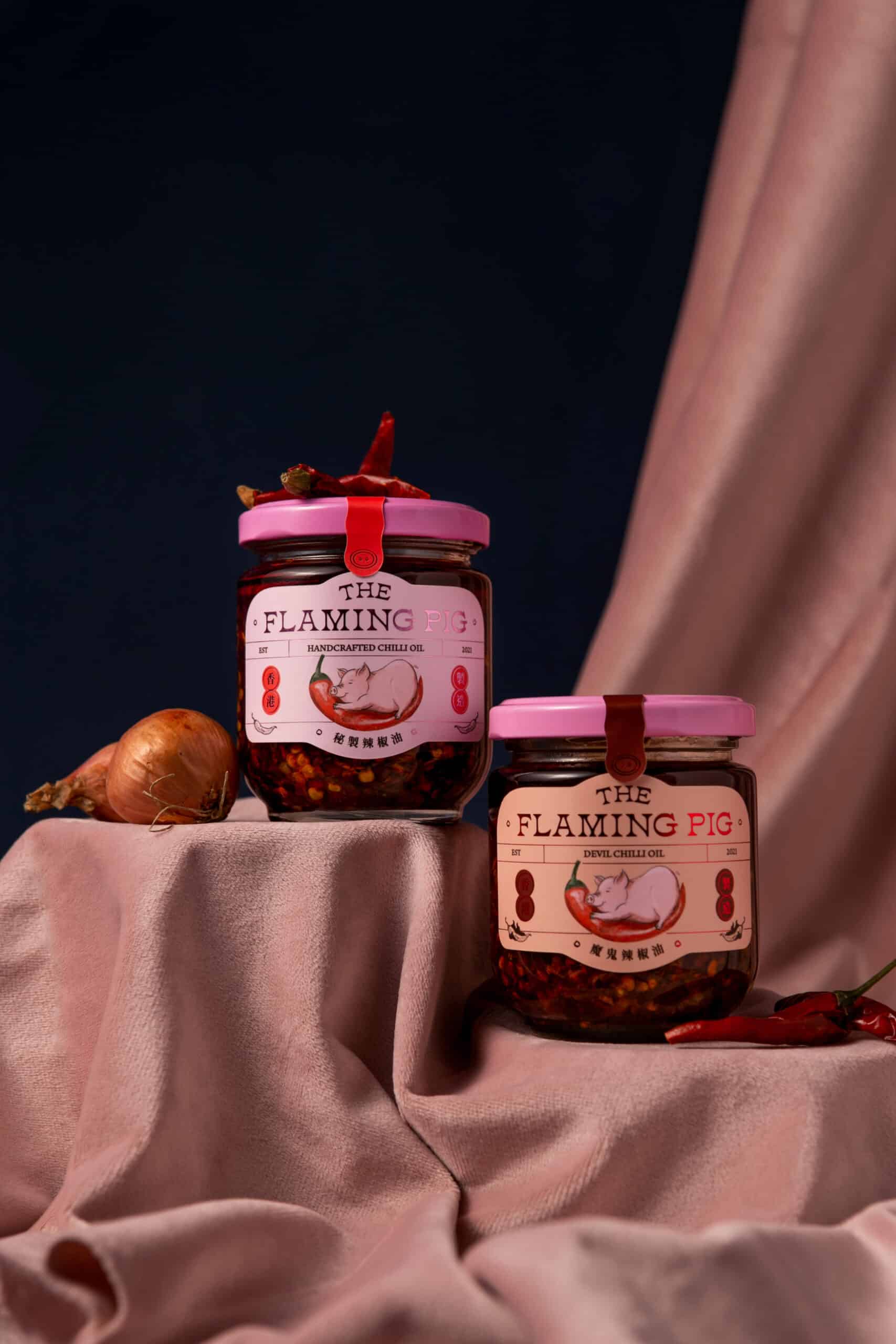
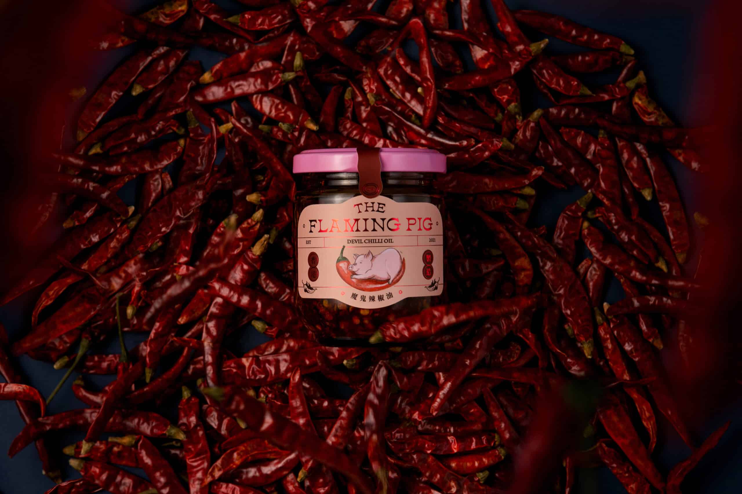
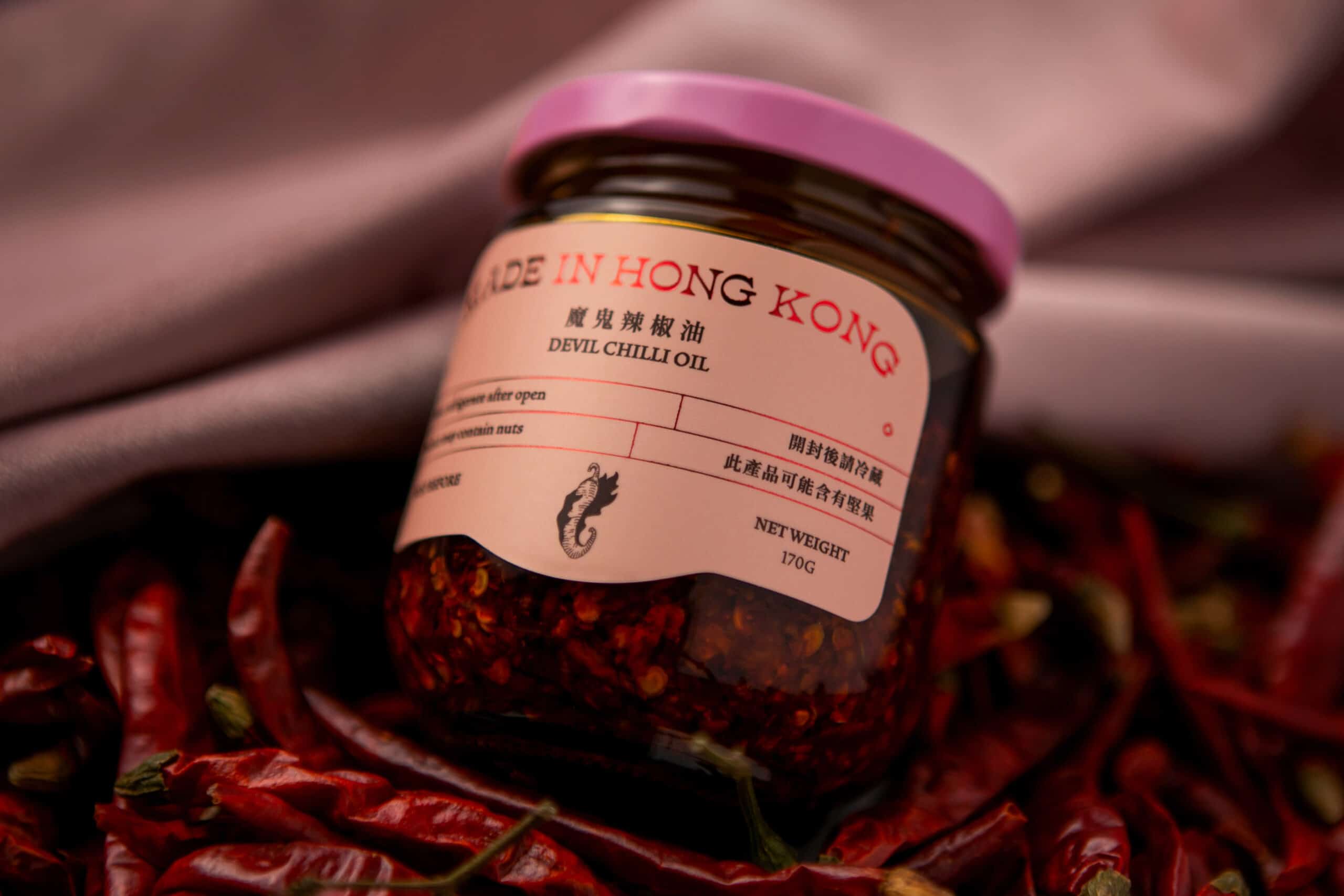
The original white packaging was plain and lacked distinctive details. The pink sealing lid was thus decided to give the collection a unifying and iconic touch. On the premise of retaining the chilli-hugging piggy logo designed by Gloria’s friend, the rounded edges of the label highlight the lively personality of the piggy. The fusion of Chinese and Western typographies also balances the stereotypical archaic sense associated with chilli oil, giving the final packaging a blend of traditional charm and modernity.
Package Design for The Flaming Pig 小辣豬
Background
In a city where chilli oil is a must for every household, the magic in The Flaming Pig’s captivating chilli oil is the traditional homemade recipe developed by the aunt of the founder Gloria.
The reason for having a cute pink piglet as the logo is not only because of Gloria’s fondness for piggies, but also for the zodiac sign of Gloria’s aunt and the Cantonese surname of her respected grandmother.
Design Solution
VINCDESIGN redesigned for The Flaming Pig to give their packaging a more playful and trendy sense.
The original white packaging was plain and lacked distinctive details. The pink sealing lid was thus decided to give the collection a unifying and iconic touch. On the premise of retaining the chilli-hugging piggy logo designed by Gloria’s friend, the rounded edges of the label highlight the lively personality of the piggy. The fusion of Chinese and Western typographies also balances the stereotypical archaic sense associated with chilli oil, giving the final packaging a blend of traditional charm and modernity.
WHAT WE DID
Brand Positioning, Creative Concept, Package Design
Package design for The Flaming Pig 小辣豬
Client/Project: The Flaming Pig 小辣豬
Creative Director: Vince Cheung
Design and illustration: Ping Ting
Photography: Ping Ting & Yin Ip @tinysotiny.co
商標 | 品牌設計 | 香港 | 香港設計 | 視覺形象 | 包裝 | 包裝設計
logo | branding | design | hong kong | hong kong designer | VI | visual identity | vincdesign | package | package design